EconML Tutorial 13: Estimator Comparison Benchmark

A causal inference library gives us many estimators, but the important practical question is not “which estimator sounds most advanced?” The important question is: which estimator is best matched to the treatment assignment process, outcome structure, sample size, overlap, and decision goal?

This notebook builds a controlled benchmark where every estimator sees the same data, the same train-test split, and the same evaluation metrics. Because the data are synthetic, we know the true CATE for every held-out row. That lets us compare estimators in a way that real observational data cannot.

We will compare six EconML estimators:

The benchmark evaluates more than CATE RMSE. We also examine ATE bias, CATE ranking quality, top-group targeting value, decile calibration, segment behavior, and runtime. The goal is to build a habit of comparing estimators across the decision surface, not just one leaderboard metric.

Learning Goals

By the end of this notebook, you should be able to:

  • design a fair benchmark for heterogeneous treatment-effect estimators;
  • keep the data split, features, and metrics identical across estimators;
  • compare orthogonal estimators with meta-learners;
  • evaluate CATE recovery, ATE bias, ranking quality, and policy-style targeting value;
  • diagnose estimator behavior by CATE decile and by business-relevant segment;
  • explain why the “best” estimator depends on the use case, not only a single score.

Tutorial Flow

The notebook has five parts:

  1. Create a nonlinear binary-treatment teaching dataset with confounded assignment and known CATE.
  2. Run basic diagnostics: treatment balance, propensity overlap, and true effect distribution.
  3. Fit six EconML estimators on the same training data.
  4. Compare held-out performance across recovery, ranking, calibration, targeting, and runtime.
  5. Summarize how to choose an estimator based on the observed benchmark pattern.

Every result-producing code cell is followed by a short discussion so the benchmark reads like an analysis, not just a list of tables.

Setup

This cell imports the notebook dependencies, creates output folders, sets plotting defaults, and suppresses harmless display warnings. All code remains visible so students can rerun and modify the benchmark.

from pathlib import Path
import os
import time
import warnings

# Suppress optional widget warnings that can appear while importing EconML in headless notebook runs.
warnings.filterwarnings("ignore", message="IProgress not found.*")

# Keep Matplotlib cache files in a writable location during notebook execution.
os.environ.setdefault("MPLCONFIGDIR", "/tmp/matplotlib")

import econml
import matplotlib.pyplot as plt
from matplotlib.ticker import PercentFormatter
import numpy as np
import pandas as pd
import seaborn as sns
from IPython.display import display
from scipy.special import expit
from sklearn.ensemble import RandomForestClassifier, RandomForestRegressor
from sklearn.linear_model import LogisticRegression
from sklearn.metrics import log_loss, mean_absolute_error, mean_squared_error, roc_auc_score
from sklearn.model_selection import train_test_split
from sklearn.preprocessing import PolynomialFeatures

from econml.dml import CausalForestDML, LinearDML
from econml.dr import DRLearner
from econml.metalearners import SLearner, TLearner, XLearner

warnings.filterwarnings("ignore", message="X does not have valid feature names.*", category=UserWarning)
warnings.filterwarnings("ignore", message="Not all column names are strings.*", category=UserWarning)
warnings.filterwarnings("ignore", message="Co-variance matrix is underdetermined.*", category=UserWarning)
warnings.filterwarnings("ignore", category=FutureWarning)

sns.set_theme(style="whitegrid", context="notebook")
plt.rcParams["figure.figsize"] = (10, 6)
plt.rcParams["axes.titleweight"] = "bold"
plt.rcParams["axes.labelsize"] = 11


def find_project_root(start=None):
    """Find the repository root from either the repo or a nested notebook folder."""
    start = Path.cwd() if start is None else Path(start)
    for candidate in [start, *start.parents]:
        if (candidate / "pyproject.toml").exists() and (candidate / "notebooks").exists():
            return candidate
    return Path.cwd()


PROJECT_ROOT = find_project_root()
NOTEBOOK_DIR = PROJECT_ROOT / "notebooks" / "tutorials" / "econml"
OUTPUT_DIR = NOTEBOOK_DIR / "outputs"
FIGURE_DIR = OUTPUT_DIR / "figures"
TABLE_DIR = OUTPUT_DIR / "tables"

FIGURE_DIR.mkdir(parents=True, exist_ok=True)
TABLE_DIR.mkdir(parents=True, exist_ok=True)

rng = np.random.default_rng(202613)

print(f"Project root: {PROJECT_ROOT}")
print(f"EconML version: {econml.__version__}")
print(f"Figures will be saved to: {FIGURE_DIR.relative_to(PROJECT_ROOT)}")
print(f"Tables will be saved to: {TABLE_DIR.relative_to(PROJECT_ROOT)}")
Project root: /home/apex/Documents/ranking_sys
EconML version: 0.16.0
Figures will be saved to: notebooks/tutorials/econml/outputs/figures
Tables will be saved to: notebooks/tutorials/econml/outputs/tables

The environment is ready. All artifacts from this benchmark use the 13_ prefix.

Benchmark Design Principles

Before creating data, we define what “fair comparison” means. The estimators differ internally, but the benchmark should hold the external setup fixed.

benchmark_principles = pd.DataFrame(
    [
        {
            "principle": "Same data split",
            "how_this_notebook_applies_it": "Every estimator trains on the same training rows and is evaluated on the same held-out rows.",
            "why_it_matters": "Different splits can make estimator differences look larger or smaller than they are.",
        },
        {
            "principle": "Same feature set",
            "how_this_notebook_applies_it": "All estimators receive the same observed pre-treatment covariates.",
            "why_it_matters": "Feature differences should not be confused with estimator differences.",
        },
        {
            "principle": "Multiple metrics",
            "how_this_notebook_applies_it": "We compare ATE bias, CATE RMSE, correlation, targeting value, calibration, and runtime.",
            "why_it_matters": "One metric rarely captures all decision needs.",
        },
        {
            "principle": "Ground-truth teaching data",
            "how_this_notebook_applies_it": "The synthetic data include true CATE for held-out evaluation.",
            "why_it_matters": "Real data cannot directly validate row-level CATE recovery.",
        },
        {
            "principle": "Decision-aware ranking",
            "how_this_notebook_applies_it": "We evaluate top-group true effects, not only pointwise errors.",
            "why_it_matters": "Many CATE workflows are used for prioritization rather than exact prediction.",
        },
    ]
)

benchmark_principles.to_csv(TABLE_DIR / "13_benchmark_principles.csv", index=False)
display(benchmark_principles)
principle how_this_notebook_applies_it why_it_matters
0 Same data split Every estimator trains on the same training ro... Different splits can make estimator difference...
1 Same feature set All estimators receive the same observed pre-t... Feature differences should not be confused wit...
2 Multiple metrics We compare ATE bias, CATE RMSE, correlation, t... One metric rarely captures all decision needs.
3 Ground-truth teaching data The synthetic data include true CATE for held-... Real data cannot directly validate row-level C...
4 Decision-aware ranking We evaluate top-group true effects, not only p... Many CATE workflows are used for prioritizatio...

These principles keep the benchmark honest. We want estimator differences to come from estimator behavior, not from accidental differences in preprocessing or evaluation.

Estimator Map

This table summarizes the estimator families included in the benchmark. The point is not to declare a universal winner; it is to make each estimator’s modeling strategy explicit.

estimator_map = pd.DataFrame(
    [
        {
            "estimator": "LinearDML",
            "family": "orthogonal DML",
            "core_idea": "Residualize outcome and treatment, then fit a structured final CATE model.",
            "expected_strength": "Good when effect heterogeneity is fairly smooth or well represented by chosen features.",
        },
        {
            "estimator": "CausalForestDML",
            "family": "orthogonal forest",
            "core_idea": "Use forest splits to learn nonlinear heterogeneous effects with orthogonalization.",
            "expected_strength": "Good for nonlinear heterogeneity and segment discovery.",
        },
        {
            "estimator": "DRLearner",
            "family": "doubly robust",
            "core_idea": "Combine outcome and propensity nuisance models into a pseudo-outcome for CATE learning.",
            "expected_strength": "Good when either propensity or outcome modeling is strong enough to stabilize estimates.",
        },
        {
            "estimator": "SLearner",
            "family": "meta-learner",
            "core_idea": "Fit one outcome model using treatment as a feature, then contrast predicted outcomes.",
            "expected_strength": "Simple baseline that can work when treatment interactions are learned well.",
        },
        {
            "estimator": "TLearner",
            "family": "meta-learner",
            "core_idea": "Fit separate outcome models for treated and control rows, then subtract predictions.",
            "expected_strength": "Useful when treated and control outcome surfaces differ strongly and both groups have support.",
        },
        {
            "estimator": "XLearner",
            "family": "meta-learner",
            "core_idea": "Impute treatment effects in each arm and combine them using propensity information.",
            "expected_strength": "Often useful when treatment groups are imbalanced or effects are heterogeneous.",
        },
    ]
)

estimator_map.to_csv(TABLE_DIR / "13_estimator_map.csv", index=False)
display(estimator_map)
estimator family core_idea expected_strength
0 LinearDML orthogonal DML Residualize outcome and treatment, then fit a ... Good when effect heterogeneity is fairly smoot...
1 CausalForestDML orthogonal forest Use forest splits to learn nonlinear heterogen... Good for nonlinear heterogeneity and segment d...
2 DRLearner doubly robust Combine outcome and propensity nuisance models... Good when either propensity or outcome modelin...
3 SLearner meta-learner Fit one outcome model using treatment as a fea... Simple baseline that can work when treatment i...
4 TLearner meta-learner Fit separate outcome models for treated and co... Useful when treated and control outcome surfac...
5 XLearner meta-learner Impute treatment effects in each arm and combi... Often useful when treatment groups are imbalan...

The estimators differ in how they use nuisance models, treatment assignment, and outcome surfaces. That is why the same dataset can favor different methods under different metrics.

Teaching Data Design

The synthetic data include nonlinear treatment effects, confounded binary treatment assignment, and realistic overlap. Treatment assignment depends on observed covariates, so naive treated-control comparisons will be biased.

def true_cate_function(frame):
    """Ground-truth CATE used for synthetic benchmark evaluation."""
    return (
        0.38
        + 0.34 * frame["baseline_need"]
        + 0.22 * np.tanh(frame["content_affinity"])
        - 0.24 * np.maximum(frame["friction_score"], 0)
        - 0.18 * frame["price_sensitivity"]
        - 0.12 * frame["region_risk"]
        + 0.18 * frame["high_need_segment"] * (frame["content_affinity"] > 0).astype(float)
        + 0.12 * np.sin(frame["baseline_need"] + frame["novelty_preference"])
        + 0.08 * frame["device_stability"] * frame["content_affinity"]
    )


n = 4_000
baseline_need = rng.normal(0, 1, size=n)
prior_engagement = rng.normal(0, 1, size=n)
friction_score = rng.normal(0, 1, size=n)
content_affinity = rng.normal(0, 1, size=n)
novelty_preference = rng.normal(0, 1, size=n)
price_sensitivity = rng.beta(2.2, 3.0, size=n)
account_tenure = rng.gamma(shape=3.0, scale=16.0, size=n)
region_risk = rng.binomial(1, 0.28, size=n)
device_stability = rng.beta(4.0, 2.0, size=n)
high_need_segment = (baseline_need > 0.55).astype(int)
low_friction_segment = (friction_score < -0.25).astype(int)

features = pd.DataFrame(
    {
        "baseline_need": baseline_need,
        "prior_engagement": prior_engagement,
        "friction_score": friction_score,
        "content_affinity": content_affinity,
        "novelty_preference": novelty_preference,
        "price_sensitivity": price_sensitivity,
        "account_tenure": account_tenure,
        "region_risk": region_risk,
        "device_stability": device_stability,
        "high_need_segment": high_need_segment,
        "low_friction_segment": low_friction_segment,
    }
)

true_cate = true_cate_function(features)
propensity = expit(
    -0.15
    + 0.58 * baseline_need
    + 0.35 * prior_engagement
    - 0.38 * friction_score
    + 0.28 * content_affinity
    - 0.40 * price_sensitivity
    + 0.20 * novelty_preference
    + 0.22 * region_risk
)
propensity = np.clip(propensity, 0.04, 0.96)
treatment = rng.binomial(1, propensity, size=n)

baseline_outcome = (
    1.05
    + 0.55 * baseline_need
    + 0.42 * prior_engagement
    - 0.32 * friction_score
    + 0.26 * content_affinity
    + 0.18 * novelty_preference
    - 0.20 * price_sensitivity
    + 0.10 * np.log1p(account_tenure)
    - 0.18 * region_risk
    + 0.12 * device_stability
    + 0.10 * np.sin(content_affinity)
)
noise = rng.normal(0, 0.70 + 0.15 * np.maximum(friction_score, 0), size=n)
outcome = baseline_outcome + treatment * true_cate + noise

benchmark_df = features.assign(
    treatment=treatment,
    outcome=outcome,
    true_propensity=propensity,
    true_cate=true_cate,
    baseline_outcome=baseline_outcome,
)

benchmark_df.to_csv(TABLE_DIR / "13_benchmark_teaching_data.csv", index=False)
benchmark_df.head()
baseline_need prior_engagement friction_score content_affinity novelty_preference price_sensitivity account_tenure region_risk device_stability high_need_segment low_friction_segment treatment outcome true_propensity true_cate baseline_outcome
0 1.032714 -0.012577 2.409001 1.352976 1.053867 0.557824 96.371016 0 0.776164 1 0 0 2.631807 0.473931 0.613399 1.920365
1 2.167932 -0.961431 0.350214 -0.587670 0.679030 0.659541 27.196253 0 0.704150 1 0 0 1.827384 0.585468 0.799862 1.926991
2 -0.605126 -0.138752 -0.212956 -0.792624 1.518319 0.690447 63.876623 0 0.787881 0 0 0 0.743609 0.340052 -0.050184 1.096751
3 1.279988 -0.598436 1.487410 -0.138919 1.809341 0.377421 73.808594 0 0.262653 1 0 0 0.058752 0.497432 0.363265 1.689921
4 0.802231 0.588796 0.752663 -0.874492 -0.266609 0.649335 38.721834 1 0.973615 1 0 1 1.084485 0.474384 0.073568 1.320747

The first rows show the complete teaching dataset. The models will use observed covariates, treatment, and outcome; the true CATE and true propensity are kept only for diagnostics.

Field Dictionary

This table describes the fields used in the benchmark. Clear field roles help students separate observed inputs from teaching-only truth.

field_dictionary = pd.DataFrame(
    [
        ("baseline_need", "Observed covariate", "Pre-treatment demand or need signal."),
        ("prior_engagement", "Observed covariate", "Pre-treatment engagement signal."),
        ("friction_score", "Observed covariate", "Higher values mean more friction."),
        ("content_affinity", "Observed covariate", "Match between row and content or offer."),
        ("novelty_preference", "Observed covariate", "Preference for exploratory or new experiences."),
        ("price_sensitivity", "Observed covariate", "Sensitivity to cost, effort, or inconvenience."),
        ("account_tenure", "Observed covariate", "Age of the account or relationship in weeks."),
        ("region_risk", "Observed covariate", "Binary marker for lower baseline outcome regions."),
        ("device_stability", "Observed covariate", "Technical stability or reliability signal."),
        ("high_need_segment", "Observed covariate", "Binary segment derived from baseline need."),
        ("low_friction_segment", "Observed covariate", "Binary segment derived from friction score."),
        ("treatment", "Treatment", "Binary intervention assignment."),
        ("outcome", "Outcome", "Observed post-treatment outcome."),
        ("true_propensity", "Teaching-only truth", "Known treatment probability from the synthetic assignment process."),
        ("true_cate", "Teaching-only truth", "Known conditional treatment effect for each row."),
        ("baseline_outcome", "Teaching-only truth", "Potential baseline outcome component before treatment effect and noise."),
    ],
    columns=["field", "role", "description"],
)

field_dictionary.to_csv(TABLE_DIR / "13_field_dictionary.csv", index=False)
display(field_dictionary)
field role description
0 baseline_need Observed covariate Pre-treatment demand or need signal.
1 prior_engagement Observed covariate Pre-treatment engagement signal.
2 friction_score Observed covariate Higher values mean more friction.
3 content_affinity Observed covariate Match between row and content or offer.
4 novelty_preference Observed covariate Preference for exploratory or new experiences.
5 price_sensitivity Observed covariate Sensitivity to cost, effort, or inconvenience.
6 account_tenure Observed covariate Age of the account or relationship in weeks.
7 region_risk Observed covariate Binary marker for lower baseline outcome regions.
8 device_stability Observed covariate Technical stability or reliability signal.
9 high_need_segment Observed covariate Binary segment derived from baseline need.
10 low_friction_segment Observed covariate Binary segment derived from friction score.
11 treatment Treatment Binary intervention assignment.
12 outcome Outcome Observed post-treatment outcome.
13 true_propensity Teaching-only truth Known treatment probability from the synthetic...
14 true_cate Teaching-only truth Known conditional treatment effect for each row.
15 baseline_outcome Teaching-only truth Potential baseline outcome component before tr...

The teaching-only fields make benchmarking possible. Real applications usually cannot compute CATE RMSE because the true row-level treatment effect is unknown.

Basic Data Summary

This cell summarizes the treatment rate, outcome distribution, true effect distribution, and overlap range. These checks establish the difficulty of the benchmark before fitting any estimator.

basic_summary = pd.DataFrame(
    {
        "metric": [
            "rows",
            "columns",
            "treatment_rate",
            "outcome_mean",
            "outcome_std",
            "true_ate",
            "true_cate_std",
            "share_positive_true_cate",
            "min_true_propensity",
            "max_true_propensity",
        ],
        "value": [
            len(benchmark_df),
            benchmark_df.shape[1],
            benchmark_df["treatment"].mean(),
            benchmark_df["outcome"].mean(),
            benchmark_df["outcome"].std(),
            benchmark_df["true_cate"].mean(),
            benchmark_df["true_cate"].std(),
            (benchmark_df["true_cate"] > 0).mean(),
            benchmark_df["true_propensity"].min(),
            benchmark_df["true_propensity"].max(),
        ],
    }
)

basic_summary.to_csv(TABLE_DIR / "13_basic_summary.csv", index=False)
display(basic_summary)
metric value
0 rows 4000.000000
1 columns 16.000000
2 treatment_rate 0.439750
3 outcome_mean 1.541152
4 outcome_std 1.368809
5 true_ate 0.198488
6 true_cate_std 0.507004
7 share_positive_true_cate 0.640000
8 min_true_propensity 0.040000
9 max_true_propensity 0.944819

The true CATE has meaningful spread, so estimator ranking and heterogeneity recovery matter. This is not just an average-effect problem.

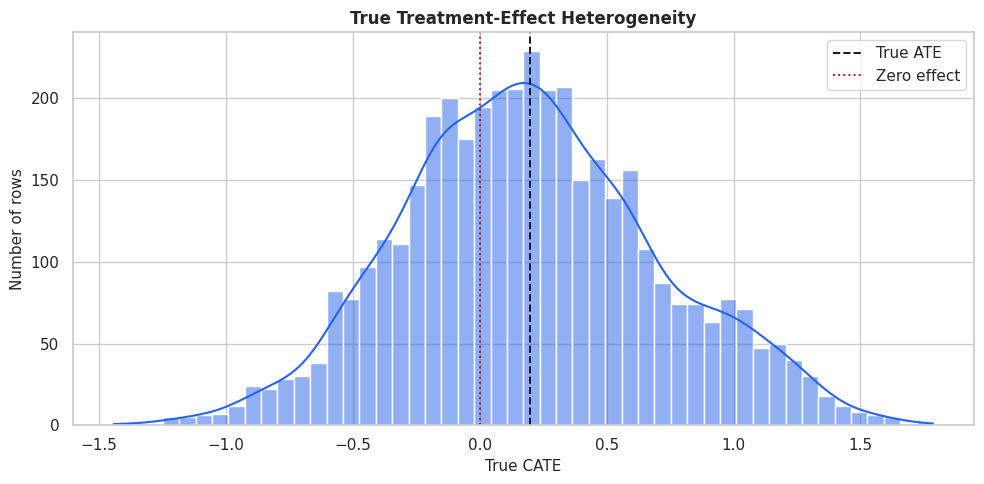
True CATE Distribution

The true CATE distribution gives a visual sense of the benchmark target. Estimators should recover both the level and ranking of this distribution on held-out data.

fig, ax = plt.subplots(figsize=(10, 5))
sns.histplot(benchmark_df["true_cate"], bins=50, kde=True, color="#2563eb", ax=ax)
ax.axvline(benchmark_df["true_cate"].mean(), color="#111827", linestyle="--", linewidth=1.4, label="True ATE")
ax.axvline(0, color="#b91c1c", linestyle=":", linewidth=1.4, label="Zero effect")
ax.set_title("True Treatment-Effect Heterogeneity")
ax.set_xlabel("True CATE")
ax.set_ylabel("Number of rows")
ax.legend()
plt.tight_layout()
fig.savefig(FIGURE_DIR / "13_true_cate_distribution.png", dpi=160, bbox_inches="tight")
plt.show()

The distribution contains low-benefit and high-benefit regions. A good estimator should not only estimate the mean, but also identify the right tail well enough for targeting.

Naive Treated-Control Difference

Before fitting causal estimators, we compute the raw treated-control difference. This is not a causal estimate because treatment assignment is confounded.

raw_group_summary = (
    benchmark_df.groupby("treatment")
    .agg(
        rows=("outcome", "size"),
        outcome_mean=("outcome", "mean"),
        true_cate_mean=("true_cate", "mean"),
        true_propensity_mean=("true_propensity", "mean"),
        high_need_rate=("high_need_segment", "mean"),
        low_friction_rate=("low_friction_segment", "mean"),
    )
    .reset_index()
)
raw_difference = raw_group_summary.loc[raw_group_summary["treatment"] == 1, "outcome_mean"].iloc[0] - raw_group_summary.loc[raw_group_summary["treatment"] == 0, "outcome_mean"].iloc[0]
raw_difference_vs_truth = pd.DataFrame(
    {
        "quantity": ["raw_treated_minus_control", "true_ate", "raw_minus_true_ate"],
        "value": [raw_difference, benchmark_df["true_cate"].mean(), raw_difference - benchmark_df["true_cate"].mean()],
    }
)

raw_group_summary.to_csv(TABLE_DIR / "13_raw_group_summary.csv", index=False)
raw_difference_vs_truth.to_csv(TABLE_DIR / "13_raw_difference_vs_truth.csv", index=False)
display(raw_group_summary)
display(raw_difference_vs_truth)
treatment rows outcome_mean true_cate_mean true_propensity_mean high_need_rate low_friction_rate
0 0 2241 1.105038 0.065412 0.388476 0.211959 0.352521
1 1 1759 2.096770 0.368029 0.524493 0.387152 0.475270
quantity value
0 raw_treated_minus_control 0.991732
1 true_ate 0.198488
2 raw_minus_true_ate 0.793244

The raw difference mixes true treatment effect with selection into treatment. The benchmark therefore needs estimators that adjust for observed confounding.
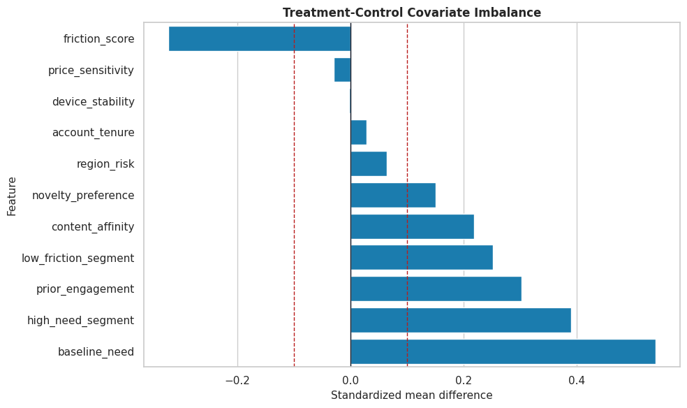
Covariate Balance

This cell computes standardized mean differences between treated and control rows. Large imbalance tells us where adjustment is needed.

feature_cols = [
    "baseline_need",
    "prior_engagement",
    "friction_score",
    "content_affinity",
    "novelty_preference",
    "price_sensitivity",
    "account_tenure",
    "region_risk",
    "device_stability",
    "high_need_segment",
    "low_friction_segment",
]

balance_rows = []
for feature in feature_cols:
    treated_values = benchmark_df.loc[benchmark_df["treatment"] == 1, feature]
    control_values = benchmark_df.loc[benchmark_df["treatment"] == 0, feature]
    pooled_sd = np.sqrt((treated_values.var(ddof=1) + control_values.var(ddof=1)) / 2)
    smd = (treated_values.mean() - control_values.mean()) / pooled_sd
    balance_rows.append(
        {
            "feature": feature,
            "treated_mean": treated_values.mean(),
            "control_mean": control_values.mean(),
            "standardized_mean_difference": smd,
            "absolute_smd": abs(smd),
        }
    )

balance_table = pd.DataFrame(balance_rows).sort_values("absolute_smd", ascending=False)
balance_table.to_csv(TABLE_DIR / "13_covariate_balance.csv", index=False)
display(balance_table)
feature treated_mean control_mean standardized_mean_difference absolute_smd
0 baseline_need 0.293826 -0.243031 0.538938 0.538938
9 high_need_segment 0.387152 0.211959 0.389555 0.389555
2 friction_score -0.193799 0.120983 -0.322196 0.322196
1 prior_engagement 0.195121 -0.105398 0.301412 0.301412
10 low_friction_segment 0.475270 0.352521 0.251115 0.251115
3 content_affinity 0.124215 -0.091619 0.218096 0.218096
4 novelty_preference 0.074636 -0.073350 0.150108 0.150108
7 region_risk 0.306424 0.277555 0.063510 0.063510
5 price_sensitivity 0.416023 0.422035 -0.030084 0.030084
6 account_tenure 48.985911 48.214979 0.028049 0.028049
8 device_stability 0.668324 0.668905 -0.003238 0.003238

The imbalance pattern confirms that treatment assignment is observational. This creates a meaningful benchmark for methods that model propensity, outcomes, or both.

Balance Plot

The plot makes the magnitude and direction of imbalance easier to scan than the table alone.

fig, ax = plt.subplots(figsize=(10, 6))
plot_balance = balance_table.sort_values("standardized_mean_difference")
sns.barplot(data=plot_balance, x="standardized_mean_difference", y="feature", color="#0284c7", ax=ax)
ax.axvline(0, color="#111827", linewidth=1)
ax.axvline(0.10, color="#b91c1c", linestyle="--", linewidth=1)
ax.axvline(-0.10, color="#b91c1c", linestyle="--", linewidth=1)
ax.set_title("Treatment-Control Covariate Imbalance")
ax.set_xlabel("Standardized mean difference")
ax.set_ylabel("Feature")
plt.tight_layout()
fig.savefig(FIGURE_DIR / "13_covariate_balance.png", dpi=160, bbox_inches="tight")
plt.show()

Several features cross the practical imbalance threshold. The estimators will need to account for these differences to recover the causal effect.

Propensity Overlap

Overlap is essential for comparing treated and control outcomes within similar covariate regions. Here we can inspect the true synthetic propensity.

fig, ax = plt.subplots(figsize=(10, 5))
sns.kdeplot(
    data=benchmark_df,
    x="true_propensity",
    hue="treatment",
    common_norm=False,
    fill=True,
    alpha=0.28,
    linewidth=1.4,
    ax=ax,
)
ax.set_title("True Propensity Overlap")
ax.set_xlabel("True propensity score")
ax.set_ylabel("Density")
plt.tight_layout()
fig.savefig(FIGURE_DIR / "13_true_propensity_overlap.png", dpi=160, bbox_inches="tight")
plt.show()

The treated and control distributions overlap, but treatment is clearly not random. That is the sweet spot for a useful teaching benchmark: confounding exists, but overlap is not catastrophically bad.

Train-Test Split

We split the data once and reuse the split for every estimator. Stratifying on treatment keeps treatment rates similar across training and test data.

train_df, test_df = train_test_split(
    benchmark_df,
    test_size=0.35,
    random_state=202613,
    stratify=benchmark_df["treatment"],
)
train_df = train_df.reset_index(drop=True)
test_df = test_df.reset_index(drop=True)

split_summary = pd.DataFrame(
    {
        "split": ["train", "test"],
        "rows": [len(train_df), len(test_df)],
        "treatment_rate": [train_df["treatment"].mean(), test_df["treatment"].mean()],
        "outcome_mean": [train_df["outcome"].mean(), test_df["outcome"].mean()],
        "true_ate": [train_df["true_cate"].mean(), test_df["true_cate"].mean()],
        "true_cate_std": [train_df["true_cate"].std(), test_df["true_cate"].std()],
    }
)

split_summary.to_csv(TABLE_DIR / "13_train_test_split_summary.csv", index=False)
display(split_summary)
split rows treatment_rate outcome_mean true_ate true_cate_std
0 train 2600 0.439615 1.536659 0.198415 0.505453
1 test 1400 0.440000 1.549496 0.198624 0.510053

The train and test splits are similar on treatment rate and true effect distribution. That makes held-out estimator comparisons more stable.

Model Matrices

This cell creates the model inputs shared by every estimator. The same feature matrix is used across the benchmark.

X_train = train_df[feature_cols].copy()
X_test = test_df[feature_cols].copy()
y_train = train_df["outcome"].to_numpy()
y_test = test_df["outcome"].to_numpy()
t_train = train_df["treatment"].to_numpy()
t_test = test_df["treatment"].to_numpy()
true_tau_test = test_df["true_cate"].to_numpy()

matrix_summary = pd.DataFrame(
    {
        "object": ["X_train", "X_test", "y_train", "t_train", "true_tau_test"],
        "shape_or_length": [X_train.shape, X_test.shape, len(y_train), len(t_train), len(true_tau_test)],
        "description": [
            "Shared covariate matrix for training.",
            "Shared covariate matrix for held-out evaluation.",
            "Training outcomes.",
            "Training treatment indicators.",
            "Teaching-only true CATE values for held-out evaluation.",
        ],
    }
)

matrix_summary.to_csv(TABLE_DIR / "13_model_matrix_summary.csv", index=False)
display(matrix_summary)
object shape_or_length description
0 X_train (2600, 11) Shared covariate matrix for training.
1 X_test (1400, 11) Shared covariate matrix for held-out evaluation.
2 y_train 2600 Training outcomes.
3 t_train 2600 Training treatment indicators.
4 true_tau_test 1400 Teaching-only true CATE values for held-out ev...

The shared matrices are the foundation of a fair comparison. From here on, estimator differences are not due to different features or splits.

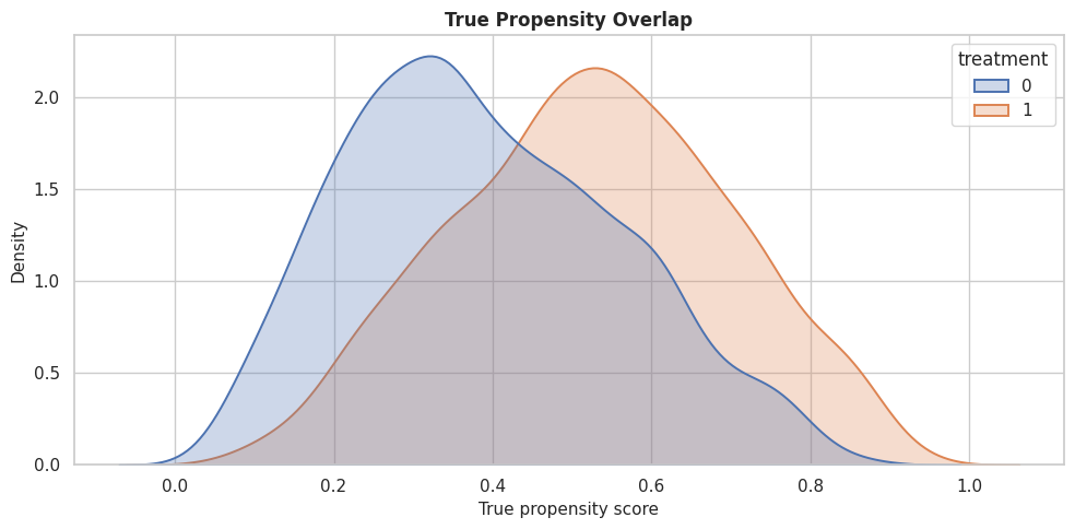
Nuisance Diagnostics

Before comparing CATE estimators, we check whether basic models can predict treatment and outcome. Strong nuisance signal is expected because treatment is confounded and the outcome is structured.

propensity_model = RandomForestClassifier(n_estimators=220, min_samples_leaf=25, random_state=202613, n_jobs=-1)
propensity_model.fit(X_train, t_train)
propensity_pred = np.clip(propensity_model.predict_proba(X_test)[:, 1], 1e-4, 1 - 1e-4)

outcome_model = RandomForestRegressor(n_estimators=220, min_samples_leaf=20, random_state=202614, n_jobs=-1)
outcome_model.fit(X_train.assign(treatment=t_train), y_train)
outcome_pred = outcome_model.predict(X_test.assign(treatment=t_test))

nuisance_diagnostics = pd.DataFrame(
    [
        {
            "model": "propensity_model",
            "metric_1": "roc_auc",
            "value_1": roc_auc_score(t_test, propensity_pred),
            "metric_2": "log_loss",
            "value_2": log_loss(t_test, propensity_pred),
        },
        {
            "model": "outcome_model",
            "metric_1": "rmse",
            "value_1": np.sqrt(mean_squared_error(y_test, outcome_pred)),
            "metric_2": "mae",
            "value_2": mean_absolute_error(y_test, outcome_pred),
        },
    ]
)

nuisance_diagnostics.to_csv(TABLE_DIR / "13_nuisance_diagnostics.csv", index=False)
display(nuisance_diagnostics)
model metric_1 value_1 metric_2 value_2
0 propensity_model roc_auc 0.684963 log_loss 0.634215
1 outcome_model rmse 0.873186 mae 0.691104

The propensity model can predict treatment assignment, so confounding is present. The outcome model also has signal, which should help estimators that rely on outcome nuisance models.

Define Estimators

This cell creates all estimators in the benchmark. The hyperparameters are intentionally moderate so the notebook runs quickly while still showing meaningful differences.

estimators = {
    "LinearDML": LinearDML(
        model_y=RandomForestRegressor(n_estimators=160, min_samples_leaf=20, random_state=202615, n_jobs=-1),
        model_t=RandomForestClassifier(n_estimators=160, min_samples_leaf=25, random_state=202616, n_jobs=-1),
        discrete_treatment=True,
        featurizer=PolynomialFeatures(degree=2, include_bias=False),
        cv=3,
        random_state=202617,
    ),
    "CausalForestDML": CausalForestDML(
        model_y=RandomForestRegressor(n_estimators=160, min_samples_leaf=20, random_state=202618, n_jobs=-1),
        model_t=RandomForestClassifier(n_estimators=160, min_samples_leaf=25, random_state=202619, n_jobs=-1),
        discrete_treatment=True,
        n_estimators=220,
        min_samples_leaf=18,
        max_samples=0.45,
        cv=3,
        random_state=202620,
        inference=True,
    ),
    "DRLearner": DRLearner(
        model_propensity=LogisticRegression(max_iter=1_000),
        model_regression=RandomForestRegressor(n_estimators=180, min_samples_leaf=20, random_state=202621, n_jobs=-1),
        model_final=RandomForestRegressor(n_estimators=220, min_samples_leaf=18, random_state=202622, n_jobs=-1),
        cv=3,
        random_state=202623,
    ),
    "SLearner": SLearner(
        overall_model=RandomForestRegressor(n_estimators=220, min_samples_leaf=18, random_state=202624, n_jobs=-1),
    ),
    "TLearner": TLearner(
        models=RandomForestRegressor(n_estimators=220, min_samples_leaf=18, random_state=202625, n_jobs=-1),
    ),
    "XLearner": XLearner(
        models=RandomForestRegressor(n_estimators=220, min_samples_leaf=18, random_state=202626, n_jobs=-1),
        cate_models=RandomForestRegressor(n_estimators=220, min_samples_leaf=18, random_state=202627, n_jobs=-1),
        propensity_model=LogisticRegression(max_iter=1_000),
    ),
}

estimator_setup = pd.DataFrame(
    [{"estimator": name, "python_class": estimator.__class__.__name__} for name, estimator in estimators.items()]
)
estimator_setup.to_csv(TABLE_DIR / "13_estimator_setup.csv", index=False)
display(estimator_setup)
estimator python_class
0 LinearDML LinearDML
1 CausalForestDML CausalForestDML
2 DRLearner DRLearner
3 SLearner SLearner
4 TLearner TLearner
5 XLearner XLearner

All estimators are now configured. Some use orthogonalization, some use doubly robust pseudo-outcomes, and some use meta-learner outcome-model contrasts.

Fit All Estimators

This cell fits every estimator and records runtime. The benchmark keeps fitting code centralized so every estimator is evaluated consistently.

fitted_estimators = {}
fit_records = []

for name, estimator in estimators.items():
    start_time = time.perf_counter()
    estimator.fit(y_train, t_train, X=X_train)
    elapsed = time.perf_counter() - start_time
    fitted_estimators[name] = estimator
    fit_records.append({"estimator": name, "fit_seconds": elapsed})

fit_runtime = pd.DataFrame(fit_records).sort_values("fit_seconds")
fit_runtime.to_csv(TABLE_DIR / "13_fit_runtime.csv", index=False)
display(fit_runtime)
estimator fit_seconds
3 SLearner 0.383530
4 TLearner 0.729670
5 XLearner 1.815952
2 DRLearner 2.173814
0 LinearDML 3.017651
1 CausalForestDML 3.261215

Runtime is not the main scientific metric, but it matters in practice. A slower estimator may be worth it if it improves the decision metric that matters.

Predict Held-Out CATEs

After fitting, each estimator predicts treatment effects on the same held-out rows. We store all predictions in one table so downstream diagnostics are easy to compare.

prediction_records = []
effect_predictions = pd.DataFrame({"true_cate": true_tau_test})

for name, estimator in fitted_estimators.items():
    start_time = time.perf_counter()
    estimated_effect = np.ravel(estimator.effect(X_test, T0=0, T1=1))
    predict_seconds = time.perf_counter() - start_time
    effect_predictions[name] = estimated_effect
    prediction_records.append({"estimator": name, "predict_seconds": predict_seconds})

prediction_runtime = pd.DataFrame(prediction_records).sort_values("predict_seconds")
effect_predictions.to_csv(TABLE_DIR / "13_heldout_cate_predictions.csv", index=False)
prediction_runtime.to_csv(TABLE_DIR / "13_prediction_runtime.csv", index=False)
display(prediction_runtime)
display(effect_predictions.head())
estimator predict_seconds
0 LinearDML 0.002862
1 CausalForestDML 0.076335
2 DRLearner 0.097243
3 SLearner 0.103912
4 TLearner 0.169307
5 XLearner 0.191745
true_cate LinearDML CausalForestDML DRLearner SLearner TLearner XLearner
0 0.376500 0.454522 0.404979 0.504012 0.569757 0.788655 0.506183
1 0.381832 0.066483 0.382831 0.257904 0.067475 0.324037 0.453422
2 0.088619 0.084981 0.281727 -0.087010 0.505844 0.403956 0.215171
3 -0.587649 0.133417 0.089354 0.075430 0.000000 0.330138 0.052100
4 0.436237 0.765672 0.287974 0.207394 0.150250 0.400706 0.139964

The prediction table is the central benchmark artifact. Every later comparison is computed from this shared held-out table.

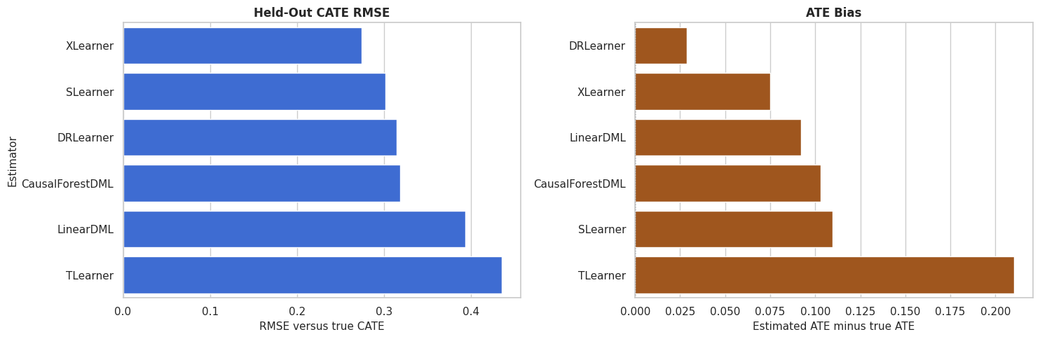
Main Benchmark Metrics

This cell computes a shared metric set for every estimator: average-effect bias, CATE error, CATE correlation, positive-effect rate, and top-20-percent targeting value.

def summarize_estimator(name, estimate):
    """Compute common held-out benchmark metrics for one estimator."""
    top_n = int(np.floor(0.20 * len(estimate)))
    top_idx = pd.Series(estimate).nlargest(top_n).index
    return {
        "estimator": name,
        "true_ate": true_tau_test.mean(),
        "estimated_ate": estimate.mean(),
        "ate_bias": estimate.mean() - true_tau_test.mean(),
        "absolute_ate_bias": abs(estimate.mean() - true_tau_test.mean()),
        "cate_rmse": np.sqrt(mean_squared_error(true_tau_test, estimate)),
        "cate_mae": mean_absolute_error(true_tau_test, estimate),
        "cate_correlation": np.corrcoef(true_tau_test, estimate)[0, 1],
        "share_estimated_positive": np.mean(estimate > 0),
        "top_20_true_cate_mean": true_tau_test[top_idx].mean(),
        "top_20_estimated_cate_mean": estimate[top_idx].mean(),
        "top_20_true_negative_share": np.mean(true_tau_test[top_idx] < 0),
    }

benchmark_metrics = pd.DataFrame(
    [summarize_estimator(name, effect_predictions[name].to_numpy()) for name in estimators.keys()]
).merge(fit_runtime, on="estimator", how="left").merge(prediction_runtime, on="estimator", how="left")

benchmark_metrics = benchmark_metrics.sort_values("cate_rmse").reset_index(drop=True)
benchmark_metrics.to_csv(TABLE_DIR / "13_benchmark_metrics.csv", index=False)
display(benchmark_metrics)
estimator true_ate estimated_ate ate_bias absolute_ate_bias cate_rmse cate_mae cate_correlation share_estimated_positive top_20_true_cate_mean top_20_estimated_cate_mean top_20_true_negative_share fit_seconds predict_seconds
0 XLearner 0.198624 0.273597 0.074973 0.074973 0.274643 0.211071 0.855272 0.694286 0.850097 0.907867 0.000000 1.815952 0.191745
1 SLearner 0.198624 0.308376 0.109752 0.109752 0.301581 0.229460 0.836177 0.793571 0.892449 1.008308 0.000000 0.383530 0.103912
2 DRLearner 0.198624 0.227219 0.028595 0.028595 0.314208 0.244124 0.813792 0.662857 0.856903 0.984641 0.000000 2.173814 0.097243
3 CausalForestDML 0.198624 0.301695 0.103071 0.103071 0.318427 0.245153 0.913833 0.893571 0.895554 0.672556 0.000000 3.261215 0.076335
4 LinearDML 0.198624 0.290684 0.092060 0.092060 0.393217 0.288085 0.761342 0.665714 0.798281 1.154401 0.021429 3.017651 0.002862
5 TLearner 0.198624 0.408943 0.210319 0.210319 0.435578 0.331652 0.719571 0.773571 0.846643 1.153384 0.007143 0.729670 0.169307

The table is the main leaderboard, but it should not be read as a single universal ranking. CATE RMSE, ATE bias, and targeting value can point to different choices.

Metric Ranking Table

A compact rank table helps compare estimators across several objectives. Lower rank is better for each metric.

rank_table = benchmark_metrics[["estimator"]].copy()
rank_table["rmse_rank"] = benchmark_metrics["cate_rmse"].rank(method="min", ascending=True).astype(int)
rank_table["ate_bias_rank"] = benchmark_metrics["absolute_ate_bias"].rank(method="min", ascending=True).astype(int)
rank_table["correlation_rank"] = benchmark_metrics["cate_correlation"].rank(method="min", ascending=False).astype(int)
rank_table["targeting_rank"] = benchmark_metrics["top_20_true_cate_mean"].rank(method="min", ascending=False).astype(int)
rank_table["runtime_rank"] = benchmark_metrics["fit_seconds"].rank(method="min", ascending=True).astype(int)
rank_table["average_rank"] = rank_table[["rmse_rank", "ate_bias_rank", "correlation_rank", "targeting_rank", "runtime_rank"]].mean(axis=1)
rank_table = rank_table.sort_values("average_rank").reset_index(drop=True)

rank_table.to_csv(TABLE_DIR / "13_metric_rank_table.csv", index=False)
display(rank_table)
estimator rmse_rank ate_bias_rank correlation_rank targeting_rank runtime_rank average_rank
0 XLearner 1 2 2 4 3 2.4
1 SLearner 2 5 3 2 1 2.6
2 DRLearner 3 1 4 3 4 3.0
3 CausalForestDML 4 4 1 1 6 3.2
4 LinearDML 5 3 5 6 5 4.8
5 TLearner 6 6 6 5 2 5.0

The average rank is a simple summary, not a decision rule. A real project should weight metrics based on the use case: estimation accuracy, targeting, or runtime.

CATE RMSE And ATE Bias Plot

This plot shows two different ways an estimator can be good or bad: pointwise CATE recovery and average-effect bias.

fig, axes = plt.subplots(1, 2, figsize=(15, 5))
plot_metrics = benchmark_metrics.sort_values("cate_rmse")

sns.barplot(data=plot_metrics, x="cate_rmse", y="estimator", color="#2563eb", ax=axes[0])
axes[0].set_title("Held-Out CATE RMSE")
axes[0].set_xlabel("RMSE versus true CATE")
axes[0].set_ylabel("Estimator")

bias_plot = benchmark_metrics.sort_values("ate_bias")
sns.barplot(data=bias_plot, x="ate_bias", y="estimator", color="#b45309", ax=axes[1])
axes[1].axvline(0, color="#111827", linestyle=":", linewidth=1)
axes[1].set_title("ATE Bias")
axes[1].set_xlabel("Estimated ATE minus true ATE")
axes[1].set_ylabel("")

plt.tight_layout()
fig.savefig(FIGURE_DIR / "13_rmse_and_ate_bias.png", dpi=160, bbox_inches="tight")
plt.show()

The side-by-side view is useful because average-effect accuracy and row-level recovery are different goals. An estimator can be close on the ATE while still ranking rows poorly.

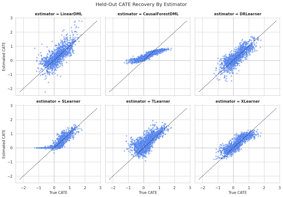
CATE Recovery Scatterplots

Scatterplots compare true and estimated CATE values directly. The diagonal line marks perfect recovery.

scatter_data = effect_predictions.melt(
    id_vars="true_cate",
    value_vars=list(estimators.keys()),
    var_name="estimator",
    value_name="estimated_cate",
)

g = sns.FacetGrid(scatter_data, col="estimator", col_wrap=3, height=4, sharex=True, sharey=True)
g.map_dataframe(sns.scatterplot, x="true_cate", y="estimated_cate", alpha=0.45, s=20, color="#2563eb")

for ax in g.axes.flat:
    lims = [
        min(scatter_data["true_cate"].min(), scatter_data["estimated_cate"].min()),
        max(scatter_data["true_cate"].max(), scatter_data["estimated_cate"].max()),
    ]
    ax.plot(lims, lims, color="#111827", linestyle="--", linewidth=1)
    ax.axhline(0, color="#64748b", linestyle=":", linewidth=1)
    ax.axvline(0, color="#64748b", linestyle=":", linewidth=1)

g.set_axis_labels("True CATE", "Estimated CATE")
g.fig.suptitle("Held-Out CATE Recovery By Estimator", y=1.03)
g.fig.savefig(FIGURE_DIR / "13_cate_recovery_scatterplots.png", dpi=160, bbox_inches="tight")
plt.show()

The scatterplots show shape differences that a table can hide. Some estimators may compress the range, while others may capture ranking but have level bias.

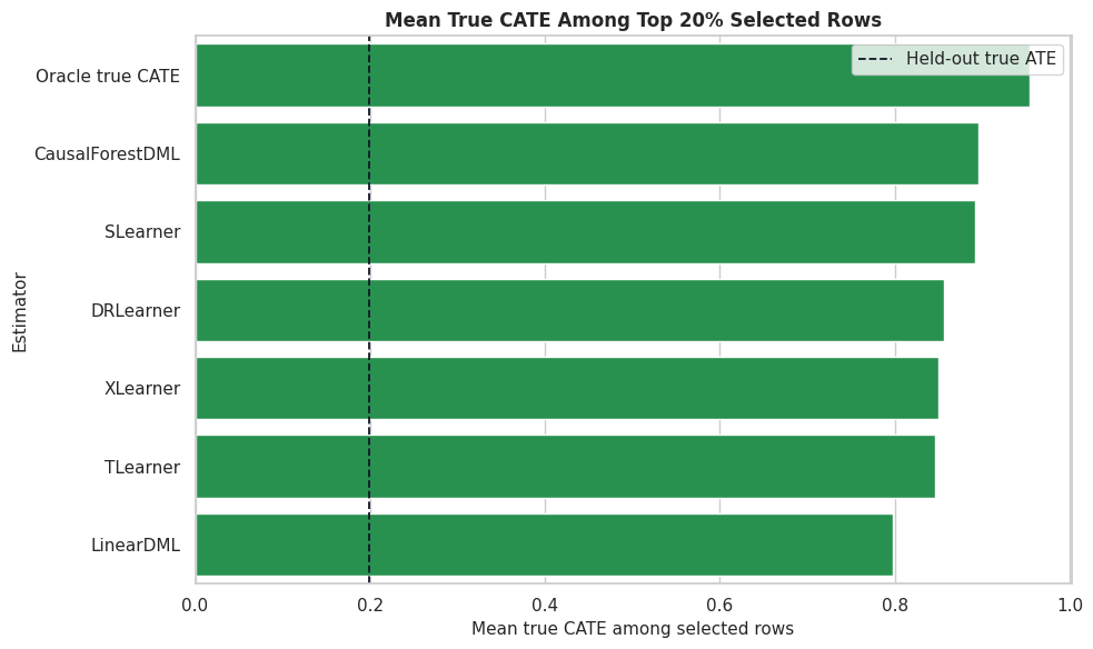
Ranking And Targeting Comparison

Many applied CATE workflows use estimates for ranking. This cell compares the true CATE among rows selected by each estimator’s top 20 percent.

top_n = int(np.floor(0.20 * len(test_df)))
targeting_rows = []
for name in estimators.keys():
    estimates = effect_predictions[name]
    selected_idx = estimates.nlargest(top_n).index
    selected = test_df.loc[selected_idx]
    targeting_rows.append(
        {
            "estimator": name,
            "selected_rows": len(selected_idx),
            "selected_share": len(selected_idx) / len(test_df),
            "mean_estimated_cate_selected": estimates.loc[selected_idx].mean(),
            "mean_true_cate_selected": test_df.loc[selected_idx, "true_cate"].mean(),
            "share_true_cate_negative_selected": (test_df.loc[selected_idx, "true_cate"] < 0).mean(),
            "high_need_rate_selected": selected["high_need_segment"].mean(),
            "low_friction_rate_selected": selected["low_friction_segment"].mean(),
        }
    )

oracle_idx = test_df["true_cate"].nlargest(top_n).index
targeting_rows.append(
    {
        "estimator": "Oracle true CATE",
        "selected_rows": len(oracle_idx),
        "selected_share": len(oracle_idx) / len(test_df),
        "mean_estimated_cate_selected": np.nan,
        "mean_true_cate_selected": test_df.loc[oracle_idx, "true_cate"].mean(),
        "share_true_cate_negative_selected": (test_df.loc[oracle_idx, "true_cate"] < 0).mean(),
        "high_need_rate_selected": test_df.loc[oracle_idx, "high_need_segment"].mean(),
        "low_friction_rate_selected": test_df.loc[oracle_idx, "low_friction_segment"].mean(),
    }
)

targeting_summary = pd.DataFrame(targeting_rows).sort_values("mean_true_cate_selected", ascending=False)
targeting_summary.to_csv(TABLE_DIR / "13_targeting_summary.csv", index=False)
display(targeting_summary)
estimator selected_rows selected_share mean_estimated_cate_selected mean_true_cate_selected share_true_cate_negative_selected high_need_rate_selected low_friction_rate_selected
6 Oracle true CATE 280 0.2 NaN 0.954328 0.000000 0.875000 0.471429
1 CausalForestDML 280 0.2 0.672556 0.895554 0.000000 0.807143 0.475000
3 SLearner 280 0.2 1.008308 0.892449 0.000000 0.835714 0.421429
2 DRLearner 280 0.2 0.984641 0.856903 0.000000 0.753571 0.467857
5 XLearner 280 0.2 0.907867 0.850097 0.000000 0.746429 0.421429
4 TLearner 280 0.2 1.153384 0.846643 0.007143 0.764286 0.446429
0 LinearDML 280 0.2 1.154401 0.798281 0.021429 0.685714 0.432143

The targeting table evaluates a decision-oriented question: which estimator finds high-benefit rows? The oracle row shows the upper benchmark available only in synthetic data.

Targeting Plot

This plot compares the true effect among selected rows. It is a high-signal artifact for prioritization use cases.

fig, ax = plt.subplots(figsize=(10, 6))
sns.barplot(data=targeting_summary, x="mean_true_cate_selected", y="estimator", color="#16a34a", ax=ax)
ax.axvline(test_df["true_cate"].mean(), color="#111827", linestyle="--", linewidth=1.3, label="Held-out true ATE")
ax.set_title("Mean True CATE Among Top 20% Selected Rows")
ax.set_xlabel("Mean true CATE among selected rows")
ax.set_ylabel("Estimator")
ax.legend()
plt.tight_layout()
fig.savefig(FIGURE_DIR / "13_targeting_summary.png", dpi=160, bbox_inches="tight")
plt.show()

Estimators with better top-group true effects are better for this specific targeting rule. That may or may not match the ranking by CATE RMSE.
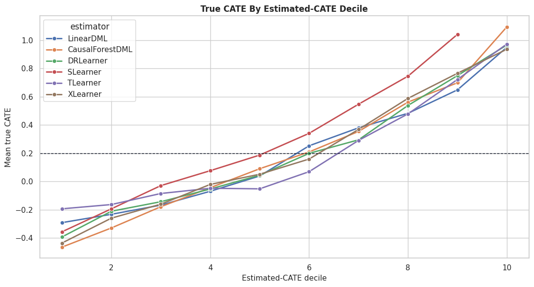
Decile Calibration

Decile calibration checks whether rows with higher estimated CATE also have higher true CATE on average. This is a useful ranking diagnostic.

decile_rows = []
for name in estimators.keys():
    temp = pd.DataFrame({"estimated_cate": effect_predictions[name], "true_cate": true_tau_test})
    temp["decile"] = pd.qcut(temp["estimated_cate"], q=10, labels=False, duplicates="drop") + 1
    decile_summary = (
        temp.groupby("decile", observed=True)
        .agg(
            rows=("true_cate", "size"),
            mean_estimated_cate=("estimated_cate", "mean"),
            mean_true_cate=("true_cate", "mean"),
        )
        .reset_index()
    )
    decile_summary["estimator"] = name
    decile_rows.append(decile_summary)

decile_calibration = pd.concat(decile_rows, ignore_index=True)
decile_calibration.to_csv(TABLE_DIR / "13_decile_calibration.csv", index=False)
display(decile_calibration.head(15))
decile rows mean_estimated_cate mean_true_cate estimator
0 1 140 -0.602850 -0.291655 LinearDML
1 2 140 -0.237903 -0.232706 LinearDML
2 3 140 -0.105576 -0.167671 LinearDML
3 4 140 0.019309 -0.069742 LinearDML
4 5 140 0.163088 0.038262 LinearDML
5 6 140 0.304745 0.252068 LinearDML
6 7 140 0.451947 0.379142 LinearDML
7 8 140 0.605282 0.481980 LinearDML
8 9 140 0.863357 0.647574 LinearDML
9 10 140 1.445445 0.948989 LinearDML
10 1 140 -0.063500 -0.464933 CausalForestDML
11 2 140 0.027663 -0.329350 CausalForestDML
12 3 140 0.094289 -0.179139 CausalForestDML
13 4 140 0.170047 -0.044493 CausalForestDML
14 5 140 0.244050 0.089720 CausalForestDML

A well-ranked estimator should show increasing true CATE as the estimated-CATE decile rises. The next plot makes that pattern easier to compare across estimators.

Decile Calibration Plot

This plot shows the mean true CATE within estimated-CATE deciles for each estimator. Steeper upward curves indicate better ranking separation.

fig, ax = plt.subplots(figsize=(11, 6))
sns.lineplot(data=decile_calibration, x="decile", y="mean_true_cate", hue="estimator", marker="o", linewidth=2, ax=ax)
ax.axhline(test_df["true_cate"].mean(), color="#111827", linestyle="--", linewidth=1, label="Held-out true ATE")
ax.set_title("True CATE By Estimated-CATE Decile")
ax.set_xlabel("Estimated-CATE decile")
ax.set_ylabel("Mean true CATE")
plt.tight_layout()
fig.savefig(FIGURE_DIR / "13_decile_calibration.png", dpi=160, bbox_inches="tight")
plt.show()

The calibration curves show which estimators create useful separation between low-benefit and high-benefit rows. This can matter more than exact row-level CATE values for targeting workflows.

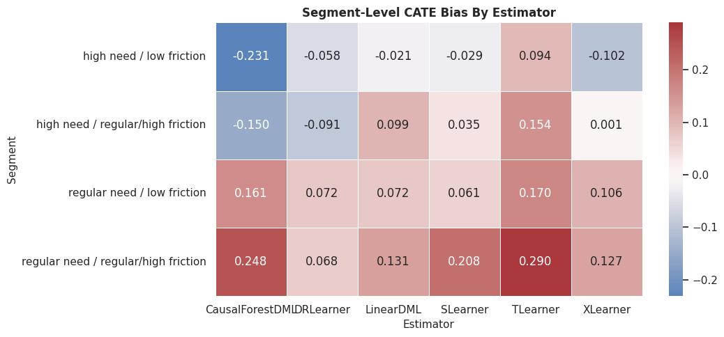
Segment-Level Benchmark

Segment summaries check whether estimators behave differently across important groups. Here we compare regular and high-need rows, crossed with friction level.

segment_eval = test_df[["baseline_need", "friction_score", "high_need_segment", "low_friction_segment", "true_cate"]].copy()
segment_eval["need_segment"] = np.where(segment_eval["high_need_segment"] == 1, "high need", "regular need")
segment_eval["friction_segment"] = np.where(segment_eval["low_friction_segment"] == 1, "low friction", "regular/high friction")
for name in estimators.keys():
    segment_eval[name] = effect_predictions[name]

segment_rows = []
for name in estimators.keys():
    grouped = (
        segment_eval.groupby(["need_segment", "friction_segment"], observed=True)
        .apply(
            lambda g: pd.Series(
                {
                    "rows": len(g),
                    "true_cate_mean": g["true_cate"].mean(),
                    "estimated_cate_mean": g[name].mean(),
                    "segment_bias": g[name].mean() - g["true_cate"].mean(),
                    "segment_rmse": np.sqrt(mean_squared_error(g["true_cate"], g[name])),
                }
            ),
            include_groups=False,
        )
        .reset_index()
    )
    grouped["estimator"] = name
    segment_rows.append(grouped)

segment_benchmark = pd.concat(segment_rows, ignore_index=True)
segment_benchmark.to_csv(TABLE_DIR / "13_segment_benchmark.csv", index=False)
display(segment_benchmark.head(20))
need_segment friction_segment rows true_cate_mean estimated_cate_mean segment_bias segment_rmse estimator
0 high need low friction 151.0 0.845285 0.824273 -0.021013 0.404828 LinearDML
1 high need regular/high friction 238.0 0.699039 0.798205 0.099166 0.384243 LinearDML
2 regular need low friction 413.0 0.088037 0.160352 0.072316 0.402211 LinearDML
3 regular need regular/high friction 598.0 -0.087450 0.043971 0.131420 0.387448 LinearDML
4 high need low friction 151.0 0.845285 0.614107 -0.231179 0.326789 CausalForestDML
5 high need regular/high friction 238.0 0.699039 0.548843 -0.150197 0.316374 CausalForestDML
6 regular need low friction 413.0 0.088037 0.249279 0.161242 0.270059 CausalForestDML
7 regular need regular/high friction 598.0 -0.087450 0.160646 0.248096 0.346713 CausalForestDML
8 high need low friction 151.0 0.845285 0.787213 -0.058073 0.268847 DRLearner
9 high need regular/high friction 238.0 0.699039 0.608299 -0.090740 0.327093 DRLearner
10 regular need low friction 413.0 0.088037 0.160524 0.072487 0.301348 DRLearner
11 regular need regular/high friction 598.0 -0.087450 -0.019790 0.067660 0.327999 DRLearner
12 high need low friction 151.0 0.845285 0.816750 -0.028535 0.201472 SLearner
13 high need regular/high friction 238.0 0.699039 0.734169 0.035130 0.256452 SLearner
14 regular need low friction 413.0 0.088037 0.149447 0.061410 0.262271 SLearner
15 regular need regular/high friction 598.0 -0.087450 0.120305 0.207755 0.359163 SLearner
16 high need low friction 151.0 0.845285 0.939421 0.094136 0.254808 TLearner
17 high need regular/high friction 238.0 0.699039 0.852736 0.153697 0.318416 TLearner
18 regular need low friction 413.0 0.088037 0.258061 0.170024 0.449238 TLearner
19 regular need regular/high friction 598.0 -0.087450 0.202570 0.290020 0.498050 TLearner

The segment table reveals whether an estimator is consistently accurate or only good in aggregate. Segment failures can be hidden by overall metrics.

Segment Bias Heatmap

This heatmap visualizes segment bias by estimator. Values near zero indicate segment-level average effects are close to truth.

segment_benchmark["segment"] = segment_benchmark["need_segment"] + " / " + segment_benchmark["friction_segment"]
segment_bias_heatmap = segment_benchmark.pivot(index="segment", columns="estimator", values="segment_bias")

fig, ax = plt.subplots(figsize=(11, 5))
sns.heatmap(segment_bias_heatmap, annot=True, fmt=".3f", cmap="vlag", center=0, linewidths=0.5, ax=ax)
ax.set_title("Segment-Level CATE Bias By Estimator")
ax.set_xlabel("Estimator")
ax.set_ylabel("Segment")
plt.tight_layout()
fig.savefig(FIGURE_DIR / "13_segment_bias_heatmap.png", dpi=160, bbox_inches="tight")
plt.show()

The heatmap shows where estimators overstate or understate effects. This is often the start of a deeper model diagnostics conversation.

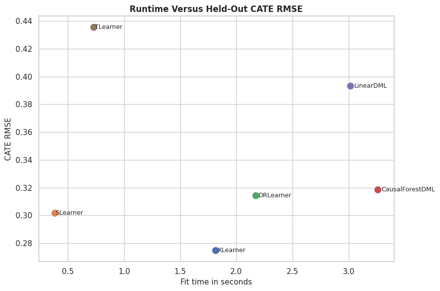
Runtime Versus Accuracy

This plot compares fit runtime with CATE RMSE. It helps students see the practical tradeoff between computation and accuracy.

fig, ax = plt.subplots(figsize=(9, 6))
sns.scatterplot(data=benchmark_metrics, x="fit_seconds", y="cate_rmse", hue="estimator", s=120, ax=ax)
for _, row in benchmark_metrics.iterrows():
    ax.text(row["fit_seconds"] * 1.01, row["cate_rmse"], row["estimator"], fontsize=9, va="center")
ax.set_title("Runtime Versus Held-Out CATE RMSE")
ax.set_xlabel("Fit time in seconds")
ax.set_ylabel("CATE RMSE")
ax.legend_.remove()
plt.tight_layout()
fig.savefig(FIGURE_DIR / "13_runtime_vs_accuracy.png", dpi=160, bbox_inches="tight")
plt.show()

Fast models are not automatically worse, and slow models are not automatically better. Runtime is one practical constraint among several.

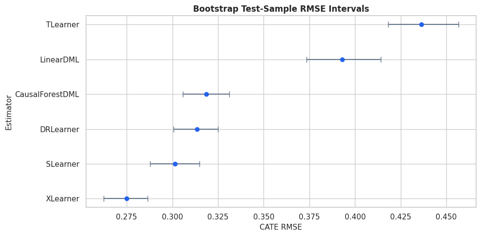
Robustness Across Bootstrap Resamples

A benchmark can be sensitive to one particular test sample. This lightweight bootstrap resamples held-out rows and recomputes the CATE RMSE for each estimator without refitting models.

bootstrap_rows = []
n_bootstrap = 300
for name in estimators.keys():
    estimates = effect_predictions[name].to_numpy()
    bootstrap_rmse = []
    for _ in range(n_bootstrap):
        sample_idx = rng.choice(np.arange(len(true_tau_test)), size=len(true_tau_test), replace=True)
        bootstrap_rmse.append(np.sqrt(mean_squared_error(true_tau_test[sample_idx], estimates[sample_idx])))
    bootstrap_rows.append(
        {
            "estimator": name,
            "rmse_mean": np.mean(bootstrap_rmse),
            "rmse_ci_lower": np.quantile(bootstrap_rmse, 0.025),
            "rmse_ci_upper": np.quantile(bootstrap_rmse, 0.975),
        }
    )

bootstrap_rmse_summary = pd.DataFrame(bootstrap_rows).sort_values("rmse_mean")
bootstrap_rmse_summary.to_csv(TABLE_DIR / "13_bootstrap_rmse_summary.csv", index=False)
display(bootstrap_rmse_summary)
estimator rmse_mean rmse_ci_lower rmse_ci_upper
5 XLearner 0.275009 0.262328 0.286428
3 SLearner 0.301513 0.287719 0.314949
2 DRLearner 0.313540 0.300542 0.325121
1 CausalForestDML 0.318488 0.305658 0.331090
0 LinearDML 0.392984 0.373317 0.414053
4 TLearner 0.436275 0.418239 0.456594

The bootstrap intervals summarize test-sample uncertainty in the RMSE comparison. They do not include refitting uncertainty, but they help avoid overreading tiny leaderboard gaps.

Bootstrap RMSE Plot

The plot shows RMSE means with bootstrap intervals. Overlapping intervals are a cue that estimator differences may not be decisive.

plot_boot = bootstrap_rmse_summary.sort_values("rmse_mean")
fig, ax = plt.subplots(figsize=(10, 5))
ax.errorbar(
    x=plot_boot["rmse_mean"],
    y=plot_boot["estimator"],
    xerr=[plot_boot["rmse_mean"] - plot_boot["rmse_ci_lower"], plot_boot["rmse_ci_upper"] - plot_boot["rmse_mean"]],
    fmt="o",
    color="#2563eb",
    ecolor="#64748b",
    capsize=4,
)
ax.set_title("Bootstrap Test-Sample RMSE Intervals")
ax.set_xlabel("CATE RMSE")
ax.set_ylabel("Estimator")
plt.tight_layout()
fig.savefig(FIGURE_DIR / "13_bootstrap_rmse_intervals.png", dpi=160, bbox_inches="tight")
plt.show()

The intervals make the benchmark more honest. A small apparent win may not matter if it sits inside the uncertainty band.

Estimator Selection Guidance

This table translates the benchmark into practical guidance. The right estimator depends on whether the goal is interpretability, nonlinear recovery, targeting, runtime, or robustness.

selection_guidance = pd.DataFrame(
    [
        {
            "use_case": "Need a transparent baseline",
            "estimator_to_try_first": "LinearDML",
            "what_to_check": "ATE bias, coefficient signs, and whether nonlinear estimators improve CATE recovery.",
        },
        {
            "use_case": "Expect nonlinear heterogeneity",
            "estimator_to_try_first": "CausalForestDML or forest-based DRLearner",
            "what_to_check": "CATE RMSE, decile calibration, and segment behavior.",
        },
        {
            "use_case": "Prioritization or targeting",
            "estimator_to_try_first": "The estimator with best top-group true effect in simulation or strongest validation proxy in real data.",
            "what_to_check": "Top-decile value, calibration curves, and stability across resamples.",
        },
        {
            "use_case": "Fast benchmark baseline",
            "estimator_to_try_first": "SLearner or TLearner",
            "what_to_check": "Whether simple outcome-model contrasts are competitive before using heavier methods.",
        },
        {
            "use_case": "Imbalanced treatment assignment",
            "estimator_to_try_first": "XLearner or DRLearner",
            "what_to_check": "Overlap, propensity quality, and selected-group composition.",
        },
        {
            "use_case": "Final reporting",
            "estimator_to_try_first": "Do not rely on one estimator only",
            "what_to_check": "Agreement across families, segment diagnostics, uncertainty, and sensitivity to assumptions.",
        },
    ]
)

selection_guidance.to_csv(TABLE_DIR / "13_estimator_selection_guidance.csv", index=False)
display(selection_guidance)
use_case estimator_to_try_first what_to_check
0 Need a transparent baseline LinearDML ATE bias, coefficient signs, and whether nonli...
1 Expect nonlinear heterogeneity CausalForestDML or forest-based DRLearner CATE RMSE, decile calibration, and segment beh...
2 Prioritization or targeting The estimator with best top-group true effect ... Top-decile value, calibration curves, and stab...
3 Fast benchmark baseline SLearner or TLearner Whether simple outcome-model contrasts are com...
4 Imbalanced treatment assignment XLearner or DRLearner Overlap, propensity quality, and selected-grou...
5 Final reporting Do not rely on one estimator only Agreement across families, segment diagnostics...

The guidance keeps the benchmark from becoming a mechanical leaderboard. Estimator choice should reflect the causal question and the decision workflow.

Final Benchmark Checklist

This checklist summarizes the steps needed for a fair estimator comparison in a real analysis.

benchmark_checklist = pd.DataFrame(
    [
        {
            "step": "Define the estimand",
            "why_it_matters": "Estimator comparison is meaningless if methods are answering different causal questions.",
        },
        {
            "step": "Use one split and one feature set",
            "why_it_matters": "Preprocessing differences can masquerade as estimator differences.",
        },
        {
            "step": "Check overlap and balance first",
            "why_it_matters": "Estimator sophistication cannot fix severe support problems.",
        },
        {
            "step": "Evaluate average and heterogeneous metrics",
            "why_it_matters": "ATE accuracy and CATE ranking are different objectives.",
        },
        {
            "step": "Inspect calibration and segments",
            "why_it_matters": "Overall metrics can hide subgroup failures.",
        },
        {
            "step": "Track runtime and complexity",
            "why_it_matters": "The best estimator must also be maintainable and rerunnable.",
        },
        {
            "step": "Avoid declaring universal winners",
            "why_it_matters": "The best choice depends on data support, assumptions, and the downstream decision.",
        },
    ]
)

benchmark_checklist.to_csv(TABLE_DIR / "13_benchmark_checklist.csv", index=False)
display(benchmark_checklist)
step why_it_matters
0 Define the estimand Estimator comparison is meaningless if methods...
1 Use one split and one feature set Preprocessing differences can masquerade as es...
2 Check overlap and balance first Estimator sophistication cannot fix severe sup...
3 Evaluate average and heterogeneous metrics ATE accuracy and CATE ranking are different ob...
4 Inspect calibration and segments Overall metrics can hide subgroup failures.
5 Track runtime and complexity The best estimator must also be maintainable a...
6 Avoid declaring universal winners The best choice depends on data support, assum...

The checklist is the portable lesson from this notebook. Use benchmarks to learn estimator behavior, not to crown a universal champion.

Summary

This notebook compared six EconML estimators on the same nonlinear binary-treatment ground truth.

The main lessons are:

  • Estimator comparisons should use the same split, same features, and same metrics.
  • ATE bias, CATE RMSE, CATE correlation, targeting value, and runtime answer different questions.
  • Orthogonal estimators and meta-learners can excel under different conditions.
  • Decile calibration is useful when treatment-effect estimates will be used for ranking.
  • Segment diagnostics can reveal failures that aggregate metrics hide.
  • Bootstrap test-sample intervals help prevent overreading tiny leaderboard gaps.
  • The right estimator is the one that best supports the causal question and downstream decision.

The next tutorial combines many of these ingredients into an end-to-end case study.