EconML Tutorial 08: Interpretability, SHAP, And Segments
This notebook focuses on explaining heterogeneous treatment-effect models after they have been fit.
CATE models can estimate a different treatment effect for every unit. That is powerful, but it creates a communication problem:
Why does the model believe some units benefit more than others, and where should we trust that story?
This lesson uses three complementary explanation layers:
global feature importance from the EconML CATE model;
SHAP-style explanations of a surrogate model trained to mimic CATE predictions;
segment-level summaries that turn unit-level estimates into auditable groups.
The most important habit in this notebook is restraint. Explanation tools describe the fitted model. They do not prove that a feature is causally valid, that confounding is solved, or that a targeting rule is ready to deploy.
Learning Goals
By the end of this notebook, you should be able to:
explain why CATE model explanations require extra care;
fit a flexible EconML CATE model and inspect feature importance;
train a high-fidelity surrogate model on CATE estimates;
use SHAP values to summarize how features move estimated CATE up or down;
build local CATE explanation tables for individual units;
compare model-level explanations with truth-known simulation drivers;
create segment summaries, heatmaps, and effect slices;
identify support and uncertainty risks in high-benefit groups;
write responsible caveats for CATE explanation outputs.
What Explanation Tools Can And Cannot Say
Feature importance, SHAP values, and segment summaries answer questions about the fitted model:
Which features does the model use most?
Which features push an estimated CATE higher or lower for a row?
Which segments have higher or lower estimated effects?
Which segments have wider uncertainty or weaker support?
They do not answer causal-design questions by themselves:
They do not prove a feature should be adjusted for.
They do not prove unconfoundedness.
They do not fix post-treatment leakage.
They do not replace overlap checks.
They do not make noisy individual treatment effects reliable.
The right mental model is: explanation tools help audit and communicate a fitted CATE model after the causal design has already been specified.
Tutorial Flow
This notebook follows this path:
Create a truth-known heterogeneous treatment-effect dataset.
Fit CausalForestDML with intervals.
Check CATE recovery and feature importance.
Train a surrogate model to mimic forest CATE predictions.
Use SHAP values on the surrogate CATE model.
Build local explanation tables for selected units.
Summarize CATE by segments and feature slices.
Compare feature importance, SHAP, and permutation sensitivity.
Close with a reporting checklist for CATE explanations.
Setup
This cell imports the packages used in the lesson, creates output folders, fixes a random seed, and checks whether EconML and SHAP are available.
from pathlib import Pathimport osimport warningsimport importlib.metadata as importlib_metadata# Keep Matplotlib cache files in a writable location during notebook execution.os.environ.setdefault("MPLCONFIGDIR", "/tmp/matplotlib-ranking-sys")warnings.filterwarnings("default")warnings.filterwarnings("ignore", category=DeprecationWarning)warnings.filterwarnings("ignore", category=PendingDeprecationWarning)warnings.filterwarnings("ignore", category=FutureWarning)warnings.filterwarnings("ignore", message=".*IProgress not found.*")warnings.filterwarnings("ignore", message=".*X does not have valid feature names.*")warnings.filterwarnings("ignore", message=".*The final model has a nonzero intercept.*")warnings.filterwarnings("ignore", message=".*Co-variance matrix is underdetermined.*")warnings.filterwarnings("ignore", module="sklearn.linear_model._logistic")import numpy as npimport pandas as pdimport matplotlib.pyplot as pltimport seaborn as snsimport shapfrom IPython.display import displayfrom sklearn.ensemble import RandomForestClassifier, RandomForestRegressorfrom sklearn.metrics import brier_score_loss, log_loss, mean_squared_error, roc_auc_scorefrom sklearn.model_selection import KFold, StratifiedKFold, cross_val_predict, train_test_splittry:import econmlfrom econml.dml import CausalForestDML, LinearDML ECONML_AVAILABLE =True ECONML_VERSION =getattr(econml, "__version__", "unknown")exceptExceptionas exc: ECONML_AVAILABLE =False ECONML_VERSION =f"import failed: {type(exc).__name__}: {exc}"try: SHAP_VERSION =getattr(shap, "__version__", importlib_metadata.version("shap")) SHAP_AVAILABLE =TrueexceptExceptionas exc: SHAP_VERSION =f"import failed: {type(exc).__name__}: {exc}" SHAP_AVAILABLE =FalseRANDOM_SEED =2026rng = np.random.default_rng(RANDOM_SEED)OUTPUT_DIR = Path("outputs")FIGURE_DIR = OUTPUT_DIR /"figures"TABLE_DIR = OUTPUT_DIR /"tables"FIGURE_DIR.mkdir(parents=True, exist_ok=True)TABLE_DIR.mkdir(parents=True, exist_ok=True)sns.set_theme(style="whitegrid", context="notebook")pd.set_option("display.max_columns", 140)pd.set_option("display.float_format", lambda value: f"{value:,.4f}")print(f"EconML available: {ECONML_AVAILABLE}")print(f"EconML version: {ECONML_VERSION}")print(f"SHAP available: {SHAP_AVAILABLE}")print(f"SHAP version: {SHAP_VERSION}")print(f"Figures will be saved to: {FIGURE_DIR.resolve()}")print(f"Tables will be saved to: {TABLE_DIR.resolve()}")
EconML available: True
EconML version: 0.16.0
SHAP available: True
SHAP version: 0.48.0
Figures will be saved to: /home/apex/Documents/ranking_sys/notebooks/tutorials/econml/outputs/figures
Tables will be saved to: /home/apex/Documents/ranking_sys/notebooks/tutorials/econml/outputs/tables
What this shows: the notebook can use EconML for CATE estimation and SHAP for explanation. The outputs are saved with the 08_ prefix.
Explanation Map
The next table separates the explanation tools used in this notebook. Each tool has a different job.
explanation_map = pd.DataFrame( [ {"tool": "Causal forest feature importance","what it explains": "Which X features the fitted forest uses most for treatment-effect heterogeneity","best use": "Quick global model audit","main caveat": "Importance is about the fitted model, not proof of causal validity", }, {"tool": "Permutation CATE sensitivity","what it explains": "How much CATE predictions change when one feature is shuffled","best use": "Model-agnostic global sensitivity check","main caveat": "Correlated features can share or hide importance", }, {"tool": "SHAP on CATE surrogate","what it explains": "How features push a surrogate CATE prediction up or down","best use": "Global and local decomposition of estimated CATE","main caveat": "Explains the surrogate of the CATE model, so surrogate fidelity must be checked", }, {"tool": "Segment summaries","what it explains": "Average estimated effect, true effect, support, and uncertainty by group","best use": "Readable reporting and audit tables","main caveat": "Segments can hide within-segment variation", }, ])explanation_map.to_csv(TABLE_DIR /"08_explanation_map.csv", index=False)display(explanation_map)
tool
what it explains
best use
main caveat
0
Causal forest feature importance
Which X features the fitted forest uses most f...
Quick global model audit
Importance is about the fitted model, not proo...
1
Permutation CATE sensitivity
How much CATE predictions change when one feat...
Model-agnostic global sensitivity check
Correlated features can share or hide importance
2
SHAP on CATE surrogate
How features push a surrogate CATE prediction ...
Global and local decomposition of estimated CATE
Explains the surrogate of the CATE model, so s...
3
Segment summaries
Average estimated effect, true effect, support...
Readable reporting and audit tables
Segments can hide within-segment variation
What this shows: no single explanation table is enough. We will triangulate across several views so the final story is less brittle.
Synthetic Teaching Data
The dataset below has observed confounding and nonlinear treatment-effect heterogeneity. We keep the true CATE because this is a teaching notebook. In real analyses, we would not know it.
The true CATE depends on several features through thresholds, nonlinear terms, and interactions. That makes it a good fit for a flexible CATE model and a good test case for explanation tools.
What this shows: the dataset contains the observed columns we would use in a real analysis plus oracle columns for teaching checks. The CATE surface is deliberately nonlinear so explanation tools have something meaningful to summarize.
Field Dictionary
The field dictionary prevents leakage. Oracle fields are useful for teaching, but they must not be model inputs.
effect_modifier_cols = ["baseline_need","prior_engagement","friction_score","content_affinity","price_sensitivity","region_risk","high_need_segment",]control_cols = ["trust_score", "recency_gap", "account_tenure", "seasonality_index", "device_stability", "traffic_intensity"]all_observed_covariates = effect_modifier_cols + control_colstrue_driver_cols = effect_modifier_cols.copy()field_rows = []for col in effect_modifier_cols: field_rows.append( {"column": col,"role": "X effect modifier","observed_in_real_analysis": "yes","description": "Pre-treatment feature used to explain CATE variation.","true_cate_driver": "yes"if col in true_driver_cols else"no", } )for col in control_cols: field_rows.append( {"column": col,"role": "W control","observed_in_real_analysis": "yes","description": "Pre-treatment feature used for nuisance adjustment and support checks.","true_cate_driver": "no", } )for col, role, description in [ ("treatment", "treatment", "Binary treatment indicator."), ("outcome", "outcome", "Observed post-treatment outcome."), ("propensity", "oracle", "True treatment probability from the simulated assignment process."), ("baseline_outcome_mean", "oracle", "Mean untreated outcome component before noise."), ("true_cate", "oracle", "Known individual treatment effect used only for evaluation."),]: field_rows.append( {"column": col,"role": role,"observed_in_real_analysis": "yes"if role in ["treatment", "outcome"] else"no","description": description,"true_cate_driver": "not applicable", } )field_dictionary = pd.DataFrame(field_rows)field_dictionary.to_csv(TABLE_DIR /"08_field_dictionary.csv", index=False)display(field_dictionary)
column
role
observed_in_real_analysis
description
true_cate_driver
0
baseline_need
X effect modifier
yes
Pre-treatment feature used to explain CATE var...
yes
1
prior_engagement
X effect modifier
yes
Pre-treatment feature used to explain CATE var...
yes
2
friction_score
X effect modifier
yes
Pre-treatment feature used to explain CATE var...
yes
3
content_affinity
X effect modifier
yes
Pre-treatment feature used to explain CATE var...
yes
4
price_sensitivity
X effect modifier
yes
Pre-treatment feature used to explain CATE var...
yes
5
region_risk
X effect modifier
yes
Pre-treatment feature used to explain CATE var...
yes
6
high_need_segment
X effect modifier
yes
Pre-treatment feature used to explain CATE var...
yes
7
trust_score
W control
yes
Pre-treatment feature used for nuisance adjust...
no
8
recency_gap
W control
yes
Pre-treatment feature used for nuisance adjust...
no
9
account_tenure
W control
yes
Pre-treatment feature used for nuisance adjust...
no
10
seasonality_index
W control
yes
Pre-treatment feature used for nuisance adjust...
no
11
device_stability
W control
yes
Pre-treatment feature used for nuisance adjust...
no
12
traffic_intensity
W control
yes
Pre-treatment feature used for nuisance adjust...
no
13
treatment
treatment
yes
Binary treatment indicator.
not applicable
14
outcome
outcome
yes
Observed post-treatment outcome.
not applicable
15
propensity
oracle
no
True treatment probability from the simulated ...
not applicable
16
baseline_outcome_mean
oracle
no
Mean untreated outcome component before noise.
not applicable
17
true_cate
oracle
no
Known individual treatment effect used only fo...
not applicable
What this shows: explanations later should be limited to valid pre-treatment inputs. A beautiful explanation of a leaky feature would still be a bad causal analysis.
Basic Shape And True Effect Scale
This cell summarizes sample size, treatment rate, and true CATE variation before modeling.
What this shows: there is enough treatment variation and enough true CATE spread to make explanation worthwhile. If treatment effects were nearly constant, a detailed heterogeneity explanation would be mostly noise.
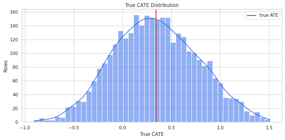
True CATE Distribution
Because this is a simulation, we can visualize the true CATE distribution. In a real analysis, this plot would be replaced by model estimates and uncertainty checks.
What this shows: treated rows are different before treatment. Explaining a CATE model only makes sense after we acknowledge the observational design and adjustment problem.
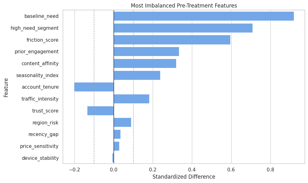
Covariate Balance Check
Standardized mean differences show pre-treatment imbalance between treated and untreated groups. Large values flag observed confounding.
What this shows: several effect-driving features are also treatment-assignment predictors. That is why the CATE model needs nuisance adjustment before explanations are meaningful.
Covariate Balance Plot
The plot highlights the most imbalanced pre-treatment features.
What this shows: explanation outputs later should not be read as if treatment were randomized. The model is adjusting for observed structure in a non-random assignment process.
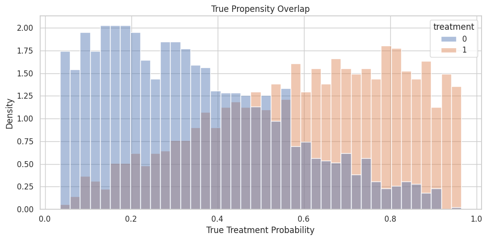
Propensity Overlap
Overlap affects how much support the data has for comparing treated and untreated rows. Weak overlap makes both estimation and explanation more fragile.
What this shows: most rows have usable support, but treatment rates shift across propensity buckets. Explanations in extreme regions should be treated with extra caution.
Propensity Overlap Plot
The histogram shows true propensity by observed treatment group. In real data, this would use an estimated propensity model.
What this shows: the split keeps treatment rates and true ATEs similar, making model and explanation checks easier to compare.
Modeling Matrices
This cell creates the arrays passed to EconML. X contains effect modifiers for the CATE surface, while W contains additional controls for nuisance adjustment.
What this shows: treatment assignment is predictable, confirming observed confounding. The explanation layer should come after this adjustment-aware modeling setup.
Fit CATE Models
We fit two models:
LinearDML as a readable baseline;
CausalForestDML as the main flexible CATE model to explain.
The forest is the focus because it captures nonlinear heterogeneity, but the linear baseline helps show what flexibility adds.
What this shows: the forest is the main model to explain because it estimates a flexible CATE surface. We still check recovery first, because explanations of a poor CATE model are not very useful.
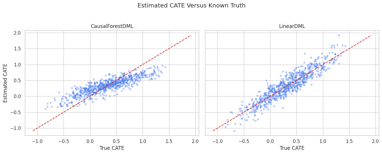
CATE Recovery Plot
The scatter plot compares estimated CATE with known true CATE. The dashed diagonal marks perfect recovery.
What this shows: the forest captures the broad treatment-effect ranking, but individual estimates remain noisy. Explanation should focus on stable patterns, not one-row certainty.
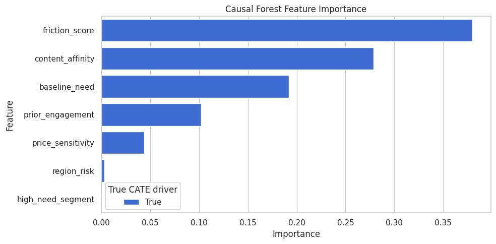
Forest Feature Importance
CausalForestDML exposes feature importance for the CATE model. This is the first global explanation layer.
forest_importance = pd.DataFrame( {"feature": effect_modifier_cols,"importance": np.ravel(causal_forest.feature_importances_),"true_cate_driver": [col in true_driver_cols for col in effect_modifier_cols], }).sort_values("importance", ascending=False)forest_importance.to_csv(TABLE_DIR /"08_causal_forest_feature_importance.csv", index=False)display(forest_importance)
feature
importance
true_cate_driver
2
friction_score
0.3799
True
3
content_affinity
0.2788
True
0
baseline_need
0.1922
True
1
prior_engagement
0.1020
True
4
price_sensitivity
0.0437
True
5
region_risk
0.0033
True
6
high_need_segment
0.0000
True
What this shows: the forest importance table says which features the fitted CATE model used most. It does not prove that those variables are sufficient for causal identification.
Forest Feature Importance Plot
The plot makes the forest importance ranking easier to scan.
What this shows: global importance gives the first story about the CATE surface. The next sections test that story with surrogate SHAP values and segment summaries.
Train A Surrogate CATE Model For SHAP
SHAP explains a prediction model. EconML CATE estimators are not always directly supported by every SHAP explainer, so a practical workflow is:
Fit the causal model.
Predict CATE on a feature matrix.
Train a surrogate supervised model to predict those CATE estimates from X.
Check surrogate fidelity.
Use SHAP on the surrogate.
This explains the fitted CATE surface, not the original outcome model.
What this shows: SHAP explanations are useful only if the surrogate closely mimics the forest CATE predictions. The fidelity table is the guardrail for the rest of the SHAP section.
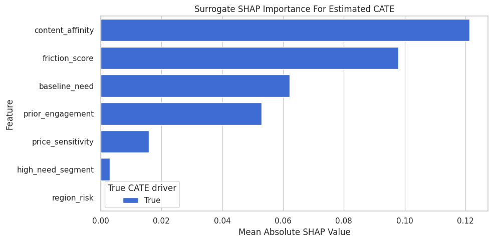
Compute SHAP Values For The Surrogate
This cell computes SHAP values for the surrogate CATE model on the test set. Each SHAP value estimates how much a feature contributes to the surrogate’s estimated CATE for a row.
ifnot SHAP_AVAILABLE:raiseImportError(f"SHAP is not available in this environment: {SHAP_VERSION}")shap_explainer = shap.TreeExplainer(surrogate_model)shap_values = shap_explainer.shap_values(X_test)shap_values = np.asarray(shap_values)expected_surrogate_cate =float(np.ravel(shap_explainer.expected_value)[0])shap_importance = pd.DataFrame( {"feature": effect_modifier_cols,"mean_abs_shap": np.abs(shap_values).mean(axis=0),"mean_shap": shap_values.mean(axis=0),"true_cate_driver": [col in true_driver_cols for col in effect_modifier_cols], }).sort_values("mean_abs_shap", ascending=False)shap_importance.to_csv(TABLE_DIR /"08_surrogate_shap_importance.csv", index=False)print(f"Expected surrogate CATE baseline: {expected_surrogate_cate:.4f}")display(shap_importance)
Expected surrogate CATE baseline: 0.3462
feature
mean_abs_shap
mean_shap
true_cate_driver
3
content_affinity
0.1214
-0.0031
True
2
friction_score
0.0980
-0.0102
True
0
baseline_need
0.0621
0.0026
True
1
prior_engagement
0.0528
-0.0042
True
4
price_sensitivity
0.0159
0.0004
True
6
high_need_segment
0.0029
0.0004
True
5
region_risk
0.0000
0.0000
True
What this shows: mean absolute SHAP values rank the features that most move surrogate CATE predictions away from the baseline prediction.
SHAP Importance Plot
The SHAP importance plot summarizes global contribution size. Larger values mean a feature more strongly changes surrogate CATE predictions across the test set.
What this shows: SHAP and forest importance should tell broadly compatible stories when the surrogate has high fidelity. Disagreements are a reason to inspect the model more carefully.
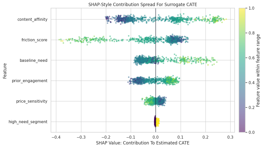
SHAP Beeswarm-Style Plot
A beeswarm-style plot shows both direction and spread. Points to the right push estimated CATE higher; points to the left push estimated CATE lower. Color shows the feature value.
What this shows: a feature can matter in different directions for different rows. The spread view is more informative than a single importance number when heterogeneity is nonlinear.
Local SHAP Examples
Global summaries can hide row-level behavior. The next cell selects three rows: low estimated CATE, median estimated CATE, and high estimated CATE. For each row, we list the largest SHAP contributions.
What this shows: local explanations are useful for examples and debugging, but they should not be presented as precise individual causal truth. They explain one estimated CATE score.
Local SHAP Waterfall-Style Table
This cell reconstructs the surrogate prediction for the selected rows from the SHAP baseline plus feature contributions.
What this shows: SHAP values add up to the surrogate prediction. That arithmetic is about the surrogate model, so the forest CATE and true CATE columns are shown separately.
Permutation CATE Sensitivity
Permutation sensitivity is another model-agnostic explanation. We shuffle one feature in X_test, recompute forest CATE, and measure how much predictions change.
What this shows: permutation sensitivity asks a direct question: how much do CATE predictions change when this feature’s relationship to the rows is broken?
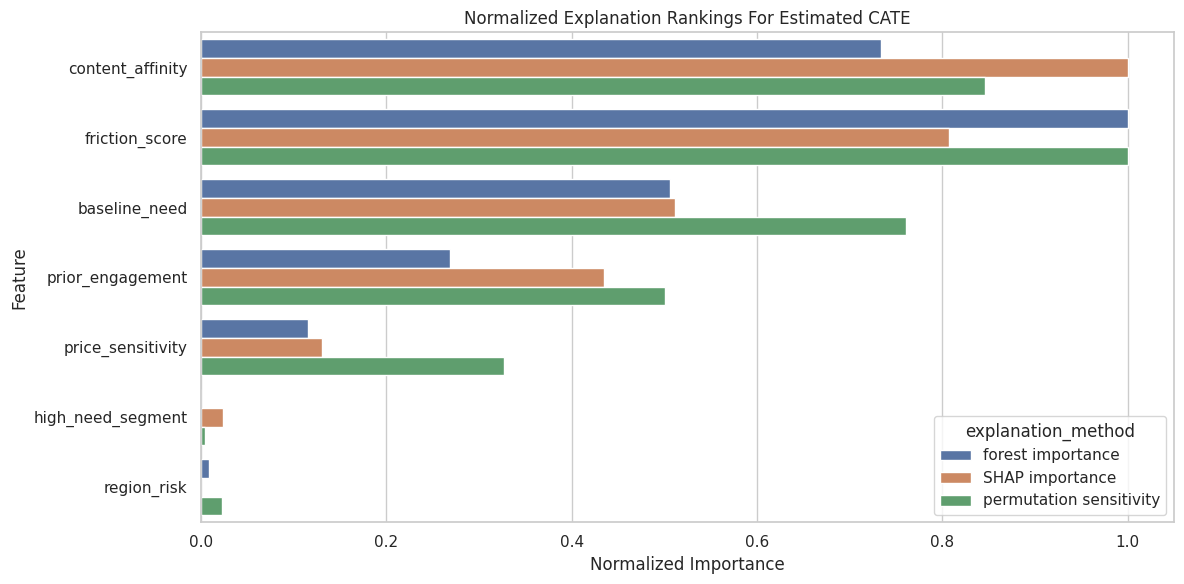
Compare Explanation Rankings
This table combines forest importance, SHAP importance, and permutation sensitivity into one view.
What this shows: explanation methods should usually agree on the strongest drivers. If they strongly disagree, the model may be unstable or the features may be correlated.
Combined Explanation Plot
The plot compares normalized importance from the three explanation methods.
What this shows: segment summaries connect model explanation to group-level reporting. The interval-width column also shows where the forest is less certain.
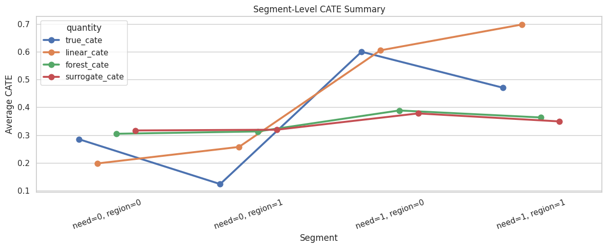
Segment CATE Plot
This plot compares true and estimated CATE by segment.
What this shows: bucketing two features creates a compact surface view. The row counts are important because tiny cells can make segment averages unstable.
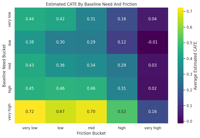
Forest CATE Heatmap
The heatmap visualizes estimated CATE across baseline-need and friction-score buckets.
fig, ax = plt.subplots(figsize=(9, 6))sns.heatmap( heatmap_matrix, annot=True, fmt=".2f", cmap="viridis", cbar_kws={"label": "Average Estimated CATE"}, ax=ax,)ax.set_title("Estimated CATE By Baseline Need And Friction")ax.set_xlabel("Friction Bucket")ax.set_ylabel("Baseline Need Bucket")plt.tight_layout()fig.savefig(FIGURE_DIR /"08_need_friction_cate_heatmap.png", dpi=160, bbox_inches="tight")plt.show()
What this shows: heatmaps are strong communication tools when the chosen axes are meaningful. They should be shown with row counts or support diagnostics nearby.
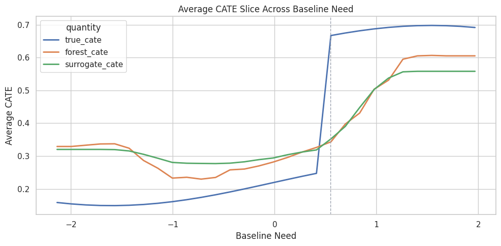
Effect Slice: Baseline Need
Effect slices show how CATE changes along one feature. For this slice, we vary baseline need while keeping other test-row features fixed, and we update high_need_segment consistently.
What this shows: effect slices explain the model’s average behavior along one feature. They are not a substitute for full multi-feature heterogeneity, but they are very readable.
Baseline Need Slice Plot
The plot compares true, forest-estimated, and surrogate-estimated CATE along the baseline-need grid.
What this shows: the slice makes a nonlinear threshold pattern visible. It also checks whether the surrogate follows the forest along an important feature.
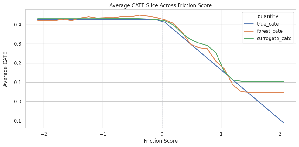
Effect Slice: Friction Score
The true CATE has a penalty when friction is positive. This slice varies friction while keeping other features fixed.
What this shows: friction is expected to push treatment effects downward after it becomes positive. The slice checks whether the fitted model learned that shape.
Friction Slice Plot
The plot compares true and estimated average CATE across the friction-score grid.
What this shows: effect slices make model behavior tangible. They are especially useful when a global importance score says a feature matters but not how it matters.
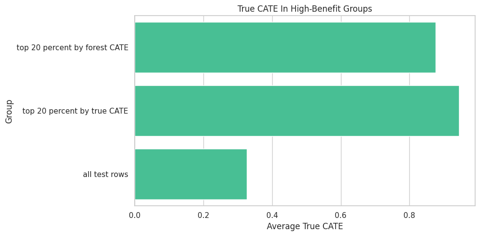
High-Benefit Group Diagnostics
Explanation often leads to targeting. This cell compares the top 20 percent by estimated CATE with the oracle top 20 percent by true CATE.
What this shows: a top-CATE group should have higher true CATE than average in this simulation. We also inspect support and uncertainty, because high estimated benefit alone is not enough.
High-Benefit Group Plot
The plot compares average true CATE across the model-selected top group, the oracle top group, and all rows.
What this shows: explanation and targeting connect here. If the explanation says high-need, low-friction users benefit more, the selected group should reflect that pattern and deliver higher true benefit in simulation.
Explanation Reporting Checklist
This table summarizes the habits that keep CATE explanation from becoming overclaiming.
explanation_checklist = pd.DataFrame( [ {"check": "Start with the causal design", "why_it_matters": "Explanations of a poorly identified model are still poorly identified."}, {"check": "Separate model explanation from causal claims", "why_it_matters": "Feature importance and SHAP explain fitted predictions, not identification assumptions."}, {"check": "Check CATE model recovery or validation", "why_it_matters": "Explaining a weak model can produce a polished but misleading story."}, {"check": "Check surrogate fidelity before SHAP", "why_it_matters": "SHAP on a surrogate is useful only if the surrogate mimics the CATE model."}, {"check": "Use multiple explanation views", "why_it_matters": "Stable themes across importance, SHAP, permutation, and segments are more credible."}, {"check": "Report support and interval width", "why_it_matters": "High estimated benefit in weak-support regions is risky."}, {"check": "Prefer segment summaries for communication", "why_it_matters": "Segments are easier to audit than individual-level CATE explanations."}, {"check": "Avoid precise individual claims", "why_it_matters": "Individual CATE estimates are usually noisy even when rankings are useful."}, ])explanation_checklist.to_csv(TABLE_DIR /"08_explanation_reporting_checklist.csv", index=False)display(explanation_checklist)
check
why_it_matters
0
Start with the causal design
Explanations of a poorly identified model are ...
1
Separate model explanation from causal claims
Feature importance and SHAP explain fitted pre...
2
Check CATE model recovery or validation
Explaining a weak model can produce a polished...
3
Check surrogate fidelity before SHAP
SHAP on a surrogate is useful only if the surr...
4
Use multiple explanation views
Stable themes across importance, SHAP, permuta...
5
Report support and interval width
High estimated benefit in weak-support regions...
6
Prefer segment summaries for communication
Segments are easier to audit than individual-l...
7
Avoid precise individual claims
Individual CATE estimates are usually noisy ev...
What this shows: the safest explanation story is layered and humble: model behavior, support, uncertainty, and segment-level patterns all shown together.
Summary
This notebook explained a fitted CATE model using several complementary tools.
The main takeaways are:
feature importance, SHAP values, and segment summaries explain fitted CATE estimates, not causal identification by themselves;
CATE explanations should come after treatment, outcome, covariate, balance, and overlap checks;
surrogate SHAP is useful when the surrogate has high fidelity to the CATE model;
local SHAP examples are good for debugging and teaching, but should not be overused as precise individual causal truth;
segment summaries and effect slices are often the clearest way to communicate heterogeneous effects;
high-benefit groups should be checked for support, uncertainty, and true or validated value where possible;
responsible reporting uses several explanation views and keeps the limitations visible.
The next tutorial can focus on uncertainty intervals and how to avoid overreacting to noisy CATE estimates.