This notebook explains the core idea behind double machine learning in EconML: estimate the parts of treatment and outcome that are predictable from observed covariates, remove those predictable parts, and use the remaining variation to estimate causal effects.
The lesson uses a synthetic teaching dataset where the true treatment effect is known. That makes the workflow unusually transparent. We can see the raw observational bias, build the residualization logic by hand, then compare the manual version to LinearDML from EconML.
The main causal question is:
For users with different baseline characteristics, how much would the outcome change if the treatment were applied instead of not applied?
That is a CATE question. DML is one of the most important ways EconML answers it.
Learning Goals
By the end of this notebook, you should be able to:
explain why DML estimates nuisance functions before estimating a treatment effect;
distinguish outcome nuisance models from treatment nuisance models;
explain residualization in plain language;
understand why cross-fitting reduces overfitting bias in causal estimation;
fit a simple manual DML-style estimator;
fit EconML’s LinearDML on the same data;
compare naive, manual DML, and EconML estimates against known truth;
diagnose overlap, nuisance model quality, residualized treatment variation, and CATE recovery.
Tutorial Flow
The notebook follows the DML workflow in small steps:
Create a confounded synthetic dataset with known heterogeneous treatment effects.
Show why a raw treated-versus-control comparison is biased.
Define which variables are treatment effect modifiers and which are controls.
Fit cross-fitted nuisance models for outcome and treatment.
Residualize outcome and treatment.
Estimate a manual residual-on-residual ATE.
Estimate a manual linear CATE model using residualized treatment interactions.
Fit EconML’s LinearDML.
Compare the resulting CATE estimates to known truth.
Summarize the practical checklist for using DML responsibly.
The Core DML Idea
DML starts from a simple concern: in observational data, treatment is usually not randomly assigned. If high-risk users are more likely to receive treatment, then a raw outcome comparison mixes two things:
the causal effect of treatment;
the pre-existing differences between treated and untreated users.
DML tries to remove the predictable, confounded parts first. In a partially linear setup, the observed outcome can be written as:
Y = baseline_outcome(X, W) + treatment_effect(X) * T + noise
and treatment assignment can be written as:
T = propensity(X, W) + assignment_noise
Here:
Y is the observed outcome;
T is treatment;
X contains effect modifiers used to explain how treatment effects vary;
W contains controls that help remove confounding but are not the main CATE reporting dimensions;
the outcome nuisance model estimates E[Y | X, W];
the treatment nuisance model estimates E[T | X, W] or the propensity score.
After residualizing, DML asks: among users with similar predicted treatment probability and similar predicted outcome level, does the remaining treatment variation explain the remaining outcome variation?
Setup
This cell imports the packages used in the lesson, makes output folders, fixes display options, and checks that EconML is available. The warning filters keep the notebook readable while still letting real execution errors appear.
from pathlib import Pathimport osimport warningsimport importlib.metadata as importlib_metadata# Keep Matplotlib cache files in a writable location during notebook execution.os.environ.setdefault("MPLCONFIGDIR", "/tmp/matplotlib-ranking-sys")warnings.filterwarnings("default")warnings.filterwarnings("ignore", category=DeprecationWarning)warnings.filterwarnings("ignore", category=PendingDeprecationWarning)warnings.filterwarnings("ignore", category=FutureWarning)warnings.filterwarnings("ignore", message=".*IProgress not found.*")warnings.filterwarnings("ignore", message=".*X does not have valid feature names.*")warnings.filterwarnings("ignore", message=".*The final model has a nonzero intercept.*")warnings.filterwarnings("ignore", message=".*Co-variance matrix is underdetermined.*")warnings.filterwarnings("ignore", module="sklearn.linear_model._logistic")import numpy as npimport pandas as pdimport matplotlib.pyplot as pltimport seaborn as snsfrom IPython.display import displayfrom sklearn.base import clonefrom sklearn.ensemble import GradientBoostingClassifier, GradientBoostingRegressor, RandomForestClassifier, RandomForestRegressorfrom sklearn.linear_model import LinearRegression, LogisticRegressionfrom sklearn.metrics import brier_score_loss, log_loss, mean_squared_error, roc_auc_scorefrom sklearn.model_selection import KFold, StratifiedKFold, cross_val_predict, train_test_splitfrom sklearn.pipeline import make_pipelinefrom sklearn.preprocessing import StandardScalertry:import econmlfrom econml.dml import LinearDML ECONML_AVAILABLE =True ECONML_VERSION =getattr(econml, "__version__", "unknown")exceptExceptionas exc: ECONML_AVAILABLE =False ECONML_VERSION =f"import failed: {type(exc).__name__}: {exc}"RANDOM_SEED =2026rng = np.random.default_rng(RANDOM_SEED)OUTPUT_DIR = Path("outputs")FIGURE_DIR = OUTPUT_DIR /"figures"TABLE_DIR = OUTPUT_DIR /"tables"FIGURE_DIR.mkdir(parents=True, exist_ok=True)TABLE_DIR.mkdir(parents=True, exist_ok=True)sns.set_theme(style="whitegrid", context="notebook")pd.set_option("display.max_columns", 120)pd.set_option("display.float_format", lambda value: f"{value:,.4f}")print(f"EconML available: {ECONML_AVAILABLE}")print(f"EconML version: {ECONML_VERSION}")print(f"Figures will be saved to: {FIGURE_DIR.resolve()}")print(f"Tables will be saved to: {TABLE_DIR.resolve()}")
EconML available: True
EconML version: 0.16.0
Figures will be saved to: /home/apex/Documents/ranking_sys/notebooks/tutorials/econml/outputs/figures
Tables will be saved to: /home/apex/Documents/ranking_sys/notebooks/tutorials/econml/outputs/tables
What this shows: the environment is ready if EconML imports successfully. The output folders are local to this tutorial folder, so the notebook can save figures and tables without mixing them with the applied causal projects.
Synthetic Teaching Data
The next cell creates data with three useful properties:
treatment assignment is confounded because treatment depends on baseline covariates;
treatment effects are heterogeneous because the true CATE depends on user characteristics;
the true CATE is kept in the table only for teaching diagnostics.
In a real dataset, true_cate and propensity are not observed. They are included here so we can check whether each estimator is learning the right object.
n =3_000baseline_need = rng.normal(0, 1, size=n)prior_engagement = rng.normal(0, 1, size=n)account_tenure = rng.normal(0, 1, size=n)seasonality_index = rng.normal(0, 1, size=n)friction_score =0.45* baseline_need -0.25* prior_engagement + rng.normal(0, 0.9, size=n)region_risk = rng.binomial(1, 0.35, size=n)high_need_segment = (baseline_need >0.45).astype(int)# Treatment is more likely for users who look needier, more engaged, or more friction-heavy.propensity_logit = (-0.20+0.75* baseline_need+0.45* prior_engagement-0.30* account_tenure+0.45* friction_score+0.30* region_risk+0.25* high_need_segment+0.25* seasonality_index)propensity =1/ (1+ np.exp(-propensity_logit))propensity = np.clip(propensity, 0.04, 0.96)treatment = rng.binomial(1, propensity, size=n)# The true CATE is linear in the effect modifiers, which makes LinearDML a sensible teaching estimator.true_cate = (0.45+0.28* baseline_need+0.18* prior_engagement-0.22* friction_score-0.10* region_risk+0.24* high_need_segment)baseline_outcome = (2.00+0.85* baseline_need+0.65* prior_engagement-0.45* friction_score+0.35* account_tenure+0.30* seasonality_index+0.22* region_risk+0.12* baseline_need * friction_score)noise = rng.normal(0, 0.85, size=n)outcome = baseline_outcome + true_cate * treatment + noiseteaching_df = pd.DataFrame( {"user_id": np.arange(n),"baseline_need": baseline_need,"prior_engagement": prior_engagement,"account_tenure": account_tenure,"seasonality_index": seasonality_index,"friction_score": friction_score,"region_risk": region_risk,"high_need_segment": high_need_segment,"propensity": propensity,"treatment": treatment,"outcome": outcome,"true_cate": true_cate,"baseline_outcome_mean": baseline_outcome, })teaching_df.head()
user_id
baseline_need
prior_engagement
account_tenure
seasonality_index
friction_score
region_risk
high_need_segment
propensity
treatment
outcome
true_cate
baseline_outcome_mean
0
0
-0.7931
-0.4520
0.3610
1.5171
1.0923
0
0
0.4413
1
1.6935
-0.0937
1.0180
1
1
0.2406
-0.3531
-1.0970
-0.6711
-1.3666
0
0
0.3470
0
2.8867
0.7544
1.9652
2
2
-1.8963
-0.9423
-0.4935
0.9219
0.2232
0
0
0.1726
0
-0.1574
-0.2997
-0.2718
3
3
1.3958
0.0110
0.4890
0.1365
0.8186
0
1
0.7954
1
4.4147
0.9027
3.1744
4
4
0.6383
1.1904
-0.5878
1.5456
-0.3600
0
1
0.8123
1
4.0839
1.1622
3.7087
What this shows: each row is one observational unit. treatment and outcome are the two fields we would definitely observe in a real analysis. The fields propensity, true_cate, and baseline_outcome_mean are oracle fields that help us teach and debug the DML workflow.
Field Dictionary
Before modeling, it helps to name every column and explain whether it is observed in a real analysis. This prevents a common tutorial mistake: accidentally training on oracle fields that would not exist outside a simulation.
data_dictionary = pd.DataFrame( [ {"column": "user_id", "role": "identifier", "observed_in_real_analysis": "yes", "description": "Unique row identifier."}, {"column": "baseline_need", "role": "effect modifier and confounder", "observed_in_real_analysis": "yes", "description": "Baseline user need. It affects treatment assignment, baseline outcome, and treatment effect."}, {"column": "prior_engagement", "role": "effect modifier and confounder", "observed_in_real_analysis": "yes", "description": "Pre-treatment engagement level. It affects treatment assignment, baseline outcome, and treatment effect."}, {"column": "account_tenure", "role": "control", "observed_in_real_analysis": "yes", "description": "Pre-treatment account age signal. It affects treatment and outcome, but not the true CATE here."}, {"column": "seasonality_index", "role": "control", "observed_in_real_analysis": "yes", "description": "Pre-treatment timing or seasonality signal. It helps remove confounding."}, {"column": "friction_score", "role": "effect modifier and confounder", "observed_in_real_analysis": "yes", "description": "Pre-treatment friction signal. Treatment effects are smaller when friction is high."}, {"column": "region_risk", "role": "effect modifier and confounder", "observed_in_real_analysis": "yes", "description": "Binary segment with different baseline outcomes and treatment effects."}, {"column": "high_need_segment", "role": "effect modifier", "observed_in_real_analysis": "yes", "description": "Segment indicator derived from baseline need."}, {"column": "propensity", "role": "oracle treatment probability", "observed_in_real_analysis": "no", "description": "True probability of treatment under the simulated assignment mechanism."}, {"column": "treatment", "role": "treatment", "observed_in_real_analysis": "yes", "description": "Binary treatment indicator."}, {"column": "outcome", "role": "outcome", "observed_in_real_analysis": "yes", "description": "Observed post-treatment outcome."}, {"column": "true_cate", "role": "oracle effect", "observed_in_real_analysis": "no", "description": "Known individual treatment effect used only for tutorial evaluation."}, {"column": "baseline_outcome_mean", "role": "oracle baseline response", "observed_in_real_analysis": "no", "description": "Mean untreated outcome component before random noise."}, ])data_dictionary.to_csv(TABLE_DIR /"02_data_dictionary.csv", index=False)display(data_dictionary)
column
role
observed_in_real_analysis
description
0
user_id
identifier
yes
Unique row identifier.
1
baseline_need
effect modifier and confounder
yes
Baseline user need. It affects treatment assig...
2
prior_engagement
effect modifier and confounder
yes
Pre-treatment engagement level. It affects tre...
3
account_tenure
control
yes
Pre-treatment account age signal. It affects t...
4
seasonality_index
control
yes
Pre-treatment timing or seasonality signal. It...
5
friction_score
effect modifier and confounder
yes
Pre-treatment friction signal. Treatment effec...
6
region_risk
effect modifier and confounder
yes
Binary segment with different baseline outcome...
7
high_need_segment
effect modifier
yes
Segment indicator derived from baseline need.
8
propensity
oracle treatment probability
no
True probability of treatment under the simula...
9
treatment
treatment
yes
Binary treatment indicator.
10
outcome
outcome
yes
Observed post-treatment outcome.
11
true_cate
oracle effect
no
Known individual treatment effect used only fo...
12
baseline_outcome_mean
oracle baseline response
no
Mean untreated outcome component before random...
What this shows: DML should use only pre-treatment observed covariates, treatment, and outcome. Oracle fields are useful for grading the lesson, but they must not be included in the nuisance models or final CATE model.
Basic Shape And Treatment Rate
The next cell gives a quick dataset summary. For DML, the treatment rate matters because the method needs enough treated and untreated observations in comparable covariate regions.
What this shows: the treatment rate is neither extremely close to zero nor one, which gives us enough variation for a teaching example. The true CATE standard deviation confirms that this is not only an ATE problem; effects vary meaningfully across units.
True Estimands Available In The Simulation
Because the data is simulated, we can compute the true ATE, ATT, and ATC directly from true_cate.
ATE is the average effect across everyone.
ATT is the average effect among treated units.
ATC is the average effect among untreated units.
If treatment assignment favors people with higher or lower treatment effects, ATT and ATC can differ from ATE.
What this shows: the target estimand must be named before fitting models. This notebook mainly focuses on the CATE and its average over a test set, but seeing ATE, ATT, and ATC side by side reinforces that treatment assignment changes which population is being averaged.
Raw Observational Difference
A raw treated-versus-control comparison is tempting, but it is usually not a causal estimate. Here treatment is assigned based on covariates, so treated users are systematically different before treatment.
The next cell compares observed outcomes by treatment group and contrasts the raw difference with the true ATE.
What this shows: the raw difference is not only measuring treatment. It also reflects the fact that treated users have different baseline need, engagement, friction, and propensity. DML is designed to remove this predictable baseline structure before estimating the treatment effect.
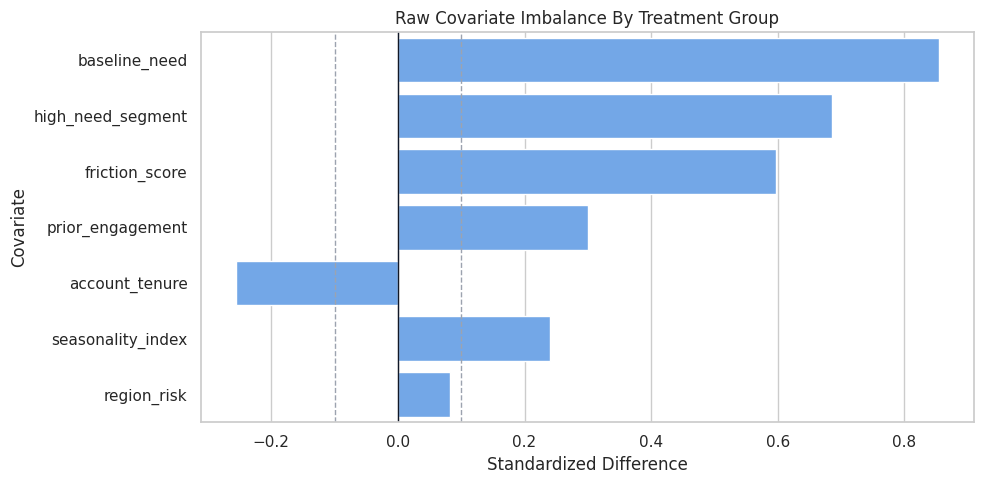
Covariate Balance Check
DML does not require perfect raw balance, but balance checks reveal how observational the data is. Large standardized differences mean treatment groups are different before treatment, which makes nuisance modeling and overlap diagnostics more important.
The standardized mean difference is:
(treated mean - control mean) / pooled standard deviation
What this shows: the largest absolute standardized differences identify where treatment assignment is most confounded. Those same covariates should be included in nuisance models so DML can partial out their relationship with treatment and outcome.
Covariate Balance Plot
The table is precise, but a plot makes the imbalance pattern easier to scan. Values farther from zero mean the treated and untreated groups differ more strongly on that covariate.
What this shows: DML is being used in a setting where adjustment is needed. The plot also warns us which variables should not be forgotten when defining controls and effect modifiers.
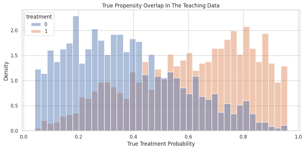
Propensity Overlap
Overlap means that comparable users have some chance of being treated and some chance of not being treated. If the treatment probability is nearly zero or nearly one for many units, then the data has weak support for causal comparisons in those regions.
In this simulation we know the true propensity. In a real analysis we would only estimate it.
What this shows: observations are spread across a range of treatment probabilities. The table also shows why treatment assignment and effect heterogeneity can interact: different propensity regions can have different average true CATE values.
Propensity Overlap Plot
The histogram below shows whether treated and untreated rows occupy similar propensity regions. Strong overlap means the residualized treatment signal has something to work with.
What this shows: the two groups overlap enough for a clean teaching example, but the distributions are not identical. That is exactly the zone where nuisance adjustment matters.
X And W Roles In EconML
EconML often separates covariates into two sets:
X: effect modifiers. These are the variables used to describe how treatment effects vary.
W: controls. These help remove confounding but are not the main variables used to report CATE variation.
A variable can be placed in X if you want the treatment effect to vary with it. A variable can be placed in W if it is mainly needed for adjustment.
For this lesson, all true CATE drivers are placed in X, while two pure confounders are placed in W.
effect_modifier_cols = ["baseline_need", "prior_engagement", "friction_score", "region_risk", "high_need_segment"]control_cols = ["account_tenure", "seasonality_index"]all_model_covariates = effect_modifier_cols + control_colsrole_table = pd.DataFrame( [ {"column": col, "econml_role": "X", "why_included": "Allows the estimated treatment effect to vary with this feature."}for col in effect_modifier_cols ]+ [ {"column": col, "econml_role": "W", "why_included": "Adjusts for confounding in treatment and outcome nuisance models."}for col in control_cols ])role_table.to_csv(TABLE_DIR /"02_x_w_role_table.csv", index=False)display(role_table)
column
econml_role
why_included
0
baseline_need
X
Allows the estimated treatment effect to vary ...
1
prior_engagement
X
Allows the estimated treatment effect to vary ...
2
friction_score
X
Allows the estimated treatment effect to vary ...
3
region_risk
X
Allows the estimated treatment effect to vary ...
4
high_need_segment
X
Allows the estimated treatment effect to vary ...
5
account_tenure
W
Adjusts for confounding in treatment and outco...
6
seasonality_index
W
Adjusts for confounding in treatment and outco...
What this shows: the role split is a modeling decision, not a property of the raw data file. If an important effect modifier is put only in W, EconML can adjust for it but will not report CATE variation along that dimension.
Train And Test Split
The train set is used to fit nuisance models and treatment-effect models. The test set is held out for checking CATE recovery against known truth.
In real work, there is no true CATE column, so the test set would be used for diagnostics, robustness checks, and policy evaluation rather than oracle accuracy.
What this shows: stratifying by treatment keeps the train and test treatment rates similar. The true ATEs are also close, which helps make the tutorial comparison stable.
Prepare Modeling Matrices
This cell creates the arrays and data frames used by the manual DML steps and EconML. The important point is that oracle fields are excluded from model inputs.
Y_train and T_train are the observed outcome and treatment.
X_train contains effect modifiers.
W_train contains controls.
nuisance_train contains both X and W because nuisance models should use all observed pre-treatment covariates that help predict treatment or outcome.
Y_train = train_df["outcome"].to_numpy()T_train = train_df["treatment"].to_numpy()Y_test = test_df["outcome"].to_numpy()T_test = test_df["treatment"].to_numpy()X_train = train_df[effect_modifier_cols]X_test = test_df[effect_modifier_cols]W_train = train_df[control_cols]W_test = test_df[control_cols]nuisance_train = train_df[all_model_covariates]nuisance_test = test_df[all_model_covariates]true_cate_train = train_df["true_cate"].to_numpy()true_cate_test = test_df["true_cate"].to_numpy()matrix_summary = pd.DataFrame( [ {"object": "Y_train", "rows": Y_train.shape[0], "columns": 1, "meaning": "Observed outcome used for training."}, {"object": "T_train", "rows": T_train.shape[0], "columns": 1, "meaning": "Observed binary treatment used for training."}, {"object": "X_train", "rows": X_train.shape[0], "columns": X_train.shape[1], "meaning": "Effect modifiers for CATE estimation."}, {"object": "W_train", "rows": W_train.shape[0], "columns": W_train.shape[1], "meaning": "Controls for nuisance adjustment."}, {"object": "nuisance_train", "rows": nuisance_train.shape[0], "columns": nuisance_train.shape[1], "meaning": "All observed pre-treatment features used by nuisance models."}, ])matrix_summary.to_csv(TABLE_DIR /"02_model_matrix_summary.csv", index=False)display(matrix_summary)
object
rows
columns
meaning
0
Y_train
1950
1
Observed outcome used for training.
1
T_train
1950
1
Observed binary treatment used for training.
2
X_train
1950
5
Effect modifiers for CATE estimation.
3
W_train
1950
2
Controls for nuisance adjustment.
4
nuisance_train
1950
7
All observed pre-treatment features used by nu...
What this shows: the DML workflow has separate data roles even though many columns come from the same original table. Being explicit here prevents leakage and makes the EconML call easier to read.
Nuisance Models
DML uses two nuisance models:
Outcome nuisance model: predicts Y from observed pre-treatment covariates.
Treatment nuisance model: predicts T from observed pre-treatment covariates.
These are called nuisance models because they are not the final causal answer. They are supporting models that remove predictable structure from outcome and treatment.
The next cell uses cross-fitting: each training row gets a prediction from a model that did not train on that row.
What this shows: nuisance models are judged by predictive quality, but good prediction alone is not the causal answer. Their job is to remove confounding-related predictability so the final residualized treatment variation is closer to as-if random variation.
Cross-Fitting Fold Summary
Cross-fitting matters because using in-sample nuisance predictions can make residuals look artificially small. That can leak overfitting into the causal stage.
The next cell shows the fold sizes and treatment rates used by the treatment nuisance cross-fitting split.
What this shows: every row is held out once for nuisance prediction. Stratification keeps the treatment rate stable across folds, which is helpful when the treatment model estimates propensities.
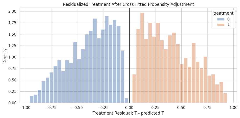
Residualize Outcome And Treatment
Residualization subtracts each nuisance prediction from the observed value:
outcome residual: Y - predicted_Y
treatment residual: T - predicted_T
The residualized treatment is especially important. It represents the part of treatment assignment not explained by the observed covariates.
What this shows: residuals are centered close to zero because the predictable part has been subtracted. The residualized treatment still has variation, which is essential; without residualized treatment variation, there is no local comparison left for estimating effects.
Residualized Treatment Distribution
This plot checks whether residualized treatment variation remains after adjusting for covariates. Treated rows tend to have positive treatment residuals and untreated rows tend to have negative residuals, but the magnitude depends on the estimated propensity.
What this shows: DML is not comparing all treated rows to all untreated rows. It compares residualized deviations from expected treatment assignment, which reduces the role of observed confounding.
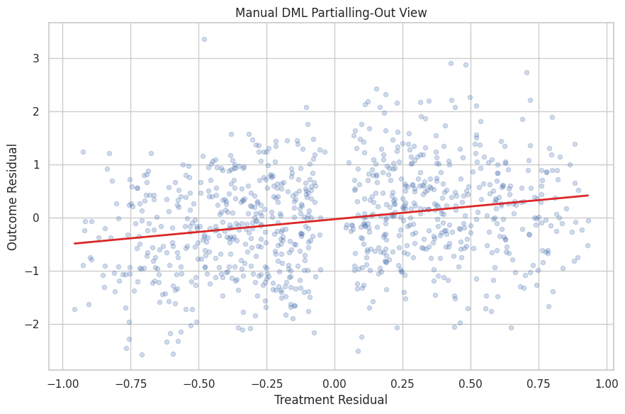
Manual Residual-On-Residual ATE
A very simple DML-style ATE can be estimated by regressing outcome residuals on treatment residuals with no intercept. This is not the full CATE estimator yet, but it is the cleanest way to see the partialling-out idea.
The final-stage model is:
outcome_residual = ate * treatment_residual + final_stage_noise
What this shows: residualization typically moves the estimate closer to the true effect than the raw comparison. It is still a simplified ATE-style calculation, so the next step lets the treatment effect vary with X.
Partialling-Out Scatter
The scatter plot shows the final-stage ATE idea visually. Each point is a training row after removing the predicted outcome and predicted treatment parts.
The fitted line is the manual residual-on-residual ATE estimate.
What this shows: the slope is estimated after both axes have been adjusted for observed covariates. The cloud is noisy because individual outcomes are noisy, but the residualized relationship is the signal DML uses.
Manual Linear CATE From Residualized Interactions
To estimate heterogeneous effects, we let the residualized treatment interact with the effect modifiers in X.
This is the same broad idea behind LinearDML: use nuisance models to residualize, then use a final linear model to describe how the treatment effect changes with X.
What this shows: the manual CATE model can recover much of the true effect pattern because the true CATE was designed to be linear in X. The coefficient table connects the causal estimand to a concrete final-stage regression.
Fit EconML LinearDML
Now we let EconML perform the DML workflow directly. LinearDML will:
fit nuisance models for outcome and treatment;
use cross-fitting internally;
residualize treatment and outcome;
fit a final linear CATE model over X;
return unit-level effect estimates through .effect(X).
We use random forests as nuisance models to show that DML can combine flexible first-stage prediction with a simple final-stage CATE model.
What this shows: EconML produces unit-level CATE estimates and an average effect over any population we pass in. In this truth-known lesson, we can verify both average-effect accuracy and CATE ranking quality.
Compare Manual DML And EconML
The manual estimator and LinearDML use the same conceptual ingredients, but not exactly the same implementation details. This comparison is useful because it separates the idea of DML from the library implementation.
What this shows: the raw comparison has no CATE diagnostics because it gives only one number. The DML-style methods give individual effect estimates, so we can evaluate both the average effect and how well the model recovers heterogeneity.
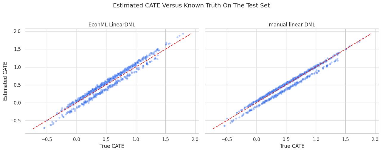
CATE Recovery Plot
A useful simulation diagnostic is estimated CATE versus true CATE. The 45-degree line represents perfect recovery. Points close to that line mean the model is learning the heterogeneous effect structure.
What this shows: both DML versions recover the broad ranking pattern when the final-stage functional form matches the true CATE. Scatter around the diagonal reflects finite sample noise, nuisance model error, and final-stage estimation error.
EconML Final-Stage Coefficients
Because LinearDML uses a linear final CATE model, we can inspect its coefficients. This is one of the reasons LinearDML is a good first EconML estimator: the CATE model is interpretable.
The coefficients are not the nuisance model coefficients. They describe how the treatment effect itself changes with X.
What this shows: the final-stage coefficients are estimates of the treatment-effect equation, not estimates of the outcome equation. In this simulation, the signs should line up with the known CATE formula.
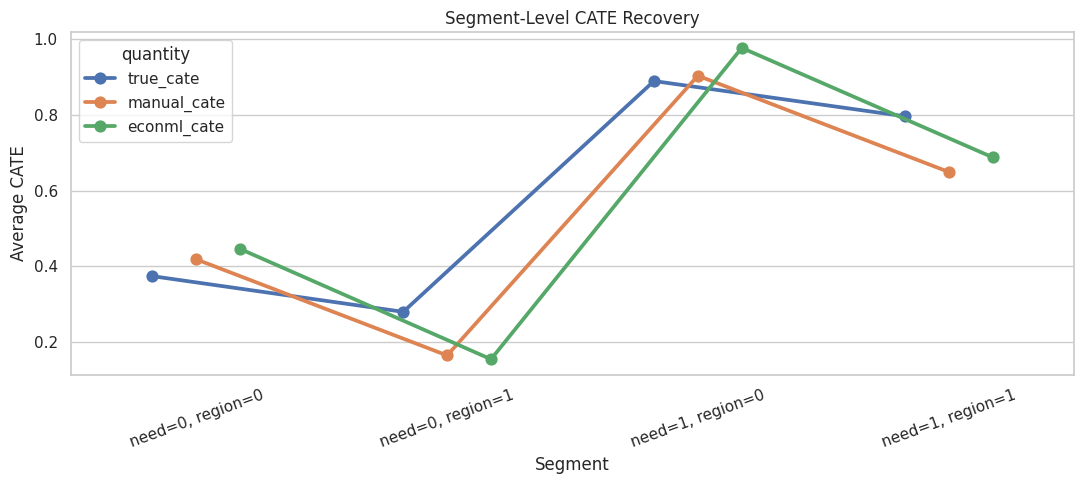
Segment-Level Recovery
Unit-level scatter plots are useful, but stakeholders often ask about segments. The next cell compares true and estimated CATE by high-need segment and region risk.
What this shows: segment summaries translate CATE estimates into a format that is easier to explain. They also reveal whether the model is accurate only on average or whether it recovers important subgroup patterns.
Segment Recovery Plot
This plot puts the segment summary into a compact visual. Each marker is a segment average, not an individual row.
What this shows: the estimates are most useful when they preserve the ordering of segment benefits. Perfect segment accuracy is not required for the tutorial point; the key idea is that DML gives a structured way to estimate heterogeneity after adjustment.
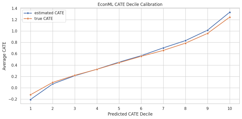
CATE Decile Calibration
A common use case for CATE models is ranking units by expected benefit. If the model ranks well, higher predicted CATE deciles should also have higher average true CATE.
This check is only possible here because true CATE is known.
What this shows: a CATE model can be evaluated as a ranking model. The goal is not just to estimate one average effect, but to identify which parts of the population appear to benefit more.
CATE Decile Calibration Plot
The plot checks whether predicted effect ranking agrees with known true effect ranking. A healthy curve rises as the predicted CATE decile increases.
What this shows: the decile plot connects DML to decision-making. If predicted high-benefit groups also have high true benefit in simulation, the model is learning useful treatment-effect ranking structure.
What DML Assumes In Practice
DML is powerful, but it is not magic. It still relies on causal assumptions. The next table summarizes the main practical requirements behind the estimator.
dml_assumption_table = pd.DataFrame( [ {"requirement": "Unconfoundedness after observed covariates","plain_language": "After conditioning on X and W, treatment assignment is as good as random.","practical_check": "Use domain knowledge; inspect balance; include all important pre-treatment confounders.", }, {"requirement": "Overlap","plain_language": "Comparable units have a chance of being treated and untreated.","practical_check": "Inspect propensity distributions and avoid unsupported regions.", }, {"requirement": "No post-treatment controls","plain_language": "Covariates used for adjustment must be measured before treatment.","practical_check": "Audit timestamps and feature definitions.", }, {"requirement": "Reasonable nuisance models","plain_language": "Outcome and treatment models should capture the main predictive structure.","practical_check": "Use cross-fitted metrics, calibration checks, and sensitivity to model choices.", }, {"requirement": "Appropriate final-stage CATE form","plain_language": "A linear final CATE model is only suitable when effect variation is reasonably linear in X.","practical_check": "Compare with forests or flexible learners when nonlinear heterogeneity is plausible.", }, ])dml_assumption_table.to_csv(TABLE_DIR /"02_dml_assumption_table.csv", index=False)display(dml_assumption_table)
requirement
plain_language
practical_check
0
Unconfoundedness after observed covariates
After conditioning on X and W, treatment assig...
Use domain knowledge; inspect balance; include...
1
Overlap
Comparable units have a chance of being treate...
Inspect propensity distributions and avoid uns...
2
No post-treatment controls
Covariates used for adjustment must be measure...
Audit timestamps and feature definitions.
3
Reasonable nuisance models
Outcome and treatment models should capture th...
Use cross-fitted metrics, calibration checks, ...
4
Appropriate final-stage CATE form
A linear final CATE model is only suitable whe...
Compare with forests or flexible learners when...
What this shows: the estimator handles nuisance adjustment, but the analyst still owns the causal design. In real work, a DML result should be paired with design logic, overlap diagnostics, and robustness checks.
Practical DML Checklist
The final table turns the lesson into a reusable checklist. These are the questions to answer before presenting a DML estimate.
dml_checklist = pd.DataFrame( [ {"step": 1, "question": "Is the treatment clearly defined?", "why_it_matters": "DML estimates the effect of a specific intervention, not a vague exposure."}, {"step": 2, "question": "Is the outcome measured after treatment?", "why_it_matters": "Temporal order is necessary for a causal design."}, {"step": 3, "question": "Are all adjustment variables pre-treatment?", "why_it_matters": "Post-treatment variables can block or distort causal pathways."}, {"step": 4, "question": "Which variables belong in X versus W?", "why_it_matters": "X defines reported heterogeneity; W supports adjustment."}, {"step": 5, "question": "Is there enough overlap?", "why_it_matters": "Without comparable treated and untreated units, the model extrapolates."}, {"step": 6, "question": "Do nuisance models have reasonable out-of-fold performance?", "why_it_matters": "Poor nuisance models leave confounding structure in the residuals."}, {"step": 7, "question": "Do results persist across sensible model choices?", "why_it_matters": "Robustness matters because flexible nuisance models can vary."}, {"step": 8, "question": "Are CATE estimates used with uncertainty and support in mind?", "why_it_matters": "Treatment targeting should not overreact to noisy individual effects."}, ])dml_checklist.to_csv(TABLE_DIR /"02_dml_checklist.csv", index=False)display(dml_checklist)
step
question
why_it_matters
0
1
Is the treatment clearly defined?
DML estimates the effect of a specific interve...
1
2
Is the outcome measured after treatment?
Temporal order is necessary for a causal design.
2
3
Are all adjustment variables pre-treatment?
Post-treatment variables can block or distort ...
3
4
Which variables belong in X versus W?
X defines reported heterogeneity; W supports a...
4
5
Is there enough overlap?
Without comparable treated and untreated units...
5
6
Do nuisance models have reasonable out-of-fold...
Poor nuisance models leave confounding structu...
6
7
Do results persist across sensible model choices?
Robustness matters because flexible nuisance m...
7
8
Are CATE estimates used with uncertainty and s...
Treatment targeting should not overreact to no...
What this shows: DML is a workflow, not only one function call. The checklist is the bridge from a tutorial notebook to a credible applied analysis.
Summary
This notebook built double machine learning from the ground up.
The key takeaways are:
raw treated-versus-control differences are biased when treatment assignment is confounded;
DML estimates outcome and treatment nuisance functions first;
cross-fitting gives each row nuisance predictions from models that did not train on that row;
residualized treatment and residualized outcome isolate the final-stage causal signal;
a simple residual-on-residual regression gives ATE intuition;
residualized treatment interactions with X give CATE intuition;
EconML’s LinearDML packages this workflow into a reusable estimator;
final CATE estimates should be checked for overlap, nuisance quality, segment recovery, and ranking behavior.
The next notebook can go deeper into LinearDML and SparseLinearDML, focusing on estimation details, coefficient reporting, and when sparse high-dimensional effect modification is useful.