EconML Tutorial 01: CATE Foundations And Potential Outcomes
This notebook builds the conceptual foundation for the EconML tutorial series. Before fitting DML, causal forests, DR learners, or meta-learners, we need a precise answer to a simpler question:
What treatment effect are we trying to estimate?
EconML is especially useful when the effect is not the same for everyone. That means we need to understand:
potential outcomes;
the fundamental missing-data problem in causal inference;
average treatment effects versus conditional treatment effects;
why raw treated-control comparisons are usually not causal in observational data;
why CATE estimates are useful for segmentation and treatment targeting.
The dataset is synthetic, so both potential outcomes are known inside the notebook. That would not be true in real data, but it gives us a clean teaching sandbox.
Learning Goals
By the end of this notebook, you should be able to:
Define potential outcomes Y(0) and Y(1).
Explain why individual treatment effects are not directly observed in real data.
Distinguish ATE, ATT, ATC, CATE, and ITE-style language.
Diagnose confounding and overlap before estimating treatment effects.
Show why one ATE can hide meaningful segment-level differences.
Use an oracle synthetic dataset to connect CATE to treatment targeting.
Understand why later EconML notebooks need nuisance models and effect modifiers.
Why Foundations Matter For EconML
EconML estimators can produce a treatment-effect estimate for every row. That is powerful, but it is easy to misuse if the estimand is unclear.
A row-level CATE estimate is not magic personalization. It is an estimate of an expected contrast under assumptions:
E[Y(1) - Y(0) | X = x]
The conditioning features X define the heterogeneity we want to learn. The controls W help adjust for confounding. Later notebooks will fit estimators; this notebook focuses on what those estimators are trying to recover.
Setup
This cell imports the libraries, creates output folders, checks the EconML version, and sets plotting defaults. We keep this notebook estimator-light, but the import check confirms the tutorial environment is still ready for the later EconML notebooks.
from pathlib import Pathimport osimport warningsimport importlib.metadata as importlib_metadata# Keep Matplotlib cache files in a writable location during notebook execution.os.environ.setdefault("MPLCONFIGDIR", "/tmp/matplotlib-ranking-sys")warnings.filterwarnings("default")warnings.filterwarnings("ignore", category=DeprecationWarning)warnings.filterwarnings("ignore", category=PendingDeprecationWarning)warnings.filterwarnings("ignore", category=FutureWarning)warnings.filterwarnings("ignore", message=".*IProgress not found.*")warnings.filterwarnings("ignore", message=".*X does not have valid feature names.*")warnings.filterwarnings("ignore", module="sklearn.linear_model._logistic")import numpy as npimport pandas as pdimport matplotlib.pyplot as pltimport seaborn as snsimport statsmodels.api as smfrom IPython.display import displayfrom sklearn.linear_model import LogisticRegressionfrom sklearn.metrics import roc_auc_score, mean_squared_errorfrom sklearn.model_selection import train_test_splitfrom sklearn.pipeline import make_pipelinefrom sklearn.preprocessing import StandardScalertry:import econml ECONML_AVAILABLE =True ECONML_VERSION =getattr(econml, "__version__", "unknown")exceptExceptionas exc: ECONML_AVAILABLE =False ECONML_VERSION =f"import failed: {type(exc).__name__}: {exc}"RANDOM_SEED =2026rng = np.random.default_rng(RANDOM_SEED)OUTPUT_DIR = Path("outputs")FIGURE_DIR = OUTPUT_DIR /"figures"TABLE_DIR = OUTPUT_DIR /"tables"FIGURE_DIR.mkdir(parents=True, exist_ok=True)TABLE_DIR.mkdir(parents=True, exist_ok=True)sns.set_theme(style="whitegrid", context="notebook")pd.set_option("display.max_columns", 100)pd.set_option("display.float_format", lambda value: f"{value:,.4f}")print(f"EconML available: {ECONML_AVAILABLE}")print(f"EconML version: {ECONML_VERSION}")print(f"Figures will be saved to: {FIGURE_DIR.resolve()}")print(f"Tables will be saved to: {TABLE_DIR.resolve()}")
EconML available: True
EconML version: 0.16.0
Figures will be saved to: /home/apex/Documents/ranking_sys/notebooks/tutorials/econml/outputs/figures
Tables will be saved to: /home/apex/Documents/ranking_sys/notebooks/tutorials/econml/outputs/tables
The setup confirms that the environment is ready. Every saved artifact from this notebook uses a 01_ prefix.
Estimand Vocabulary
The next table defines the core treatment-effect quantities used throughout the EconML series. The names look similar, but they answer different questions.
estimand_vocabulary = pd.DataFrame( [ {"term": "Potential outcome Y(0)","plain meaning": "Outcome the unit would have under no treatment.","conditioning": "unit-level hypothetical","observed in real data": "only if T = 0", }, {"term": "Potential outcome Y(1)","plain meaning": "Outcome the unit would have under treatment.","conditioning": "unit-level hypothetical","observed in real data": "only if T = 1", }, {"term": "ITE-style contrast","plain meaning": "Y(1) - Y(0) for a unit.","conditioning": "single unit","observed in real data": "no, because one potential outcome is missing", }, {"term": "ATE","plain meaning": "Average treatment effect in the whole population.","conditioning": "none or full population","observed in real data": "estimated under assumptions", }, {"term": "ATT","plain meaning": "Average treatment effect among treated units.","conditioning": "T = 1 population","observed in real data": "estimated under assumptions", }, {"term": "ATC","plain meaning": "Average treatment effect among control units.","conditioning": "T = 0 population","observed in real data": "estimated under assumptions", }, {"term": "CATE","plain meaning": "Average treatment effect for units with features X = x.","conditioning": "effect modifiers X","observed in real data": "estimated under assumptions", }, ])estimand_vocabulary.to_csv(TABLE_DIR /"01_estimand_vocabulary.csv", index=False)display(estimand_vocabulary)
term
plain meaning
conditioning
observed in real data
0
Potential outcome Y(0)
Outcome the unit would have under no treatment.
unit-level hypothetical
only if T = 0
1
Potential outcome Y(1)
Outcome the unit would have under treatment.
unit-level hypothetical
only if T = 1
2
ITE-style contrast
Y(1) - Y(0) for a unit.
single unit
no, because one potential outcome is missing
3
ATE
Average treatment effect in the whole population.
none or full population
estimated under assumptions
4
ATT
Average treatment effect among treated units.
T = 1 population
estimated under assumptions
5
ATC
Average treatment effect among control units.
T = 0 population
estimated under assumptions
6
CATE
Average treatment effect for units with featur...
effect modifiers X
estimated under assumptions
The key EconML target is usually CATE. The average effect still matters, but heterogeneity is the reason to reach for a specialized library.
Identification Assumptions
Potential-outcomes notation does not identify effects by itself. We need assumptions that connect observed data to the missing counterfactual outcomes.
assumption_table = pd.DataFrame( [ {"assumption": "Consistency","plain meaning": "The observed outcome equals the potential outcome under the treatment actually received.","why it matters": "Lets us write Y = T*Y(1) + (1-T)*Y(0).", }, {"assumption": "No interference","plain meaning": "One unit's treatment does not change another unit's potential outcomes.","why it matters": "Lets each row be treated as its own treatment-effect problem.", }, {"assumption": "Ignorability / unconfoundedness","plain meaning": "After observed covariates, treatment assignment is as-if random.","why it matters": "Lets observed controls stand in for the missing counterfactual assignment process.", }, {"assumption": "Overlap / positivity","plain meaning": "Every relevant covariate region has some chance of treatment and control.","why it matters": "Lets us compare like with like instead of extrapolating everywhere.", }, {"assumption": "Correct feature timing","plain meaning": "X and W are measured before treatment and are not outcome leakage.","why it matters": "Prevents post-treatment or future variables from contaminating CATE estimates.", }, ])assumption_table.to_csv(TABLE_DIR /"01_identification_assumptions.csv", index=False)display(assumption_table)
assumption
plain meaning
why it matters
0
Consistency
The observed outcome equals the potential outc...
Lets us write Y = T*Y(1) + (1-T)*Y(0).
1
No interference
One unit's treatment does not change another u...
Lets each row be treated as its own treatment-...
2
Ignorability / unconfoundedness
After observed covariates, treatment assignmen...
Lets observed controls stand in for the missin...
3
Overlap / positivity
Every relevant covariate region has some chanc...
Lets us compare like with like instead of extr...
4
Correct feature timing
X and W are measured before treatment and are ...
Prevents post-treatment or future variables fr...
These assumptions are not EconML-specific; they are causal inference assumptions. EconML gives estimators, not automatic identification guarantees.
Simulate Potential Outcomes
We now create a synthetic dataset where both Y0 and Y1 are known. The analyst would normally observe only one of them, but we keep both in the notebook so the foundations are visible.
The full teaching dataframe contains both potential outcomes and the true CATE. The analyst-facing dataframe removes those truth columns because real data would not contain them.
Data Dictionary
The data dictionary separates observed analyst columns from oracle-only teaching columns. This is a habit worth keeping in all synthetic tutorials.
data_dictionary = pd.DataFrame( [ {"column": "baseline_need", "role": "observed pre-treatment feature", "visible to analyst": True}, {"column": "prior_engagement", "role": "observed pre-treatment feature", "visible to analyst": True}, {"column": "account_tenure", "role": "observed pre-treatment feature", "visible to analyst": True}, {"column": "friction_score", "role": "observed pre-treatment feature", "visible to analyst": True}, {"column": "region_risk", "role": "observed pre-treatment feature", "visible to analyst": True}, {"column": "high_need_segment", "role": "observed effect-modifier segment", "visible to analyst": True}, {"column": "treatment", "role": "observed binary treatment", "visible to analyst": True}, {"column": "observed_outcome", "role": "observed factual outcome", "visible to analyst": True}, {"column": "propensity", "role": "true treatment probability from simulator", "visible to analyst": False}, {"column": "y0", "role": "potential outcome under control", "visible to analyst": False}, {"column": "y1", "role": "potential outcome under treatment", "visible to analyst": False}, {"column": "missing_counterfactual", "role": "the potential outcome not observed for the assigned treatment", "visible to analyst": False}, {"column": "true_cate", "role": "Y(1) - Y(0) in the simulator", "visible to analyst": False}, ])data_dictionary.to_csv(TABLE_DIR /"01_data_dictionary.csv", index=False)display(data_dictionary)
column
role
visible to analyst
0
baseline_need
observed pre-treatment feature
True
1
prior_engagement
observed pre-treatment feature
True
2
account_tenure
observed pre-treatment feature
True
3
friction_score
observed pre-treatment feature
True
4
region_risk
observed pre-treatment feature
True
5
high_need_segment
observed effect-modifier segment
True
6
treatment
observed binary treatment
True
7
observed_outcome
observed factual outcome
True
8
propensity
true treatment probability from simulator
False
9
y0
potential outcome under control
False
10
y1
potential outcome under treatment
False
11
missing_counterfactual
the potential outcome not observed for the ass...
False
12
true_cate
Y(1) - Y(0) in the simulator
False
The oracle-only columns are what make the lesson possible. In real data, these columns are precisely what causal inference tries to reason about indirectly.
Basic Dataset Summary
Before estimands, we check the basic shape of the data and the distribution of treatment. This also gives the true effect quantities available only in the synthetic setup.
The ATE is positive, but the CATE standard deviation and negative-effect share tell us there is meaningful heterogeneity. A single average will hide some of that structure.
The Fundamental Missing-Data Problem
For each unit, we observe only the potential outcome corresponding to the treatment actually received. The other potential outcome is counterfactual.
The true_cate column is shown only because this is a simulation. In real data, we would not observe both Y(0) and Y(1) for the same row.
True Effect Quantities From Oracle Data
With synthetic potential outcomes, we can compute ATE, ATT, ATC, and segment CATE directly. This gives us a target for later estimation notebooks.
true_effect_summary = pd.DataFrame( [ {"estimand": "ATE","value": true_ate,"population": "all units","formula in this simulation": "mean(Y1 - Y0)", }, {"estimand": "ATT","value": true_att,"population": "treated units","formula in this simulation": "mean(Y1 - Y0 | T=1)", }, {"estimand": "ATC","value": true_atc,"population": "control units","formula in this simulation": "mean(Y1 - Y0 | T=0)", }, ])true_effect_summary.to_csv(TABLE_DIR /"01_true_effect_summary.csv", index=False)display(true_effect_summary)
estimand
value
population
formula in this simulation
0
ATE
0.5050
all units
mean(Y1 - Y0)
1
ATT
0.5771
treated units
mean(Y1 - Y0 | T=1)
2
ATC
0.4355
control units
mean(Y1 - Y0 | T=0)
ATE, ATT, and ATC differ because treatment assignment is related to features that also modify treatment effects. This is common in targeted observational systems.
Raw Difference Versus True ATE
The raw treated-control difference compares observed outcomes by treatment group. It is easy to compute, but it is not automatically causal.
The raw difference is biased because treatment is observational. Treated units have different baseline features and different treatment-effect profiles.
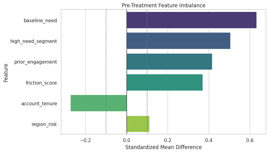
Confounding Check With Covariate Balance
If treatment were randomized, pre-treatment covariates would be similar across treatment groups up to sampling noise. Here they are not.
The imbalance plot explains why an unadjusted comparison is not credible. It also previews the role of treatment nuisance models in DML and DR learners.
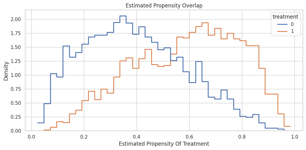
Overlap Check
Overlap asks whether treatment and control units exist in the same feature regions. We fit a simple propensity model to visualize estimated assignment probabilities.
The treatment model is predictive, confirming that treatment assignment is not random. The distribution still needs to have enough overlap for causal comparison.
Plot Propensity Overlap
This plot compares estimated propensities for treated and control units. Severe separation would make CATE estimation much more fragile.
The overlap is usable for a teaching example. Some tail regions are thinner, which is exactly where individual CATE estimates would be less trustworthy.
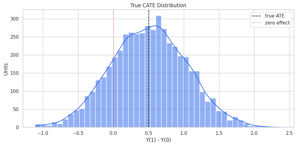
True CATE Distribution
CATE is a distribution, not just one number. We plot the true synthetic CATE to see how much heterogeneity exists.
The distribution makes the core EconML motivation visible. Some units have much larger expected benefit than the average, while a smaller share may have little or negative benefit.
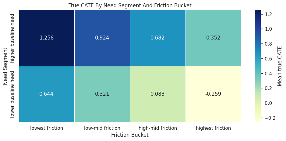
Segment-Level CATE
CATE becomes easier to communicate when summarized over meaningful segments. Here we use the high-need segment and friction buckets.
The segment table shows meaningful variation. Higher need tends to raise treatment benefit, while higher friction tends to reduce it in this simulator.
Plot Segment-Level CATE
A heatmap makes the two-way heterogeneity pattern easier to scan.
This plot shows why targeting can matter. Treating every unit the same would ignore large differences in expected benefit.
CATE Drivers In The Oracle Data
Because true CATE is known, we can regress it on features to show which variables drive heterogeneity. In real data, this would be replaced by model-based explanation of estimated CATE.
The oracle regression recovers the simulator logic: high need and prior engagement raise the effect, while friction lowers it. Later notebooks will try to learn this from observed outcomes only.
Naive Segment Effects Versus True Segment Effects
A common first attempt is to compute treated-control differences inside segments. This can still be biased if treatment is confounded within those segments.
Even segment-level comparisons can be biased. Segmenting does not automatically solve confounding; it only changes the population being compared.
A Simple Interaction Regression Bridge
Before using EconML, we can fit a transparent baseline: an outcome regression with treatment-feature interactions. This is not the final estimator, but it shows the shape of a CATE model.
The interaction terms are a simple way to let treatment effects vary with features. EconML estimators generalize this idea with more careful nuisance modeling and flexible final stages.
Recover CATE From The Interaction Regression
For the interaction model, the estimated CATE is the treatment coefficient plus the treatment-feature interaction terms for each row.
The simple interaction model performs well here because the simulator is mostly linear. Later notebooks will show why we need stronger tools when nuisance functions or CATE patterns are more complex.
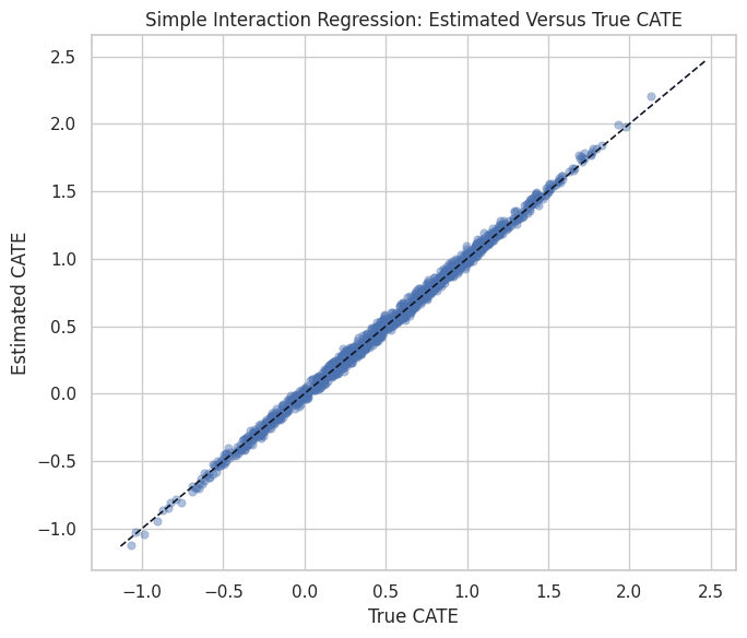
Plot Estimated Versus True CATE For The Simple Baseline
This plot checks whether the interaction regression learns the treatment-effect ranking, not just the average.
The baseline recovers the broad pattern in this friendly simulation. EconML becomes more valuable as the data-generating process becomes less friendly.
CATE As A Treatment-Targeting Signal
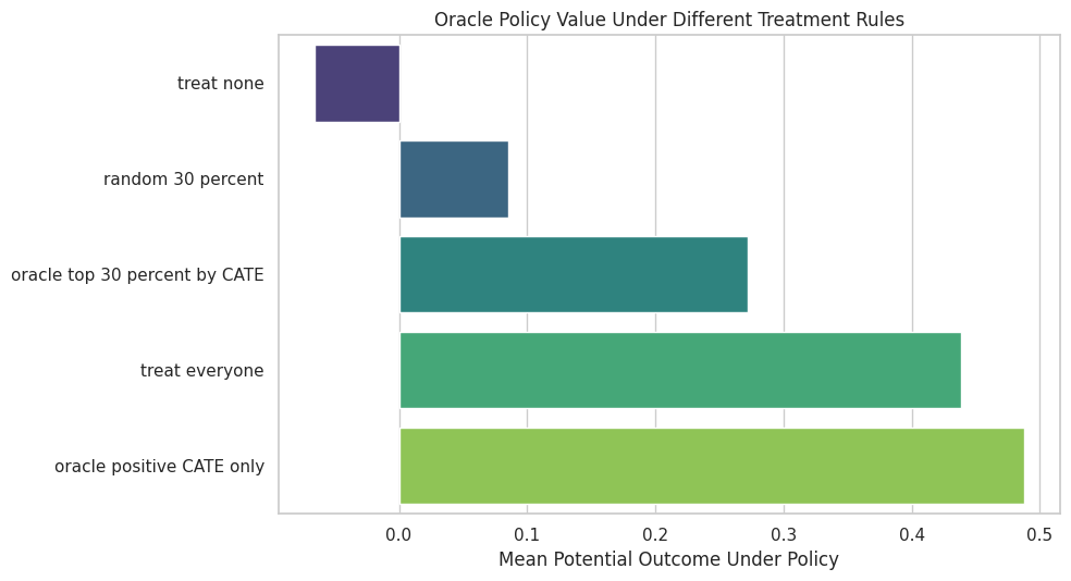
CATE estimates are often used to prioritize treatment. With oracle potential outcomes, we can compare simple targeting policies using the true treatment effects.
The oracle CATE policies outperform random targeting because they concentrate treatment where benefit is highest. Real CATE models try to approximate this ranking without observing the oracle truth.
Plot Oracle Policy Values
The policy plot shows why heterogeneity matters operationally. A good treatment rule can create more value with fewer treated units.
plot_policy_summary = policy_summary.sort_values("oracle_value")fig, ax = plt.subplots(figsize=(10, 5.5))sns.barplot( data=plot_policy_summary, x="oracle_value", y="policy", hue="policy", dodge=False, palette="viridis", legend=False, ax=ax,)ax.set_title("Oracle Policy Value Under Different Treatment Rules")ax.set_xlabel("Mean Potential Outcome Under Policy")ax.set_ylabel("")plt.tight_layout()fig.savefig(FIGURE_DIR /"01_oracle_policy_values.png", dpi=160, bbox_inches="tight")plt.show()
The oracle policy is not achievable in real data, but it gives the north star for treatment-targeting notebooks: learn a ranking that improves policy value without relying on hidden truth.
Why EconML Needs X And W
This table connects the foundation concepts to the data roles used by EconML estimators.
x_w_role_summary = pd.DataFrame( [ {"role": "X: effect modifiers","columns in this notebook": ", ".join(X_EFFECT_MODIFIERS),"why it matters": "CATE is modeled as a function of these features.", }, {"role": "W: controls","columns in this notebook": ", ".join(W_CONTROLS),"why it matters": "Controls help nuisance models adjust for confounding.", }, {"role": "T: treatment","columns in this notebook": "treatment","why it matters": "The intervention whose effect is estimated.", }, {"role": "Y: outcome","columns in this notebook": "observed_outcome","why it matters": "Only the factual outcome is observed in real data.", }, ])x_w_role_summary.to_csv(TABLE_DIR /"01_x_w_role_summary.csv", index=False)display(x_w_role_summary)
role
columns in this notebook
why it matters
0
X: effect modifiers
baseline_need, prior_engagement, friction_scor...
CATE is modeled as a function of these features.
1
W: controls
account_tenure, region_risk
Controls help nuisance models adjust for confo...
2
T: treatment
treatment
The intervention whose effect is estimated.
3
Y: outcome
observed_outcome
Only the factual outcome is observed in real d...
The same variable can sometimes be both a confounder and an effect modifier. The X and W split is a modeling choice that should follow the causal question.
Foundation Checklist
Before fitting an EconML estimator, this checklist should be clear. It keeps CATE modeling connected to causal design rather than pure prediction.
foundation_checklist = pd.DataFrame( [ {"check": "Treatment and outcome are defined", "status in this notebook": "treatment and observed_outcome"}, {"check": "Potential-outcome estimand is named", "status in this notebook": "ATE, ATT, ATC, and CATE"}, {"check": "Observed features are pre-treatment", "status in this notebook": "baseline features only"}, {"check": "Confounding is diagnosed", "status in this notebook": "covariate balance table and plot"}, {"check": "Overlap is diagnosed", "status in this notebook": "propensity summary and histogram"}, {"check": "Effect modifiers are named", "status in this notebook": ", ".join(X_EFFECT_MODIFIERS)}, {"check": "Controls are named", "status in this notebook": ", ".join(W_CONTROLS)}, {"check": "A simple baseline is available", "status in this notebook": "interaction regression CATE baseline"}, {"check": "Targeting use case is explicit", "status in this notebook": "oracle policy-value comparison"}, ])foundation_checklist.to_csv(TABLE_DIR /"01_foundation_checklist.csv", index=False)display(foundation_checklist)
check
status in this notebook
0
Treatment and outcome are defined
treatment and observed_outcome
1
Potential-outcome estimand is named
ATE, ATT, ATC, and CATE
2
Observed features are pre-treatment
baseline features only
3
Confounding is diagnosed
covariate balance table and plot
4
Overlap is diagnosed
propensity summary and histogram
5
Effect modifiers are named
baseline_need, prior_engagement, friction_scor...
6
Controls are named
account_tenure, region_risk
7
A simple baseline is available
interaction regression CATE baseline
8
Targeting use case is explicit
oracle policy-value comparison
The checklist is intentionally estimator-agnostic. It should be completed before choosing LinearDML, CausalForestDML, DRLearner, or any other method.
Final Summary
This notebook introduced the potential-outcomes foundation for the EconML series.
Key takeaways:
Real data reveal only one potential outcome per unit.
ATE, ATT, ATC, and CATE answer different population questions.
Raw treated-control differences can be badly biased in observational data.
CATE is useful because treatment effects vary across feature-defined groups.
Segment summaries and policy values show why heterogeneity matters for decisions.
Later EconML estimators try to recover CATE from observed data using nuisance models, effect modifiers, and assumptions about confounding and overlap.
The next notebook moves from these foundations to double machine learning: residualization, orthogonalization, nuisance models, and cross-fitting.