DoWhy Tutorial 15: Common Pitfalls, Debugging, And Reporting
This notebook closes the DoWhy tutorial series with a practical debugging guide. The earlier notebooks showed how to run causal workflows when the assumptions are clear. This notebook shows what can go wrong when those assumptions are confused, the graph is misspecified, overlap is weak, or the report hides important caveats.
The goal is not to make the workflow feel fragile. The goal is to make the workflow inspectable. A good causal notebook should make mistakes easier to notice.
We will use one synthetic observational case where the true total effect is known. Then we will intentionally compare correct and incorrect analyses:
raw association without adjustment;
correct pre-treatment adjustment;
bad control through a post-treatment mediator;
collider adjustment;
leakage through a future outcome-like variable;
weak propensity overlap;
graph misspecification;
refuter and negative-control checks;
final reporting templates.
Learning Goals
By the end of this notebook, you should be able to:
Recognize bad controls, colliders, leakage, weak overlap, and estimator instability.
Debug DoWhy graph and estimator workflows with small, explicit checks.
Explain why a variable’s timing matters as much as its predictive power.
Compare correct and incorrect graph specifications in DoWhy.
Use refuters and negative controls as stress tests rather than decorations.
Write a causal report that includes the estimate, assumptions, diagnostics, limitations, and recommended next step.
Why This Notebook Exists
Most bad causal analyses do not fail because a function call crashes. They fail because the wrong variables are adjusted for, the wrong estimand is reported, or the graph silently encodes the wrong timing.
A predictive modeling habit says, “add variables that improve prediction.” A causal modeling habit says, “add variables only if they belong in the adjustment set for this estimand.” This distinction is the heart of the notebook.
Setup
This cell imports the libraries, creates output folders, and suppresses known noisy warnings. Code is visible by default throughout the notebook.
from pathlib import Pathimport osimport warnings# Keep Matplotlib cache files in a writable location during notebook execution.os.environ.setdefault("MPLCONFIGDIR", "/tmp/matplotlib-ranking-sys")warnings.filterwarnings("default")warnings.filterwarnings("ignore", category=DeprecationWarning)warnings.filterwarnings("ignore", category=PendingDeprecationWarning)warnings.filterwarnings("ignore", category=FutureWarning)warnings.filterwarnings("ignore", message=".*IProgress not found.*")warnings.filterwarnings("ignore", message=".*setParseAction.*deprecated.*")warnings.filterwarnings("ignore", message=".*copy keyword is deprecated.*")warnings.filterwarnings("ignore", message=".*variables are assumed unobserved.*")warnings.filterwarnings("ignore", module="dowhy.causal_estimators.regression_estimator")warnings.filterwarnings("ignore", module="sklearn.linear_model._logistic")warnings.filterwarnings("ignore", module="pydot.dot_parser")import numpy as npimport pandas as pdimport matplotlib.pyplot as pltimport seaborn as snsimport networkx as nximport statsmodels.api as smfrom IPython.display import displayfrom sklearn.linear_model import LogisticRegressionfrom sklearn.preprocessing import StandardScalerfrom sklearn.pipeline import make_pipelinefrom sklearn.metrics import roc_auc_scorefrom dowhy import CausalModelimport dowhyRANDOM_SEED =2026rng = np.random.default_rng(RANDOM_SEED)OUTPUT_DIR = Path("outputs")FIGURE_DIR = OUTPUT_DIR /"figures"TABLE_DIR = OUTPUT_DIR /"tables"FIGURE_DIR.mkdir(parents=True, exist_ok=True)TABLE_DIR.mkdir(parents=True, exist_ok=True)sns.set_theme(style="whitegrid", context="notebook")pd.set_option("display.max_columns", 100)pd.set_option("display.float_format", lambda value: f"{value:,.4f}")print(f"DoWhy version: {getattr(dowhy, '__version__', 'unknown')}")print(f"Figures will be saved to: {FIGURE_DIR.resolve()}")print(f"Tables will be saved to: {TABLE_DIR.resolve()}")
DoWhy version: 0.14
Figures will be saved to: /home/apex/Documents/ranking_sys/notebooks/tutorials/dowhy/outputs/figures
Tables will be saved to: /home/apex/Documents/ranking_sys/notebooks/tutorials/dowhy/outputs/tables
The notebook is ready once the DoWhy version and output folders print. Every saved artifact uses a 15_ prefix.
Pitfall Map
The table below previews the mistakes we will intentionally create. Each pitfall is common because it often looks reasonable from a predictive modeling perspective.
pitfall_map = pd.DataFrame( [ {"pitfall": "raw association","what goes wrong": "Treatment and outcome differ because treatment assignment is confounded.","debugging check": "Compare treated/control covariates before trusting outcome differences.", }, {"pitfall": "bad control","what goes wrong": "A post-treatment mediator is added to a total-effect adjustment set.","debugging check": "Document variable timing and exclude descendants of treatment for total effects.", }, {"pitfall": "collider adjustment","what goes wrong": "Conditioning on a common effect opens a noncausal path.","debugging check": "Ask whether the variable is caused by treatment and another outcome cause.", }, {"pitfall": "leakage","what goes wrong": "A future or outcome-derived feature is used as a control.","debugging check": "Audit feature timestamps and outcome construction.", }, {"pitfall": "weak overlap","what goes wrong": "Treated and control units are not comparable in parts of covariate space.","debugging check": "Plot propensity overlap, weights, and effective sample size.", }, {"pitfall": "graph misspecification","what goes wrong": "DoWhy identifies the wrong adjustment set because the graph encodes the wrong story.","debugging check": "Review graph edges, omitted variables, and variable timing before estimation.", }, {"pitfall": "overconfident reporting","what goes wrong": "A single estimate is reported without assumptions, diagnostics, or sensitivity checks.","debugging check": "Use a final scorecard with limitations and recommended validation.", }, ])pitfall_map.to_csv(TABLE_DIR /"15_pitfall_map.csv", index=False)display(pitfall_map)
pitfall
what goes wrong
debugging check
0
raw association
Treatment and outcome differ because treatment...
Compare treated/control covariates before trus...
1
bad control
A post-treatment mediator is added to a total-...
Document variable timing and exclude descendan...
2
collider adjustment
Conditioning on a common effect opens a noncau...
Ask whether the variable is caused by treatmen...
3
leakage
A future or outcome-derived feature is used as...
Audit feature timestamps and outcome construct...
4
weak overlap
Treated and control units are not comparable i...
Plot propensity overlap, weights, and effectiv...
5
graph misspecification
DoWhy identifies the wrong adjustment set beca...
Review graph edges, omitted variables, and var...
6
overconfident reporting
A single estimate is reported without assumpti...
Use a final scorecard with limitations and rec...
The rest of the notebook turns this map into executable examples. The repeated theme is simple: every estimate should be tied to a timing story and a graph story.
Case Study Variables
We use a compact observational system with pre-treatment covariates, one treatment, one mediator, one collider, one leakage variable, and the outcome.
The safety column is estimand-specific. It says whether the variable belongs in a total-effect adjustment set for guidance on future engagement.
Simulate The Debugging Dataset
The data-generating process creates known confounding, a mediator, a collider, and a leakage feature. The hidden truth columns are saved for teaching checks but excluded from the analyst-facing dataset.
Known true total effect for teaching check: 0.8596
baseline_need
prior_engagement
account_tenure_z
friction_score
region_risk
high_need_segment
proactive_guidance
activation_depth
support_ticket
future_leakage_score
future_engagement
0
-0.7931
0.3610
1.4847
1.6834
0
0
0
-1.7183
-0.6393
-1.6413
-1.8961
1
0.2406
-1.0970
-1.7368
-1.4981
0
1
0
-0.1053
-0.6020
1.5139
1.4631
2
-1.8963
-0.4935
0.9344
2.8652
1
0
0
-2.0246
-1.0265
-4.2817
-4.2156
3
1.3958
0.4890
0.2148
-0.2507
0
1
1
3.0094
1.9769
3.9445
4.0802
4
0.6383
-0.5878
-0.3884
-1.8590
0
1
1
0.8215
-1.9551
1.1328
1.0859
The analyst-facing data include tempting variables that should not be used for total-effect adjustment. The hidden truth columns let us quantify each mistake.
Basic Quality Checks
The first debugging habit is basic: verify shape, missingness, variable types, and treatment rate before any causal modeling.
The table is clean, which means any bias we see later comes from causal design choices rather than missingness or obvious type problems.
Variable Timing Audit
A timing audit is one of the highest-value causal debugging tools. It forces us to decide whether each variable happens before treatment, after treatment, or after the outcome.
This audit already tells us the correct adjustment set. Predictive usefulness is not enough; the variable must also be causally eligible for the estimand.
Raw Association Pitfall
The raw treated-versus-control difference is the easiest number to compute and often the easiest number to misuse. Here it is confounded because guidance assignment depends on pre-treatment covariates.
The raw difference is far from the known total effect. That is the first red flag: treated and control units differ before the treatment effect is even considered.
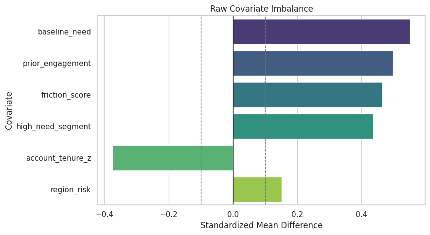
Raw Covariate Balance
We now check whether pre-treatment covariates are balanced between treated and control units. Standardized mean differences put all covariates on a comparable scale.
The plot makes the debugging lesson visual: if covariates are imbalanced, the outcome difference is a blend of selection and causal effect.
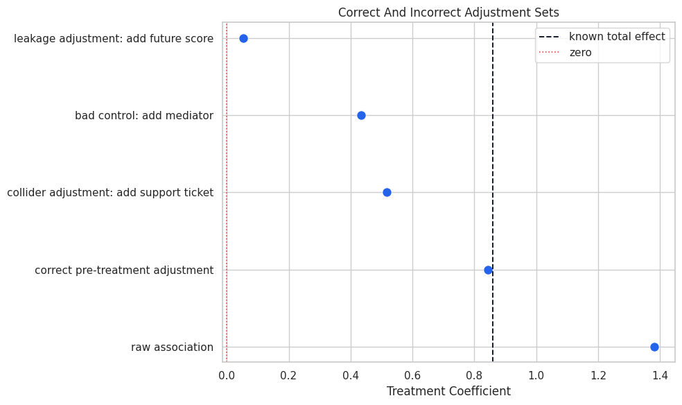
Correct Versus Incorrect Adjustment Sets
Now we compare five regressions:
raw association;
correct adjustment for pre-treatment covariates;
bad-control adjustment for the mediator;
collider adjustment;
leakage adjustment.
The only intended total-effect model is the pre-treatment adjustment model.
def ols_treatment_coefficient(data, columns, outcome=OUTCOME, treatment=TREATMENT): fit = sm.OLS(data[outcome], sm.add_constant(data[columns])).fit()return fit.params[treatment], fit.bse[treatment]regression_specs = [ {"specification": "raw association","columns": [TREATMENT],"causal reading": "confounded association", }, {"specification": "correct pre-treatment adjustment","columns": [TREATMENT] + PRE_TREATMENT_COVARIATES,"causal reading": "intended total effect", }, {"specification": "bad control: add mediator","columns": [TREATMENT] + PRE_TREATMENT_COVARIATES + [MEDIATOR],"causal reading": "blocks part of the total effect", }, {"specification": "collider adjustment: add support ticket","columns": [TREATMENT] + PRE_TREATMENT_COVARIATES + [COLLIDER],"causal reading": "opens a noncausal path through an unobserved risk factor", }, {"specification": "leakage adjustment: add future score","columns": [TREATMENT] + PRE_TREATMENT_COVARIATES + [LEAKAGE],"causal reading": "controls for an outcome-derived future variable", },]regression_rows = []for spec in regression_specs: estimate, standard_error = ols_treatment_coefficient(analyst_df, spec["columns"]) regression_rows.append( {"specification": spec["specification"],"estimate": estimate,"standard_error": standard_error,"known_true_total_effect": true_ate,"absolute_error": abs(estimate - true_ate),"causal reading": spec["causal reading"], } )adjustment_comparison = pd.DataFrame(regression_rows).sort_values("absolute_error")adjustment_comparison.to_csv(TABLE_DIR /"15_adjustment_pitfall_comparison.csv", index=False)display(adjustment_comparison)
specification
estimate
standard_error
known_true_total_effect
absolute_error
causal reading
1
correct pre-treatment adjustment
0.8446
0.0292
0.8596
0.0150
intended total effect
3
collider adjustment: add support ticket
0.5179
0.0278
0.8596
0.3416
opens a noncausal path through an unobserved r...
2
bad control: add mediator
0.4338
0.0300
0.8596
0.4258
blocks part of the total effect
0
raw association
1.3825
0.0394
0.8596
0.5229
confounded association
4
leakage adjustment: add future score
0.0535
0.0075
0.8596
0.8061
controls for an outcome-derived future variable
The correct pre-treatment adjustment is close to the known total effect. The mediator, collider, and leakage specifications all answer the wrong question or introduce bias.
Plot Adjustment Pitfalls
The plot compares each specification to the known total effect. This is the quickest visual summary of why timing and graph structure matter.
The leakage model nearly removes the effect because it controls for something derived from the outcome. That is a classic sign of future information contaminating the adjustment set.
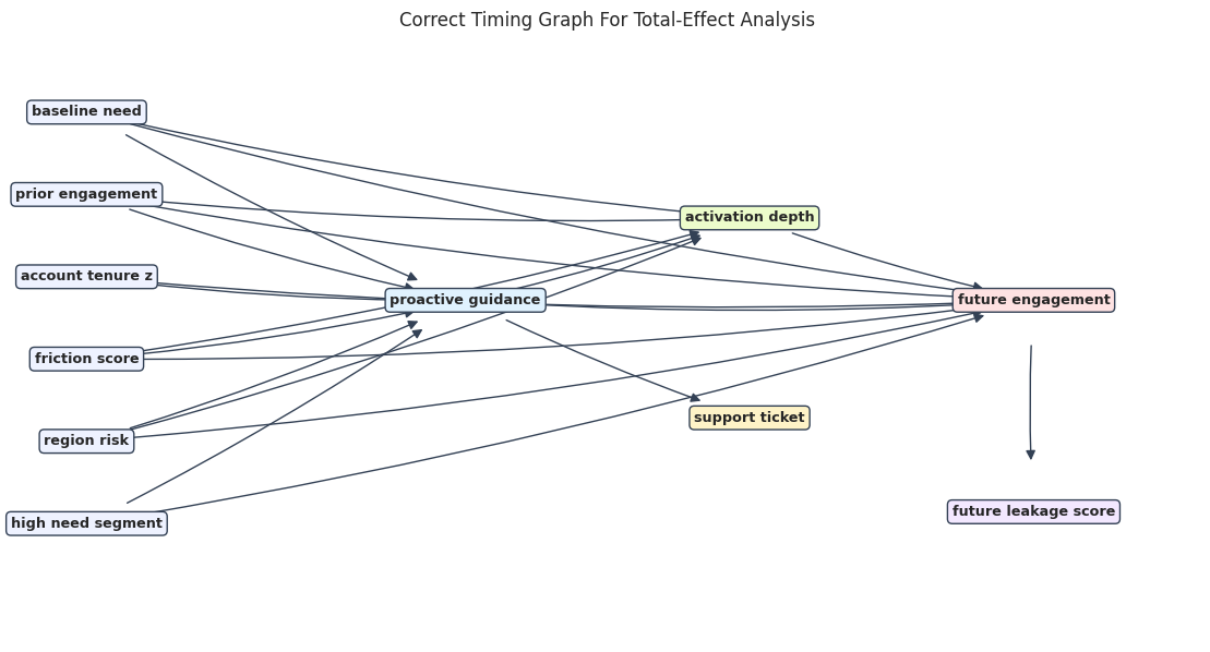
Draw The Correct Graph
The correct graph includes pre-treatment confounders, treatment, mediator, collider symptom, leakage feature, and outcome timing. The leakage feature is shown as downstream of the outcome, so it is clearly excluded from adjustment.
The edge table is the graph in audit form. A reviewer can inspect it without needing to parse a diagram.
Visualize The Correct Graph
The diagram uses compact labels to keep the graph readable. The key visual cue is that mediator, collider, and leakage variables are downstream of treatment or outcome.
The graph helps explain why the correct total-effect adjustment set contains only pre-treatment variables. The mediator, collider, and leakage variables are not eligible controls.
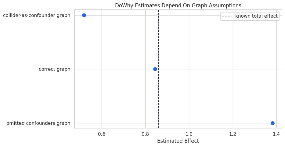
Build DoWhy Graph Variants
DoWhy will identify different estimands depending on the graph. We compare a correct graph against two wrong graphs:
one that omits confounders;
one that treats the support-ticket collider as if it were a pre-treatment common cause.
def dot_from_edges(edges): edge_lines ="\n".join(f" {source} -> {target};"for source, target in edges)return"digraph {\n"+ edge_lines +"\n}"correct_graph_dot = dot_from_edges(correct_edges)omitted_confounder_graph_dot ="""digraph { proactive_guidance -> activation_depth; activation_depth -> future_engagement; proactive_guidance -> future_engagement;}"""collider_as_confounder_edges = []for covariate in PRE_TREATMENT_COVARIATES: collider_as_confounder_edges.append((covariate, TREATMENT)) collider_as_confounder_edges.append((covariate, OUTCOME))collider_as_confounder_edges.extend( [ (COLLIDER, TREATMENT), (COLLIDER, OUTCOME), (TREATMENT, OUTCOME), ])collider_graph_dot = dot_from_edges(collider_as_confounder_edges)graph_variant_table = pd.DataFrame( [ {"graph": "correct graph", "main flaw": "none for this teaching data"}, {"graph": "omitted confounders graph", "main flaw": "ignores observed pre-treatment common causes"}, {"graph": "collider-as-confounder graph", "main flaw": "treats a post-treatment collider as a common cause"}, ])graph_variant_table.to_csv(TABLE_DIR /"15_graph_variant_table.csv", index=False)display(graph_variant_table)
graph
main flaw
0
correct graph
none for this teaching data
1
omitted confounders graph
ignores observed pre-treatment common causes
2
collider-as-confounder graph
treats a post-treatment collider as a common c...
The graph variants are deliberately simple. The point is to show that DoWhy can only identify what the graph tells it to identify.
Estimate Each Graph Variant With DoWhy
We run the same backdoor.linear_regression estimator under each graph variant. The data are the same; only the causal story changes.
The correct graph produces the closest estimate. The omitted-confounder graph reproduces the raw bias, and the collider graph moves the estimate in the wrong direction by conditioning on a post-treatment symptom.
Plot DoWhy Graph Variant Estimates
The plot makes the graph-dependence of the estimate visible. Same data, same estimator, different graph assumptions.
This is the central debugging lesson for graph-based causal inference: DoWhy makes assumptions explicit, but it cannot make incorrect assumptions true.
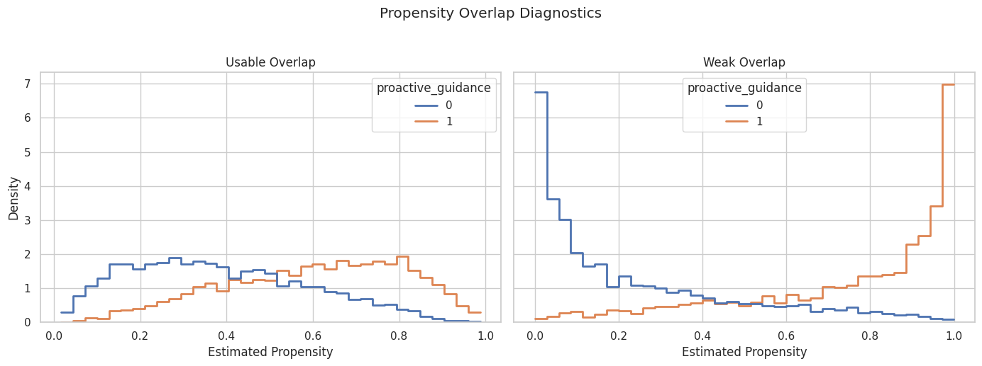
Propensity Overlap Debugging
Weak overlap means some treated units have no comparable controls, or vice versa. We compare a usable-overlap dataset with a weak-overlap dataset generated from the same structural system but stronger treatment selection.
The weak-overlap scenario has a higher propensity AUC, larger maximum weight, and lower effective sample size. A treatment model that predicts treatment too well is often bad news for causal comparison.
Plot Propensity Overlap Scenarios
The histograms show whether treated and control units occupy the same propensity range. Thin overlap creates extrapolation risk.
The weak-overlap panel has more separation between treated and control propensities. Estimates in that scenario rely more heavily on modeling assumptions and high-weight observations.
Weighting Instability Under Weak Overlap
The next table compares adjusted regression and IPW estimates under usable and weak overlap. IPW tends to be more sensitive to weak overlap because weights can become large.
The weak-overlap IPW estimate is less reliable in this run. That is the practical reason overlap plots and effective sample size checks belong before any final causal estimate.
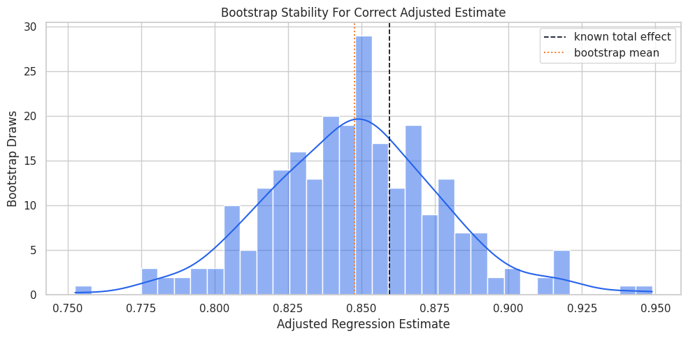
Estimator Stability With Bootstrap Resampling
A causal estimate should not swing wildly under reasonable sampling perturbations. We bootstrap the correct adjusted regression to check stability.
The bootstrap interval is narrow in this large teaching dataset. In real analyses, a wide or unstable bootstrap distribution would be a cue to revisit overlap, model form, or sample definitions.
Plot Bootstrap Stability
The histogram shows the sampling distribution of the adjusted regression estimate. The dashed line marks the known teaching truth.
The bootstrap distribution is centered near the known total effect. This is the behavior we hope to see after diagnosing confounding and overlap.
DoWhy Refuters On The Correct Graph
Refuters are stress tests. They do not prove the graph is correct, but they help detect estimates that behave oddly under placebo or perturbation checks.
Refute: Add a random common cause
Estimated effect:0.8445968243772793
New effect:0.8445017531560346
p value:0.4414910879666033

Refute: Use a Placebo Treatment
Estimated effect:0.8445968243772793
New effect:-0.003884177264457034
p value:0.4514888617202447

Refute: Use a subset of data
Estimated effect:0.8445968243772793
New effect:0.8433901291578826
p value:0.4744791633532476
The random common cause and subset refuters should stay close to the original effect. The placebo treatment should be near zero.
Refuter Summary Table
This table extracts the main numbers from the DoWhy refuter objects so they can be included in a report.
The refuters behave as expected in this teaching setup. The placebo treatment is especially useful because it checks whether the workflow can avoid finding an effect where none should exist.
Negative-Control Outcome
A negative-control outcome should not be caused by the treatment. Here we create a pre-treatment outcome-like measure, so any adjusted treatment coefficient should be near zero.
The adjusted negative-control coefficient is much closer to zero. That supports the observed adjustment strategy, while still not ruling out all unmeasured confounding.
Hidden-Confounding Stress Test
The unobserved-common-cause refuter asks how the estimate could move under hypothetical hidden confounding. This is not a replacement for design, but it makes the main untestable risk more concrete.
treatment_strength_grid = np.array([0.01, 0.03, 0.05])outcome_strength_grid = np.array([0.05, 0.15, 0.30])hidden_confounder_refutation = correct_model.refute_estimate( correct_estimand, correct_estimate, method_name="add_unobserved_common_cause", simulation_method="direct-simulation", confounders_effect_on_treatment="binary_flip", confounders_effect_on_outcome="linear", effect_strength_on_treatment=treatment_strength_grid, effect_strength_on_outcome=outcome_strength_grid, plotmethod=None,)hidden_confounding_matrix = pd.DataFrame( hidden_confounder_refutation.new_effect_array, index=[f"treatment strength {value:.2f}"for value in treatment_strength_grid], columns=[f"outcome strength {value:.2f}"for value in outcome_strength_grid],)hidden_confounding_matrix.to_csv(TABLE_DIR /"15_hidden_confounding_sensitivity_matrix.csv")display(hidden_confounding_matrix)print(f"Original estimate: {correct_estimate.value:.3f}")print(f"Range after simulated hidden confounding: {hidden_confounder_refutation.new_effect}")
outcome strength 0.05
outcome strength 0.15
outcome strength 0.30
treatment strength 0.01
0.8320
0.8007
0.7511
treatment strength 0.03
0.6844
0.6326
0.5920
treatment strength 0.05
0.5269
0.4790
0.4156
Original estimate: 0.845
Range after simulated hidden confounding: (np.float64(0.4156252840032876), np.float64(0.8319970436959336))
The sensitivity matrix shows the estimate can move under strong hypothetical hidden confounding. A transparent report should name this risk instead of burying it.
Graph And Data Debugging Checklist
The following checks catch many common DoWhy notebook issues before estimation. They are intentionally simple and readable.
def graph_debug_audit(data, edges, treatment, outcome): nodes_in_graph =sorted(set([node for edge in edges for node in edge])) missing_nodes =sorted(set(nodes_in_graph) -set(data.columns)) extra_data_columns =sorted(set(data.columns) -set(nodes_in_graph)) graph = nx.DiGraph(edges)return pd.DataFrame( [ {"check": "treatment column exists", "status": treatment in data.columns, "details": treatment}, {"check": "outcome column exists", "status": outcome in data.columns, "details": outcome}, {"check": "all graph nodes exist in data", "status": len(missing_nodes) ==0, "details": ", ".join(missing_nodes) or"none"}, {"check": "graph is acyclic", "status": nx.is_directed_acyclic_graph(graph), "details": "DAG required"}, {"check": "treatment has variation", "status": data[treatment].nunique() ==2, "details": f"unique values: {sorted(data[treatment].unique())}"}, {"check": "outcome is not constant", "status": data[outcome].nunique() >1, "details": f"unique values: {data[outcome].nunique()}"}, {"check": "data columns not in graph", "status": True, "details": ", ".join(extra_data_columns[:8]) + ("..."iflen(extra_data_columns) >8else"")}, ] )graph_audit = graph_debug_audit(dowhy_data, correct_edges, TREATMENT, OUTCOME)graph_audit.to_csv(TABLE_DIR /"15_graph_debug_audit.csv", index=False)display(graph_audit)
check
status
details
0
treatment column exists
True
proactive_guidance
1
outcome column exists
True
future_engagement
2
all graph nodes exist in data
True
none
3
graph is acyclic
True
DAG required
4
treatment has variation
True
unique values: [np.int64(0), np.int64(1)]
5
outcome is not constant
True
unique values: 6000
6
data columns not in graph
True
These checks do not verify causal truth, but they catch mechanical problems: missing columns, cycles, constant treatment, and graph/data mismatches.
Caught Error Example: Missing Graph Variable
A practical debugging notebook should show how to catch and summarize setup errors without crashing the whole analysis. Here we intentionally reference a missing graph variable and store the error message in a table.
bad_edges_with_missing_variable = correct_edges + [("missing_covariate", TREATMENT)]bad_graph_dot = dot_from_edges(bad_edges_with_missing_variable)try: bad_model = CausalModel( data=dowhy_data, treatment=TREATMENT, outcome=OUTCOME, graph=bad_graph_dot, ) bad_estimand = bad_model.identify_effect(proceed_when_unidentifiable=True) bad_estimate = bad_model.estimate_effect(bad_estimand, method_name="backdoor.linear_regression") error_message ="No error raised"exceptExceptionas exc: error_message =f"{type(exc).__name__}: {exc}"caught_error_table = pd.DataFrame( [ {"debugging scenario": "graph references a variable missing from the dataframe","captured message": error_message,"repair": "remove the edge or add the missing column before identification", } ])caught_error_table.to_csv(TABLE_DIR /"15_caught_missing_variable_error.csv", index=False)display(caught_error_table)
debugging scenario
captured message
repair
0
graph references a variable missing from the d...
No error raised
remove the edge or add the missing column befo...
Catching the error as a table makes the notebook teachable and keeps execution clean. In production notebooks, these checks can run before any expensive estimator call.
Reporting Anti-Patterns
A causal estimate can be technically correct and still poorly reported. The next table lists common reporting anti-patterns and better alternatives.
reporting_antipatterns = pd.DataFrame( [ {"anti-pattern": "Only report one number","why it is risky": "Readers cannot see assumptions, diagnostics, or sensitivity.","better habit": "Report estimate, estimand, graph assumptions, diagnostics, and limitations together.", }, {"anti-pattern": "Call observational results causal without caveats","why it is risky": "No-unmeasured-confounding is not directly testable.","better habit": "State that the estimate is causal under the listed assumptions.", }, {"anti-pattern": "Hide overlap problems","why it is risky": "Estimates may rely on extrapolation or extreme weights.","better habit": "Include propensity overlap, weight summary, and effective sample size.", }, {"anti-pattern": "Use post-treatment variables as controls without naming the estimand change","why it is risky": "The reported estimate may no longer be a total effect.","better habit": "Separate total, direct, and mediation questions explicitly.", }, {"anti-pattern": "Treat refuters as proof","why it is risky": "Refuters are stress tests, not assumption guarantees.","better habit": "Use refuters as supporting evidence and still report residual risks.", }, ])reporting_antipatterns.to_csv(TABLE_DIR /"15_reporting_antipatterns.csv", index=False)display(reporting_antipatterns)
anti-pattern
why it is risky
better habit
0
Only report one number
Readers cannot see assumptions, diagnostics, o...
Report estimate, estimand, graph assumptions, ...
1
Call observational results causal without caveats
No-unmeasured-confounding is not directly test...
State that the estimate is causal under the li...
2
Hide overlap problems
Estimates may rely on extrapolation or extreme...
Include propensity overlap, weight summary, an...
3
Use post-treatment variables as controls witho...
The reported estimate may no longer be a total...
Separate total, direct, and mediation question...
4
Treat refuters as proof
Refuters are stress tests, not assumption guar...
Use refuters as supporting evidence and still ...
Good reporting is mostly disciplined humility. It tells the reader what was estimated, why it might be credible, and what could still break it.
Final Diagnostic Scorecard
This scorecard summarizes the notebook’s debugging results. It is a compact template for applied causal reports.
correct_adjusted_estimate = adjustment_comparison.loc[ adjustment_comparison["specification"] =="correct pre-treatment adjustment","estimate",].iloc[0]placebo_effect = placebo_treatment_refutation.new_effectadjusted_negative_control = negative_control_table.loc[ negative_control_table["model"] =="adjusted negative-control outcome","treatment_coefficient",].iloc[0]weak_overlap_ess = overlap_summary.loc[overlap_summary["scenario"] =="weak overlap", "effective_sample_size"].iloc[0]usable_overlap_ess = overlap_summary.loc[overlap_summary["scenario"] =="usable overlap", "effective_sample_size"].iloc[0]scorecard = pd.DataFrame( [ {"diagnostic": "correct adjusted estimate","result": f"{correct_adjusted_estimate:.3f} versus known {true_ate:.3f}","reading": "pre-treatment adjustment recovers the teaching effect well", }, {"diagnostic": "bad-control check","result": "mediator, collider, and leakage controls all distort the estimate","reading": "variable timing audit is necessary", }, {"diagnostic": "graph variant comparison","result": "wrong graph assumptions produce wrong DoWhy estimates","reading": "DoWhy makes assumptions explicit but does not validate them automatically", }, {"diagnostic": "overlap stress test","result": f"ESS usable {usable_overlap_ess:.0f}; ESS weak {weak_overlap_ess:.0f}","reading": "weak overlap reduces information and raises estimator sensitivity", }, {"diagnostic": "placebo treatment refuter","result": f"placebo effect {placebo_effect:.3f}","reading": "fake treatment does not reproduce the main effect", }, {"diagnostic": "negative-control outcome","result": f"adjusted coefficient {adjusted_negative_control:.3f}","reading": "pre-treatment outcome check is close to zero after adjustment", }, {"diagnostic": "hidden-confounding sensitivity","result": f"range {hidden_confounder_refutation.new_effect[0]:.3f} to {hidden_confounder_refutation.new_effect[1]:.3f}","reading": "strong unobserved confounding remains a possible threat", }, ])scorecard.to_csv(TABLE_DIR /"15_final_diagnostic_scorecard.csv", index=False)display(scorecard)
diagnostic
result
reading
0
correct adjusted estimate
0.845 versus known 0.860
pre-treatment adjustment recovers the teaching...
1
bad-control check
mediator, collider, and leakage controls all d...
variable timing audit is necessary
2
graph variant comparison
wrong graph assumptions produce wrong DoWhy es...
DoWhy makes assumptions explicit but does not ...
3
overlap stress test
ESS usable 4031; ESS weak 1633
weak overlap reduces information and raises es...
4
placebo treatment refuter
placebo effect -0.004
fake treatment does not reproduce the main effect
5
negative-control outcome
adjusted coefficient 0.032
pre-treatment outcome check is close to zero a...
6
hidden-confounding sensitivity
range 0.416 to 0.832
strong unobserved confounding remains a possib...
The scorecard keeps the final conclusion attached to the diagnostics. This makes the analysis easier to review and harder to oversell.
Reusable Debugging Checklist
The final checklist is meant to be copied into future causal notebooks. It is deliberately short enough to use before estimation.
reusable_debugging_checklist = pd.DataFrame( [ {"step": "Name the estimand", "question": "Total, direct, indirect, CATE, or policy value?"}, {"step": "Audit timing", "question": "Which variables are pre-treatment, post-treatment, or outcome-derived?"}, {"step": "Draw the graph", "question": "Which variables cause treatment and outcome? Which are descendants?"}, {"step": "Check graph/data consistency", "question": "Do all graph nodes exist in the dataframe, and is the graph acyclic?"}, {"step": "Inspect raw imbalance", "question": "Do treated and control groups differ before treatment?"}, {"step": "Inspect overlap", "question": "Are comparable treated/control units available across propensity ranges?"}, {"step": "Avoid bad controls", "question": "Did any mediator, collider, or future feature enter the adjustment set?"}, {"step": "Compare estimators", "question": "Do reasonable estimators tell the same broad story?"}, {"step": "Run stress tests", "question": "Do placebo, subset, random-cause, and sensitivity checks behave sensibly?"}, {"step": "Report limitations", "question": "What assumption would change the conclusion if violated?"}, ])reusable_debugging_checklist.to_csv(TABLE_DIR /"15_reusable_debugging_checklist.csv", index=False)display(reusable_debugging_checklist)
step
question
0
Name the estimand
Total, direct, indirect, CATE, or policy value?
1
Audit timing
Which variables are pre-treatment, post-treatm...
2
Draw the graph
Which variables cause treatment and outcome? W...
3
Check graph/data consistency
Do all graph nodes exist in the dataframe, and...
4
Inspect raw imbalance
Do treated and control groups differ before tr...
5
Inspect overlap
Are comparable treated/control units available...
6
Avoid bad controls
Did any mediator, collider, or future feature ...
7
Compare estimators
Do reasonable estimators tell the same broad s...
8
Run stress tests
Do placebo, subset, random-cause, and sensitiv...
9
Report limitations
What assumption would change the conclusion if...
This checklist is the notebook’s main reusable artifact. It turns the series into a practical review process for future DoWhy work.
Final Summary
This notebook showed how causal analyses can go wrong and how to debug them:
raw outcome differences were biased by pre-treatment confounding;
mediator adjustment changed the estimand away from the total effect;
collider adjustment opened a noncausal path;
future leakage nearly erased the treatment coefficient;
weak overlap reduced effective sample size and made IPW less stable;
wrong graph assumptions produced wrong DoWhy estimates;
refuters and negative controls provided useful stress tests but not proof;
transparent reporting tied estimates to assumptions, diagnostics, and residual risks.
That closes the DoWhy tutorial sequence with a practical rule: the best causal notebook is not the one with the fanciest estimator. It is the one where the assumptions, diagnostics, and limitations are visible enough for another careful person to inspect.