DoWhy Tutorial 09: Graph Discovery And Graph Refutation
The previous notebooks assumed that the analyst had already written a reasonable causal graph. This notebook focuses on a different part of the workflow: how do we build, challenge, and refine a graph before trusting an effect estimate?
Causal graph discovery is tempting because it sounds like the data can tell us the graph. In practice, graph discovery is better treated as an assistant, not an oracle. Data can reveal dependencies, suggest candidate edges, and flag graph implications that do not match observed patterns. But causal direction, hidden variables, measurement choices, timing, and domain constraints still need analyst judgment.
This notebook teaches a practical graph workflow:
start from a known simulated causal system,
inspect correlations and partial correlations,
build a simple constraint-assisted candidate graph,
compare candidate edges to the known graph,
use DoWhy’s graph refuter to test conditional independence implications,
show how the wrong graph can bias a causal estimate.
Learning Goals
By the end of this notebook, you should be able to:
Explain why graph discovery is not the same as causal proof.
Distinguish marginal dependence from conditional dependence.
Use domain ordering to orient candidate graph edges.
Compare discovered candidate edges against a known graph in a simulation.
Use DoWhy’s refute_graph API for conditional-independence checks.
Understand why missing a confounder-to-outcome edge can bias an effect estimate.
Explain why passing graph checks does not guarantee that a graph is correct.
How To Think About Graph Discovery
A causal graph encodes assumptions. Some assumptions imply conditional independencies in the observed data. For example, if a graph says X -> T -> M, then it often implies that X and M should be independent after conditioning on T, assuming there are no other open paths.
Graph discovery tries to work backward from observed dependence patterns toward graph structure. That is useful, but it has hard limits:
Dependence does not reveal direction by itself.
Hidden confounders can create edges that look direct.
Different graphs can imply the same observed dependencies.
Conditioning on colliders can create misleading associations.
Sample noise and model misspecification can make tests unstable.
So the right posture is: use discovery to generate questions, then use graph refutation to challenge assumptions, then use domain knowledge to decide what graph is credible enough for estimation.
Setup
The setup cell imports the packages, filters known non-actionable warnings, creates output folders, and sets plotting defaults. The notebook uses only installed dependencies. Optional graph-discovery libraries are checked later rather than required.
from pathlib import Pathimport importlib.utilimport osimport warningsos.environ.setdefault("MPLCONFIGDIR", "/tmp/matplotlib-ranking-sys")warnings.filterwarnings("default")warnings.filterwarnings("ignore", category=DeprecationWarning)warnings.filterwarnings("ignore", category=PendingDeprecationWarning)warnings.filterwarnings("ignore", category=FutureWarning)warnings.filterwarnings("ignore", message=".*IProgress not found.*")warnings.filterwarnings("ignore", message=".*setParseAction.*deprecated.*")warnings.filterwarnings("ignore", message=".*copy keyword is deprecated.*")warnings.filterwarnings("ignore", message=".*disp.*iprint.*L-BFGS-B.*")warnings.filterwarnings("ignore", message=".*variables are assumed unobserved.*")warnings.filterwarnings("ignore", module="dowhy.causal_estimators.regression_estimator")warnings.filterwarnings("ignore", module="sklearn.linear_model._logistic")warnings.filterwarnings("ignore", module="seaborn.categorical")warnings.filterwarnings("ignore", module="pydot.dot_parser")import dowhyimport matplotlib.pyplot as pltimport networkx as nximport numpy as npimport pandas as pdimport seaborn as snsimport statsmodels.formula.api as smffrom dowhy import CausalModelfrom dowhy.utils.cit import partial_corrfrom IPython.display import displayfrom matplotlib.patches import FancyArrowPatchpd.set_option("display.max_columns", 100)pd.set_option("display.width", 150)pd.set_option("display.float_format", "{:.4f}".format)sns.set_theme(style="whitegrid", context="notebook")for candidate in [Path.cwd(), *Path.cwd().parents]:if (candidate /"notebooks"/"tutorials"/"dowhy").exists(): PROJECT_ROOT = candidatebreakelse: PROJECT_ROOT = Path.cwd()NOTEBOOK_DIR = PROJECT_ROOT /"notebooks"/"tutorials"/"dowhy"OUTPUT_DIR = NOTEBOOK_DIR /"outputs"FIGURE_DIR = OUTPUT_DIR /"figures"TABLE_DIR = OUTPUT_DIR /"tables"FIGURE_DIR.mkdir(parents=True, exist_ok=True)TABLE_DIR.mkdir(parents=True, exist_ok=True)RNG = np.random.default_rng(909)print(f"DoWhy version: {dowhy.__version__}")print(f"Notebook directory: {NOTEBOOK_DIR}")print(f"Figure output directory: {FIGURE_DIR}")print(f"Table output directory: {TABLE_DIR}")
The environment is ready once the folders print. All outputs created here use a 09_ prefix.
Optional Discovery Backends
DoWhy exposes CausalModel.learn_graph, which can call external discovery libraries such as LiNGAM, CDT, or GES when those packages are installed. This environment does not need those optional packages for the tutorial. Instead, we check availability explicitly and then build an executable constraint-assisted workflow using standard Python tools.
If one of these backends is installed, DoWhy can delegate graph learning to it. Since they are optional and not present here, the rest of the notebook uses transparent dependency and partial-correlation checks that run with the current environment.
Simulate A Known Causal System
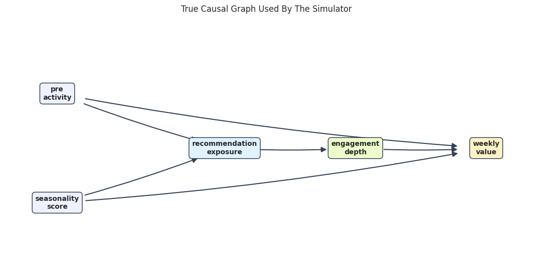
We will simulate a small continuous system with a known graph. The treatment-like variable is recommendation_exposure, the mediator is engagement_depth, and the final outcome is weekly_value.
The true total effect of exposure on weekly value flows through engagement:
Two pre-treatment variables, pre_activity and seasonality_score, affect both exposure and weekly value. They are confounders for the total exposure effect.
Rows: 5,000
True total effect of recommendation exposure on weekly value: 1.680
pre_activity
seasonality_score
recommendation_exposure
engagement_depth
weekly_value
negative_control_metric
0
-0.7925
-0.0048
0.6276
0.9291
1.8947
0.2889
1
0.6065
1.1533
2.1557
1.6642
4.5552
1.7108
2
-0.6350
-0.0009
-0.3334
-0.2068
0.1012
-0.1707
3
-1.1514
-1.1449
-0.5104
0.3502
-1.2972
-0.6475
4
0.4317
0.4667
-0.4992
0.2583
1.8669
0.9448
The known truth lets us judge the workflow. In real data, the graph is unknown, so these checks would be evidence for or against assumptions rather than a comparison to ground truth.
Data Field Guide
The table below describes the columns and their causal roles in the simulation. Graph work benefits from a field guide because causal direction often depends on timing and measurement definitions.
field_guide = pd.DataFrame( [ {"column": "pre_activity","role": "source confounder","description": "Pre-treatment activity that affects exposure and weekly value.", }, {"column": "seasonality_score","role": "source confounder","description": "Pre-treatment timing signal that affects exposure and weekly value.", }, {"column": "recommendation_exposure","role": "treatment-like exposure","description": "Continuous exposure intensity affected by the source variables.", }, {"column": "engagement_depth","role": "mediator","description": "Post-exposure engagement depth through which exposure affects weekly value.", }, {"column": "weekly_value","role": "outcome","description": "Final outcome affected by engagement and the source confounders.", }, {"column": "negative_control_metric","role": "diagnostic variable","description": "Outcome-like metric driven by source variables but not by exposure in the simulation.", }, ])field_guide.to_csv(TABLE_DIR /"09_field_guide.csv", index=False)display(field_guide)
column
role
description
0
pre_activity
source confounder
Pre-treatment activity that affects exposure a...
1
seasonality_score
source confounder
Pre-treatment timing signal that affects expos...
2
recommendation_exposure
treatment-like exposure
Continuous exposure intensity affected by the ...
3
engagement_depth
mediator
Post-exposure engagement depth through which e...
4
weekly_value
outcome
Final outcome affected by engagement and the s...
5
negative_control_metric
diagnostic variable
Outcome-like metric driven by source variables...
The source variables come first in time, exposure comes next, engagement follows exposure, and weekly value is last. This time order will be used to orient candidate edges.
Basic Data Checks
Before looking at graph structure, check shape, missingness, and basic distribution summaries. Conditional-independence tests are sensitive to missing values and extreme data problems.
The true graph has two source variables, one exposure, one mediator, and one outcome. The exposure has no direct edge to weekly value; its effect is fully mediated by engagement depth in this simulation.
A Graph Drawing Helper
Network diagrams can become hard to read when arrows sit under nodes. This helper draws rounded text boxes and explicit arrow patches with shrink spacing, so arrows remain visible.
def draw_directed_graph(edges, positions, title, path, node_colors=None): node_colors = node_colors or {} nodes =list(dict.fromkeys([node for edge in edges for node in edge])) fig, ax = plt.subplots(figsize=(11, 5.8)) ax.set_axis_off()for left, right in edges: start = positions[left] end = positions[right] arrow = FancyArrowPatch( start, end, arrowstyle="-|>", mutation_scale=16, linewidth=1.5, color="#334155", shrinkA=42, shrinkB=42, connectionstyle="arc3,rad=0.03", ) ax.add_patch(arrow)for node in nodes: x, y = positions[node] label = node.replace("_", "\n") ax.text( x, y, label, ha="center", va="center", fontsize=10, fontweight="bold", bbox=dict( boxstyle="round,pad=0.45", facecolor=node_colors.get(node, "#e0f2fe"), edgecolor="#334155", linewidth=1.1, ), ) ax.set_xlim(0, 1) ax.set_ylim(0, 1) ax.set_title(title, pad=18) plt.tight_layout() fig.savefig(path, dpi=160, bbox_inches="tight") plt.show()node_colors = {"pre_activity": "#eef2ff","seasonality_score": "#eef2ff","recommendation_exposure": "#e0f2fe","engagement_depth": "#ecfccb","weekly_value": "#fef3c7",}draw_directed_graph( TRUE_EDGES, TRUE_POSITIONS,"True Causal Graph Used By The Simulator", FIGURE_DIR /"09_true_causal_graph.png", node_colors=node_colors,)
The graph shows why pre_activity and seasonality_score are confounders for the total exposure effect. They affect exposure and the final outcome.
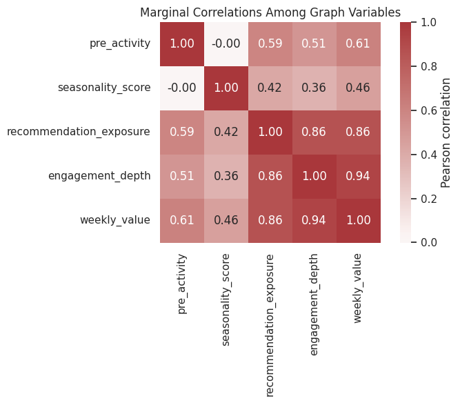
Marginal Correlation Is Not A Causal Graph
A common first step is to inspect correlations. Correlations are useful for finding dependence, but they cannot distinguish direct effects from indirect paths or common causes.
Many variables are correlated because the graph has mediated paths and common causes. A correlation heatmap can suggest candidate relationships, but it will usually overstate the number of direct causal edges.
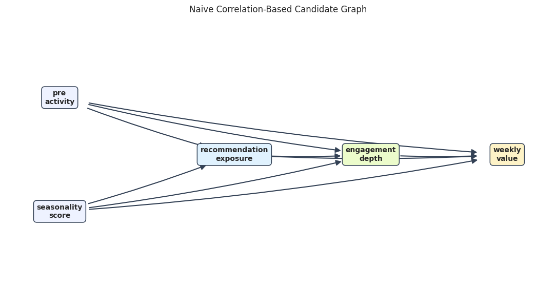
Naive Correlation-Based Candidate Edges
To make that limitation concrete, we build a naive candidate graph: if two variables have an absolute correlation above a threshold, we draw an edge from the earlier variable to the later variable according to the known time order.
This is not a recommended causal-discovery algorithm. It is a teaching baseline that shows why marginal dependence is not enough.
The correlation graph usually includes extra edges. For example, recommendation_exposure and weekly_value are correlated even though the true direct path goes through engagement_depth.
Draw The Naive Correlation Graph
The visual below shows what happens when marginal correlations are treated as direct edges. It is dense because it confuses indirect association with direct causal structure.
For each target variable, we regress it on all earlier variables and keep edges with small p-values. This is still not a complete causal-discovery algorithm, but it is a transparent way to combine data with time-order constraints.
Conditioning on earlier variables removes several indirect associations. The resulting graph should be much closer to the data-generating graph than the naive correlation graph.
Draw The Constraint-Assisted Candidate Graph
The next graph shows the edges retained by the tiered regression screen. This is the candidate graph we would take into a graph-review conversation.
The candidate graph is simpler than the correlation graph because it asks whether a relationship remains after accounting for earlier variables.
Compare Candidate Graphs To The Known Truth
Since this is a simulation, we can score each candidate graph against the true edge list. In real data this table would not be possible, but it is excellent for learning what each discovery step is doing.
The tiered regression screen should have fewer false positives. The broader lesson is that graph discovery improves when data checks are combined with timing and domain restrictions.
Conditional Independence Checks By Hand
Graph refutation is based on implications such as “these two variables should be independent after conditioning on this set.” We will first compute a few partial correlations manually so the DoWhy graph refuter is easier to understand.
For continuous variables, a small partial correlation with a large p-value is consistent with conditional independence.
CONSTRAINTS_CORRECT_GRAPH = [ ("recommendation_exposure","weekly_value", ("engagement_depth", "pre_activity", "seasonality_score"),"No direct exposure-to-value edge after mediator and confounders are conditioned on.", ), ("pre_activity","engagement_depth", ("recommendation_exposure",),"Pre-activity affects engagement through exposure in the true graph.", ), ("seasonality_score","engagement_depth", ("recommendation_exposure",),"Seasonality affects engagement through exposure in the true graph.", ), ("pre_activity","seasonality_score",tuple(),"The two source variables were generated independently.", ),]partial_corr_rows = []for x, y, z, reason in CONSTRAINTS_CORRECT_GRAPH: stats = partial_corr(data=core_graph_df, x=x, y=y, z=list(z)) partial_corr_rows.append( {"x": x,"y": y,"conditioning_set": ", ".join(z) if z else"none","partial_correlation": stats["r"],"p_value": stats["p-val"],"consistent_with_independence_at_0_05": stats["p-val"] >=0.05,"why_this_constraint_matters": reason, } )partial_correlation_table = pd.DataFrame(partial_corr_rows)partial_correlation_table.to_csv(TABLE_DIR /"09_manual_partial_correlation_checks.csv", index=False)display(partial_correlation_table)
x
y
conditioning_set
partial_correlation
p_value
consistent_with_independence_at_0_05
why_this_constraint_matters
0
recommendation_exposure
weekly_value
engagement_depth, pre_activity, seasonality_score
0.0076
0.5896
True
No direct exposure-to-value edge after mediato...
1
pre_activity
engagement_depth
recommendation_exposure
-0.0003
0.9841
True
Pre-activity affects engagement through exposu...
2
seasonality_score
engagement_depth
recommendation_exposure
0.0047
0.7370
True
Seasonality affects engagement through exposur...
3
pre_activity
seasonality_score
none
-0.0019
0.8942
True
The two source variables were generated indepe...
These checks are consistent with the true graph: the tested conditional independencies have small partial correlations and non-small p-values.
Refute The Correct Graph With DoWhy
Now we pass the same conditional-independence constraints to DoWhy’s graph refuter. The refuter counts how many constraints are satisfied by the data.
def edges_to_dot(edges, graph_name="causal_graph"): edge_lines = [f" {left} -> {right};"for left, right in edges]return"digraph "+ graph_name +" {\n"+"\n".join(edge_lines) +"\n}"true_graph_dot = edges_to_dot(TRUE_EDGES, graph_name="true_graph")graph_model_correct = CausalModel( data=core_graph_df, treatment="recommendation_exposure", outcome="weekly_value", graph=true_graph_dot,)correct_graph_constraints = [(x, y, z) for x, y, z, _ in CONSTRAINTS_CORRECT_GRAPH]correct_graph_refutation = graph_model_correct.refute_graph(independence_constraints=correct_graph_constraints)print(correct_graph_refutation)
Method name for discrete data:conditional_mutual_information
Method name for continuous data:partial_correlation
Number of conditional independencies entailed by model:4
Number of independences satisfied by data:4
Test passed:True
The correct graph should pass these hand-picked constraints. Passing does not prove the graph is true; it only says these particular graph implications were not contradicted by the data.
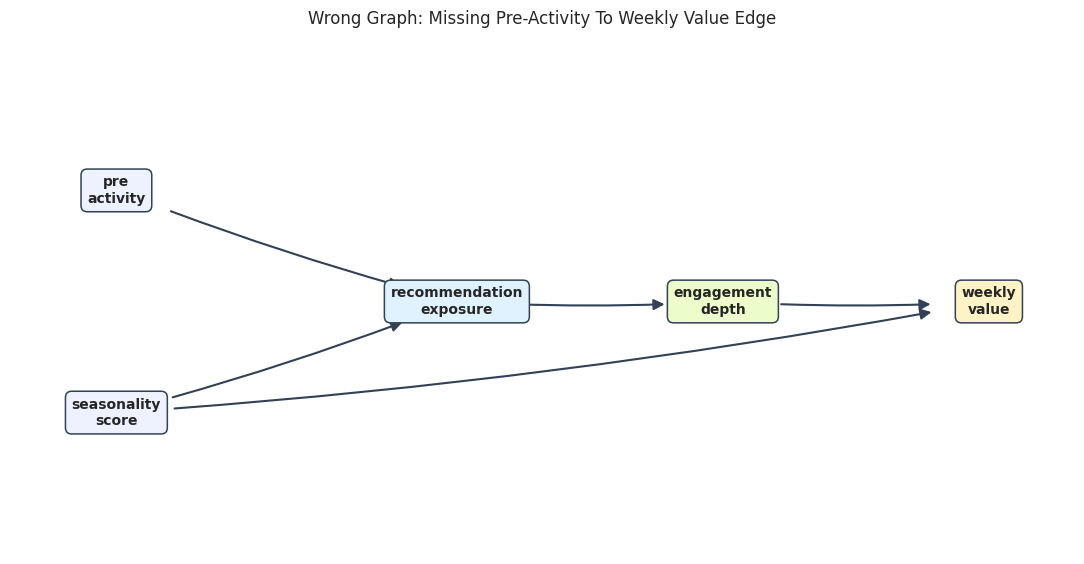
Build A Plausible But Wrong Graph
Now we create a graph that omits the edge from pre_activity to weekly_value. This is a common applied mistake: a variable is known to affect treatment, but its direct relationship to the outcome is under-modeled.
If that edge is missing, the graph implies a false conditional independence: pre_activity should be independent of weekly_value after conditioning on exposure, engagement, and seasonality. The data should reject that implication.
The wrong graph still looks plausible at a glance. That is why graph refutation checks are useful: they can turn a visual assumption into a testable conditional-independence claim.
Refute The Wrong Graph With A Targeted Constraint
This test checks the false implication introduced by omitting the pre_activity -> weekly_value edge.
Method name for discrete data:conditional_mutual_information
Method name for continuous data:partial_correlation
Number of conditional independencies entailed by model:1
Number of independences satisfied by data:0
Test passed:False
The wrong graph should fail because pre_activity remains strongly related to weekly_value even after conditioning on the variables that the wrong graph claims are sufficient.
Compare Graph Refutation Results
This compact table compares the correct graph and the wrong graph. The wrong graph fails because it entails a conditional independence that the data do not support.
Graph refutation is most useful when it is targeted. A graph can imply many constraints, but the best checks are often the ones tied to the causal risks that would change the estimate.
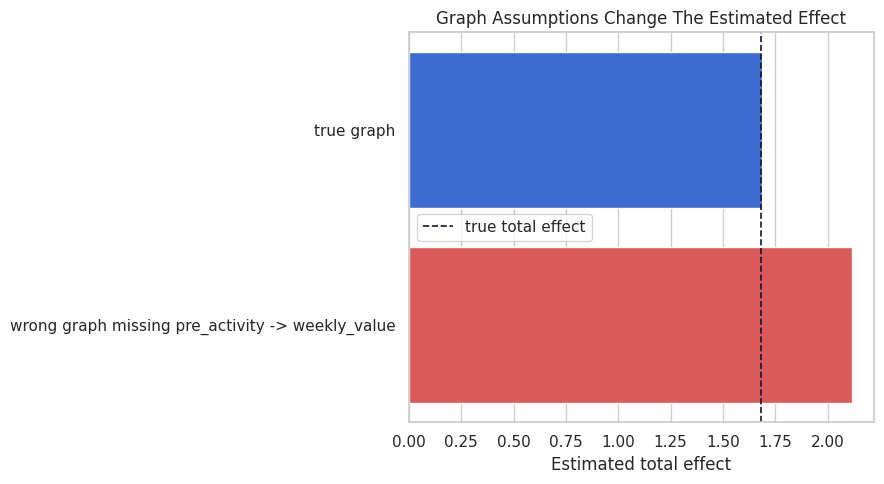
Graph Choice Changes The Causal Estimate
The previous check showed that the wrong graph is inconsistent with the data. Now we show why that matters: DoWhy uses the graph to decide the adjustment set. If the graph omits a confounder-to-outcome edge, DoWhy may omit that variable from adjustment and produce a biased estimate.
The wrong graph gives a biased estimate because it fails to adjust for pre_activity as a confounder. This is the practical reason graph assumptions matter: graph mistakes flow directly into estimation choices.
Plot Estimates From Different Graphs
The dashed line is the true total effect from the simulator. The correct graph estimate should land near the dashed line, while the wrong graph estimate is pulled upward by omitted confounding.
fig, ax = plt.subplots(figsize=(9, 5))sns.barplot( data=estimate_by_graph, x="estimate", y="graph", hue="graph", dodge=False, legend=False, palette=["#2563eb", "#ef4444"], ax=ax,)ax.axvline(true_total_effect, color="#111827", linestyle="--", linewidth=1.2, label="true total effect")ax.set_title("Graph Assumptions Change The Estimated Effect")ax.set_xlabel("Estimated total effect")ax.set_ylabel("")ax.legend()plt.tight_layout()fig.savefig(FIGURE_DIR /"09_effect_estimates_by_graph.png", dpi=160, bbox_inches="tight")plt.show()
This plot ties graph refutation back to causal estimation. The issue is not only whether the graph is aesthetically plausible; it changes the numerical answer.
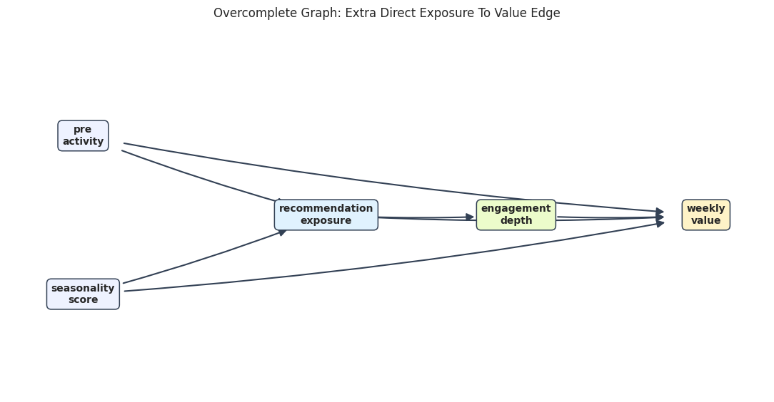
Overcomplete Graphs Can Be Hard To Reject
Graph refutation can often reject graphs that imply false independencies. It is less able to reject graphs that add extra edges. Extra edges remove conditional-independence claims, so there may be fewer testable implications.
The graph below adds a direct edge from exposure to value even though the simulator has no direct edge. This overcomplete graph may pass many checks because it makes fewer independence claims.
OVERCOMPLETE_EDGES = TRUE_EDGES + [("recommendation_exposure", "weekly_value")]draw_directed_graph( OVERCOMPLETE_EDGES, TRUE_POSITIONS,"Overcomplete Graph: Extra Direct Exposure To Value Edge", FIGURE_DIR /"09_overcomplete_graph_extra_edge.png", node_colors=node_colors,)
The extra edge makes the graph more flexible but less informative. This is why graph building should value parsimony and domain logic, not only refutation pass/fail results.
A Small Overcomplete-Graph Check
The overcomplete graph still implies that the two source variables are independent, so it can pass that weak check. But passing one weak check does not establish that the extra direct edge is real.
overcomplete_model = CausalModel( data=core_graph_df, treatment="recommendation_exposure", outcome="weekly_value", graph=edges_to_dot(OVERCOMPLETE_EDGES, graph_name="overcomplete_graph"),)overcomplete_refutation = overcomplete_model.refute_graph( independence_constraints=[("pre_activity", "seasonality_score", tuple())])overcomplete_summary = pd.DataFrame( [ {"graph": "overcomplete graph with extra direct edge","constraints_tested": overcomplete_refutation.number_of_constraints_model,"constraints_satisfied": overcomplete_refutation.number_of_constraints_satisfied,"passed": overcomplete_refutation.refutation_result,"main lesson": "Passing a weak implication does not prove every edge is necessary.", } ])overcomplete_summary.to_csv(TABLE_DIR /"09_overcomplete_graph_refutation.csv", index=False)display(overcomplete_summary)print(overcomplete_refutation)
graph
constraints_tested
constraints_satisfied
passed
main lesson
0
overcomplete graph with extra direct edge
1
1
True
Passing a weak implication does not prove ever...
Method name for discrete data:conditional_mutual_information
Method name for continuous data:partial_correlation
Number of conditional independencies entailed by model:1
Number of independences satisfied by data:1
Test passed:True
This is a subtle but important lesson: graph refutation is better at finding contradictions than proving completeness. Extra edges can make a graph harder to falsify.
Discovery Workflow Summary
Now we collect the main outputs into one table: the naive correlation graph, the constraint-assisted graph, the correct graph refutation, and the wrong graph refutation.
workflow_summary = pd.DataFrame( [ {"workflow piece": "naive correlation screen","result": f"{len(correlation_edges)} candidate edges","lesson": "marginal dependence produces false positive direct edges", }, {"workflow piece": "tiered regression screen","result": f"{len(tiered_edges)} candidate edges","lesson": "time ordering plus conditioning gives a cleaner candidate graph", }, {"workflow piece": "true graph refutation","result": f"{correct_graph_refutation.number_of_constraints_satisfied}/{correct_graph_refutation.number_of_constraints_model} constraints satisfied","lesson": "targeted graph implications are consistent with the data", }, {"workflow piece": "wrong graph refutation","result": f"{wrong_graph_refutation.number_of_constraints_satisfied}/{wrong_graph_refutation.number_of_constraints_model} constraints satisfied","lesson": "missing an outcome edge creates a false conditional-independence claim", }, {"workflow piece": "effect estimate comparison","result": f"correct {correct_estimate.value:.3f}; wrong {wrong_estimate.value:.3f}; target {true_total_effect:.3f}","lesson": "graph errors can become estimation errors", }, ])workflow_summary.to_csv(TABLE_DIR /"09_workflow_summary.csv", index=False)display(workflow_summary)
workflow piece
result
lesson
0
naive correlation screen
9 candidate edges
marginal dependence produces false positive di...
1
tiered regression screen
6 candidate edges
time ordering plus conditioning gives a cleane...
2
true graph refutation
4/4 constraints satisfied
targeted graph implications are consistent wit...
3
wrong graph refutation
0/1 constraints satisfied
missing an outcome edge creates a false condit...
4
effect estimate comparison
correct 1.686; wrong 2.116; target 1.680
graph errors can become estimation errors
The workflow moves from exploratory discovery to graph stress testing to effect estimation. That order is deliberate: we should challenge graph assumptions before presenting a causal effect as credible.
Practical Checklist For Graph Discovery And Refutation
Use this checklist when applying graph discovery ideas to real data:
Start with measurement timing and domain constraints before looking at algorithms.
Use marginal dependence as a clue, not as a direct edge list.
Prefer candidate graphs that are explainable and time-respecting.
Translate key graph assumptions into conditional-independence checks.
Test the graph implications that would change the adjustment set or estimand.
Remember that passing graph checks does not prove the graph; it only removes some contradictions.
Be especially cautious about hidden confounders and extra edges that reduce testable implications.
Practice Prompts
Try these extensions after running the notebook:
Add a direct edge from recommendation_exposure to weekly_value in the simulator. Which partial-correlation check changes?
Make pre_activity and seasonality_score correlated. Which source-variable independence check fails?
Lower the correlation threshold in the naive graph screen. How many false positives appear?
Remove the time-order constraint from the tiered regression screen. What edge directions become ambiguous?
Write a short graph-review memo explaining which assumptions are testable and which require domain judgment.
What Comes Next
The next tutorial moves from classic DoWhy causal models into graphical causal models. Instead of only identifying and estimating a treatment effect, we will model causal mechanisms attached to graph nodes and use them for richer diagnostic and simulation tasks.