DoWhy Tutorial 06: Frontdoor, IV, And Natural Experiments
The earlier notebooks focused on the most common observational workflow: draw a graph, identify a backdoor adjustment set, estimate an average effect, and then stress-test the result. That is the right starting point, but many real causal questions have a harder problem: some important confounder is not measured well enough to adjust for directly.
This notebook introduces three families of designs that can still identify causal effects under stronger structural assumptions:
Frontdoor identification: use a measured mediator when treatment and outcome share an unobserved cause.
Instrumental variables: use an external source of treatment variation that affects the outcome only through the treatment.
Natural-experiment designs: use discontinuities, rollouts, timing, or assignment rules that create quasi-random variation.
The goal is not to make these strategies look magical. The goal is to learn what each design buys, what it assumes, how to implement a transparent teaching example, and how DoWhy fits into the workflow.
Learning Goals
By the end of this notebook, you should be able to:
Explain why ordinary backdoor adjustment fails when an important common cause is unobserved.
Recognize the three frontdoor conditions and estimate a frontdoor effect with DoWhy.
Recognize the relevance, exclusion, and independence assumptions behind instrumental variables.
Estimate an IV effect with a manual Wald estimator, a simple two-stage regression, and DoWhy.
Build transparent regression-discontinuity and difference-in-differences examples as natural-experiment designs.
Compare identification strategies by asking: where did the causal variation come from, and what assumption would break the estimate?
Why Backdoor Adjustment Is Not Always Enough
Backdoor adjustment is powerful when the important confounders are measured. If a variable affects both treatment and outcome, and we observe it, we can often block the non-causal path by conditioning on it.
The problem is that many important causes are not directly observed. In product, policy, education, marketplace, and health settings, latent motivation, latent need, hidden quality, exposure opportunity, or local assignment rules may shape both who gets treated and what outcome they would have had anyway.
This notebook starts by creating a controlled failure case. We will know the true effect because the data are simulated. Then we will intentionally hide the confounder and watch ordinary adjustment drift away from the truth. That gives the later designs a clear purpose: they are alternative ways to get credible causal variation when the usual adjustment path is blocked.
Setup
This setup cell imports the core packages, applies a small set of warning filters, creates output folders, and fixes the plotting style. The warning filters keep the notebook readable while preserving normal errors. The generated tables and figures use a 06_ prefix so outputs from different tutorial notebooks do not overwrite each other.
from pathlib import Pathimport warningswarnings.filterwarnings("default")warnings.filterwarnings("ignore", category=DeprecationWarning)warnings.filterwarnings("ignore", category=PendingDeprecationWarning)warnings.filterwarnings("ignore", category=FutureWarning)warnings.filterwarnings("ignore", message=".*IProgress not found.*")warnings.filterwarnings("ignore", message=".*setParseAction.*deprecated.*")warnings.filterwarnings("ignore", message=".*copy keyword is deprecated.*")warnings.filterwarnings("ignore", message=".*disp.*iprint.*L-BFGS-B.*")warnings.filterwarnings("ignore", message=".*variables are assumed unobserved.*")warnings.filterwarnings("ignore", module="dowhy.causal_estimators.regression_estimator")warnings.filterwarnings("ignore", module="sklearn.linear_model._logistic")warnings.filterwarnings("ignore", module="seaborn.categorical")warnings.filterwarnings("ignore", module="pydot.dot_parser")import dowhyimport matplotlib.pyplot as pltimport numpy as npimport pandas as pdimport seaborn as snsimport statsmodels.formula.api as smffrom dowhy import CausalModelfrom IPython.display import displaypd.set_option("display.max_columns", 80)pd.set_option("display.width", 140)pd.set_option("display.float_format", "{:.4f}".format)sns.set_theme(style="whitegrid", context="notebook")# Resolve paths so the notebook works both from the repository root and from inside JupyterLab.for candidate in [Path.cwd(), *Path.cwd().parents]:if (candidate /"notebooks"/"tutorials"/"dowhy").exists(): PROJECT_ROOT = candidatebreakelse: PROJECT_ROOT = Path.cwd()NOTEBOOK_DIR = PROJECT_ROOT /"notebooks"/"tutorials"/"dowhy"OUTPUT_DIR = NOTEBOOK_DIR /"outputs"FIGURE_DIR = OUTPUT_DIR /"figures"TABLE_DIR = OUTPUT_DIR /"tables"FIGURE_DIR.mkdir(parents=True, exist_ok=True)TABLE_DIR.mkdir(parents=True, exist_ok=True)RNG = np.random.default_rng(606)print(f"DoWhy version: {dowhy.__version__}")print(f"Notebook directory: {NOTEBOOK_DIR}")print(f"Figure output directory: {FIGURE_DIR}")print(f"Table output directory: {TABLE_DIR}")
The environment is ready once the DoWhy version and output folders print successfully. From this point on, every saved artifact lands under notebooks/tutorials/dowhy/outputs, with figures and tables separated for easier browsing.
Strategy Map
Before writing estimators, it helps to name the designs side by side. The table below is a compact map of the identification strategies in this notebook. Read it as a checklist: each method needs a particular source of causal variation, and each method has a characteristic failure mode.
strategy_map = pd.DataFrame( [ {"strategy": "Backdoor adjustment","main source of identification": "Condition on measured common causes of treatment and outcome","works best when": "The important confounders are observed and measured well","main risk": "Hidden confounding remains after adjustment", }, {"strategy": "Frontdoor","main source of identification": "A measured mediator carries the treatment effect","works best when": "Treatment affects outcome only through the mediator, and mediator-outcome confounding is controlled","main risk": "Direct effects or mediator-outcome confounding violate the design", }, {"strategy": "Instrumental variables","main source of identification": "An external variable shifts treatment but has no direct path to outcome","works best when": "The instrument is relevant, independent, and satisfies exclusion","main risk": "The instrument affects the outcome through another path", }, {"strategy": "Regression discontinuity","main source of identification": "Treatment probability jumps at a cutoff in a running variable","works best when": "Units cannot precisely manipulate the cutoff and the outcome is smooth around it","main risk": "Sorting around the cutoff or unrelated discontinuities", }, {"strategy": "Difference-in-differences","main source of identification": "A treated group changes after treatment relative to a comparison group","works best when": "The groups would have followed parallel trends without treatment","main risk": "The comparison group is not a credible counterfactual trend", }, ])strategy_map.to_csv(TABLE_DIR /"06_strategy_map.csv", index=False)display(strategy_map)
strategy
main source of identification
works best when
main risk
0
Backdoor adjustment
Condition on measured common causes of treatme...
The important confounders are observed and mea...
Hidden confounding remains after adjustment
1
Frontdoor
A measured mediator carries the treatment effect
Treatment affects outcome only through the med...
Direct effects or mediator-outcome confounding...
2
Instrumental variables
An external variable shifts treatment but has ...
The instrument is relevant, independent, and s...
The instrument affects the outcome through ano...
3
Regression discontinuity
Treatment probability jumps at a cutoff in a r...
Units cannot precisely manipulate the cutoff a...
Sorting around the cutoff or unrelated discont...
4
Difference-in-differences
A treated group changes after treatment relati...
The groups would have followed parallel trends...
The comparison group is not a credible counter...
The common theme is that none of these designs is just a modeling trick. Each one is a story about where the identifying variation comes from. A good analysis explains that story before presenting the estimate.
A Small Graph Helper
DoWhy accepts graph descriptions in formats such as DOT. To keep the notebook readable, this helper turns a list of directed edges into a simple DOT graph string. We will use it for frontdoor and IV examples where DoWhy can identify the estimand directly.
def edges_to_dot(edges, graph_name="causal_graph"):"""Create a compact DOT graph string from a list of directed edges.""" edge_lines = [f" {left} -> {right};"for left, right in edges]return"digraph "+ graph_name +" {\n"+"\n".join(edge_lines) +"\n}"example_dot = edges_to_dot( [ ("observed_cause", "treatment"), ("observed_cause", "outcome"), ("treatment", "outcome"), ], graph_name="example",)print(example_dot)
The helper is intentionally minimal. It keeps the causal structure visible in the code cell instead of hiding the graph in a separate file.
A Controlled Failure Case: Hidden Confounding
The next dataset has a true treatment effect of 1.50. The treatment is feature_exposure, the outcome is weekly_value, and there is an unobserved variable called unobserved_motivation that affects both.
We will keep the hidden variable in the simulated dataframe only so that we can compare what would happen in an impossible oracle analysis. In a real observational dataset, this variable would be missing, and that is exactly the challenge.
def make_hidden_confounding_data(n=6_000, seed=606): local_rng = np.random.default_rng(seed) pre_activity = local_rng.normal(loc=0.0, scale=1.0, size=n) account_age_weeks = local_rng.gamma(shape=5.0, scale=8.0, size=n) unobserved_motivation = local_rng.normal(loc=0.0, scale=1.0, size=n)# A noisy observed proxy is helpful, but it is not the same as the hidden cause itself. proxy_engagement = (0.70* unobserved_motivation+0.45* pre_activity+ local_rng.normal(loc=0.0, scale=0.90, size=n) ) true_effect =1.50 feature_exposure = (0.95* unobserved_motivation+0.45* pre_activity+0.015* account_age_weeks+ local_rng.normal(loc=0.0, scale=1.00, size=n) ) weekly_value = ( true_effect * feature_exposure+1.25* unobserved_motivation+0.35* pre_activity+0.010* account_age_weeks+ local_rng.normal(loc=0.0, scale=1.20, size=n) ) df = pd.DataFrame( {"pre_activity": pre_activity,"account_age_weeks": account_age_weeks,"proxy_engagement": proxy_engagement,"unobserved_motivation": unobserved_motivation,"feature_exposure": feature_exposure,"weekly_value": weekly_value, } )return df, true_effecthidden_df, hidden_true_effect = make_hidden_confounding_data()print(f"Rows: {len(hidden_df):,}")print(f"True treatment effect used in the simulation: {hidden_true_effect:.2f}")display(hidden_df.head())
Rows: 6,000
True treatment effect used in the simulation: 1.50
pre_activity
account_age_weeks
proxy_engagement
unobserved_motivation
feature_exposure
weekly_value
0
0.2597
46.9620
0.6869
1.0567
2.0448
6.5141
1
1.6213
28.4868
-0.0787
-0.0828
1.4323
1.7884
2
0.3564
17.6493
-0.9203
-0.8517
-1.6836
-3.4640
3
0.9715
21.7265
-0.5835
0.1214
0.0407
-0.7740
4
0.7361
49.0277
0.1901
-0.1348
0.2330
3.6733
The data look ordinary: observed pre-treatment variables, a treatment-like exposure, and an outcome. The danger is not visible in the first rows. The danger is structural: the treatment and outcome share a cause that we pretend not to observe.
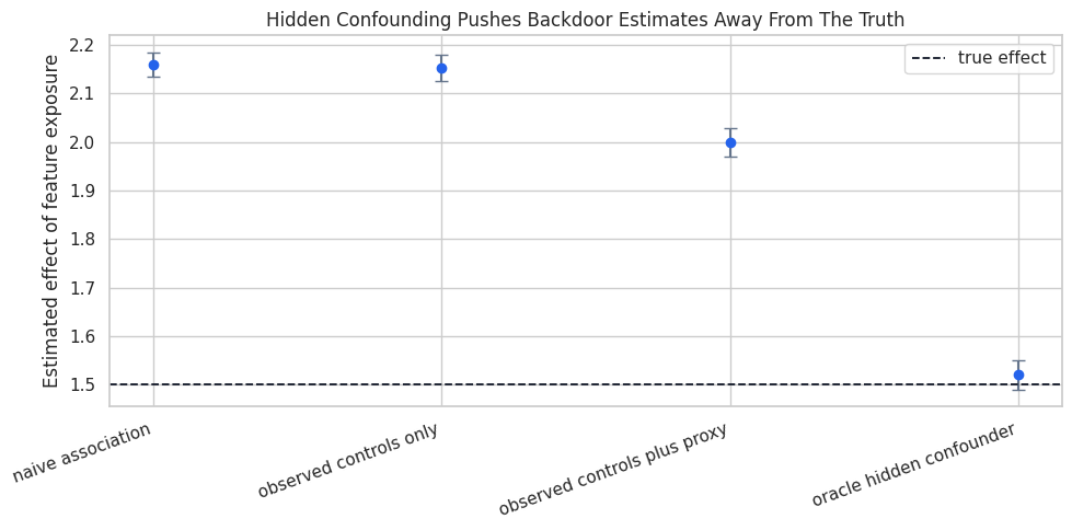
Compare Naive, Proxy, And Oracle Adjustment
This cell fits four simple linear regressions. The first is naive. The second adjusts for ordinary observed controls. The third also adjusts for a noisy proxy of the hidden cause. The fourth includes the hidden cause itself, which is not available in practice but helps us see the benchmark.
The important number is the coefficient on feature_exposure. Since the true effect is 1.50, estimates far above that value are picking up non-causal association from hidden motivation.
The oracle model is close to the true effect because it includes the real common cause. The other models are too high because exposure is partly a signal of latent motivation. A proxy helps somewhat, but a noisy proxy does not automatically make the backdoor path disappear.
Plot The Hidden-Confounding Bias
A plot makes the lesson more immediate. The dashed line is the true effect. Each point is the treatment coefficient from a different adjustment strategy.
This is why alternative identification strategies matter. If hidden confounding is plausible, adding more flexible models to the same observed covariates may make predictions better without making the causal effect credible.
Frontdoor Identification: The Idea
Frontdoor identification can work when the treatment-outcome relationship is confounded, but the treatment effect flows through a measured mediator.
For a treatment A, mediator M, outcome Y, and hidden confounder U, the core story is:
U affects A and Y, so the direct treatment-outcome association is confounded.
A affects M.
M affects Y.
All of the causal effect of A on Y flows through M.
There is no unblocked confounding between A and M.
After conditioning on A, there is no unblocked confounding between M and Y.
This is a strong design. It is useful to learn because it shows how a mediator can sometimes rescue identification when treatment assignment itself is confounded.
Frontdoor Assumption Checklist
This table translates the frontdoor design into practical questions. If these assumptions are not plausible, the estimate should be described as a sensitivity or teaching exercise rather than a credible causal conclusion.
frontdoor_assumptions = pd.DataFrame( [ {"condition": "Treatment affects the mediator","question to ask": "Does feature exposure clearly move engagement depth?", }, {"condition": "Mediator carries the treatment effect","question to ask": "Is there a direct path from exposure to future value that bypasses engagement depth?", }, {"condition": "No unblocked treatment-mediator confounding","question to ask": "Could a hidden variable affect both exposure and the mediator?", }, {"condition": "Mediator-outcome confounding is blocked after treatment","question to ask": "Once exposure is held fixed, are mediator and outcome still confounded by hidden causes?", }, ])frontdoor_assumptions.to_csv(TABLE_DIR /"06_frontdoor_assumptions.csv", index=False)display(frontdoor_assumptions)
condition
question to ask
0
Treatment affects the mediator
Does feature exposure clearly move engagement ...
1
Mediator carries the treatment effect
Is there a direct path from exposure to future...
2
No unblocked treatment-mediator confounding
Could a hidden variable affect both exposure a...
3
Mediator-outcome confounding is blocked after ...
Once exposure is held fixed, are mediator and ...
The checklist should be treated as part of the analysis, not as decoration. Frontdoor is persuasive only when the mediator has a believable structural role.
Simulate A Frontdoor Setting
The next data-generating process intentionally satisfies the frontdoor story. Hidden motivation confounds exposure and future value, but it does not affect the mediator directly. Exposure moves engagement_depth, and engagement_depth moves weekly_value. The true total effect is the product of those two path coefficients.
Unlike the hidden-confounding example, this dataset includes a mediator that was designed to carry the effect. The next cells estimate the effect through that mediator instead of trusting the raw exposure-outcome association.
Manual Linear Frontdoor Calculation
In this linear teaching setup, the frontdoor effect can be seen as two pieces:
Estimate how much feature_exposure changes engagement_depth.
Estimate how much engagement_depth changes weekly_value after controlling for feature_exposure.
Multiply the two pieces.
The multiplication is not the general frontdoor formula for every setting, but it is a clear linear special case that helps build intuition.
The naive exposure-outcome slope is biased because exposure carries hidden motivation. The product of the two frontdoor stages lands much closer to the true total effect because it uses the mediator path rather than the confounded direct association.
Identify The Frontdoor Estimand With DoWhy
Now we encode the same graph in DoWhy. Notice that unobserved_motivation appears in the graph but not in the dataframe. That is deliberate: the graph tells DoWhy that a hidden common cause exists, while the mediator supplies a possible frontdoor path.
Estimand type: EstimandType.NONPARAMETRIC_ATE

### Estimand : 1
Estimand name: backdoor
No such variable(s) found!

### Estimand : 2
Estimand name: iv
No such variable(s) found!

### Estimand : 3
Estimand name: frontdoor
Estimand expression:
 ⎡         d                               d                             ⎤
E⎢───────────────────(weeklyᵥₐₗᵤₑ)⋅──────────────────([engagement_depth])⎥
 ⎣d[engagement_depth]              d[featureₑₓₚₒₛᵤᵣₑ]                    ⎦
Estimand assumption 1, Full-mediation: engagement_depth intercepts (blocks) all directed paths from feature_exposure to w,e,e,k,l,y,_,v,a,l,u,e.
Estimand assumption 2, First-stage-unconfoundedness: If U→{feature_exposure} and U→{engagement_depth} then P(engagement_depth|feature_exposure,U) = P(engagement_depth|feature_exposure)
Estimand assumption 3, Second-stage-unconfoundedness: If U→{engagement_depth} and U→weekly_value then P(weekly_value|engagement_depth, feature_exposure, U) = P(weekly_value|engagement_depth, feature_exposure)

### Estimand : 4
Estimand name: general_adjustment
No such variable(s) found!
The identified estimand text is verbose because DoWhy is showing which symbolic paths are available. The key point is that DoWhy can find a frontdoor estimand even though the treatment-outcome relationship has an unobserved common cause.
Estimate The Frontdoor Effect With DoWhy
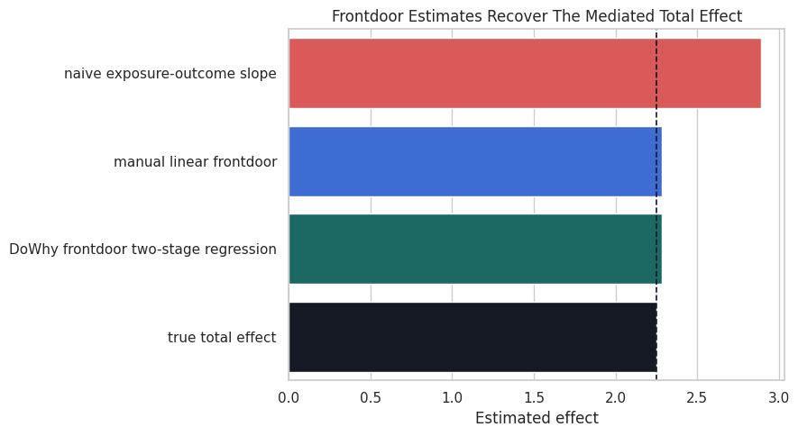
DoWhy’s frontdoor.two_stage_regression estimator implements the frontdoor strategy for this kind of teaching example. We compare it with the manual product and the known truth.
The DoWhy estimate lines up with the manual frontdoor calculation in this linear setting. That agreement is useful: the manual calculation teaches the mechanics, while the DoWhy workflow keeps the graph and estimand explicit.
Visualize The Frontdoor Comparison
The chart below separates the confounded naive slope from the frontdoor estimates and the known truth. This is the same lesson as before, but now the mediator gives us a credible route around hidden treatment-outcome confounding.
The naive bar is the warning sign. It answers an associational question, while the frontdoor bars target the mediated causal effect implied by the graph.
Instrumental Variables: The Idea
An instrumental variable is a source of treatment variation that is as-good-as-random with respect to the outcome, except through the treatment itself. A common teaching example is randomized encouragement: an assignment increases take-up, but assignment does not directly change the outcome.
For instrument Z, treatment A, outcome Y, and hidden confounder U, the core assumptions are:
Relevance:Z changes A.
Independence:Z is independent of hidden causes of Y.
Exclusion:Z affects Y only through A.
Monotonicity: if estimating a local average treatment effect, there are no systematic defiers.
This notebook focuses on the first three because they are the easiest to show in a compact simulation.
IV Assumption Checklist
The following table turns the IV assumptions into diagnostics and design questions. Only relevance is directly testable in the observed data. The other assumptions require design knowledge and careful argument.
iv_assumptions = pd.DataFrame( [ {"assumption": "Relevance","meaning": "The instrument changes treatment exposure","observable check": "First-stage coefficient and first-stage strength", }, {"assumption": "Independence","meaning": "The instrument is unrelated to hidden outcome causes","observable check": "Balance checks on observed pre-treatment covariates, plus design knowledge", }, {"assumption": "Exclusion","meaning": "The instrument has no direct effect on the outcome except through treatment","observable check": "Mostly a substantive argument; violated by direct messaging, information, or access paths", }, {"assumption": "Monotonicity","meaning": "The instrument does not push some units in the opposite direction","observable check": "Usually argued from the assignment mechanism and treatment take-up logic", }, ])iv_assumptions.to_csv(TABLE_DIR /"06_iv_assumptions.csv", index=False)display(iv_assumptions)
assumption
meaning
observable check
0
Relevance
The instrument changes treatment exposure
First-stage coefficient and first-stage strength
1
Independence
The instrument is unrelated to hidden outcome ...
Balance checks on observed pre-treatment covar...
2
Exclusion
The instrument has no direct effect on the out...
Mostly a substantive argument; violated by dir...
3
Monotonicity
The instrument does not push some units in the...
Usually argued from the assignment mechanism a...
The most common IV mistake is to celebrate a strong first stage while ignoring exclusion. A strong instrument can still be invalid if it changes the outcome through a second path.
Simulate An Encouragement Instrument
The next dataset has a randomized rollout_assignment that increases feature_exposure. Hidden motivation still affects both exposure and value, so ordinary regression is confounded. The instrument is valid because it is randomly assigned and has no direct path to weekly_value in the simulation.
Rows: 8,000
True treatment effect used in the simulation: 1.70
rollout_assignment
feature_exposure
weekly_value
0
1
2.0878
3.9934
1
1
1.6020
3.4766
2
1
3.2716
5.4254
3
1
1.7341
2.6352
4
0
1.7898
5.7876
The instrument is binary, while the treatment is continuous. That is a common encouragement design: assignment changes exposure intensity, but it does not perfectly determine exposure.
Check The First Stage And Reduced Form
The first stage estimates how much the instrument changes treatment. The reduced form estimates how much the instrument changes the outcome. The Wald IV estimate divides the reduced form by the first stage.
This ratio works in the simple single-instrument, single-treatment setting. It is a useful way to see what the IV estimator is doing before relying on any library abstraction.
The first stage is strong, and the Wald ratio is close to the true effect. The naive slope is too high because it mixes the treatment effect with hidden motivation.
A Simple Two-Stage Regression View
Two-stage least squares can be understood as replacing the confounded treatment with the part of treatment predicted by the instrument. In this simple example, that predicted exposure is a function of randomized assignment.
The point estimate below is a teaching implementation. Production IV analyses usually use dedicated IV routines for standard errors and richer specifications.
The simple two-stage point estimate matches the Wald ratio because there is one binary instrument and one continuous treatment. The important conceptual move is that the second stage uses only instrument-induced exposure variation.
Estimate The IV Effect With DoWhy
Now we encode the IV graph in DoWhy. The hidden variable is included in the graph and omitted from the dataframe, just as in the frontdoor example. The instrument is rollout_assignment.
Estimand type: EstimandType.NONPARAMETRIC_ATE

### Estimand : 1
Estimand name: backdoor
No such variable(s) found!

### Estimand : 2
Estimand name: iv
Estimand expression:
 ⎡                                                                             ↪
 ⎢          d                        ⎛          d                              ↪
E⎢─────────────────────(weeklyᵥₐₗᵤₑ)⋅⎜─────────────────────([featureₑₓₚₒₛᵤᵣₑ]) ↪
 ⎣d[rollout_assignment]              ⎝d[rollout_assignment]                    ↪

↪  -1⎤
↪ ⎞  ⎥
↪ ⎟  ⎥
↪ ⎠  ⎦
Estimand assumption 1, As-if-random: If U→→weekly_value then ¬(U →→{rollout_assignment})
Estimand assumption 2, Exclusion: If we remove {rollout_assignment}→{feature_exposure}, then ¬({rollout_assignment}→weekly_value)

### Estimand : 3
Estimand name: frontdoor
No such variable(s) found!

### Estimand : 4
Estimand name: general_adjustment
No such variable(s) found!
The estimand output should show that DoWhy recognizes the instrument. This is the model-identify step from the core DoWhy workflow, now applied to an IV design instead of a backdoor design.
Compare DoWhy IV With The Manual Estimates
The DoWhy IV estimator gives the same causal target in this simple setting. Comparing it with the manual Wald ratio is a useful sanity check.
The IV estimates line up because they are using the same assignment-driven variation. The naive slope remains different because it uses all variation in exposure, including the part driven by hidden motivation.
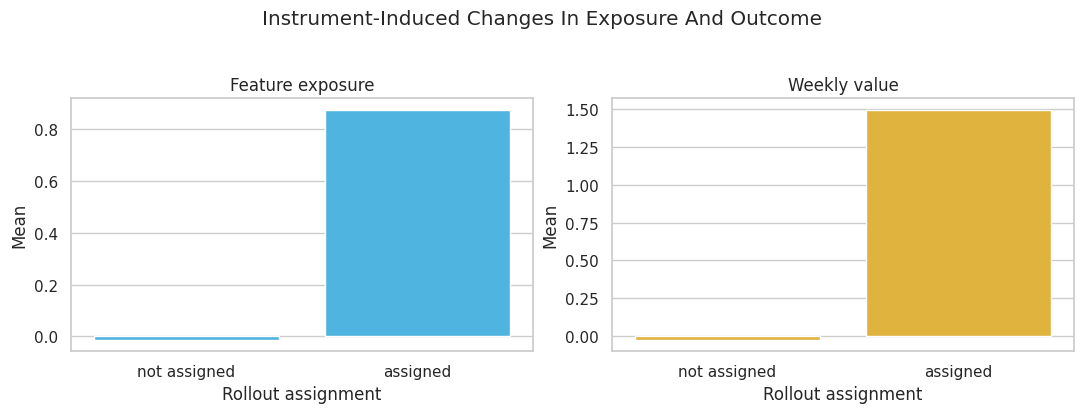
Visualize The Instrument’s First Stage
A valid instrument must move treatment. This plot shows the average exposure and average outcome by assignment group. The exposure jump is the first stage; the outcome jump is the reduced form.
The two bars for exposure should differ clearly. If an instrument barely changes treatment, the resulting IV estimate becomes unstable even if the graph is theoretically valid.
Natural Experiments: Design Before Estimator
Frontdoor and IV fit naturally into DoWhy’s identify-estimate API. Some natural-experiment designs are better introduced as design-specific analyses first.
The next two examples are intentionally transparent:
Regression discontinuity: a treatment rule changes sharply at a threshold.
Difference-in-differences: a treated group changes after treatment relative to an untreated comparison group.
The purpose here is to understand the estimand logic, not to replace specialized econometrics packages.
Regression Discontinuity Setup
In a fuzzy regression discontinuity design, crossing a cutoff changes treatment probability or treatment intensity, but does not perfectly determine treatment. The causal estimate near the cutoff is the outcome jump divided by the treatment jump.
The key assumption is local smoothness: units just below and just above the cutoff would have had similar potential outcomes if treatment exposure had not jumped.
Rows: 30,000
True local treatment effect used in the simulation: 1.35
running_score
threshold_assignment
feature_exposure
weekly_value
0
-0.5057
0
0.8723
1.6547
1
-1.6145
0
-0.8022
-0.6525
2
-1.6179
0
-0.2519
-1.1858
3
0.4025
1
1.1149
1.9999
4
0.2709
1
0.7904
1.9649
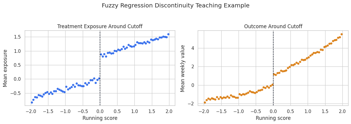
The treatment is continuous, and the cutoff changes its average level. The outcome also changes smoothly with the running score, so we need to compare units locally around the cutoff rather than across the entire score range.
Visualize The Cutoff
This binned scatterplot shows how treatment and outcome behave around the threshold. We bin the running score only for visualization. The estimation cell below uses the individual rows inside local bandwidths.
The treatment jump at zero is the design’s engine. The outcome jump is not by itself the treatment effect because exposure is fuzzy; the fuzzy RD estimate scales the outcome jump by the treatment jump.
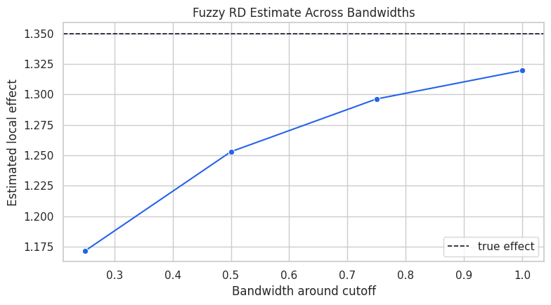
Estimate A Fuzzy RD Across Bandwidths
Bandwidth choice controls the locality of the comparison. A narrow bandwidth compares units very close to the cutoff but uses fewer rows. A wider bandwidth uses more rows but relies more heavily on the local linear model.
For each bandwidth, we estimate two jumps at the cutoff: one for the outcome and one for the treatment. The fuzzy RD estimate is outcome_jump / treatment_jump.
The estimates should cluster around the true effect. They are not identical because each bandwidth makes a slightly different locality tradeoff.
Plot RD Bandwidth Sensitivity
A bandwidth sensitivity plot is a compact way to show whether the design is fragile. If the estimate moves wildly as the bandwidth changes, the causal reading should become more cautious.
fig, ax = plt.subplots(figsize=(8, 4.5))sns.lineplot( data=rd_bandwidth_table, x="bandwidth", y="fuzzy_rd_estimate", marker="o", color="#2563eb", ax=ax,)ax.axhline(rd_true_effect, color="#111827", linestyle="--", linewidth=1.2, label="true effect")ax.set_title("Fuzzy RD Estimate Across Bandwidths")ax.set_xlabel("Bandwidth around cutoff")ax.set_ylabel("Estimated local effect")ax.legend()plt.tight_layout()fig.savefig(FIGURE_DIR /"06_rd_bandwidth_sensitivity.png", dpi=160, bbox_inches="tight")plt.show()
The curve is the design’s stability check. In real work, we would also inspect covariate balance around the cutoff, density manipulation, and alternative polynomial or local-linear specifications.
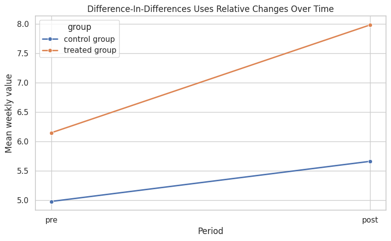
Difference-In-Differences Setup
Difference-in-differences compares changes over time. If the treated group and comparison group would have followed parallel trends without treatment, then the extra post-period change in the treated group can be read as the treatment effect.
The minimal two-period version has four cells: treated pre, treated post, control pre, and control post.
Rows: 8,000
Units: 4,000
True treatment effect used in the simulation: 1.20
unit_id
treated_group
post_period
treatment
weekly_value
0
0
0
0
0
1.3949
1
1
0
0
0
6.6459
2
2
0
0
0
4.7025
3
3
0
0
0
8.5818
4
4
1
0
0
5.4307
Each unit appears once before and once after. Treated units receive treatment only in the post period, so the treatment column is the interaction of treated group and post period.
Compute The Four DiD Cell Means
The simplest DiD estimate comes from four means. We calculate the treated change, the control change, and then subtract the two changes.
The treated group starts at a different level, which is allowed in DiD. The design uses differences in changes, not equality of pre-period levels.
Estimate DiD With A Regression Interaction
The standard two-period DiD regression includes group, time, and their interaction. The interaction coefficient equals the manual DiD estimate from the four-cell table.
The regression and manual estimate match because they are algebraically the same in this two-period setup. The regression form becomes more convenient when adding covariates, fixed effects, or more time periods.
Visualize The DiD Design
The parallel-trends idea is easiest to see as a line chart. The vertical distance between lines before treatment can differ. The causal claim is about whether the treated line would have moved like the control line in the absence of treatment.
The treated group rises more after treatment than the control group. Under the parallel-trends assumption, that extra rise is the causal effect.
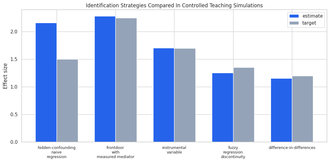
Compare The Designs
Now we combine the estimates from the notebook. These methods do not all estimate the exact same population estimand in real applications. Here, the simulations were built so that each design has a clear known target.
design_comparison = pd.DataFrame( [ {"design": "hidden-confounding naive regression","estimate": hidden_estimates.loc[hidden_estimates["model"] =="naive association", "estimate"].iloc[0],"target": hidden_true_effect,"main lesson": "Association is biased when hidden common causes drive treatment and outcome", }, {"design": "frontdoor with measured mediator","estimate": frontdoor_estimate.value,"target": frontdoor_true_effect,"main lesson": "A valid mediator can identify the total effect despite hidden treatment-outcome confounding", }, {"design": "instrumental variable","estimate": iv_dowhy_estimate.value,"target": iv_true_effect,"main lesson": "A valid instrument isolates assignment-driven treatment variation", }, {"design": "fuzzy regression discontinuity","estimate": rd_bandwidth_table.loc[rd_bandwidth_table["bandwidth"] ==0.50, "fuzzy_rd_estimate"].iloc[0],"target": rd_true_effect,"main lesson": "A cutoff can identify a local effect near the threshold", }, {"design": "difference-in-differences","estimate": did_regression.params["treated_group:post_period"],"target": did_true_effect,"main lesson": "A comparison-group trend can stand in for the treated group's missing counterfactual trend", }, ])design_comparison["error"] = design_comparison["estimate"] - design_comparison["target"]design_comparison.to_csv(TABLE_DIR /"06_design_comparison.csv", index=False)display(design_comparison)
design
estimate
target
main lesson
error
0
hidden-confounding naive regression
2.1598
1.5000
Association is biased when hidden common cause...
0.6598
1
frontdoor with measured mediator
2.2823
2.2500
A valid mediator can identify the total effect...
0.0323
2
instrumental variable
1.7072
1.7000
A valid instrument isolates assignment-driven ...
0.0072
3
fuzzy regression discontinuity
1.2530
1.3500
A cutoff can identify a local effect near the ...
-0.0970
4
difference-in-differences
1.1524
1.2000
A comparison-group trend can stand in for the ...
-0.0476
The table is a reminder that design quality matters more than estimator complexity. The right question is not only “what model did we fit?” but “what source of variation made the causal contrast believable?”
Final Figure: Estimates Versus Targets
This final plot puts each design next to its target. The hidden-confounding naive regression is included as a deliberate failure case. The other designs are not universally better; they work here because their assumptions were built into the data-generating process.
The visual contrast is useful when presenting the notebook: ordinary regression is not wrong because it is simple; it is wrong because the identifying variation is contaminated. Frontdoor, IV, RD, and DiD each try to locate cleaner variation under different assumptions.
Practical Checklist For Real Analyses
When using these designs outside a simulation, document the assumptions in plain language before showing the final number.
For frontdoor, explain why the mediator carries the treatment effect and why mediator-outcome confounding is controlled.
For IV, explain instrument relevance, independence, exclusion, and monotonicity.
For RD, show the cutoff rule, local balance, density around the cutoff, and bandwidth sensitivity.
For DiD, show pre-trends when possible and explain why the comparison group is credible.
For all designs, report what would make the estimate fail.
A strong causal notebook should make the identifying assumption easy to find, easy to criticize, and easy to connect to the estimator.
Practice Prompts
Use these prompts to extend the notebook:
Add a direct effect from feature_exposure to weekly_value in the frontdoor simulation. How quickly does the frontdoor estimate become misleading?
Add a direct effect from rollout_assignment to weekly_value in the IV simulation. Compare the naive, Wald, and DoWhy estimates.
In the RD simulation, let units manipulate the running score near zero. How does the cutoff plot change?
In the DiD simulation, give the treated group a faster untreated trend. How does the interaction coefficient change?
Write one paragraph for each design explaining the strongest assumption in language a non-technical stakeholder could challenge.
What Comes Next
The next tutorial moves from average effects to heterogeneous effects. Once we have credible identification, the natural follow-up is to ask whether the effect is larger for some units than others. That requires a new kind of care: heterogeneity models can be useful, but they should still sit on top of a clear causal design.