DoWhy Tutorial 04: Regression, Matching, And Propensity Estimators

This notebook compares several estimators for the same identified causal estimand. The goal is not to crown one estimator as universally best. The goal is to understand what each estimator is doing, what assumptions it leans on, and why estimates can differ even when the causal graph is unchanged.

We will use one observational teaching dataset, one causal graph, and one target estimand: the average total effect of feature_exposure on weekly_value. Then we will estimate that target with outcome regression, propensity-score matching, propensity-score stratification, and propensity-score weighting.

Learning Goals

By the end of this notebook, you should be able to:

  • Explain the difference between an estimand and an estimator.
  • Run manual versions of regression, matching, stratification, and weighting estimators.
  • Run the corresponding DoWhy estimators for a common backdoor estimand.
  • Diagnose basic estimator behavior using propensity overlap, covariate balance, and estimate stability.
  • Explain why estimator agreement is useful but does not prove the causal graph is correct.

Estimand Versus Estimator

The estimand is the causal quantity implied by the graph and assumptions. In this notebook, the estimand is the average treatment effect after adjusting for observed common causes.

The estimator is the statistical method used to compute that estimand from finite data. Regression, matching, stratification, and weighting can all target the same estimand, but they do so with different statistical machinery.

Setup

This setup cell imports the packages used in the notebook, creates output folders, fixes a random seed, and suppresses known third-party compatibility warnings. The warning policy keeps expected library chatter out of the student-facing notebook while preserving real execution errors.

from pathlib import Path
import os
import platform
import sys
import warnings

START_DIR = Path.cwd().resolve()
PROJECT_ROOT = next(
    (candidate for candidate in [START_DIR, *START_DIR.parents] if (candidate / "pyproject.toml").exists()),
    START_DIR,
)

NOTEBOOK_DIR = PROJECT_ROOT / "notebooks" / "tutorials" / "dowhy"
OUTPUT_DIR = NOTEBOOK_DIR / "outputs"
FIGURE_DIR = OUTPUT_DIR / "figures"
TABLE_DIR = OUTPUT_DIR / "tables"
CACHE_DIR = PROJECT_ROOT / ".cache" / "matplotlib"

for directory in [OUTPUT_DIR, FIGURE_DIR, TABLE_DIR, CACHE_DIR]:
    directory.mkdir(parents=True, exist_ok=True)

os.environ.setdefault("MPLCONFIGDIR", str(CACHE_DIR))

warnings.filterwarnings("default")
warnings.filterwarnings("ignore", category=DeprecationWarning)
warnings.filterwarnings("ignore", category=PendingDeprecationWarning)
warnings.filterwarnings("ignore", category=FutureWarning)
warnings.filterwarnings("ignore", message=".*IProgress not found.*")
warnings.filterwarnings("ignore", message=".*setParseAction.*deprecated.*")
warnings.filterwarnings("ignore", message=".*copy keyword is deprecated.*")
warnings.filterwarnings("ignore", message=".*disp.*iprint.*L-BFGS-B.*")
warnings.filterwarnings("ignore", module="dowhy.causal_estimators.regression_estimator")
warnings.filterwarnings("ignore", module="sklearn.linear_model._logistic")
warnings.filterwarnings("ignore", module="seaborn.categorical")
warnings.filterwarnings("ignore", module="pydot.dot_parser")

import numpy as np
import pandas as pd
import matplotlib.pyplot as plt
import seaborn as sns
import networkx as nx
import statsmodels.formula.api as smf

from sklearn.linear_model import LogisticRegression
from sklearn.metrics import roc_auc_score
from sklearn.neighbors import NearestNeighbors
from sklearn.pipeline import make_pipeline
from sklearn.preprocessing import StandardScaler

import dowhy
from dowhy import CausalModel

RANDOM_SEED = 41
rng = np.random.default_rng(RANDOM_SEED)

sns.set_theme(style="whitegrid", context="notebook")

print(f"Python executable: {sys.executable}")
print(f"Python version: {platform.python_version()}")
print(f"DoWhy version: {getattr(dowhy, '__version__', 'unknown')}")
print(f"Notebook directory: {NOTEBOOK_DIR}")
print(f"Output directory: {OUTPUT_DIR}")
Python executable: /home/apex/Documents/ranking_sys/.venv/bin/python3
Python version: 3.13.12
DoWhy version: 0.14
Notebook directory: /home/apex/Documents/ranking_sys/notebooks/tutorials/dowhy
Output directory: /home/apex/Documents/ranking_sys/notebooks/tutorials/dowhy/outputs

The notebook is ready if this cell prints a DoWhy version. All generated artifacts from this notebook use a 04_ prefix.

Estimator Map

Before creating data, it helps to name the estimator families. This table gives a student-friendly summary of what each method is trying to do.

estimator_map = pd.DataFrame(
    [
        {
            "estimator_family": "Outcome regression",
            "basic_idea": "Model the outcome as a function of treatment and confounders.",
            "main_strength": "Simple and interpretable when the outcome model is credible.",
            "main_failure_mode": "Can be biased if the outcome model is misspecified.",
        },
        {
            "estimator_family": "Propensity-score matching",
            "basic_idea": "Compare treated and untreated units with similar treatment probabilities.",
            "main_strength": "Makes treated-control comparability intuitive.",
            "main_failure_mode": "Can be noisy or biased when matches are poor or overlap is weak.",
        },
        {
            "estimator_family": "Propensity-score stratification",
            "basic_idea": "Compare treated and untreated units within propensity-score strata.",
            "main_strength": "Easy to inspect and explain.",
            "main_failure_mode": "Sensitive to bin choices and sparse cells.",
        },
        {
            "estimator_family": "Propensity-score weighting",
            "basic_idea": "Reweight units by inverse treatment probability to reduce observed confounding.",
            "main_strength": "Targets population-level effects directly when propensities are reliable.",
            "main_failure_mode": "Extreme weights can create high variance and fragile estimates.",
        },
    ]
)

estimator_map.to_csv(TABLE_DIR / "04_estimator_map.csv", index=False)
estimator_map
estimator_family basic_idea main_strength main_failure_mode
0 Outcome regression Model the outcome as a function of treatment a... Simple and interpretable when the outcome mode... Can be biased if the outcome model is misspeci...
1 Propensity-score matching Compare treated and untreated units with simil... Makes treated-control comparability intuitive. Can be noisy or biased when matches are poor o...
2 Propensity-score stratification Compare treated and untreated units within pro... Easy to inspect and explain. Sensitive to bin choices and sparse cells.
3 Propensity-score weighting Reweight units by inverse treatment probabilit... Targets population-level effects directly when... Extreme weights can create high variance and f...

All four methods still rely on the same causal assumption: after adjusting for observed common causes, treatment is as-if randomized. The estimator does not rescue a wrong graph.

Causal Question And Variable Roles

The teaching question is:

What is the average total effect of feature_exposure on weekly_value?

The variables below are all pre-treatment common causes except the treatment, outcome, and simulation-only treatment probability.

role_table = pd.DataFrame(
    [
        {"variable": "feature_exposure", "role": "treatment", "timing": "treatment time", "used_for_adjustment": "no; this is the treatment"},
        {"variable": "weekly_value", "role": "outcome", "timing": "future outcome window", "used_for_adjustment": "no; this is the outcome"},
        {"variable": "user_engagement", "role": "observed common cause", "timing": "pre-treatment", "used_for_adjustment": "yes"},
        {"variable": "prior_sessions", "role": "observed common cause", "timing": "pre-treatment", "used_for_adjustment": "yes"},
        {"variable": "account_age_weeks", "role": "observed common cause", "timing": "pre-treatment", "used_for_adjustment": "yes"},
        {"variable": "is_power_user", "role": "observed common cause", "timing": "pre-treatment", "used_for_adjustment": "yes"},
        {"variable": "baseline_value", "role": "observed common cause", "timing": "pre-treatment", "used_for_adjustment": "yes"},
        {"variable": "treatment_probability", "role": "simulation diagnostic", "timing": "known only because this is simulated", "used_for_adjustment": "no; not a real observed column"},
    ]
)

role_table.to_csv(TABLE_DIR / "04_variable_roles.csv", index=False)
role_table
variable role timing used_for_adjustment
0 feature_exposure treatment treatment time no; this is the treatment
1 weekly_value outcome future outcome window no; this is the outcome
2 user_engagement observed common cause pre-treatment yes
3 prior_sessions observed common cause pre-treatment yes
4 account_age_weeks observed common cause pre-treatment yes
5 is_power_user observed common cause pre-treatment yes
6 baseline_value observed common cause pre-treatment yes
7 treatment_probability simulation diagnostic known only because this is simulated no; not a real observed column

The adjustment set is deliberately straightforward: all adjustment variables are pre-treatment common causes. This lets the notebook focus on estimator mechanics rather than bad-control mistakes.

Create A Teaching Dataset

This dataset is observational: treatment assignment depends on baseline variables. The true effect is constant and known because this is a simulation. That gives us a benchmark for comparing estimators.

def make_estimator_teaching_data(n=4_500, seed=41):
    local_rng = np.random.default_rng(seed)

    user_engagement = local_rng.normal(loc=0.0, scale=1.0, size=n)
    prior_sessions = np.clip(
        local_rng.poisson(lam=np.exp(1.0 + 0.23 * user_engagement), size=n),
        0,
        30,
    )
    account_age_weeks = local_rng.gamma(shape=2.2, scale=3.5, size=n)
    is_power_user = local_rng.binomial(
        n=1,
        p=1 / (1 + np.exp(-(0.70 * user_engagement - 0.20))),
        size=n,
    )
    baseline_value = (
        2.0
        + 1.00 * user_engagement
        + 0.050 * prior_sessions
        + 0.020 * account_age_weeks
        + 0.550 * is_power_user
        + local_rng.normal(loc=0.0, scale=1.0, size=n)
    )

    treatment_logit = (
        -0.65
        + 0.80 * user_engagement
        + 0.040 * prior_sessions
        + 0.200 * baseline_value
        + 0.450 * is_power_user
        - 0.015 * account_age_weeks
    )
    treatment_probability = 1 / (1 + np.exp(-treatment_logit))
    feature_exposure = local_rng.binomial(n=1, p=treatment_probability, size=n)

    true_ate = 1.65
    weekly_value = (
        4.0
        + true_ate * feature_exposure
        + 1.15 * user_engagement
        + 0.055 * prior_sessions
        + 0.030 * account_age_weeks
        + 0.550 * baseline_value
        + 0.450 * is_power_user
        + local_rng.normal(loc=0.0, scale=1.15, size=n)
    )

    df = pd.DataFrame(
        {
            "feature_exposure": feature_exposure,
            "weekly_value": weekly_value,
            "user_engagement": user_engagement,
            "prior_sessions": prior_sessions,
            "account_age_weeks": account_age_weeks,
            "is_power_user": is_power_user,
            "baseline_value": baseline_value,
            "treatment_probability": treatment_probability,
        }
    )
    return df, true_ate

estimator_df, TRUE_ATE = make_estimator_teaching_data()
estimator_df.to_csv(TABLE_DIR / "04_estimator_teaching_dataset.csv", index=False)

print(f"Rows: {len(estimator_df):,}")
print(f"Known true ATE: {TRUE_ATE:.4f}")
estimator_df.head()
Rows: 4,500
Known true ATE: 1.6500
feature_exposure weekly_value user_engagement prior_sessions account_age_weeks is_power_user baseline_value treatment_probability
0 0 2.012963 -1.231665 2 11.291630 1 0.390388 0.232075
1 0 5.894137 0.267119 4 8.218280 0 2.583502 0.529247
2 0 5.865394 -0.006926 4 19.840561 0 1.635882 0.385570
3 1 8.297606 0.501535 3 3.476287 0 4.670994 0.679894
4 1 6.857627 -1.326728 6 15.562224 0 2.764735 0.240148

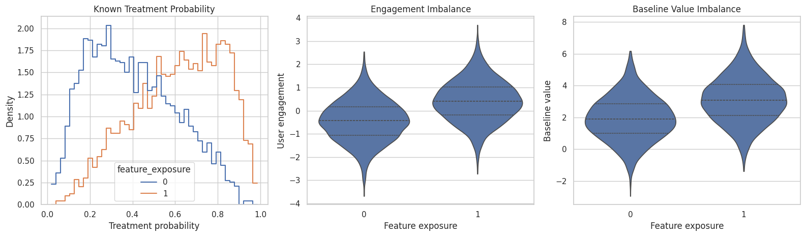
The first rows show the treatment, outcome, common causes, and known assignment probability. In real data, the true treatment probability would usually be unknown, so we will also estimate a propensity model.

Basic Dataset Checks

Before fitting estimators, inspect treatment prevalence, outcome scale, covariate ranges, and the treatment-probability range.

basic_summary = estimator_df.agg(
    {
        "feature_exposure": ["mean", "sum"],
        "weekly_value": ["mean", "std", "min", "max"],
        "user_engagement": ["mean", "std", "min", "max"],
        "prior_sessions": ["mean", "std", "min", "max"],
        "account_age_weeks": ["mean", "std", "min", "max"],
        "is_power_user": ["mean", "sum"],
        "baseline_value": ["mean", "std", "min", "max"],
        "treatment_probability": ["mean", "std", "min", "max"],
    }
).T

basic_summary.to_csv(TABLE_DIR / "04_dataset_summary.csv")
basic_summary
mean sum std min max
feature_exposure 0.511556 2302.0 NaN NaN NaN
weekly_value 6.841887 NaN 2.717787 -2.672389 15.225523
user_engagement 0.002319 NaN 0.987011 -3.678627 3.688559
prior_sessions 2.757333 NaN 1.761446 0.000000 13.000000
account_age_weeks 7.611833 NaN 5.280117 0.151001 63.187628
is_power_user 0.452667 2037.0 NaN NaN NaN
baseline_value 2.546050 NaN 1.532906 -2.954430 7.818962
treatment_probability 0.510979 NaN 0.232225 0.019354 0.985849

The treatment rate is close enough to balanced for all four estimator families to be meaningful. The treatment-probability range shows some tails, which is useful for teaching weighting and matching behavior.

Confirm Observed Confounding

This plot shows that treatment assignment is not random. Exposed users tend to have different baseline engagement and baseline value.

fig, axes = plt.subplots(1, 3, figsize=(16, 4.8))

sns.histplot(
    data=estimator_df,
    x="treatment_probability",
    hue="feature_exposure",
    bins=45,
    stat="density",
    common_norm=False,
    element="step",
    fill=False,
    ax=axes[0],
)
axes[0].set_title("Known Treatment Probability")
axes[0].set_xlabel("Treatment probability")
axes[0].set_ylabel("Density")

sns.violinplot(data=estimator_df, x="feature_exposure", y="user_engagement", inner="quartile", cut=0, ax=axes[1])
axes[1].set_title("Engagement Imbalance")
axes[1].set_xlabel("Feature exposure")
axes[1].set_ylabel("User engagement")

sns.violinplot(data=estimator_df, x="feature_exposure", y="baseline_value", inner="quartile", cut=0, ax=axes[2])
axes[2].set_title("Baseline Value Imbalance")
axes[2].set_xlabel("Feature exposure")
axes[2].set_ylabel("Baseline value")

plt.tight_layout()
fig.savefig(FIGURE_DIR / "04_assignment_and_confounding_checks.png", dpi=160, bbox_inches="tight")
plt.show()

The treated and untreated groups differ before treatment. That is why all estimators in this notebook target an adjusted effect rather than a raw difference in means.

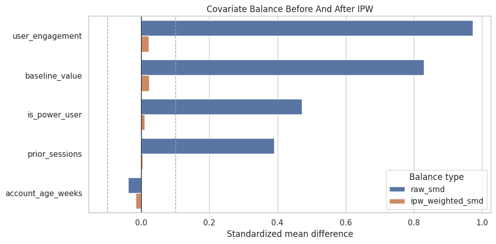
Baseline Imbalance Table

Standardized mean differences summarize baseline imbalance in standard-deviation units. We will use the same metric later to compare raw and weighted balance.

confounder_cols = ["user_engagement", "prior_sessions", "account_age_weeks", "is_power_user", "baseline_value"]

def weighted_mean(values, weights):
    values = np.asarray(values)
    weights = np.asarray(weights)
    return np.sum(values * weights) / np.sum(weights)

def weighted_var(values, weights):
    values = np.asarray(values)
    weights = np.asarray(weights)
    mean = weighted_mean(values, weights)
    return np.sum(weights * (values - mean) ** 2) / np.sum(weights)

def standardized_mean_difference(df, column, treatment_col="feature_exposure", weights=None):
    treated_mask = df[treatment_col].to_numpy() == 1
    values = df[column].to_numpy()
    if weights is None:
        treated_values = values[treated_mask]
        control_values = values[~treated_mask]
        pooled_sd = np.sqrt((treated_values.var(ddof=1) + control_values.var(ddof=1)) / 2)
        return (treated_values.mean() - control_values.mean()) / pooled_sd

    weights = np.asarray(weights)
    treated_mean = weighted_mean(values[treated_mask], weights[treated_mask])
    control_mean = weighted_mean(values[~treated_mask], weights[~treated_mask])
    treated_var = weighted_var(values[treated_mask], weights[treated_mask])
    control_var = weighted_var(values[~treated_mask], weights[~treated_mask])
    pooled_sd = np.sqrt((treated_var + control_var) / 2)
    return (treated_mean - control_mean) / pooled_sd

raw_balance = pd.DataFrame(
    [
        {"covariate": column, "raw_smd": standardized_mean_difference(estimator_df, column)}
        for column in confounder_cols
    ]
).sort_values("raw_smd", key=lambda s: s.abs(), ascending=False)

raw_balance.to_csv(TABLE_DIR / "04_raw_covariate_balance.csv", index=False)
raw_balance
covariate raw_smd
0 user_engagement 0.973071
4 baseline_value 0.830520
3 is_power_user 0.471878
1 prior_sessions 0.390748
2 account_age_weeks -0.038578

Large absolute values mean exposed and unexposed users differ on that covariate. Matching, stratification, and weighting are all different attempts to reduce the consequences of this imbalance.

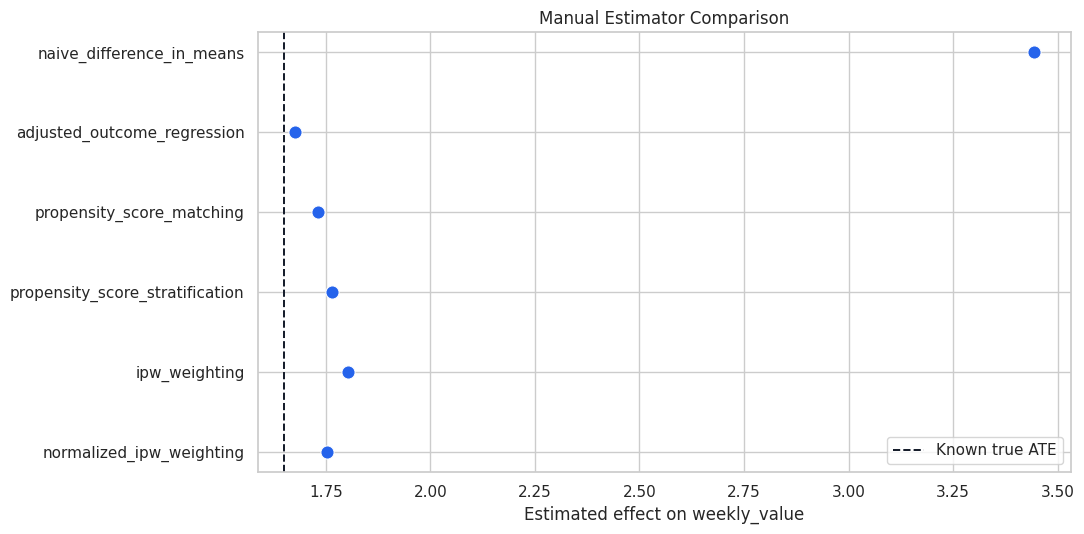
Naive Difference And Outcome Regression

We start with two simple baselines: the naive treated-minus-control difference and an adjusted regression. The adjusted regression controls for the observed common causes named in the graph.

naive_effect = (
    estimator_df.loc[estimator_df["feature_exposure"] == 1, "weekly_value"].mean()
    - estimator_df.loc[estimator_df["feature_exposure"] == 0, "weekly_value"].mean()
)

regression_formula = (
    "weekly_value ~ feature_exposure + user_engagement + prior_sessions "
    "+ account_age_weeks + is_power_user + baseline_value"
)
regression_fit = smf.ols(formula=regression_formula, data=estimator_df).fit()
regression_effect = regression_fit.params["feature_exposure"]
regression_ci = regression_fit.conf_int().loc["feature_exposure"].to_numpy()

regression_baseline = pd.DataFrame(
    [
        {"estimator": "known_true_ate", "estimate": TRUE_ATE, "ci_95_lower": np.nan, "ci_95_upper": np.nan, "description": "Known only because this is a teaching simulation."},
        {"estimator": "naive_difference_in_means", "estimate": naive_effect, "ci_95_lower": np.nan, "ci_95_upper": np.nan, "description": "Unadjusted association; confounding is not blocked."},
        {"estimator": "adjusted_outcome_regression", "estimate": regression_effect, "ci_95_lower": regression_ci[0], "ci_95_upper": regression_ci[1], "description": "Backdoor adjustment through a linear outcome model."},
    ]
)

regression_baseline.to_csv(TABLE_DIR / "04_regression_baseline_estimates.csv", index=False)
regression_baseline
estimator estimate ci_95_lower ci_95_upper description
0 known_true_ate 1.650000 NaN NaN Known only because this is a teaching simulation.
1 naive_difference_in_means 3.442531 NaN NaN Unadjusted association; confounding is not blo...
2 adjusted_outcome_regression 1.675725 1.600592 1.750857 Backdoor adjustment through a linear outcome m...

The naive difference is inflated because exposed users are stronger at baseline. The adjusted regression moves much closer to the known ATE because it blocks the observed backdoor paths.

Estimate Propensity Scores

Propensity-score methods first model the probability of treatment given observed common causes. The propensity score compresses multiple confounders into one balancing score.

This cell estimates propensities with logistic regression. We clip very small or very large estimated probabilities to keep manual weighting stable for teaching.

X = estimator_df[confounder_cols]
y_treatment = estimator_df["feature_exposure"]

propensity_model = make_pipeline(
    StandardScaler(),
    LogisticRegression(max_iter=1_000, random_state=RANDOM_SEED),
)
propensity_model.fit(X, y_treatment)

estimated_propensity = propensity_model.predict_proba(X)[:, 1]
clipped_propensity = np.clip(estimated_propensity, 0.02, 0.98)

scored_df = estimator_df.copy()
scored_df["estimated_propensity"] = estimated_propensity
scored_df["clipped_propensity"] = clipped_propensity

propensity_summary = pd.DataFrame(
    [
        {"metric": "propensity_model_auc", "value": roc_auc_score(y_treatment, estimated_propensity)},
        {"metric": "estimated_propensity_min", "value": estimated_propensity.min()},
        {"metric": "estimated_propensity_max", "value": estimated_propensity.max()},
        {"metric": "clipped_propensity_min", "value": clipped_propensity.min()},
        {"metric": "clipped_propensity_max", "value": clipped_propensity.max()},
    ]
)

propensity_summary.to_csv(TABLE_DIR / "04_propensity_model_summary.csv", index=False)
propensity_summary
metric value
0 propensity_model_auc 0.765052
1 estimated_propensity_min 0.019625
2 estimated_propensity_max 0.984895
3 clipped_propensity_min 0.020000
4 clipped_propensity_max 0.980000

A high AUC means the observed covariates are predictive of treatment. That is not automatically good or bad; it tells us treatment was not random. Very extreme propensities would be a warning for matching and weighting.
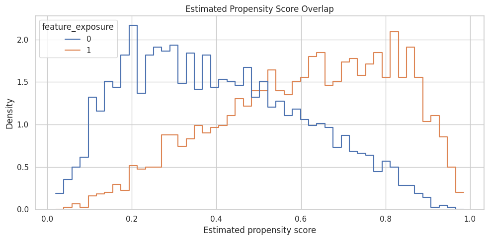
Propensity Overlap

This plot shows whether treated and untreated users occupy similar regions of the estimated propensity-score distribution. Strong overlap makes propensity methods more credible; weak overlap means some units have poor comparisons.

fig, ax = plt.subplots(figsize=(10, 5))
sns.histplot(
    data=scored_df,
    x="estimated_propensity",
    hue="feature_exposure",
    bins=50,
    stat="density",
    common_norm=False,
    element="step",
    fill=False,
    ax=ax,
)
ax.set_title("Estimated Propensity Score Overlap")
ax.set_xlabel("Estimated propensity score")
ax.set_ylabel("Density")
plt.tight_layout()
fig.savefig(FIGURE_DIR / "04_propensity_overlap.png", dpi=160, bbox_inches="tight")
plt.show()

The distributions overlap enough for this teaching example, but the tails are worth noticing. The next notebook will go deeper on overlap, common support, and extreme weights.

Manual Matching Estimator

Matching creates treated-control comparisons among units with similar propensity scores. Here we use one-nearest-neighbor matching on the estimated propensity score.

To approximate an ATE rather than only an ATT, we match treated units to controls and controls to treated units, then average the implied individual contrasts.

treated_df = scored_df.loc[scored_df["feature_exposure"] == 1].copy()
control_df = scored_df.loc[scored_df["feature_exposure"] == 0].copy()

treated_ps = treated_df[["estimated_propensity"]].to_numpy()
control_ps = control_df[["estimated_propensity"]].to_numpy()

control_matcher = NearestNeighbors(n_neighbors=1)
control_matcher.fit(control_ps)
treated_to_control_distance, treated_to_control_index = control_matcher.kneighbors(treated_ps)
matched_control_outcome = control_df["weekly_value"].to_numpy()[treated_to_control_index[:, 0]]
att_estimate = (treated_df["weekly_value"].to_numpy() - matched_control_outcome).mean()

treated_matcher = NearestNeighbors(n_neighbors=1)
treated_matcher.fit(treated_ps)
control_to_treated_distance, control_to_treated_index = treated_matcher.kneighbors(control_ps)
matched_treated_outcome = treated_df["weekly_value"].to_numpy()[control_to_treated_index[:, 0]]
atc_estimate = (matched_treated_outcome - control_df["weekly_value"].to_numpy()).mean()

manual_matching_ate = scored_df["feature_exposure"].mean() * att_estimate + (1 - scored_df["feature_exposure"].mean()) * atc_estimate

matching_summary = pd.DataFrame(
    [
        {"quantity": "ATT from treated-to-control matching", "estimate": att_estimate},
        {"quantity": "ATC from control-to-treated matching", "estimate": atc_estimate},
        {"quantity": "ATE weighted from ATT and ATC", "estimate": manual_matching_ate},
        {"quantity": "Mean treated-to-control propensity distance", "estimate": treated_to_control_distance.mean()},
        {"quantity": "Mean control-to-treated propensity distance", "estimate": control_to_treated_distance.mean()},
    ]
)

matching_summary.to_csv(TABLE_DIR / "04_manual_matching_summary.csv", index=False)
matching_summary
quantity estimate
0 ATT from treated-to-control matching 1.725263
1 ATC from control-to-treated matching 1.739918
2 ATE weighted from ATT and ATC 1.732422
3 Mean treated-to-control propensity distance 0.000656
4 Mean control-to-treated propensity distance 0.000495

The matching estimate should be much closer to the true effect than the naive difference. The match-distance rows are simple diagnostics: smaller distances mean treated and untreated units were compared at more similar propensities.

Manual Stratification Estimator

Stratification divides the sample into propensity-score bins, compares treated and untreated users inside each bin, and averages those within-bin differences.

This is a useful bridge between matching and weighting because it makes the balancing logic very visible.

stratified_df = scored_df.copy()
stratified_df["propensity_stratum"] = pd.qcut(
    stratified_df["estimated_propensity"],
    q=10,
    duplicates="drop",
)

stratum_rows = []
for stratum, group in stratified_df.groupby("propensity_stratum", observed=True):
    treated_group = group.loc[group["feature_exposure"] == 1]
    control_group = group.loc[group["feature_exposure"] == 0]
    if len(treated_group) == 0 or len(control_group) == 0:
        continue
    effect = treated_group["weekly_value"].mean() - control_group["weekly_value"].mean()
    stratum_rows.append(
        {
            "stratum": str(stratum),
            "rows": len(group),
            "treated_rows": len(treated_group),
            "control_rows": len(control_group),
            "mean_propensity": group["estimated_propensity"].mean(),
            "within_stratum_effect": effect,
        }
    )

stratum_effects = pd.DataFrame(stratum_rows)
manual_stratification_ate = np.average(stratum_effects["within_stratum_effect"], weights=stratum_effects["rows"])

stratum_effects.to_csv(TABLE_DIR / "04_stratification_effects_by_stratum.csv", index=False)
print(f"Manual stratification ATE: {manual_stratification_ate:.4f}")
stratum_effects
Manual stratification ATE: 1.7656
stratum rows treated_rows control_rows mean_propensity within_stratum_effect
0 (0.0186, 0.197] 450 57 393 0.137476 2.065986
1 (0.197, 0.284] 450 111 339 0.241153 1.683068
2 (0.284, 0.362] 450 151 299 0.321175 1.436624
3 (0.362, 0.44] 450 179 271 0.400964 1.465293
4 (0.44, 0.513] 450 216 234 0.476063 1.782675
5 (0.513, 0.586] 450 250 200 0.548276 1.844546
6 (0.586, 0.659] 450 281 169 0.622910 1.614906
7 (0.659, 0.742] 450 305 145 0.700100 1.792125
8 (0.742, 0.828] 450 349 101 0.784780 1.706804
9 (0.828, 0.985] 450 403 47 0.882742 2.264248

Each stratum creates a local treated-versus-control comparison among units with similar estimated propensities. If a stratum has very few treated or control units, the estimate for that stratum becomes fragile.

Manual Weighting Estimator

Inverse propensity weighting gives each observed unit a weight based on how surprising its treatment status was. Treated units get weight 1 / e(X), and untreated units get weight 1 / (1 - e(X)).

This cell computes both a plain IPW ATE and a normalized, or self-normalized, IPW estimate.

treatment = scored_df["feature_exposure"].to_numpy()
outcome = scored_df["weekly_value"].to_numpy()
propensity = scored_df["clipped_propensity"].to_numpy()

ipw_weights = treatment / propensity + (1 - treatment) / (1 - propensity)
scored_df["ipw_weight"] = ipw_weights

manual_ipw_ate = np.mean(treatment * outcome / propensity - (1 - treatment) * outcome / (1 - propensity))
manual_normalized_ipw_ate = (
    np.sum(treatment * outcome / propensity) / np.sum(treatment / propensity)
    - np.sum((1 - treatment) * outcome / (1 - propensity)) / np.sum((1 - treatment) / (1 - propensity))
)

weight_summary = pd.DataFrame(
    [
        {"metric": "manual_ipw_ate", "value": manual_ipw_ate},
        {"metric": "manual_normalized_ipw_ate", "value": manual_normalized_ipw_ate},
        {"metric": "mean_ipw_weight", "value": ipw_weights.mean()},
        {"metric": "max_ipw_weight", "value": ipw_weights.max()},
        {"metric": "p99_ipw_weight", "value": np.quantile(ipw_weights, 0.99)},
    ]
)

weight_summary.to_csv(TABLE_DIR / "04_manual_weighting_summary.csv", index=False)
weight_summary
metric value
0 manual_ipw_ate 1.802791
1 manual_normalized_ipw_ate 1.753315
2 mean_ipw_weight 1.992565
3 max_ipw_weight 24.004464
4 p99_ipw_weight 7.173259

The plain IPW and normalized IPW estimates can differ because normalization reduces sensitivity to weight scale. The maximum and p99 weights are early warnings about variance; the next notebook will inspect weights more deeply.

Covariate Balance After Weighting

A weighting estimator should reduce imbalance in observed confounders. This table compares raw standardized mean differences to IPW-weighted standardized mean differences.

weighted_balance = pd.DataFrame(
    [
        {
            "covariate": column,
            "raw_smd": standardized_mean_difference(scored_df, column),
            "ipw_weighted_smd": standardized_mean_difference(scored_df, column, weights=scored_df["ipw_weight"].to_numpy()),
        }
        for column in confounder_cols
    ]
)
weighted_balance["absolute_raw_smd"] = weighted_balance["raw_smd"].abs()
weighted_balance["absolute_weighted_smd"] = weighted_balance["ipw_weighted_smd"].abs()
weighted_balance = weighted_balance.sort_values("absolute_raw_smd", ascending=False)

weighted_balance.to_csv(TABLE_DIR / "04_weighted_covariate_balance.csv", index=False)
weighted_balance
covariate raw_smd ipw_weighted_smd absolute_raw_smd absolute_weighted_smd
0 user_engagement 0.973071 0.022206 0.973071 0.022206
4 baseline_value 0.830520 0.023212 0.830520 0.023212
3 is_power_user 0.471878 0.009249 0.471878 0.009249
1 prior_sessions 0.390748 0.003591 0.390748 0.003591
2 account_age_weeks -0.038578 -0.017259 0.038578 0.017259

The weighted SMDs should be closer to zero than the raw SMDs. That is the practical balancing purpose of propensity weighting.

Visualize Balance Before And After Weighting

This plot shows whether inverse propensity weighting reduced covariate imbalance.

balance_plot_df = weighted_balance.melt(
    id_vars="covariate",
    value_vars=["raw_smd", "ipw_weighted_smd"],
    var_name="balance_type",
    value_name="smd",
)

fig, ax = plt.subplots(figsize=(10, 5))
sns.barplot(
    data=balance_plot_df,
    x="smd",
    y="covariate",
    hue="balance_type",
    ax=ax,
)
ax.axvline(0, color="#111827", linewidth=1)
ax.axvline(0.1, color="#9ca3af", linestyle="--", linewidth=1)
ax.axvline(-0.1, color="#9ca3af", linestyle="--", linewidth=1)
ax.set_title("Covariate Balance Before And After IPW")
ax.set_xlabel("Standardized mean difference")
ax.set_ylabel("")
ax.legend(title="Balance type")
plt.tight_layout()
fig.savefig(FIGURE_DIR / "04_weighted_covariate_balance.png", dpi=160, bbox_inches="tight")
plt.show()

The weighted bars should shrink toward zero. If they did not, we would revisit the propensity model, overlap, or the causal design itself.

Manual Estimator Comparison

This table gathers the manual estimators into one place and compares them to the known true ATE.

manual_estimator_comparison = pd.DataFrame(
    [
        {"estimator": "known_true_ate", "estimate": TRUE_ATE, "notes": "Simulation benchmark."},
        {"estimator": "naive_difference_in_means", "estimate": naive_effect, "notes": "No adjustment; confounded association."},
        {"estimator": "adjusted_outcome_regression", "estimate": regression_effect, "notes": "Outcome model with observed common causes."},
        {"estimator": "propensity_score_matching", "estimate": manual_matching_ate, "notes": "Nearest-neighbor matching on estimated propensity."},
        {"estimator": "propensity_score_stratification", "estimate": manual_stratification_ate, "notes": "Weighted average of within-stratum effects."},
        {"estimator": "ipw_weighting", "estimate": manual_ipw_ate, "notes": "Plain inverse propensity weighted ATE."},
        {"estimator": "normalized_ipw_weighting", "estimate": manual_normalized_ipw_ate, "notes": "Self-normalized inverse propensity weighted ATE."},
    ]
)
manual_estimator_comparison["absolute_error_vs_true_ate"] = (manual_estimator_comparison["estimate"] - TRUE_ATE).abs()

manual_estimator_comparison.to_csv(TABLE_DIR / "04_manual_estimator_comparison.csv", index=False)
manual_estimator_comparison
estimator estimate notes absolute_error_vs_true_ate
0 known_true_ate 1.650000 Simulation benchmark. 0.000000
1 naive_difference_in_means 3.442531 No adjustment; confounded association. 1.792531
2 adjusted_outcome_regression 1.675725 Outcome model with observed common causes. 0.025725
3 propensity_score_matching 1.732422 Nearest-neighbor matching on estimated propens... 0.082422
4 propensity_score_stratification 1.765627 Weighted average of within-stratum effects. 0.115627
5 ipw_weighting 1.802791 Plain inverse propensity weighted ATE. 0.152791
6 normalized_ipw_weighting 1.753315 Self-normalized inverse propensity weighted ATE. 0.103315

The adjusted estimators should be much closer to the known ATE than the naive comparison. They will not be identical because each method uses a different finite-sample approximation.

Plot Manual Estimator Comparison

This plot makes the estimator comparison easier to scan. The dashed vertical line marks the known ATE.

plot_manual = manual_estimator_comparison.query("estimator != 'known_true_ate'").copy()

fig, ax = plt.subplots(figsize=(11, 5.5))
sns.scatterplot(
    data=plot_manual,
    x="estimate",
    y="estimator",
    s=90,
    color="#2563eb",
    ax=ax,
)
ax.axvline(TRUE_ATE, color="#111827", linestyle="--", linewidth=1.4, label="Known true ATE")
ax.set_title("Manual Estimator Comparison")
ax.set_xlabel("Estimated effect on weekly_value")
ax.set_ylabel("")
ax.legend(loc="lower right")
plt.tight_layout()
fig.savefig(FIGURE_DIR / "04_manual_estimator_comparison.png", dpi=160, bbox_inches="tight")
plt.show()

Estimator disagreement is not automatically a failure. It is a diagnostic prompt: inspect overlap, model specification, matching quality, and whether all estimators are really targeting the same population estimand.

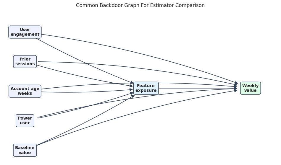
Create The DoWhy Causal Graph

Now we move from manual estimators to DoWhy estimators. The graph states that all baseline variables are common causes of treatment and outcome.

estimator_edges = [
    ("user_engagement", "feature_exposure"),
    ("user_engagement", "weekly_value"),
    ("prior_sessions", "feature_exposure"),
    ("prior_sessions", "weekly_value"),
    ("account_age_weeks", "feature_exposure"),
    ("account_age_weeks", "weekly_value"),
    ("is_power_user", "feature_exposure"),
    ("is_power_user", "weekly_value"),
    ("baseline_value", "feature_exposure"),
    ("baseline_value", "weekly_value"),
    ("feature_exposure", "weekly_value"),
]

def edges_to_dot(edges):
    lines = ["digraph {"]
    for source, target in edges:
        lines.append(f"    {source} -> {target};")
    lines.append("}")
    return chr(10).join(lines)

estimator_graph = edges_to_dot(estimator_edges)
print(estimator_graph)
digraph {
    user_engagement -> feature_exposure;
    user_engagement -> weekly_value;
    prior_sessions -> feature_exposure;
    prior_sessions -> weekly_value;
    account_age_weeks -> feature_exposure;
    account_age_weeks -> weekly_value;
    is_power_user -> feature_exposure;
    is_power_user -> weekly_value;
    baseline_value -> feature_exposure;
    baseline_value -> weekly_value;
    feature_exposure -> weekly_value;
}

This is the same backdoor graph for every DoWhy estimator below. The graph and estimand stay fixed; only the statistical estimator changes.

Visualize The Estimator Graph

This graph is intentionally simpler than the previous notebook’s graph. Every baseline covariate is a common cause, and the treatment points to the outcome.

node_positions = {
    "user_engagement": (0.08, 0.88),
    "prior_sessions": (0.08, 0.68),
    "account_age_weeks": (0.08, 0.48),
    "is_power_user": (0.08, 0.28),
    "baseline_value": (0.08, 0.08),
    "feature_exposure": (0.52, 0.50),
    "weekly_value": (0.90, 0.50),
}

node_labels = {
    "user_engagement": "User\nengagement",
    "prior_sessions": "Prior\nsessions",
    "account_age_weeks": "Account age\nweeks",
    "is_power_user": "Power\nuser",
    "baseline_value": "Baseline\nvalue",
    "feature_exposure": "Feature\nexposure",
    "weekly_value": "Weekly\nvalue",
}

node_colors = {node: "#eef2ff" for node in node_positions}
node_colors["feature_exposure"] = "#e0f2fe"
node_colors["weekly_value"] = "#dcfce7"

fig, ax = plt.subplots(figsize=(12, 6.5))
ax.set_xlim(0, 1)
ax.set_ylim(0, 1)
ax.set_axis_off()

for source, target in estimator_edges:
    rad = 0.04 if target == "feature_exposure" else -0.06 if source != "feature_exposure" else 0.0
    ax.annotate(
        "",
        xy=node_positions[target],
        xytext=node_positions[source],
        arrowprops=dict(
            arrowstyle="-|>",
            color="#334155",
            linewidth=1.25,
            mutation_scale=15,
            shrinkA=32,
            shrinkB=32,
            connectionstyle=f"arc3,rad={rad}",
        ),
        zorder=1,
    )

for node, (x, y) in node_positions.items():
    ax.text(
        x,
        y,
        node_labels[node],
        ha="center",
        va="center",
        fontsize=10,
        fontweight="bold",
        bbox=dict(boxstyle="round,pad=0.44", facecolor=node_colors[node], edgecolor="#334155", linewidth=1.1),
        zorder=2,
    )

ax.set_title("Common Backdoor Graph For Estimator Comparison", pad=18)
fig.savefig(FIGURE_DIR / "04_estimator_comparison_dag.png", dpi=160, bbox_inches="tight")
plt.show()

The graph clarifies why all estimators should adjust for the same baseline variables. If the graph changed, the estimand could change too.

Identify The Common Estimand With DoWhy

This cell creates a DoWhy CausalModel and identifies the backdoor estimand. We inspect the common causes before estimating.

dowhy_df = estimator_df.drop(columns=["treatment_probability"]).copy()

estimator_model = CausalModel(
    data=dowhy_df,
    treatment="feature_exposure",
    outcome="weekly_value",
    graph=estimator_graph,
)

model_metadata = pd.DataFrame(
    [
        {"component": "common_causes_reported_by_DoWhy", "value": ", ".join(estimator_model.get_common_causes())},
        {"component": "instruments_reported_by_DoWhy", "value": ", ".join(estimator_model.get_instruments()) or "none detected"},
        {"component": "effect_modifiers_reported_by_DoWhy", "value": ", ".join(estimator_model.get_effect_modifiers()) or "none detected"},
    ]
)

identified_estimand = estimator_model.identify_effect(proceed_when_unidentifiable=True)

model_metadata.to_csv(TABLE_DIR / "04_dowhy_model_metadata.csv", index=False)
model_metadata
component value
0 common_causes_reported_by_DoWhy user_engagement, prior_sessions, account_age_w...
1 instruments_reported_by_DoWhy none detected
2 effect_modifiers_reported_by_DoWhy none detected

The detected common causes match the graph. That is the key checkpoint before comparing estimators.

Run DoWhy Estimators

DoWhy provides estimator names for regression, matching, stratification, and weighting. This cell runs all four against the same identified estimand.

dowhy_estimator_specs = [
    ("dowhy_linear_regression", "backdoor.linear_regression"),
    ("dowhy_propensity_score_matching", "backdoor.propensity_score_matching"),
    ("dowhy_propensity_score_stratification", "backdoor.propensity_score_stratification"),
    ("dowhy_propensity_score_weighting", "backdoor.propensity_score_weighting"),
]

dowhy_rows = []
for label, method_name in dowhy_estimator_specs:
    try:
        estimate = estimator_model.estimate_effect(identified_estimand, method_name=method_name)
        dowhy_rows.append(
            {
                "estimator": label,
                "method_name": method_name,
                "estimate": float(estimate.value),
                "absolute_error_vs_true_ate": abs(float(estimate.value) - TRUE_ATE),
                "status": "ok",
            }
        )
    except Exception as exc:
        dowhy_rows.append(
            {
                "estimator": label,
                "method_name": method_name,
                "estimate": np.nan,
                "absolute_error_vs_true_ate": np.nan,
                "status": f"failed: {exc}",
            }
        )

dowhy_estimator_comparison = pd.DataFrame(dowhy_rows)
dowhy_estimator_comparison.to_csv(TABLE_DIR / "04_dowhy_estimator_comparison.csv", index=False)
dowhy_estimator_comparison
estimator method_name estimate absolute_error_vs_true_ate status
0 dowhy_linear_regression backdoor.linear_regression 1.675725 0.025725 ok
1 dowhy_propensity_score_matching backdoor.propensity_score_matching 1.734642 0.084642 ok
2 dowhy_propensity_score_stratification backdoor.propensity_score_stratification 1.644848 0.005152 ok
3 dowhy_propensity_score_weighting backdoor.propensity_score_weighting 1.758190 0.108190 ok

The DoWhy estimates should be near the true effect and much closer than the naive association. Differences across estimators reflect finite-sample behavior and estimator-specific modeling choices.

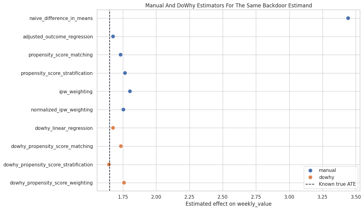
Manual And DoWhy Estimates Side By Side

This table combines the manual and DoWhy estimates. The exact manual and DoWhy values may differ because the internal implementations are not identical, but they should tell a similar causal story.

manual_for_join = manual_estimator_comparison.assign(source="manual")[["source", "estimator", "estimate", "absolute_error_vs_true_ate"]]
dowhy_for_join = dowhy_estimator_comparison.assign(source="dowhy")[["source", "estimator", "estimate", "absolute_error_vs_true_ate"]]

all_estimator_comparison = pd.concat([manual_for_join, dowhy_for_join], ignore_index=True)
all_estimator_comparison.to_csv(TABLE_DIR / "04_all_estimator_comparison.csv", index=False)
all_estimator_comparison
source estimator estimate absolute_error_vs_true_ate
0 manual known_true_ate 1.650000 0.000000
1 manual naive_difference_in_means 3.442531 1.792531
2 manual adjusted_outcome_regression 1.675725 0.025725
3 manual propensity_score_matching 1.732422 0.082422
4 manual propensity_score_stratification 1.765627 0.115627
5 manual ipw_weighting 1.802791 0.152791
6 manual normalized_ipw_weighting 1.753315 0.103315
7 dowhy dowhy_linear_regression 1.675725 0.025725
8 dowhy dowhy_propensity_score_matching 1.734642 0.084642
9 dowhy dowhy_propensity_score_stratification 1.644848 0.005152
10 dowhy dowhy_propensity_score_weighting 1.758190 0.108190

The combined table is the main result of the notebook. A good causal workflow asks whether the estimator family changes the conclusion enough to affect the decision.

Plot All Estimator Results

This plot compares all estimates against the known true ATE. In real data the true ATE is unavailable, but this plot style is still useful with a reference estimate or sensitivity band.

plot_all = all_estimator_comparison.query("estimator != 'known_true_ate'").copy()

fig, ax = plt.subplots(figsize=(12, 7))
sns.scatterplot(
    data=plot_all,
    x="estimate",
    y="estimator",
    hue="source",
    s=90,
    ax=ax,
)
ax.axvline(TRUE_ATE, color="#111827", linestyle="--", linewidth=1.4, label="Known true ATE")
ax.set_title("Manual And DoWhy Estimators For The Same Backdoor Estimand")
ax.set_xlabel("Estimated effect on weekly_value")
ax.set_ylabel("")
ax.legend(loc="lower right")
plt.tight_layout()
fig.savefig(FIGURE_DIR / "04_all_estimator_comparison.png", dpi=160, bbox_inches="tight")
plt.show()

The adjusted estimators cluster near the true effect, while the naive estimate is far away. This is the central practical lesson: the causal graph and adjustment logic matter more than the surface sophistication of the estimator.

Estimator Choice Guide

This table turns the comparison into practical guidance. It is not a rigid rulebook, but it helps students choose a reasonable first estimator and know what to check next.

estimator_choice_guide = pd.DataFrame(
    [
        {
            "situation": "Need a transparent first estimate",
            "reasonable_start": "Outcome regression",
            "what_to_check": "Model specification, residual patterns, and whether treatment effect is plausibly constant.",
        },
        {
            "situation": "Want intuitive treated-control comparisons",
            "reasonable_start": "Propensity-score matching",
            "what_to_check": "Match distances, unmatched regions, and whether matching changes the target population.",
        },
        {
            "situation": "Want a simple propensity-based diagnostic table",
            "reasonable_start": "Propensity-score stratification",
            "what_to_check": "Treated/control counts and effect stability inside strata.",
        },
        {
            "situation": "Want a population-level weighted contrast",
            "reasonable_start": "Propensity-score weighting",
            "what_to_check": "Overlap, extreme weights, and weighted covariate balance.",
        },
        {
            "situation": "Estimators disagree materially",
            "reasonable_start": "Do not average them blindly",
            "what_to_check": "Graph assumptions, overlap, model misspecification, outliers, and target population differences.",
        },
    ]
)

estimator_choice_guide.to_csv(TABLE_DIR / "04_estimator_choice_guide.csv", index=False)
estimator_choice_guide
situation reasonable_start what_to_check
0 Need a transparent first estimate Outcome regression Model specification, residual patterns, and wh...
1 Want intuitive treated-control comparisons Propensity-score matching Match distances, unmatched regions, and whethe...
2 Want a simple propensity-based diagnostic table Propensity-score stratification Treated/control counts and effect stability in...
3 Want a population-level weighted contrast Propensity-score weighting Overlap, extreme weights, and weighted covaria...
4 Estimators disagree materially Do not average them blindly Graph assumptions, overlap, model misspecifica...

The right response to estimator disagreement is investigation, not automatic ensemble averaging. Estimators are diagnostic lenses on the same causal design.

Final Summary

This final table gives a compact report-ready summary of the notebook’s causal result.

final_summary = pd.DataFrame(
    [
        {"item": "Causal question", "summary": "Average total effect of feature exposure on weekly value."},
        {"item": "Identified estimand", "summary": "Backdoor-adjusted ATE using observed pre-treatment common causes."},
        {"item": "Known true ATE", "summary": f"{TRUE_ATE:.3f}"},
        {"item": "Naive estimate", "summary": f"{naive_effect:.3f}; inflated because treated users are stronger at baseline."},
        {"item": "Adjusted regression estimate", "summary": f"{regression_effect:.3f}"},
        {"item": "Manual matching estimate", "summary": f"{manual_matching_ate:.3f}"},
        {"item": "Manual stratification estimate", "summary": f"{manual_stratification_ate:.3f}"},
        {"item": "Manual normalized IPW estimate", "summary": f"{manual_normalized_ipw_ate:.3f}"},
        {"item": "Main diagnostic", "summary": "Adjusted estimators cluster near the true effect and improve sharply over the naive comparison."},
        {"item": "Main limitation", "summary": "All estimates still depend on the observed-confounding assumption and adequate overlap."},
    ]
)

final_summary.to_csv(TABLE_DIR / "04_final_estimator_summary.csv", index=False)
final_summary
item summary
0 Causal question Average total effect of feature exposure on we...
1 Identified estimand Backdoor-adjusted ATE using observed pre-treat...
2 Known true ATE 1.650
3 Naive estimate 3.443; inflated because treated users are stro...
4 Adjusted regression estimate 1.676
5 Manual matching estimate 1.732
6 Manual stratification estimate 1.766
7 Manual normalized IPW estimate 1.753
8 Main diagnostic Adjusted estimators cluster near the true effe...
9 Main limitation All estimates still depend on the observed-con...

The final summary separates the causal claim from the estimator mechanics. That is the habit to preserve: report the graph assumptions, the estimand, the estimators, and the diagnostics together.

Student Exercises

Try these after running the notebook:

  1. Increase the strength of confounding in the treatment assignment equation and watch the naive estimate move farther away.
  2. Reduce sample size and see which estimators become noisier.
  3. Change the number of propensity strata from 10 to 5 or 20.
  4. Match on all standardized covariates instead of only the propensity score.
  5. Remove clipping in the IPW estimator and inspect the maximum weight.
  6. Add a nonlinear outcome term and compare how regression and propensity estimators respond.

Closing Notes

This notebook showed that multiple estimators can target the same identified causal effect. Regression, matching, stratification, and weighting are different ways to operationalize the same backdoor logic.

The next tutorial will focus more deeply on weighting, overlap, common support, and why extreme propensity scores can make causal estimates fragile.