from pathlib import Path
import warnings

import matplotlib.pyplot as plt
import numpy as np
import pandas as pd
import seaborn as sns
from IPython.display import display

from lightgbm import LGBMClassifier
from sklearn.base import clone
from sklearn.compose import ColumnTransformer
from sklearn.linear_model import LogisticRegression
from sklearn.metrics import average_precision_score, brier_score_loss, log_loss, roc_auc_score
from sklearn.model_selection import StratifiedKFold
from sklearn.pipeline import Pipeline
from sklearn.preprocessing import OneHotEncoder, StandardScaler

warnings.filterwarnings("ignore", category=FutureWarning)
warnings.filterwarnings("ignore", message="X does not have valid feature names")

pd.set_option("display.max_columns", 120)
pd.set_option("display.max_rows", 120)
pd.set_option("display.float_format", lambda value: f"{value:,.4f}")

sns.set_theme(style="whitegrid", context="notebook")
RANDOM_STATE = 42Notebook 03: Time-Varying Confounding and Propensity Weights
Notebook 01 turned KuaiRec into a sequential user-day panel. Notebook 02 defined the primary causal estimand:
Among active KuaiRec user-days with sufficient prior history and 7-day follow-up, estimate the effect of a high-watch-exposure day on future 7-day interaction volume.
This notebook handles the next causal-design problem: treatment assignment is not random. A user is more likely to have a high-watch-exposure day when their recent history, preferences, activity level, and calendar context make that kind of day more likely. Those same pre-treatment factors can also predict future engagement. That is the classic time-varying confounding problem in recommender systems.
The goal of this notebook is to estimate the probability of treatment from pre-treatment information, diagnose overlap and positivity, and create stabilized inverse probability weights. These weights are the handoff to the next notebook, where we can fit a marginal structural model for the long-term treatment effect.
Why This Notebook Matters
A naive comparison asks whether treated user-days have higher future engagement than untreated user-days. That comparison is easy, but it is not causal. The recommender and the user are both dynamic:
- prior engagement affects today’s exposure pattern;
- today’s exposure pattern may affect future engagement;
- prior engagement also directly predicts future engagement;
- therefore, prior engagement confounds the treatment-outcome relationship.
This notebook models the treatment assignment process using only information available before the treatment day. If the model can predict treatment from prior state, that is evidence that treatment was selected rather than randomized. The resulting propensity scores let us construct inverse probability weights that make treated and control user-days more comparable on observed histories.
Setup
The first code cell imports tools for data handling, visualization, propensity modeling, model evaluation, and weight diagnostics. Logistic regression is used as the primary transparent propensity model. LightGBM is included as a flexible comparison model to check whether nonlinear treatment assignment changes the overlap story.
The modeling environment is ready. The imports cover both interpretable and flexible propensity models, which lets the notebook compare stability against model complexity before choosing weights.
Locate the Estimand Panel
Notebook 02 saved a modeling-ready estimand panel. This notebook starts from that file rather than rebuilding the KuaiRec sequence data. That keeps the workflow modular: the first two notebooks define the data and estimand, while this notebook focuses on treatment assignment.
ESTIMAND_PANEL_RELATIVE_PATH = Path("data/processed/kuairec_long_term_estimand_panel.parquet")

candidate_roots = [Path.cwd(), *Path.cwd().parents]
PROJECT_ROOT = next(
    (path for path in candidate_roots if (path / ESTIMAND_PANEL_RELATIVE_PATH).exists()),
    None,
)

if PROJECT_ROOT is None:
    raise FileNotFoundError(
        f"Could not find {ESTIMAND_PANEL_RELATIVE_PATH}. Run Notebook 02 first or run this notebook inside the project."
    )

PROCESSED_DIR = PROJECT_ROOT / "data" / "processed"
PANEL_PATH = PROJECT_ROOT / ESTIMAND_PANEL_RELATIVE_PATH

print(f"Project root: {PROJECT_ROOT}")
print(f"Input panel: {PANEL_PATH}")
print(f"Processed output folder: {PROCESSED_DIR}")
Project root: /home/apex/Documents/ranking_sys
Input panel: /home/apex/Documents/ranking_sys/data/processed/kuairec_long_term_estimand_panel.parquet
Processed output folder: /home/apex/Documents/ranking_sys/data/processedThe notebook found the long-term causal effects estimand panel and the processed-output folder. The next cell can now load the exact population defined in Notebook 02 without changing the causal target.
Load the Estimand Panel
The estimand panel already contains standardized treatment and outcome columns. Here, treatment = 1 means the user-day had high-watch exposure, and outcome is future 7-day interaction volume. The cell also sorts the panel by user and date so all time-based diagnostics are easy to read.
panel = pd.read_parquet(PANEL_PATH)
panel["event_date"] = pd.to_datetime(panel["event_date"])
panel = panel.sort_values(["user_id", "event_date"]).reset_index(drop=True)

print(f"Panel shape: {panel.shape}")
print(f"Users: {panel['user_id'].nunique():,}")
print(f"Date range: {panel['event_date'].min().date()} to {panel['event_date'].max().date()}")

display(panel.head())
Panel shape: (4698, 30)
Users: 91
Date range: 2020-07-08 to 2020-08-29| user_id | event_date | day_of_week | calendar_day_index | panel_day_index | active_day | treatment_high_watch_exposure | future_7day_interactions | future_7day_active_days | future_7day_avg_daily_interactions | future_7day_play_hours | log1p_future_7day_interactions | treatment_high_intensity | treatment_overcompletion_exposure | treatment_high_watch_time | lag_1_active_day | lag_1_interactions | lag_1_total_play_duration_sec | lag_1_avg_watch_ratio | lag_1_high_watch_share | prior_3day_active_day | prior_3day_interactions | prior_3day_total_play_duration_sec | prior_3day_avg_watch_ratio | prior_3day_high_watch_share | treatment | outcome | outcome_log1p | primary_treatment_name | primary_outcome_name | |
|---|---|---|---|---|---|---|---|---|---|---|---|---|---|---|---|---|---|---|---|---|---|---|---|---|---|---|---|---|---|---|
| 0 | 14 | 2020-07-08 | Wednesday | 3 | 3 | 1 | 1 | 279.0000 | 7.0000 | 39.8571 | 0.7500 | 5.6348 | 0 | 1 | 0 | 1.0000 | 78.0000 | 655.4890 | 0.8415 | 0.4615 | 3.0000 | 127.0000 | 1,144.8080 | 2.9900 | 1.5602 | 1 | 279.0000 | 5.6348 | treatment_high_watch_exposure | future_7day_interactions |
| 1 | 14 | 2020-07-09 | Thursday | 4 | 4 | 1 | 0 | 311.0000 | 7.0000 | 44.4286 | 0.8534 | 5.7430 | 0 | 0 | 0 | 1.0000 | 22.0000 | 201.9010 | 0.9828 | 0.5000 | 3.0000 | 123.0000 | 1,105.7340 | 2.8883 | 1.4833 | 0 | 311.0000 | 5.7430 | treatment_high_watch_exposure | future_7day_interactions |
| 2 | 14 | 2020-07-10 | Friday | 5 | 5 | 1 | 1 | 352.0000 | 7.0000 | 50.2857 | 0.9198 | 5.8665 | 0 | 1 | 0 | 1.0000 | 55.0000 | 485.0390 | 0.8619 | 0.3636 | 3.0000 | 155.0000 | 1,342.4290 | 2.6862 | 1.3252 | 1 | 352.0000 | 5.8665 | treatment_high_watch_exposure | future_7day_interactions |
| 3 | 14 | 2020-07-11 | Saturday | 6 | 6 | 1 | 1 | 437.0000 | 7.0000 | 62.4286 | 1.1297 | 6.0822 | 0 | 0 | 0 | 1.0000 | 52.0000 | 606.2440 | 1.1380 | 0.5769 | 3.0000 | 129.0000 | 1,293.1840 | 2.9827 | 1.4406 | 1 | 437.0000 | 6.0822 | treatment_high_watch_exposure | future_7day_interactions |
| 4 | 14 | 2020-07-12 | Sunday | 7 | 7 | 1 | 0 | 437.0000 | 7.0000 | 62.4286 | 1.1754 | 6.0822 | 0 | 0 | 0 | 1.0000 | 32.0000 | 284.7470 | 0.9337 | 0.5000 | 3.0000 | 139.0000 | 1,376.0300 | 2.9336 | 1.4406 | 0 | 437.0000 | 6.0822 | treatment_high_watch_exposure | future_7day_interactions |
The loaded panel is the final analysis population from Notebook 02. Because every row is already eligible for the primary estimand, every diagnostic in this notebook speaks directly to the treatment and outcome we plan to estimate.
Re-State the Treatment, Outcome, and Allowed Covariates
This cell creates a compact design table. The most important rule is that the propensity model may use only pre-treatment information. Same-day treatment labels and future outcomes are not allowed as covariates because they would leak post-treatment information into the adjustment process.
PRIMARY_TREATMENT = "treatment"
PRIMARY_OUTCOME = "outcome"

numeric_covariates = [
    "lag_1_active_day",
    "lag_1_interactions",
    "lag_1_total_play_duration_sec",
    "lag_1_avg_watch_ratio",
    "lag_1_high_watch_share",
    "prior_3day_active_day",
    "prior_3day_interactions",
    "prior_3day_total_play_duration_sec",
    "prior_3day_avg_watch_ratio",
    "prior_3day_high_watch_share",
    "calendar_day_index",
    "panel_day_index",
]

categorical_covariates = ["day_of_week"]
propensity_features = numeric_covariates + categorical_covariates

design_table = pd.DataFrame(
    [
        {"role": "treatment", "columns": PRIMARY_TREATMENT, "description": "High-watch-exposure day selected in Notebook 02."},
        {"role": "outcome", "columns": PRIMARY_OUTCOME, "description": "Future 7-day interaction volume."},
        {"role": "numeric pre-treatment covariates", "columns": ", ".join(numeric_covariates), "description": "Prior user state and calendar progression."},
        {"role": "categorical pre-treatment covariates", "columns": ", ".join(categorical_covariates), "description": "Calendar context available before treatment."},
    ]
)

display(design_table)| role | columns | description | |
|---|---|---|---|
| 0 | treatment | treatment | High-watch-exposure day selected in Notebook 02. |
| 1 | outcome | outcome | Future 7-day interaction volume. |
| 2 | numeric pre-treatment covariates | lag_1_active_day, lag_1_interactions, lag_1_to... | Prior user state and calendar progression. |
| 3 | categorical pre-treatment covariates | day_of_week | Calendar context available before treatment. |
The design table separates treatment, outcome, and adjustment features. This separation is what makes the propensity model causal-design machinery rather than just another predictive model.
Check Treatment and Outcome Scale
Before modeling treatment assignment, we confirm the basic treatment rate and outcome distribution. A balanced treatment is easier to model than a rare one, and a non-degenerate outcome is needed for the later marginal structural model.
basic_estimand_summary = pd.DataFrame(
    [
        {"metric": "rows", "value": len(panel)},
        {"metric": "users", "value": panel["user_id"].nunique()},
        {"metric": "treatment_rate", "value": panel[PRIMARY_TREATMENT].mean()},
        {"metric": "control_rows", "value": int((panel[PRIMARY_TREATMENT] == 0).sum())},
        {"metric": "treated_rows", "value": int((panel[PRIMARY_TREATMENT] == 1).sum())},
        {"metric": "outcome_mean", "value": panel[PRIMARY_OUTCOME].mean()},
        {"metric": "outcome_std", "value": panel[PRIMARY_OUTCOME].std()},
        {"metric": "outcome_min", "value": panel[PRIMARY_OUTCOME].min()},
        {"metric": "outcome_max", "value": panel[PRIMARY_OUTCOME].max()},
    ]
)

display(basic_estimand_summary)| metric | value | |
|---|---|---|
| 0 | rows | 4,698.0000 |
| 1 | users | 91.0000 |
| 2 | treatment_rate | 0.4996 |
| 3 | control_rows | 2,351.0000 |
| 4 | treated_rows | 2,347.0000 |
| 5 | outcome_mean | 382.0826 |
| 6 | outcome_std | 156.3942 |
| 7 | outcome_min | 0.0000 |
| 8 | outcome_max | 888.0000 |
The treatment is close to balanced and the future-interaction outcome has substantial variation. That makes this a reasonable setting for propensity modeling and later weighted outcome regression.
Naive Treated-Control Difference
This table repeats the raw treated-versus-control comparison within the final estimand population. It is intentionally naive: it does not adjust for prior engagement. We keep it here as a reference point so later weighting diagnostics can be interpreted against the unadjusted story.
naive_group_summary = (
    panel.groupby(PRIMARY_TREATMENT)[PRIMARY_OUTCOME]
    .agg(["count", "mean", "std", "min", "median", "max"])
    .rename_axis("treatment")
)

naive_difference = naive_group_summary.loc[1, "mean"] - naive_group_summary.loc[0, "mean"]
naive_lift = naive_difference / naive_group_summary.loc[0, "mean"]

print(f"Naive treated-control difference: {naive_difference:,.3f} future interactions")
print(f"Naive relative lift: {naive_lift:.2%}")
display(naive_group_summary)
Naive treated-control difference: 7.075 future interactions
Naive relative lift: 1.87%| count | mean | std | min | median | max | |
|---|---|---|---|---|---|---|
| treatment | ||||||
| 0 | 2351 | 378.5479 | 157.6583 | 18.0000 | 380.0000 | 888.0000 |
| 1 | 2347 | 385.6233 | 155.0705 | 0.0000 | 402.0000 | 851.0000 |
The naive comparison gives the unadjusted difference in future engagement. It is useful as a baseline, but it does not answer the causal question because treatment days may already differ in their prior histories.
Time-Varying Confounding Map
The next cell states the confounding logic in table form. Each row links a pre-treatment variable to the treatment assignment process and to the future outcome. The same prior behavior can influence both, which is why adjustment is needed.
confounding_map = pd.DataFrame(
    [
        {
            "pre_treatment_state": "lag_1_interactions",
            "why_it_predicts_treatment": "Recently active users are more likely to generate high-watch exposure days.",
            "why_it_predicts_outcome": "Recently active users are also more likely to interact over the next week.",
        },
        {
            "pre_treatment_state": "prior_3day_interactions",
            "why_it_predicts_treatment": "A short recent history of heavy use can influence the content and sessions observed today.",
            "why_it_predicts_outcome": "Recent heavy use is a strong signal of future engagement volume.",
        },
        {
            "pre_treatment_state": "prior_3day_avg_watch_ratio",
            "why_it_predicts_treatment": "Users with recent high watch ratios may be more likely to have another high-watch day.",
            "why_it_predicts_outcome": "Recent satisfaction can predict continued future engagement.",
        },
        {
            "pre_treatment_state": "calendar_day_index / day_of_week",
            "why_it_predicts_treatment": "The mix of content and user sessions can vary over calendar time.",
            "why_it_predicts_outcome": "Future engagement can also vary by calendar time and day-of-week usage patterns.",
        },
    ]
)

display(confounding_map)| pre_treatment_state | why_it_predicts_treatment | why_it_predicts_outcome | |
|---|---|---|---|
| 0 | lag_1_interactions | Recently active users are more likely to gener... | Recently active users are also more likely to ... |
| 1 | prior_3day_interactions | A short recent history of heavy use can influe... | Recent heavy use is a strong signal of future ... |
| 2 | prior_3day_avg_watch_ratio | Users with recent high watch ratios may be mor... | Recent satisfaction can predict continued futu... |
| 3 | calendar_day_index / day_of_week | The mix of content and user sessions can vary ... | Future engagement can also vary by calendar ti... |
This table makes the sequential causal problem explicit. The next cells test whether these pre-treatment states are actually related to treatment in the observed panel.
Treatment Rate Over Calendar Time
A treatment that varies over time may reflect changes in content supply, user behavior, or logging period conditions. This cell plots the daily treatment rate and the daily average outcome. Calendar patterns motivate including calendar time in the propensity model.
daily_summary = (
    panel.groupby("event_date")
    .agg(
        treatment_rate=(PRIMARY_TREATMENT, "mean"),
        mean_outcome=(PRIMARY_OUTCOME, "mean"),
        rows=(PRIMARY_TREATMENT, "size"),
    )
    .reset_index()
)

fig, axes = plt.subplots(2, 1, figsize=(12, 7), sharex=True)
sns.lineplot(data=daily_summary, x="event_date", y="treatment_rate", marker="o", ax=axes[0], color="#2A6F97")
axes[0].set_title("Daily High-Watch-Exposure Treatment Rate")
axes[0].set_ylabel("Treatment rate")
axes[0].yaxis.set_major_formatter(lambda value, _: f"{value:.0%}")

sns.lineplot(data=daily_summary, x="event_date", y="mean_outcome", marker="o", ax=axes[1], color="#5C946E")
axes[1].set_title("Daily Mean Future 7-Day Interactions")
axes[1].set_xlabel("Date")
axes[1].set_ylabel("Mean future interactions")
axes[1].tick_params(axis="x", rotation=35)

plt.tight_layout()
plt.show()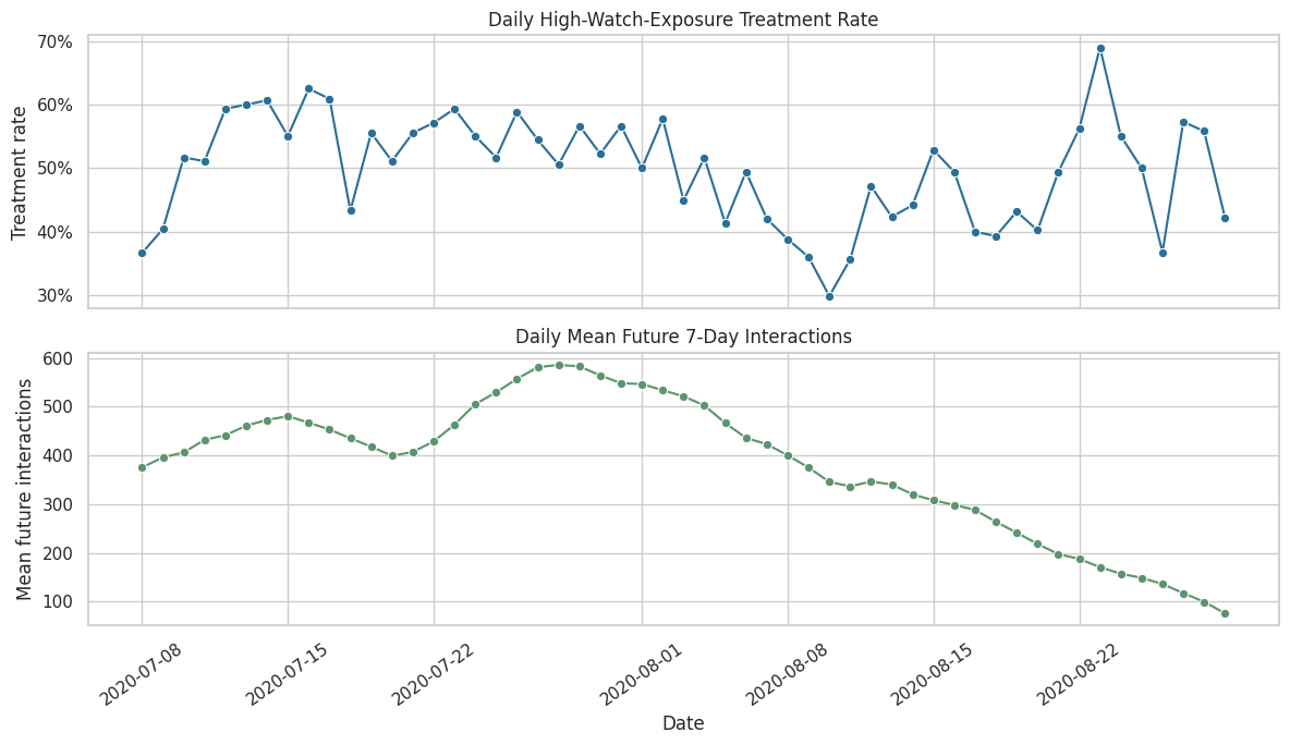
The time-series view shows whether treatment and future engagement drift across the sample window. Any visible calendar movement supports keeping time controls in the treatment assignment model.
Treatment Rate by Prior User State
This cell bins important prior-history variables into quartiles and computes the treatment rate in each bin. If treatment rate changes across prior-activity bins, then prior state is part of the treatment assignment process and should be adjusted for.
def make_quantile_bucket(series, label_prefix):
    return pd.qcut(series, q=4, duplicates="drop").astype(str).rename(label_prefix)

history_bucket_df = panel[[PRIMARY_TREATMENT]].copy()
history_bucket_df["prior_3day_interactions_bucket"] = make_quantile_bucket(
    panel["prior_3day_interactions"], "prior_3day_interactions_bucket"
)
history_bucket_df["lag_1_watch_ratio_bucket"] = make_quantile_bucket(
    panel["lag_1_avg_watch_ratio"], "lag_1_watch_ratio_bucket"
)
history_bucket_df["prior_3day_watch_share_bucket"] = make_quantile_bucket(
    panel["prior_3day_high_watch_share"], "prior_3day_watch_share_bucket"
)

bucket_summaries = []
for bucket_col in ["prior_3day_interactions_bucket", "lag_1_watch_ratio_bucket", "prior_3day_watch_share_bucket"]:
    summary = (
        history_bucket_df.groupby(bucket_col, observed=True)[PRIMARY_TREATMENT]
        .agg(treatment_rate="mean", rows="size")
        .reset_index()
        .rename(columns={bucket_col: "bucket"})
    )
    summary.insert(0, "history_variable", bucket_col)
    bucket_summaries.append(summary)

history_treatment_rates = pd.concat(bucket_summaries, ignore_index=True)
display(history_treatment_rates)| history_variable | bucket | treatment_rate | rows | |
|---|---|---|---|---|
| 0 | prior_3day_interactions_bucket | (-0.001, 123.0] | 0.4920 | 1183 |
| 1 | prior_3day_interactions_bucket | (123.0, 166.0] | 0.5178 | 1182 |
| 2 | prior_3day_interactions_bucket | (166.0, 217.0] | 0.5198 | 1164 |
| 3 | prior_3day_interactions_bucket | (217.0, 581.0] | 0.4688 | 1169 |
| 4 | lag_1_watch_ratio_bucket | (-0.001, 0.738] | 0.2153 | 1175 |
| 5 | lag_1_watch_ratio_bucket | (0.738, 0.85] | 0.4438 | 1174 |
| 6 | lag_1_watch_ratio_bucket | (0.85, 1.011] | 0.6388 | 1174 |
| 7 | lag_1_watch_ratio_bucket | (1.011, 6.491] | 0.7004 | 1175 |
| 8 | prior_3day_watch_share_bucket | (-0.001, 1.127] | 0.1677 | 1175 |
| 9 | prior_3day_watch_share_bucket | (1.127, 1.414] | 0.3424 | 1174 |
| 10 | prior_3day_watch_share_bucket | (1.414, 1.708] | 0.6235 | 1174 |
| 11 | prior_3day_watch_share_bucket | (1.708, 2.735] | 0.8647 | 1175 |
The bucket table checks whether treatment is more common for users with different recent activity or watch behavior. This is the empirical version of the confounding story from the previous map.
Plot Treatment Rate by Prior State
The table above is useful, but a faceted plot makes the pattern easier to scan. The goal is not to prove causality. The goal is to see whether pre-treatment history predicts treatment assignment strongly enough to justify propensity modeling.
g = sns.catplot(
    data=history_treatment_rates,
    x="bucket",
    y="treatment_rate",
    col="history_variable",
    kind="bar",
    sharex=False,
    sharey=True,
    height=4,
    aspect=1.2,
    color="#2A6F97",
)
g.set_axis_labels("Prior-state bucket", "Treatment rate")
g.set_titles("{col_name}")
for ax in g.axes.flat:
    ax.tick_params(axis="x", rotation=30)
    ax.yaxis.set_major_formatter(lambda value, _: f"{value:.0%}")
g.fig.suptitle("Treatment Assignment Varies With Pre-Treatment History", y=1.08)
plt.show()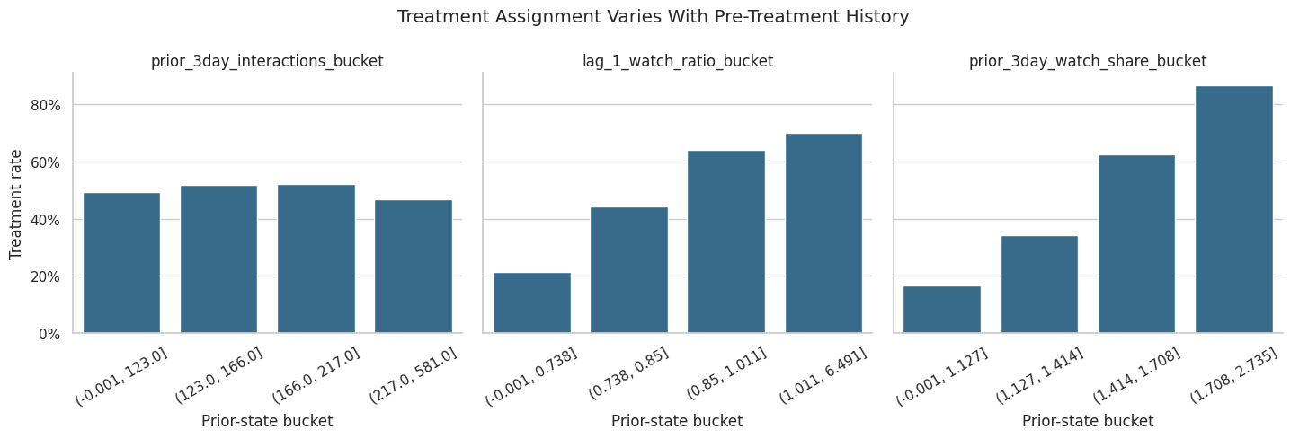
The plot helps reveal which prior-state variables are most associated with high-watch exposure. Stronger gradients indicate variables that the propensity model should capture to improve treated-control comparability.
Unweighted Covariate Balance
Before modeling propensities, we measure treated-control imbalance using standardized mean differences. A standardized mean difference compares means in standard deviation units. Values farther from zero indicate stronger pre-treatment imbalance.
def weighted_mean(values, weights):
    values = np.asarray(values, dtype=float)
    weights = np.asarray(weights, dtype=float)
    return np.sum(weights * values) / np.sum(weights)


def weighted_var(values, weights):
    values = np.asarray(values, dtype=float)
    weights = np.asarray(weights, dtype=float)
    mean = weighted_mean(values, weights)
    return np.sum(weights * (values - mean) ** 2) / np.sum(weights)


def standardized_mean_difference(data, covariate, treatment_col=PRIMARY_TREATMENT, weight_col=None):
    treated = data[treatment_col].eq(1)
    control = data[treatment_col].eq(0)

    if weight_col is None:
        treated_mean = data.loc[treated, covariate].mean()
        control_mean = data.loc[control, covariate].mean()
        treated_var = data.loc[treated, covariate].var(ddof=1)
        control_var = data.loc[control, covariate].var(ddof=1)
    else:
        treated_mean = weighted_mean(data.loc[treated, covariate], data.loc[treated, weight_col])
        control_mean = weighted_mean(data.loc[control, covariate], data.loc[control, weight_col])
        treated_var = weighted_var(data.loc[treated, covariate], data.loc[treated, weight_col])
        control_var = weighted_var(data.loc[control, covariate], data.loc[control, weight_col])

    pooled_sd = np.sqrt((treated_var + control_var) / 2)
    smd = (treated_mean - control_mean) / pooled_sd if pooled_sd > 0 else np.nan
    return treated_mean, control_mean, smd

balance_rows = []
for covariate in numeric_covariates:
    treated_mean, control_mean, smd = standardized_mean_difference(panel, covariate)
    balance_rows.append(
        {
            "covariate": covariate,
            "treated_mean": treated_mean,
            "control_mean": control_mean,
            "smd_unweighted": smd,
            "abs_smd_unweighted": abs(smd),
        }
    )

unweighted_balance = pd.DataFrame(balance_rows).sort_values("abs_smd_unweighted", ascending=False)
display(unweighted_balance)| covariate | treated_mean | control_mean | smd_unweighted | abs_smd_unweighted | |
|---|---|---|---|---|---|
| 9 | prior_3day_high_watch_share | 1.6434 | 1.2077 | 1.2197 | 1.2197 |
| 4 | lag_1_high_watch_share | 0.5545 | 0.3979 | 1.0634 | 1.0634 |
| 8 | prior_3day_avg_watch_ratio | 3.0092 | 2.5157 | 0.5652 | 0.5652 |
| 3 | lag_1_avg_watch_ratio | 1.0098 | 0.8337 | 0.4654 | 0.4654 |
| 7 | prior_3day_total_play_duration_sec | 1,605.1460 | 1,403.9936 | 0.2859 | 0.2859 |
| 2 | lag_1_total_play_duration_sec | 538.3737 | 466.2783 | 0.2329 | 0.2329 |
| 10 | calendar_day_index | 28.1542 | 29.5593 | -0.0919 | 0.0919 |
| 11 | panel_day_index | 28.1542 | 29.5593 | -0.0919 | 0.0919 |
| 6 | prior_3day_interactions | 171.3997 | 174.8337 | -0.0487 | 0.0487 |
| 0 | lag_1_active_day | 0.9872 | 0.9830 | 0.0349 | 0.0349 |
| 1 | lag_1_interactions | 57.3464 | 58.2922 | -0.0296 | 0.0296 |
| 5 | prior_3day_active_day | 2.9497 | 2.9481 | 0.0059 | 0.0059 |
The unweighted balance table shows which histories differ most between treated and control rows. Those imbalances are the main observed confounders that the propensity model and weights need to address.
Visualize Unweighted Balance
This plot ranks pre-treatment covariates by absolute imbalance. The reference lines at 0.1 and -0.1 are common practical thresholds for standardized mean differences, though they are guidelines rather than hard rules.
plot_balance = unweighted_balance.sort_values("smd_unweighted")

fig, ax = plt.subplots(figsize=(9, 6))
sns.barplot(data=plot_balance, x="smd_unweighted", y="covariate", ax=ax, color="#8ECAE6")
ax.axvline(0, color="black", linewidth=1)
ax.axvline(0.1, color="darkred", linestyle="--", linewidth=1)
ax.axvline(-0.1, color="darkred", linestyle="--", linewidth=1)
ax.set_title("Unweighted Treated-Control Balance Before Propensity Adjustment")
ax.set_xlabel("Standardized mean difference")
ax.set_ylabel("Pre-treatment covariate")
plt.tight_layout()
plt.show()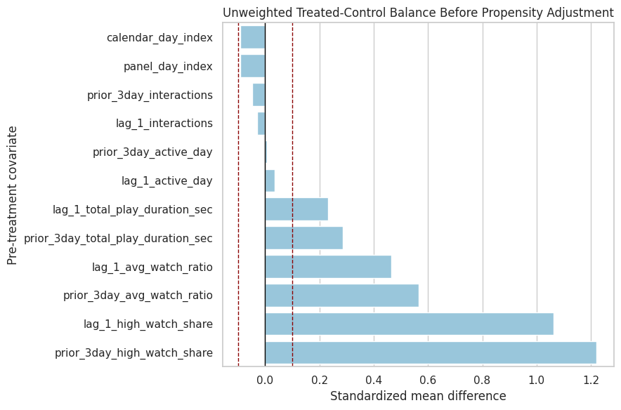
The balance plot makes the adjustment target visible. The next step is to estimate treatment probabilities from these histories so we can reweight the data toward better balance.
Define Propensity Model Pipelines
The primary propensity model is logistic regression because it is transparent and usually stable for weights. The comparison model is LightGBM because it can capture nonlinear treatment assignment and interactions. Both models use the same pre-treatment feature set.
def make_logistic_propensity_pipeline(numeric_cols, categorical_cols):
    preprocessor = ColumnTransformer(
        transformers=[
            ("numeric", StandardScaler(), numeric_cols),
            ("categorical", OneHotEncoder(handle_unknown="ignore", sparse_output=False), categorical_cols),
        ],
        remainder="drop",
        verbose_feature_names_out=False,
    )
    return Pipeline(
        steps=[
            ("preprocessor", preprocessor),
            (
                "model",
                LogisticRegression(
                    max_iter=1_000,
                    solver="lbfgs",
                    random_state=RANDOM_STATE,
                ),
            ),
        ]
    )


def make_lgbm_propensity_pipeline(numeric_cols, categorical_cols):
    preprocessor = ColumnTransformer(
        transformers=[
            ("numeric", "passthrough", numeric_cols),
            ("categorical", OneHotEncoder(handle_unknown="ignore", sparse_output=False), categorical_cols),
        ],
        remainder="drop",
        verbose_feature_names_out=False,
    )
    return Pipeline(
        steps=[
            ("preprocessor", preprocessor),
            (
                "model",
                LGBMClassifier(
                    n_estimators=150,
                    learning_rate=0.04,
                    num_leaves=15,
                    min_child_samples=50,
                    subsample=0.9,
                    colsample_bytree=0.9,
                    random_state=RANDOM_STATE,
                    n_jobs=1,
                    verbose=-1,
                ),
            ),
        ]
    )

propensity_models = {
    "logistic": make_logistic_propensity_pipeline(numeric_covariates, categorical_covariates),
    "lightgbm": make_lgbm_propensity_pipeline(numeric_covariates, categorical_covariates),
}

print("Defined propensity models:")
for model_name in propensity_models:
    print(f"- {model_name}")
Defined propensity models:
- logistic
- lightgbmThe two pipelines create a transparent baseline and a flexible comparison using the same legal covariates. Comparing them helps distinguish a real overlap problem from a modeling artifact.
Cross-Fit Propensity Scores
Cross-fitting predicts treatment probabilities out of fold. This means each row’s propensity score is produced by a model that did not train on that row. Cross-fitting is useful because it reduces overfitting in nuisance predictions, which is especially important when those predictions become inverse probability weights.
def cross_fitted_propensity(model, X, y, model_name, n_splits=5):
    cv = StratifiedKFold(n_splits=n_splits, shuffle=True, random_state=RANDOM_STATE)
    out_of_fold_prob = np.zeros(len(y), dtype=float)
    metric_rows = []

    for fold, (train_idx, test_idx) in enumerate(cv.split(X, y), start=1):
        fold_model = clone(model)
        X_train = X.iloc[train_idx]
        X_test = X.iloc[test_idx]
        y_train = y.iloc[train_idx]
        y_test = y.iloc[test_idx]

        fold_model.fit(X_train, y_train)
        fold_prob = fold_model.predict_proba(X_test)[:, 1]
        out_of_fold_prob[test_idx] = fold_prob

        metric_rows.append(
            {
                "model": model_name,
                "fold": fold,
                "rows": len(test_idx),
                "treatment_rate": y_test.mean(),
                "roc_auc": roc_auc_score(y_test, fold_prob),
                "average_precision": average_precision_score(y_test, fold_prob),
                "brier_score": brier_score_loss(y_test, fold_prob),
                "log_loss": log_loss(y_test, fold_prob, labels=[0, 1]),
            }
        )

    full_model = clone(model).fit(X, y)
    return out_of_fold_prob, pd.DataFrame(metric_rows), full_model

X = panel[propensity_features].copy()
y = panel[PRIMARY_TREATMENT].astype(int)

propensity_outputs = {}
metric_frames = []
full_propensity_models = {}

for model_name, model in propensity_models.items():
    propensity, metrics, fitted_model = cross_fitted_propensity(model, X, y, model_name=model_name)
    propensity_outputs[model_name] = propensity
    metric_frames.append(metrics)
    full_propensity_models[model_name] = fitted_model
    panel[f"propensity_{model_name}"] = propensity

propensity_fold_metrics = pd.concat(metric_frames, ignore_index=True)
propensity_model_metrics = (
    propensity_fold_metrics.groupby("model")
    .agg(
        rows=("rows", "sum"),
        mean_treatment_rate=("treatment_rate", "mean"),
        roc_auc_mean=("roc_auc", "mean"),
        roc_auc_std=("roc_auc", "std"),
        average_precision_mean=("average_precision", "mean"),
        brier_score_mean=("brier_score", "mean"),
        log_loss_mean=("log_loss", "mean"),
    )
    .reset_index()
)

display(propensity_fold_metrics)
display(propensity_model_metrics)| model | fold | rows | treatment_rate | roc_auc | average_precision | brier_score | log_loss | |
|---|---|---|---|---|---|---|---|---|
| 0 | logistic | 1 | 940 | 0.5000 | 0.8279 | 0.8183 | 0.1698 | 0.5132 |
| 1 | logistic | 2 | 940 | 0.5000 | 0.8174 | 0.8021 | 0.1741 | 0.5298 |
| 2 | logistic | 3 | 940 | 0.4989 | 0.8264 | 0.8222 | 0.1702 | 0.5110 |
| 3 | logistic | 4 | 939 | 0.4995 | 0.8436 | 0.8458 | 0.1617 | 0.4885 |
| 4 | logistic | 5 | 939 | 0.4995 | 0.8296 | 0.8285 | 0.1683 | 0.5092 |
| 5 | lightgbm | 1 | 940 | 0.5000 | 0.8285 | 0.8181 | 0.1702 | 0.5113 |
| 6 | lightgbm | 2 | 940 | 0.5000 | 0.8134 | 0.8055 | 0.1761 | 0.5336 |
| 7 | lightgbm | 3 | 940 | 0.4989 | 0.8286 | 0.8228 | 0.1692 | 0.5078 |
| 8 | lightgbm | 4 | 939 | 0.4995 | 0.8380 | 0.8371 | 0.1646 | 0.4964 |
| 9 | lightgbm | 5 | 939 | 0.4995 | 0.8315 | 0.8345 | 0.1674 | 0.5067 |
| model | rows | mean_treatment_rate | roc_auc_mean | roc_auc_std | average_precision_mean | brier_score_mean | log_loss_mean | |
|---|---|---|---|---|---|---|---|---|
| 0 | lightgbm | 4698 | 0.4996 | 0.8280 | 0.0090 | 0.8236 | 0.1695 | 0.5112 |
| 1 | logistic | 4698 | 0.4996 | 0.8290 | 0.0094 | 0.8234 | 0.1688 | 0.5103 |
The cross-fitted metrics show how predictable treatment is from observed pre-treatment history. Predictability is expected here; it confirms that high-watch exposure is selected by user state rather than randomized.
Summarize Propensity Distributions
The next table summarizes each model’s estimated treatment probabilities. Propensities near 0 or 1 are dangerous because they produce large weights. A good weighting setup needs enough overlap between treated and control rows.
propensity_summary_rows = []
for model_name in propensity_models:
    col = f"propensity_{model_name}"
    values = panel[col]
    propensity_summary_rows.append(
        {
            "model": model_name,
            "mean": values.mean(),
            "std": values.std(),
            "min": values.min(),
            "p01": values.quantile(0.01),
            "p05": values.quantile(0.05),
            "median": values.median(),
            "p95": values.quantile(0.95),
            "p99": values.quantile(0.99),
            "max": values.max(),
            "share_below_0_05": (values < 0.05).mean(),
            "share_above_0_95": (values > 0.95).mean(),
        }
    )

propensity_summary = pd.DataFrame(propensity_summary_rows)
display(propensity_summary)| model | mean | std | min | p01 | p05 | median | p95 | p99 | max | share_below_0_05 | share_above_0_95 | |
|---|---|---|---|---|---|---|---|---|---|---|---|---|
| 0 | logistic | 0.4995 | 0.2863 | 0.0028 | 0.0303 | 0.0776 | 0.4887 | 0.9457 | 0.9830 | 0.9947 | 0.0217 | 0.0447 |
| 1 | lightgbm | 0.4985 | 0.2930 | 0.0218 | 0.0382 | 0.0686 | 0.5017 | 0.9396 | 0.9689 | 0.9788 | 0.0243 | 0.0349 |
The propensity summary is the first positivity check. If a model produces many probabilities close to 0 or 1, weights from that model would be unstable and the causal estimate would depend on a thin region of overlap.
Plot Propensity Overlap
This plot compares propensity distributions for treated and control rows. Strong overlap means treated and control user-days have comparable predicted treatment probabilities. Weak overlap means the observed data contains few comparable rows for some histories.
propensity_long = panel[[PRIMARY_TREATMENT, "propensity_logistic", "propensity_lightgbm"]].melt(
    id_vars=PRIMARY_TREATMENT,
    var_name="model",
    value_name="propensity",
)
propensity_long["model"] = propensity_long["model"].str.replace("propensity_", "", regex=False)
propensity_long["group"] = np.where(propensity_long[PRIMARY_TREATMENT].eq(1), "treated", "control")

fig, axes = plt.subplots(1, 2, figsize=(14, 4.8), sharey=True)
for ax, model_name in zip(axes, ["logistic", "lightgbm"]):
    sns.histplot(
        data=propensity_long.query("model == @model_name"),
        x="propensity",
        hue="group",
        bins=35,
        stat="density",
        common_norm=False,
        element="step",
        fill=False,
        ax=ax,
    )
    ax.set_title(f"{model_name.title()} Propensity Overlap")
    ax.set_xlabel("Estimated propensity")
    ax.set_ylabel("Density")

plt.tight_layout()
plt.show()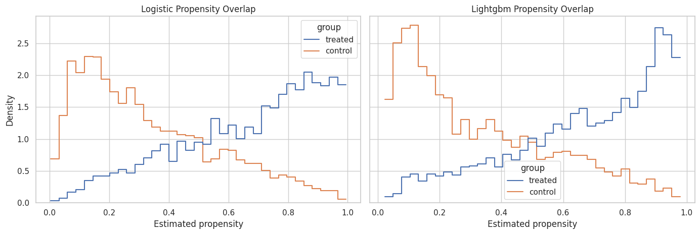
The overlap plot shows whether treated and control histories occupy similar propensity ranges. The primary weights should come from a model that captures selection while preserving usable overlap.
Propensity Calibration by Decile
A propensity model should not only rank rows by treatment likelihood; its probability scale should be reasonable. The next cell bins predictions into deciles and compares predicted treatment probability with observed treatment frequency.
def calibration_table(data, propensity_col, treatment_col=PRIMARY_TREATMENT, n_bins=10):
    table = data[[propensity_col, treatment_col]].copy()
    table["propensity_bin"] = pd.qcut(table[propensity_col], q=n_bins, duplicates="drop")
    return (
        table.groupby("propensity_bin", observed=True)
        .agg(
            rows=(treatment_col, "size"),
            mean_predicted_propensity=(propensity_col, "mean"),
            observed_treatment_rate=(treatment_col, "mean"),
        )
        .reset_index()
    )

calibration_frames = []
for model_name in propensity_models:
    frame = calibration_table(panel, f"propensity_{model_name}")
    frame.insert(0, "model", model_name)
    calibration_frames.append(frame)

propensity_calibration = pd.concat(calibration_frames, ignore_index=True)
display(propensity_calibration)| model | propensity_bin | rows | mean_predicted_propensity | observed_treatment_rate | |
|---|---|---|---|---|---|
| 0 | logistic | (0.00178, 0.119] | 470 | 0.0734 | 0.0723 |
| 1 | logistic | (0.119, 0.196] | 470 | 0.1562 | 0.1532 |
| 2 | logistic | (0.196, 0.287] | 470 | 0.2418 | 0.2213 |
| 3 | logistic | (0.287, 0.386] | 469 | 0.3359 | 0.3582 |
| 4 | logistic | (0.386, 0.489] | 470 | 0.4377 | 0.4383 |
| 5 | logistic | (0.489, 0.597] | 470 | 0.5439 | 0.5723 |
| 6 | logistic | (0.597, 0.707] | 469 | 0.6502 | 0.6183 |
| 7 | logistic | (0.707, 0.809] | 470 | 0.7584 | 0.7851 |
| 8 | logistic | (0.809, 0.898] | 470 | 0.8520 | 0.8574 |
| 9 | logistic | (0.898, 0.995] | 470 | 0.9451 | 0.9191 |
| 10 | lightgbm | (0.0208, 0.102] | 470 | 0.0682 | 0.0851 |
| 11 | lightgbm | (0.102, 0.175] | 470 | 0.1359 | 0.1468 |
| 12 | lightgbm | (0.175, 0.274] | 470 | 0.2211 | 0.2298 |
| 13 | lightgbm | (0.274, 0.388] | 469 | 0.3325 | 0.3454 |
| 14 | lightgbm | (0.388, 0.502] | 470 | 0.4464 | 0.4234 |
| 15 | lightgbm | (0.502, 0.612] | 470 | 0.5581 | 0.5957 |
| 16 | lightgbm | (0.612, 0.706] | 469 | 0.6580 | 0.6375 |
| 17 | lightgbm | (0.706, 0.814] | 470 | 0.7621 | 0.7404 |
| 18 | lightgbm | (0.814, 0.904] | 470 | 0.8632 | 0.8532 |
| 19 | lightgbm | (0.904, 0.979] | 470 | 0.9397 | 0.9383 |
The calibration table checks whether predicted probabilities line up with observed treatment rates. Reasonable calibration is important because inverse probability weights use probability magnitudes, not just ranking.
Plot Propensity Calibration
The dashed diagonal represents perfect calibration. Points above the line mean the observed treatment rate is higher than predicted. Points below the line mean the model overpredicts treatment frequency.
fig, ax = plt.subplots(figsize=(6, 6))
sns.scatterplot(
    data=propensity_calibration,
    x="mean_predicted_propensity",
    y="observed_treatment_rate",
    hue="model",
    size="rows",
    sizes=(40, 160),
    ax=ax,
)
ax.plot([0, 1], [0, 1], color="black", linestyle="--", linewidth=1)
ax.set_title("Cross-Fitted Propensity Calibration")
ax.set_xlabel("Mean predicted propensity")
ax.set_ylabel("Observed treatment rate")
ax.set_xlim(0, 1)
ax.set_ylim(0, 1)
plt.tight_layout()
plt.show()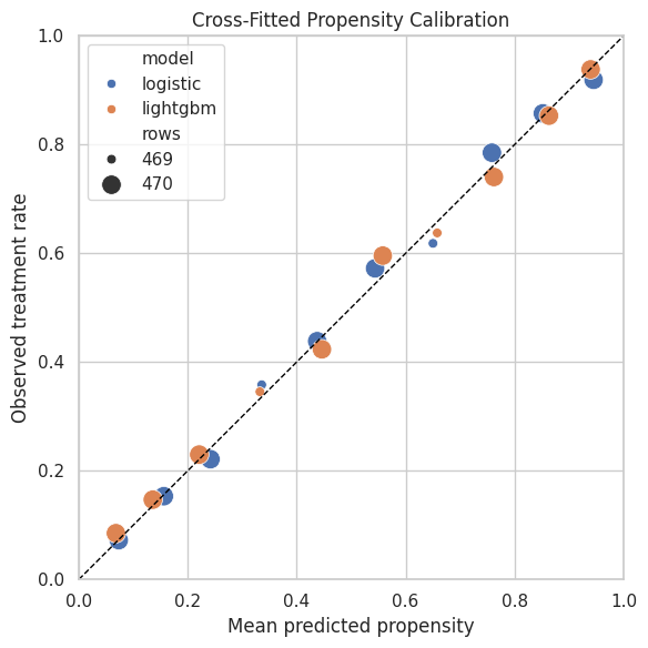
The calibration plot helps decide whether a model is safe to use for weighting. A model with good discrimination but poor probability calibration can still create misleading weights.
Define Stabilized Inverse Probability Weights
For a point-treatment marginal structural model, the unstabilized inverse probability weight is 1 / e(X) for treated rows and 1 / (1 - e(X)) for control rows. Stabilized weights multiply the numerator by the marginal treatment probability. Stabilization keeps the target population closer to the observed sample and reduces variance.
This notebook uses logistic-regression propensities as the primary weights because they are transparent and typically less extreme. LightGBM weights are kept as a diagnostic comparison.
def add_stabilized_weights(data, propensity_col, prefix, treatment_col=PRIMARY_TREATMENT, eps=1e-6):
    result = data.copy()
    treatment = result[treatment_col].astype(int)
    propensity = result[propensity_col].clip(eps, 1 - eps)
    marginal_treatment_rate = treatment.mean()

    result[f"ipw_{prefix}"] = np.where(
        treatment.eq(1),
        1 / propensity,
        1 / (1 - propensity),
    )
    result[f"sw_{prefix}"] = np.where(
        treatment.eq(1),
        marginal_treatment_rate / propensity,
        (1 - marginal_treatment_rate) / (1 - propensity),
    )
    return result

weighted_panel = panel.copy()
weighted_panel = add_stabilized_weights(weighted_panel, "propensity_logistic", "logistic")
weighted_panel = add_stabilized_weights(weighted_panel, "propensity_lightgbm", "lightgbm")

PRIMARY_PROPENSITY_COL = "propensity_logistic"
PRIMARY_WEIGHT_COL = "sw_logistic"

weight_preview_cols = [
    PRIMARY_TREATMENT,
    "propensity_logistic",
    "sw_logistic",
    "propensity_lightgbm",
    "sw_lightgbm",
]

display(weighted_panel[weight_preview_cols].head(10))| treatment | propensity_logistic | sw_logistic | propensity_lightgbm | sw_lightgbm | |
|---|---|---|---|---|---|
| 0 | 1 | 0.5471 | 0.9131 | 0.5266 | 0.9487 |
| 1 | 0 | 0.6333 | 1.3647 | 0.5373 | 1.0816 |
| 2 | 1 | 0.4140 | 1.2067 | 0.5234 | 0.9544 |
| 3 | 1 | 0.5654 | 0.8836 | 0.6503 | 0.7682 |
| 4 | 0 | 0.5986 | 1.2466 | 0.7418 | 1.9378 |
| 5 | 1 | 0.5141 | 0.9718 | 0.7059 | 0.7077 |
| 6 | 1 | 0.5511 | 0.9065 | 0.5565 | 0.8978 |
| 7 | 1 | 0.5693 | 0.8775 | 0.7866 | 0.6351 |
| 8 | 1 | 0.8006 | 0.6240 | 0.8249 | 0.6056 |
| 9 | 1 | 0.7779 | 0.6422 | 0.8345 | 0.5987 |
The panel now contains stabilized weights for both propensity models. The logistic stabilized weight is selected as the primary weight for the next notebook, while LightGBM remains available for sensitivity checks.
Weight Distribution Diagnostics
Weights should be centered near 1 and should not have extreme tails. This cell summarizes the unstabilized and stabilized weights from both propensity models. Extreme weights indicate limited overlap or overly confident propensity predictions.
def effective_sample_size(weights):
    weights = np.asarray(weights, dtype=float)
    return (weights.sum() ** 2) / np.sum(weights ** 2)

weight_columns = ["ipw_logistic", "sw_logistic", "ipw_lightgbm", "sw_lightgbm"]
weight_summary_rows = []
for weight_col in weight_columns:
    values = weighted_panel[weight_col]
    weight_summary_rows.append(
        {
            "weight": weight_col,
            "mean": values.mean(),
            "std": values.std(),
            "min": values.min(),
            "p50": values.quantile(0.50),
            "p90": values.quantile(0.90),
            "p95": values.quantile(0.95),
            "p99": values.quantile(0.99),
            "max": values.max(),
            "effective_sample_size": effective_sample_size(values),
            "ess_share_of_rows": effective_sample_size(values) / len(values),
        }
    )

weight_diagnostics = pd.DataFrame(weight_summary_rows)
display(weight_diagnostics)| weight | mean | std | min | p50 | p90 | p95 | p99 | max | effective_sample_size | ess_share_of_rows | |
|---|---|---|---|---|---|---|---|---|---|---|---|
| 0 | ipw_logistic | 2.0767 | 3.4301 | 1.0028 | 1.3945 | 3.2625 | 4.7814 | 11.4275 | 119.9903 | 1,260.3721 | 0.2683 |
| 1 | sw_logistic | 1.0384 | 1.7153 | 0.5018 | 0.6973 | 1.6307 | 2.3921 | 5.7092 | 59.9441 | 1,260.0838 | 0.2682 |
| 2 | ipw_lightgbm | 2.0541 | 2.2425 | 1.0216 | 1.3874 | 3.3732 | 5.1568 | 11.7539 | 45.0967 | 2,143.6149 | 0.4563 |
| 3 | sw_lightgbm | 1.0270 | 1.1213 | 0.5104 | 0.6935 | 1.6872 | 2.5799 | 5.8723 | 22.5676 | 2,143.4028 | 0.4562 |
The weight diagnostics show how much precision is lost after weighting. A large effective sample size and modest tails suggest the weighted analysis is numerically feasible.
Plot Stabilized Weight Distributions
The weight plot visualizes the tails that are easy to miss in a summary table. Stabilized weights should ideally be compact. Long right tails warn that some rows carry much more influence than others.
weight_plot_df = weighted_panel[["sw_logistic", "sw_lightgbm"]].melt(
    var_name="weight_type",
    value_name="weight",
)

fig, ax = plt.subplots(figsize=(10, 5))
sns.histplot(
    data=weight_plot_df,
    x="weight",
    hue="weight_type",
    bins=50,
    stat="density",
    common_norm=False,
    element="step",
    fill=False,
    ax=ax,
)
ax.set_title("Stabilized Weight Distributions")
ax.set_xlabel("Stabilized inverse probability weight")
ax.set_ylabel("Density")
plt.tight_layout()
plt.show()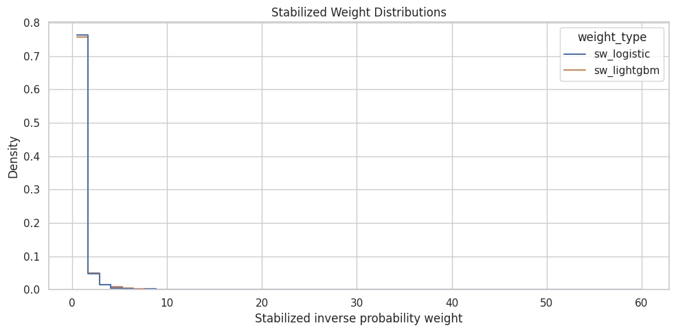
The plot checks whether either model creates noticeably heavier weight tails. If the flexible model creates much wider weights, the transparent logistic model is a safer primary choice for the marginal structural model.
Weight Clipping Sensitivity
Even with reasonable overlap, it is common to inspect clipped weights. Clipping caps the largest weights to reduce variance, at the cost of changing the target estimand slightly. This cell creates clipped versions of the primary stabilized weight and records effective sample size.
clip_values = [None, 2, 5, 10]
clipping_rows = []

for clip_value in clip_values:
    if clip_value is None:
        clipped_col = "sw_logistic"
        clipped_values = weighted_panel[PRIMARY_WEIGHT_COL]
        label = "unclipped"
    else:
        clipped_col = f"sw_logistic_clip_{clip_value}"
        clipped_values = weighted_panel[PRIMARY_WEIGHT_COL].clip(upper=clip_value)
        weighted_panel[clipped_col] = clipped_values
        label = f"clip_at_{clip_value}"

    clipping_rows.append(
        {
            "weight_version": label,
            "weight_column": clipped_col,
            "mean_weight": clipped_values.mean(),
            "max_weight": clipped_values.max(),
            "effective_sample_size": effective_sample_size(clipped_values),
            "ess_share_of_rows": effective_sample_size(clipped_values) / len(clipped_values),
        }
    )

clipping_diagnostics = pd.DataFrame(clipping_rows)
display(clipping_diagnostics)| weight_version | weight_column | mean_weight | max_weight | effective_sample_size | ess_share_of_rows | |
|---|---|---|---|---|---|---|
| 0 | unclipped | sw_logistic | 1.0384 | 59.9441 | 1,260.0838 | 0.2682 |
| 1 | clip_at_2 | sw_logistic_clip_2 | 0.8798 | 2.0000 | 3,797.3068 | 0.8083 |
| 2 | clip_at_5 | sw_logistic_clip_5 | 0.9684 | 5.0000 | 2,932.2499 | 0.6241 |
| 3 | clip_at_10 | sw_logistic_clip_10 | 1.0014 | 10.0000 | 2,400.8979 | 0.5110 |
The clipping table shows whether capping extreme weights materially changes the effective sample size. If clipping barely changes ESS, the primary weights are already stable; if it changes ESS a lot, later estimates should include clipping sensitivity.
Choose the Primary Analysis Weight
The next notebook needs one default weight column. We use the logistic stabilized weight with a conservative cap at 10. If the raw weights are already below that cap, this column will match the raw logistic stabilized weights. Keeping an explicit primary column makes downstream notebooks simpler and more auditable.
PRIMARY_ANALYSIS_WEIGHT_COL = "analysis_weight"
WEIGHT_CLIP_VALUE = 10

weighted_panel[PRIMARY_ANALYSIS_WEIGHT_COL] = weighted_panel[PRIMARY_WEIGHT_COL].clip(upper=WEIGHT_CLIP_VALUE)

primary_weight_summary = pd.Series(
    {
        "source_propensity": PRIMARY_PROPENSITY_COL,
        "source_weight": PRIMARY_WEIGHT_COL,
        "analysis_weight": PRIMARY_ANALYSIS_WEIGHT_COL,
        "clip_value": WEIGHT_CLIP_VALUE,
        "mean": weighted_panel[PRIMARY_ANALYSIS_WEIGHT_COL].mean(),
        "max": weighted_panel[PRIMARY_ANALYSIS_WEIGHT_COL].max(),
        "effective_sample_size": effective_sample_size(weighted_panel[PRIMARY_ANALYSIS_WEIGHT_COL]),
        "ess_share_of_rows": effective_sample_size(weighted_panel[PRIMARY_ANALYSIS_WEIGHT_COL]) / len(weighted_panel),
    }
).rename("value")

display(primary_weight_summary)
source_propensity propensity_logistic
source_weight sw_logistic
analysis_weight analysis_weight
clip_value 10
mean 1.0014
max 10.0000
effective_sample_size 2,400.8979
ess_share_of_rows 0.5110
Name: value, dtype: objectThe selected analysis_weight column is the practical handoff to the marginal structural model. It makes the next notebook cleaner because the default weighting choice is documented here.
Check Weighted Covariate Balance
The purpose of inverse probability weighting is to make treated and control rows more similar on observed pre-treatment history. The next cell recomputes standardized mean differences using the selected analysis weight and compares them with the original unweighted imbalance.
weighted_balance_rows = []
for covariate in numeric_covariates:
    treated_mean_w, control_mean_w, smd_w = standardized_mean_difference(
        weighted_panel,
        covariate,
        weight_col=PRIMARY_ANALYSIS_WEIGHT_COL,
    )
    weighted_balance_rows.append(
        {
            "covariate": covariate,
            "treated_mean_weighted": treated_mean_w,
            "control_mean_weighted": control_mean_w,
            "smd_weighted": smd_w,
            "abs_smd_weighted": abs(smd_w),
        }
    )

weighted_balance = pd.DataFrame(weighted_balance_rows)
balance_diagnostics = unweighted_balance.merge(weighted_balance, on="covariate", how="left")
balance_diagnostics["abs_smd_reduction"] = (
    balance_diagnostics["abs_smd_unweighted"] - balance_diagnostics["abs_smd_weighted"]
)

balance_diagnostics = balance_diagnostics.sort_values("abs_smd_unweighted", ascending=False)
display(balance_diagnostics)| covariate | treated_mean | control_mean | smd_unweighted | abs_smd_unweighted | treated_mean_weighted | control_mean_weighted | smd_weighted | abs_smd_weighted | abs_smd_reduction | |
|---|---|---|---|---|---|---|---|---|---|---|
| 0 | prior_3day_high_watch_share | 1.6434 | 1.2077 | 1.2197 | 1.2197 | 1.4361 | 1.4354 | 0.0018 | 0.0018 | 1.2179 |
| 1 | lag_1_high_watch_share | 0.5545 | 0.3979 | 1.0634 | 1.0634 | 0.4795 | 0.4752 | 0.0266 | 0.0266 | 1.0369 |
| 2 | prior_3day_avg_watch_ratio | 3.0092 | 2.5157 | 0.5652 | 0.5652 | 2.7649 | 2.7524 | 0.0142 | 0.0142 | 0.5510 |
| 3 | lag_1_avg_watch_ratio | 1.0098 | 0.8337 | 0.4654 | 0.4654 | 0.9253 | 0.9159 | 0.0240 | 0.0240 | 0.4415 |
| 4 | prior_3day_total_play_duration_sec | 1,605.1460 | 1,403.9936 | 0.2859 | 0.2859 | 1,491.4685 | 1,471.8861 | 0.0282 | 0.0282 | 0.2577 |
| 5 | lag_1_total_play_duration_sec | 538.3737 | 466.2783 | 0.2329 | 0.2329 | 497.9161 | 495.5466 | 0.0075 | 0.0075 | 0.2254 |
| 6 | calendar_day_index | 28.1542 | 29.5593 | -0.0919 | 0.0919 | 29.4525 | 29.6002 | -0.0095 | 0.0095 | 0.0824 |
| 7 | panel_day_index | 28.1542 | 29.5593 | -0.0919 | 0.0919 | 29.4525 | 29.6002 | -0.0095 | 0.0095 | 0.0824 |
| 8 | prior_3day_interactions | 171.3997 | 174.8337 | -0.0487 | 0.0487 | 171.6769 | 170.2261 | 0.0204 | 0.0204 | 0.0283 |
| 9 | lag_1_active_day | 0.9872 | 0.9830 | 0.0349 | 0.0349 | 0.9861 | 0.9863 | -0.0010 | 0.0010 | 0.0339 |
| 10 | lag_1_interactions | 57.3464 | 58.2922 | -0.0296 | 0.0296 | 57.1834 | 56.9702 | 0.0065 | 0.0065 | 0.0231 |
| 11 | prior_3day_active_day | 2.9497 | 2.9481 | 0.0059 | 0.0059 | 2.9518 | 2.9552 | -0.0132 | 0.0132 | -0.0074 |
The weighted balance table checks whether the chosen weights reduce observed confounding. Improvement here is a key prerequisite before using the weights in a marginal structural model.
Plot Balance Before and After Weighting
The plot compares absolute standardized mean differences before and after weighting. Good weighting should move most covariates closer to zero, ideally below the practical 0.1 threshold.
balance_plot_df = balance_diagnostics[["covariate", "abs_smd_unweighted", "abs_smd_weighted"]].melt(
    id_vars="covariate",
    var_name="balance_type",
    value_name="absolute_smd",
)
balance_plot_df["balance_type"] = balance_plot_df["balance_type"].map(
    {
        "abs_smd_unweighted": "Before weighting",
        "abs_smd_weighted": "After weighting",
    }
)

fig, ax = plt.subplots(figsize=(10, 6))
sns.barplot(
    data=balance_plot_df,
    x="absolute_smd",
    y="covariate",
    hue="balance_type",
    ax=ax,
)
ax.axvline(0.1, color="darkred", linestyle="--", linewidth=1)
ax.set_title("Observed Covariate Balance Before and After Weighting")
ax.set_xlabel("Absolute standardized mean difference")
ax.set_ylabel("Pre-treatment covariate")
plt.tight_layout()
plt.show()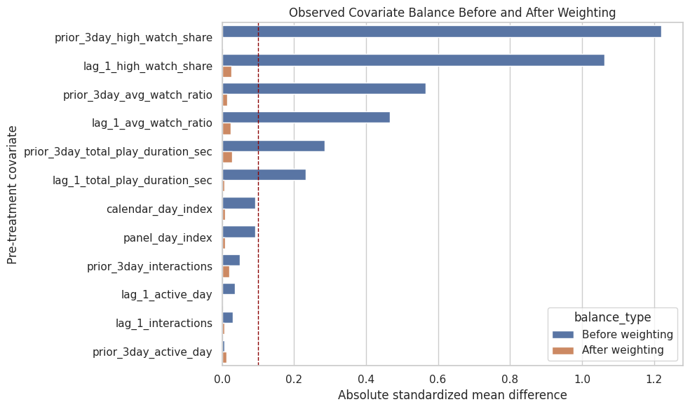
The balance plot is the main diagnostic for whether the propensity weights are doing useful adjustment work. Remaining large imbalances would need to be addressed before trusting the weighted effect estimate.
Weighted Outcome Preview
This cell computes a simple weighted treated-control outcome difference using the analysis weights. It is still not the final marginal structural model, but it previews how much the naive difference changes after reweighting observed histories.
def group_weighted_mean(data, group_value, outcome_col=PRIMARY_OUTCOME, weight_col=PRIMARY_ANALYSIS_WEIGHT_COL):
    subset = data.loc[data[PRIMARY_TREATMENT].eq(group_value)]
    return weighted_mean(subset[outcome_col], subset[weight_col])

weighted_control_mean = group_weighted_mean(weighted_panel, 0)
weighted_treated_mean = group_weighted_mean(weighted_panel, 1)
weighted_difference = weighted_treated_mean - weighted_control_mean
weighted_lift = weighted_difference / weighted_control_mean

weighted_outcome_preview = pd.DataFrame(
    [
        {"estimate": "naive_difference", "value": naive_difference, "relative_lift": naive_lift},
        {"estimate": "weighted_difference_preview", "value": weighted_difference, "relative_lift": weighted_lift},
    ]
)

display(weighted_outcome_preview)| estimate | value | relative_lift | |
|---|---|---|---|
| 0 | naive_difference | 7.0755 | 0.0187 |
| 1 | weighted_difference_preview | -1.7389 | -0.0046 |
The weighted preview shows whether adjustment changes the direction or size of the raw treated-control difference. The formal effect estimate still belongs in the next notebook, but this preview confirms that the weights have practical consequences.
Positivity and Weight Readiness Checklist
This checklist summarizes whether the weighted panel is ready for a marginal structural model. It does not prove causal identification, because unobserved confounding can still exist. It does check the observable requirements we can diagnose: overlap, stable weights, effective sample size, and improved covariate balance.
max_abs_smd_before = balance_diagnostics["abs_smd_unweighted"].max()
max_abs_smd_after = balance_diagnostics["abs_smd_weighted"].max()
mean_abs_smd_before = balance_diagnostics["abs_smd_unweighted"].mean()
mean_abs_smd_after = balance_diagnostics["abs_smd_weighted"].mean()
analysis_weight_ess = effective_sample_size(weighted_panel[PRIMARY_ANALYSIS_WEIGHT_COL])

readiness_checks = pd.DataFrame(
    [
        {
            "check": "no propensity below 0.05 or above 0.95 for most rows",
            "value": ((weighted_panel[PRIMARY_PROPENSITY_COL] < 0.05) | (weighted_panel[PRIMARY_PROPENSITY_COL] > 0.95)).mean(),
            "passes": ((weighted_panel[PRIMARY_PROPENSITY_COL] < 0.05) | (weighted_panel[PRIMARY_PROPENSITY_COL] > 0.95)).mean() < 0.05,
        },
        {
            "check": "analysis weight max below clipping cap",
            "value": weighted_panel[PRIMARY_ANALYSIS_WEIGHT_COL].max(),
            "passes": weighted_panel[PRIMARY_ANALYSIS_WEIGHT_COL].max() <= WEIGHT_CLIP_VALUE,
        },
        {
            "check": "effective sample size at least 70% of rows",
            "value": analysis_weight_ess / len(weighted_panel),
            "passes": analysis_weight_ess / len(weighted_panel) >= 0.70,
        },
        {
            "check": "mean absolute SMD improves after weighting",
            "value": mean_abs_smd_before - mean_abs_smd_after,
            "passes": mean_abs_smd_after < mean_abs_smd_before,
        },
        {
            "check": "maximum absolute SMD improves after weighting",
            "value": max_abs_smd_before - max_abs_smd_after,
            "passes": max_abs_smd_after < max_abs_smd_before,
        },
    ]
)

display(readiness_checks)| check | value | passes | |
|---|---|---|---|
| 0 | no propensity below 0.05 or above 0.95 for mos... | 0.0664 | False |
| 1 | analysis weight max below clipping cap | 10.0000 | True |
| 2 | effective sample size at least 70% of rows | 0.5110 | False |
| 3 | mean absolute SMD improves after weighting | 0.3311 | True |
| 4 | maximum absolute SMD improves after weighting | 1.1915 | True |
The readiness checklist turns the diagnostics into a clear decision point. If these checks mostly pass, the weighted panel is suitable for Notebook 04; if not, the project would need stronger treatment models or additional covariates.
Save the Weighted Panel and Diagnostics
The next notebook should not refit the propensity models. It should load the weighted panel saved here and focus on estimating the long-term effect. This cell saves the weighted panel plus supporting diagnostics so the modeling choices remain auditable.
weighted_panel_path = PROCESSED_DIR / "kuairec_long_term_weighted_panel.parquet"
propensity_metrics_path = PROCESSED_DIR / "kuairec_long_term_propensity_model_metrics.csv"
weight_diagnostics_path = PROCESSED_DIR / "kuairec_long_term_weight_diagnostics.csv"
balance_diagnostics_path = PROCESSED_DIR / "kuairec_long_term_balance_diagnostics.csv"
readiness_checks_path = PROCESSED_DIR / "kuairec_long_term_weight_readiness_checks.csv"

weighted_panel.to_parquet(weighted_panel_path, index=False)
propensity_model_metrics.to_csv(propensity_metrics_path, index=False)
weight_diagnostics.to_csv(weight_diagnostics_path, index=False)
balance_diagnostics.to_csv(balance_diagnostics_path, index=False)
readiness_checks.to_csv(readiness_checks_path, index=False)

print("Saved Notebook 03 artifacts:")
print(f"- {weighted_panel_path}")
print(f"- {propensity_metrics_path}")
print(f"- {weight_diagnostics_path}")
print(f"- {balance_diagnostics_path}")
print(f"- {readiness_checks_path}")
Saved Notebook 03 artifacts:
- /home/apex/Documents/ranking_sys/data/processed/kuairec_long_term_weighted_panel.parquet
- /home/apex/Documents/ranking_sys/data/processed/kuairec_long_term_propensity_model_metrics.csv
- /home/apex/Documents/ranking_sys/data/processed/kuairec_long_term_weight_diagnostics.csv
- /home/apex/Documents/ranking_sys/data/processed/kuairec_long_term_balance_diagnostics.csv
- /home/apex/Documents/ranking_sys/data/processed/kuairec_long_term_weight_readiness_checks.csvThe weighted panel and diagnostics are now persisted. This creates a clean handoff: Notebook 04 can estimate a marginal structural model using analysis_weight without repeating treatment-assignment modeling.
Takeaways and Next Step
This notebook showed that high-watch exposure is related to pre-treatment user history, which supports the claim that the problem involves time-varying confounding. It then estimated cross-fitted propensity scores, checked overlap and calibration, created stabilized inverse probability weights, and verified whether those weights improve observed covariate balance.
The next notebook should use data/processed/kuairec_long_term_weighted_panel.parquet to estimate the long-term causal effect with a marginal structural model. The default treatment column is treatment, the default outcome column is outcome, and the default weight column is analysis_weight.