from pathlib import Path

import matplotlib.pyplot as plt
import pandas as pd
import seaborn as sns

sns.set_theme(style="whitegrid")
pd.set_option("display.max_columns", 100)
pd.set_option("display.float_format", "{:.4f}".format)01 - MIND Rank Position EDA
Goal: understand the impression-level dataset before causal modeling.
Main questions:
- How many displayed items, impressions, users, and news items are in the sample?
- How does click-through rate vary by rank position?
- Is
is_top_3a reasonable first treatment definition? - Do top-3 and lower-ranked items differ on observed covariates?
Notebook Setup
This cell imports the libraries used throughout the EDA notebook. pandas handles tabular data, matplotlib and seaborn create plots, and Path makes file paths work cleanly from the project root, notebooks/, or notebooks/projects/project_1_ranking/. The display settings make tables easier to read by showing more columns and formatting floating-point values consistently.
This cell prepares the notebook environment for MIND ranking EDA and the first top-rank treatment definition. There is no substantive model result yet; the important outcome is that the imports and display settings are ready so the next cells can focus on the data and causal question.
Locate The Processed Dataset
This cell finds the project root and builds the path to the processed MIND sample. The ancestor search starting from Path.cwd() lets the notebook work whether it is launched from the repository root, notebooks/, or notebooks/projects/project_1_ranking/. DATA_PATH should point to the parquet file created by the data-processing script.
DATA_RELATIVE_PATH = Path("data/processed/mind_small_impressions_train_sample.parquet")
PROJECT_ROOT = next(
    path
    for path in [Path.cwd(), *Path.cwd().parents]
    if (path / DATA_RELATIVE_PATH).exists()
)

DATA_PATH = PROJECT_ROOT / DATA_RELATIVE_PATH
DATA_PATHPosixPath('/home/apex/Documents/ranking_sys/data/processed/mind_small_impressions_train_sample.parquet')The printed paths are a reproducibility checkpoint. Once the notebook can find the input data and output folders, the analysis can run from a clean checkout without manual path edits.
Load The Impression-Level Table
This cell reads the processed parquet file into a pandas DataFrame called df. Each row represents one displayed item within a recommendation impression, so the table is already in the right shape for rank-position analysis. Showing df.head() gives a quick visual check that the expected columns loaded correctly.
df = pd.read_parquet(DATA_PATH)
df.head()| impression_id | user_id | timestamp | news_id | rank_position | is_top_1 | is_top_3 | clicked | history_len | candidate_set_size | category | subcategory | title_length | abstract_length | hour | day_of_week | item_exposures | item_clicks | item_ctr | missing_news_metadata | |
|---|---|---|---|---|---|---|---|---|---|---|---|---|---|---|---|---|---|---|---|---|
| 0 | 1 | U13740 | 2019-11-11 09:05:58 | N55689 | 1 | 1 | 1 | 1 | 9 | 2 | sports | football_nfl | 12 | 24 | 9 | 0 | 2399 | 549 | 0.2288 | 0 |
| 1 | 1 | U13740 | 2019-11-11 09:05:58 | N35729 | 2 | 0 | 1 | 0 | 9 | 2 | news | newsus | 11 | 19 | 9 | 0 | 2029 | 459 | 0.2262 | 0 |
| 2 | 2 | U91836 | 2019-11-12 18:11:30 | N20678 | 1 | 1 | 1 | 0 | 82 | 11 | sports | more_sports | 15 | 13 | 18 | 1 | 874 | 66 | 0.0755 | 0 |
| 3 | 2 | U91836 | 2019-11-12 18:11:30 | N39317 | 2 | 0 | 1 | 0 | 82 | 11 | news | newspolitics | 11 | 22 | 18 | 1 | 811 | 65 | 0.0801 | 0 |
| 4 | 2 | U91836 | 2019-11-12 18:11:30 | N58114 | 3 | 0 | 1 | 0 | 82 | 11 | autos | autosnews | 11 | 0 | 18 | 1 | 1054 | 24 | 0.0228 | 0 |
The loaded table preview and shape confirm that the notebook is using the expected processed dataset. This check anchors the rest of the analysis, because all treatment, outcome, and covariate definitions depend on these columns being present and correctly typed.
Column Guide
Each row in this processed table represents one news item displayed inside one recommendation impression. The columns mean:
impression_id: Unique ID for the page/impression event where a set of news items was shown.user_id: Anonymous user identifier from MIND.timestamp: Time when the impression occurred.news_id: ID of the displayed news item.rank_position: Position of the item in the displayed list.1is the top rank.is_top_1: Indicator equal to1if the item is ranked first.is_top_3: Indicator equal to1if the item is ranked in positions 1 through 3. This is our first simple treatment definition.clicked: Outcome indicator.1means the user clicked the displayed item;0means they did not.history_len: Number of prior clicked news items in the user history before this impression.candidate_set_size: Number of items shown in the same impression.category: Broad news category, such as sports, news, finance, or entertainment.subcategory: More specific category label withincategory.title_length: Number of words in the item title.abstract_length: Number of words in the item abstract.hour: Hour of day extracted fromtimestamp.day_of_week: Day of week extracted fromtimestamp, where Monday is0and Sunday is6.item_exposures: Number of times thisnews_idappears in the processed sample. This is a simple popularity/exposure proxy.item_clicks: Number of clicks thisnews_idreceives in the processed sample.item_ctr: Sample click-through rate for the item, computed asitem_clicks / item_exposures.missing_news_metadata: Indicator equal to1if the displayed item did not successfully join tonews.tsvmetadata.
Basic Shape
Dataset Size Summary
This cell creates a compact high-level summary of the dataset. It counts displayed-item rows, unique impressions, users, and news items, then reports the overall click-through rate and maximum observed rank. This gives us the scale of the analysis before looking at distributions or models.
summary = pd.Series(
    {
        "rows_displayed_items": len(df),
        "impressions": df["impression_id"].nunique(),
        "users": df["user_id"].nunique(),
        "news_items": df["news_id"].nunique(),
        "overall_ctr": df["clicked"].mean(),
        "max_rank_position": df["rank_position"].max(),
    }
)
summary
rows_displayed_items 737762.0000
impressions 20000.0000
users 15427.0000
news_items 12349.0000
overall_ctr 0.0405
max_rank_position 294.0000
dtype: float64The size summary tells us the scale of the analysis population and whether the sample is large enough for ranking-position comparisons. This gives context for the more detailed distribution and treatment checks that follow.
Column Types
This cell displays the data type of each column. This matters because modeling and plotting depend on whether columns are numeric, categorical, datetime, or integer indicators. It also helps catch parsing mistakes early, such as timestamps accidentally being loaded as plain strings.
df.dtypesimpression_id int64
user_id str
timestamp datetime64[us]
news_id str
rank_position int16
is_top_1 int8
is_top_3 int8
clicked int8
history_len int64
candidate_set_size int32
category str
subcategory str
title_length int32
abstract_length int32
hour int8
day_of_week int8
item_exposures int64
item_clicks int64
item_ctr float64
missing_news_metadata int8
dtype: objectThis output clarifies the structure of the data before modeling begins. Knowing which columns are numeric, categorical, treatment-related, or outcome-related helps prevent accidental leakage and keeps the causal design readable.
Missingness Check
This cell computes the missing-value rate for every column. df.isna() marks missing entries, .mean() turns those true/false indicators into a fraction missing per column, and the final filter shows only columns with any missing values. If the output is empty, the processed table has no missing values.
missing = df.isna().mean().sort_values(ascending=False).rename("missing_rate")
missing[missing > 0]
Series([], Name: missing_rate, dtype: float64)The missingness output shows whether key treatment, outcome, and covariate fields are complete enough for causal analysis. Low missingness means later estimates are less likely to be driven by silent row drops or inconsistent feature availability.
Outcome And Rank Distributions
Key Numeric Distributions
This cell summarizes the main numeric columns used in the first analysis. rank_position describes where items appear, clicked is the outcome, history_len describes user history size, candidate_set_size describes the slate size, and item_ctr is a simple item-level engagement proxy. The percentiles help us spot skew, outliers, and unusually large values.
df[["rank_position", "clicked", "history_len", "candidate_set_size", "item_ctr"]].describe()| rank_position | clicked | history_len | candidate_set_size | item_ctr | |
|---|---|---|---|---|---|
| count | 737762.0000 | 737762.0000 | 737762.0000 | 737762.0000 | 737762.0000 |
| mean | 38.8271 | 0.0405 | 35.4340 | 76.6542 | 0.0405 |
| std | 37.6288 | 0.1972 | 41.6360 | 52.7167 | 0.0465 |
| min | 1.0000 | 0.0000 | 0.0000 | 2.0000 | 0.0000 |
| 25% | 11.0000 | 0.0000 | 9.0000 | 36.0000 | 0.0153 |
| 50% | 27.0000 | 0.0000 | 21.0000 | 66.0000 | 0.0289 |
| 75% | 55.0000 | 0.0000 | 46.0000 | 108.0000 | 0.0499 |
| max | 294.0000 | 1.0000 | 558.0000 | 294.0000 | 1.0000 |
The distribution summary shows the range and skew of the main ranking and engagement variables. These summaries help identify whether transformations, bins, or robust diagnostics are needed before modeling.
Visualize Slate And Rank Distributions
This cell plots two histograms. The first shows how many items are displayed per impression, and the second shows the distribution of rank positions in the processed sample. These plots help us understand whether most impressions are short lists, long lists, or a mix of both.
fig, axes = plt.subplots(1, 2, figsize=(13, 4))

sns.histplot(df["candidate_set_size"], bins=50, ax=axes[0])
axes[0].set_title("Candidate Set Size")
axes[0].set_xlabel("Items displayed in impression")

sns.histplot(df["rank_position"], bins=50, ax=axes[1])
axes[1].set_title("Rank Position")
axes[1].set_xlabel("Rank position")

plt.tight_layout()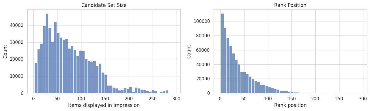
The plots show how impressions are distributed across ranks and candidate sets. This matters because rank position is both the treatment source and a strong proxy for recommendation-system selection pressure.
Naive CTR By Rank
This is not causal yet. It mixes true position effects with relevance, popularity, and ranking policy selection.
CTR By Exact Rank
This cell summarizes click behavior separately for each displayed rank position. We group all displayed items by rank_position, then compute three quantities:
clicks: total number of clicked items at that rank. Sinceclickedis1for a click and0otherwise, summing it counts clicks.impressions: total number of displayed items observed at that rank. This is the denominator for CTR.ctr: click-through rate at that rank, computed as the mean ofclicked, orclicks / impressions.
The output shows the first 15 rank positions so we can quickly inspect whether higher positions receive more clicks. This is a descriptive baseline, not a causal estimate, because high-ranked items may also be more relevant, more popular, or chosen by the ranking system for reasons correlated with clicks.
ctr_by_rank = (
    df.groupby("rank_position")
    .agg(clicks=("clicked", "sum"), impressions=("clicked", "size"), ctr=("clicked", "mean"))
    .reset_index()
)
ctr_by_rank.head(15)| rank_position | clicks | impressions | ctr | |
|---|---|---|---|---|
| 0 | 1 | 2229 | 20000 | 0.1114 |
| 1 | 2 | 2201 | 20000 | 0.1100 |
| 2 | 3 | 1528 | 18646 | 0.0819 |
| 3 | 4 | 1302 | 18164 | 0.0717 |
| 4 | 5 | 1100 | 17257 | 0.0637 |
| 5 | 6 | 1056 | 16914 | 0.0624 |
| 6 | 7 | 976 | 16513 | 0.0591 |
| 7 | 8 | 850 | 15671 | 0.0542 |
| 8 | 9 | 792 | 15420 | 0.0514 |
| 9 | 10 | 752 | 15048 | 0.0500 |
| 10 | 11 | 690 | 14492 | 0.0476 |
| 11 | 12 | 660 | 14080 | 0.0469 |
| 12 | 13 | 646 | 13558 | 0.0476 |
| 13 | 14 | 605 | 13236 | 0.0457 |
| 14 | 15 | 562 | 12922 | 0.0435 |
The rank-level CTR table shows how click probability changes as an item moves down the slate. This descriptive pattern motivates using top-rank exposure as the first treatment definition, while remembering that the comparison is still confounded by ranking logic.
Plot Naive CTR For The First 50 Ranks
This cell turns the exact-rank CTR table into a line plot. It restricts the display to ranks 1 through 50 because those positions are easiest to interpret visually, and farther ranks can make the chart too compressed. The goal is to see the raw shape of click decay as rank position gets lower.
plot_df = ctr_by_rank.query("rank_position <= 50")

plt.figure(figsize=(10, 5))
sns.lineplot(data=plot_df, x="rank_position", y="ctr", marker="o")
plt.title("Naive CTR By Rank Position: First 50 Ranks")
plt.xlabel("Rank position")
plt.ylabel("Click-through rate")
plt.tight_layout()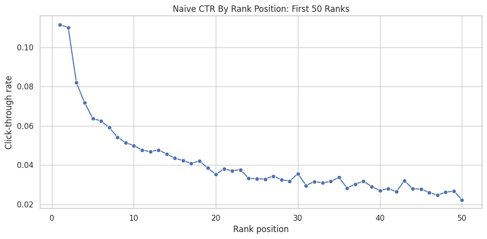
The plot makes the raw position bias visually obvious: higher ranks tend to receive different click rates than lower ranks. The next step groups ranks into interpretable buckets so the treatment definition is easier to explain.
CTR By Rank Bucket
The previous table computed CTR for every exact rank position. That is useful, but exact ranks can get noisy, especially farther down the recommendation list where there may be fewer impressions or very low click rates. This cell groups nearby rank positions into larger buckets so the pattern is easier to read.
First, we define the bucket boundaries:
0to1becomes bucket"1", meaning the top-ranked item.1to3becomes bucket"2-3", meaning ranks 2 and 3.3to10becomes bucket"4-10".10to25becomes bucket"11-25".25to50becomes bucket"26-50".50to the maximum observed rank becomes bucket"51+".
pd.cut(...) takes each item’s numeric rank_position and assigns it to one of those labeled intervals. For example, an item at rank 7 gets rank_bucket = "4-10", while an item at rank 30 gets rank_bucket = "26-50". include_lowest=True makes sure the lowest rank boundary is included, and duplicates="drop" protects the code if the maximum rank makes any bin edges duplicate.
Then we group by rank_bucket and compute the same descriptive metrics as before: clicks, impressions, and ctr. This gives a smoother descriptive view of how engagement changes from highly visible positions to lower positions. It is still not causal: items in higher buckets may differ systematically from items in lower buckets.
rank_bins = [0, 1, 3, 10, 25, 50, df["rank_position"].max()]
rank_labels = ["1", "2-3", "4-10", "11-25", "26-50", "51+"]

df = df.assign(
    rank_bucket=pd.cut(
        df["rank_position"],
        bins=rank_bins,
        labels=rank_labels,
        include_lowest=True,
        duplicates="drop",
    )
)

ctr_by_bucket = (
    df.groupby("rank_bucket", observed=True)
    .agg(clicks=("clicked", "sum"), impressions=("clicked", "size"), ctr=("clicked", "mean"))
    .reset_index()
)
ctr_by_bucket| rank_bucket | clicks | impressions | ctr | |
|---|---|---|---|---|
| 0 | 1 | 2229 | 20000 | 0.1114 |
| 1 | 2-3 | 3729 | 38646 | 0.0965 |
| 2 | 4-10 | 6828 | 114987 | 0.0594 |
| 3 | 11-25 | 7455 | 181168 | 0.0411 |
| 4 | 26-50 | 5340 | 177476 | 0.0301 |
| 5 | 51+ | 4313 | 205485 | 0.0210 |
The bucketed CTR table turns many individual ranks into readable exposure groups. This is useful because the causal question is about a product-relevant intervention, not about memorizing every exact rank position.
Plot CTR By Rank Bucket
This cell visualizes the bucket-level CTR table as a bar chart. The chart makes the rank-position pattern easier to communicate than the raw table, especially for a portfolio report or product memo. Each bar shows the average click rate for a broader visibility group.
plt.figure(figsize=(8, 4))
sns.barplot(data=ctr_by_bucket, x="rank_bucket", y="ctr")
plt.title("Naive CTR By Rank Bucket")
plt.xlabel("Rank bucket")
plt.ylabel("Click-through rate")
plt.tight_layout()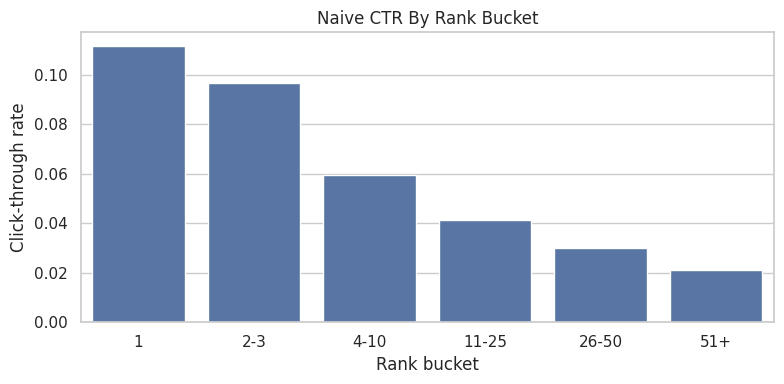
The bucketed plot shows the same position-bias pattern in a cleaner product format. It supports the top-rank versus lower-rank treatment contrast used in the next cells.
First Treatment Definition
The causal project needs a clear treatment, control group, and outcome. In this first pass, we use a simple binary treatment based on rank position:
- Treatment group: displayed items where
is_top_3 = 1, meaning the item appeared in rank positions 1, 2, or 3. - Control group: displayed items where
is_top_3 = 0, meaning the item appeared below position 3. - Outcome:
clicked, where1means the user clicked the item and0means they did not.
The purpose of this section is to create a simple baseline contrast: items near the top of the ranking versus items lower in the ranking. This is easier to reason about than comparing every exact rank position at once, and it sets up the next notebook where we will estimate a propensity model for P(is_top_3 = 1 | X).
The table below computes click-through rate for both groups. Then we calculate two versions of lift:
- Absolute lift: the difference in CTR between top-3 items and lower-ranked items. For example, if top-3 CTR is
0.09and lower-ranked CTR is0.03, the absolute lift is0.06, or 6 percentage points. - Relative lift: the proportional increase in CTR for top-3 items compared with lower-ranked items. Using the same example,
(0.09 / 0.03) - 1 = 2.0, or 200% relative lift.
Important: this lift is naive descriptive lift, not a causal effect yet. Top-3 items are not randomly assigned. The ranking system probably places more relevant or popular items near the top, so the raw CTR gap combines position effects with selection effects. The goal here is to measure the raw gap first, then later adjust for observed confounding with IPW and doubly robust estimation.
Summarize Treatment And Control Outcomes
This cell compares the two groups created by the treatment definition. Rows with is_top_3 = 1 are labeled top_3, and rows with is_top_3 = 0 are labeled rank_4_plus. For each group, the table reports the number of rows, total clicks, and click-through rate.
treatment_summary = (
    df.groupby("is_top_3")
    .agg(rows=("clicked", "size"), clicks=("clicked", "sum"), ctr=("clicked", "mean"))
    .rename(index={0: "rank_4_plus", 1: "top_3"})
)
treatment_summary| rows | clicks | ctr | |
|---|---|---|---|
| is_top_3 | |||
| rank_4_plus | 679116 | 23936 | 0.0352 |
| top_3 | 58646 | 5958 | 0.1016 |
The treatment-control summary gives the first naive comparison between exposed and comparison rows. This is a useful descriptive baseline, but it should not be interpreted as causal until confounding and selection are addressed.
Compute Naive Lift
This cell computes the raw difference between top-3 CTR and lower-ranked CTR. naive_lift is the absolute difference in click probability, while relative_lift expresses that difference as a percentage increase over the lower-ranked baseline. This is useful as a descriptive benchmark, but it is not adjusted for confounding.
naive_lift = treatment_summary.loc["top_3", "ctr"] - treatment_summary.loc["rank_4_plus", "ctr"]
relative_lift = treatment_summary.loc["top_3", "ctr"] / treatment_summary.loc["rank_4_plus", "ctr"] - 1
print(f"Naive absolute lift: {naive_lift:.4f}")
print(f"Naive relative lift: {relative_lift:.1%}")
Naive absolute lift: 0.0663
Naive relative lift: 188.2%The naive lift quantifies the raw click-rate gap between treatment and control groups. It is the starting point for the project: later notebooks ask how much of this apparent lift remains after adjustment.
Confounding Checks
The naive top-3 lift compares click rates for items ranked in positions 1-3 against items ranked lower. That comparison is useful as a first descriptive baseline, but it is not automatically causal because ranking position is not randomly assigned.
A confounder is a variable that affects both the treatment and the outcome. In this project:
- The treatment is whether an item appears in the top 3:
is_top_3. - The outcome is whether the item is clicked:
clicked. - A potential confounder is any observed feature that may influence both where the item is ranked and whether it gets clicked.
For example, a very popular article may be more likely to appear near the top and also more likely to get clicked even if its position had not changed. If we do not adjust for that, we may wrongly attribute the popularity effect to rank position.
The purpose of the following cells is to check whether the treated group (is_top_3 = 1) and control group (is_top_3 = 0) look different before causal adjustment.
First, we compare numeric covariates:
history_len: whether users seeing top-3 items have different prior activity.candidate_set_size: whether top-3 rows come from impressions with different slate sizes.title_lengthandabstract_length: simple content-text proxies.item_exposures,item_clicks, anditem_ctr: item popularity and historical engagement proxies.hourandday_of_week: timing/context features.
The numeric balance table reports the mean of each feature in the lower-ranked group and the top-3 group, then computes:
diff_top3_minus_lower: top-3 mean minus lower-ranked mean.relative_diff: that difference divided by the lower-ranked mean.
Large differences suggest that top-3 and lower-ranked items are not directly comparable without adjustment.
Next, we compare categorical covariates using category. The category table shows each category’s share within the lower-ranked group versus the top-3 group. If some categories are much more common in the top-3 group, category is a likely confounder and should be included in the propensity model.
Finally, the bar plot visualizes the category mix for the most common categories. This makes it easier to see whether the ranking system places certain content categories near the top more often than others.
These checks do not solve confounding by themselves. They tell us what imbalance exists so the next step, propensity modeling and IPW, can adjust for observed differences between top-3 and lower-ranked items.
Numeric Covariate Balance
This cell compares average numeric feature values between lower-ranked rows and top-3 rows. The goal is to see whether the two groups differ on observed covariates before any causal adjustment. Large differences imply that naive lift is mixing rank-position effects with differences in user context, item characteristics, or timing.
numeric_features = [
    "history_len",
    "candidate_set_size",
    "title_length",
    "abstract_length",
    "item_exposures",
    "item_clicks",
    "item_ctr",
    "hour",
    "day_of_week",
]

balance = df.groupby("is_top_3")[numeric_features].mean().T
balance.columns = ["rank_4_plus", "top_3"]
balance["diff_top3_minus_lower"] = balance["top_3"] - balance["rank_4_plus"]
balance["relative_diff"] = balance["diff_top3_minus_lower"] / balance["rank_4_plus"].replace(0, pd.NA)
balance.sort_values("relative_diff", key=lambda s: s.abs(), ascending=False)| rank_4_plus | top_3 | diff_top3_minus_lower | relative_diff | |
|---|---|---|---|---|
| item_clicks | 30.8286 | 62.4235 | 31.5950 | 1.0249 |
| candidate_set_size | 80.0187 | 37.6936 | -42.3251 | -0.5289 |
| item_ctr | 0.0390 | 0.0577 | 0.0186 | 0.4769 |
| item_exposures | 619.2887 | 840.5458 | 221.2571 | 0.3573 |
| history_len | 35.6583 | 32.8360 | -2.8224 | -0.0792 |
| day_of_week | 2.2356 | 2.1808 | -0.0548 | -0.0245 |
| title_length | 10.9443 | 11.0837 | 0.1393 | 0.0127 |
| hour | 10.7980 | 10.8809 | 0.0830 | 0.0077 |
| abstract_length | 25.3329 | 25.2988 | -0.0340 | -0.0013 |
The numeric balance table checks whether treated and control impressions differ before adjustment. Any imbalance here is evidence that raw CTR differences mix ranking exposure effects with the recommender’s selection behavior.
Category Balance
This cell checks whether the content category mix differs between top-3 and lower-ranked rows. It uses a normalized crosstab so each column sums to 1, then computes the difference in category share between the two groups. Large category differences suggest that category should be included in later adjustment models.
category_balance = (
    pd.crosstab(df["category"], df["is_top_3"], normalize="columns")
    .rename(columns={0: "rank_4_plus", 1: "top_3"})
)
category_balance["diff_top3_minus_lower"] = category_balance["top_3"] - category_balance["rank_4_plus"]
category_balance.sort_values("diff_top3_minus_lower", key=lambda s: s.abs(), ascending=False).head(15)| is_top_3 | rank_4_plus | top_3 | diff_top3_minus_lower |
|---|---|---|---|
| category | |||
| news | 0.2678 | 0.3091 | 0.0413 |
| foodanddrink | 0.0653 | 0.0419 | -0.0234 |
| health | 0.0532 | 0.0368 | -0.0164 |
| travel | 0.0556 | 0.0393 | -0.0163 |
| autos | 0.0482 | 0.0331 | -0.0151 |
| music | 0.0448 | 0.0594 | 0.0146 |
| sports | 0.0997 | 0.1138 | 0.0141 |
| weather | 0.0142 | 0.0245 | 0.0103 |
| lifestyle | 0.1132 | 0.1048 | -0.0084 |
| tv | 0.0417 | 0.0501 | 0.0084 |
| entertainment | 0.0603 | 0.0524 | -0.0079 |
| movies | 0.0229 | 0.0202 | -0.0027 |
| finance | 0.0970 | 0.0979 | 0.0010 |
| video | 0.0160 | 0.0167 | 0.0006 |
| kids | 0.0000 | 0.0000 | -0.0000 |
The category balance table checks whether different content types are overrepresented in top positions. Category imbalance matters because content preferences can affect clicks independently of rank exposure.
Plot Category Mix Differences
This cell visualizes the category-balance table for the most common categories. The grouped bar chart makes it easier to see whether certain categories appear disproportionately in the top-3 group. This is a visual confounding diagnostic, not a causal estimate.
top_categories = df["category"].value_counts().head(10).index
plot_df = category_balance.loc[top_categories, ["rank_4_plus", "top_3"]].reset_index()
plot_df = plot_df.melt(id_vars="category", var_name="group", value_name="share")

plt.figure(figsize=(11, 5))
sns.barplot(data=plot_df, x="category", y="share", hue="group")
plt.title("Category Mix: Top-3 Versus Lower Ranked")
plt.xlabel("Category")
plt.ylabel("Share within group")
plt.xticks(rotation=35, ha="right")
plt.tight_layout()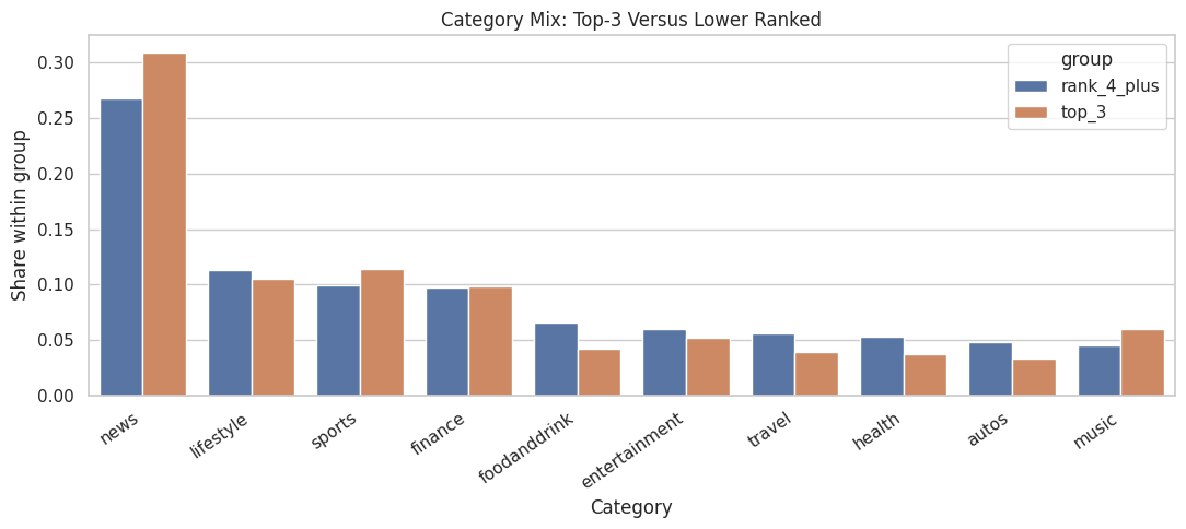
The plot makes content-mix imbalance easier to scan. If top-ranked and lower-ranked impressions contain different categories, later models should adjust for category and subcategory features.
Notes For Next Step
Next notebook/script: estimate P(is_top_3 | X) and inspect overlap.
Candidate covariates:
history_lencandidate_set_sizecategory,subcategorytitle_length,abstract_lengthhour,day_of_week- item popularity proxies:
item_exposures,item_ctr
Do not call the naive top-3 lift causal yet. It is a baseline descriptive contrast.